Full review can be found in this stream:
Play game
Colory's itch.io pageResults
| Criteria | Rank | Score* | Raw Score |
| Theme | #3 | 4.471 | 4.471 |
| Art | #24 | 3.588 | 3.588 |
| Overall | #27 | 3.459 | 3.459 |
| Originality | #32 | 3.412 | 3.412 |
| Audio | #38 | 3.059 | 3.059 |
| Fun | #51 | 2.765 | 2.765 |
Ranked from 17 ratings. Score is adjusted from raw score by the median number of ratings per game in the jam.
Did your team create most/all of the graphics yourselves?
Did your team create most of/all the audio yourselves?
How did you incorporate the theme "COMBINATION"?
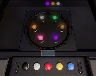
Combine colors to play a game of Simon.
Comments
I liked that you took an older and more basic game and added your own twist. I'll admit its a bit on the harder side for me. I'm not an artist and combining colors sometimes required looking up what combination of colors made the required color. It looks really sleek as well. Though its not tied to the gameplay itself, I really love that you made this with you daughter (IIRC you mentioned this in discord.) That's wholesome and really cool. Congrats!
This is like future Simon Says, the visuals look very cool and modern. Nice interpretation of the theme!
Interesting interpretation of the theme, and the assets were well chosen.
Having brown as red + black felt a little counterintuitive, but otherwise a pretty solid experience!
really nice atmosphere and cool idea also my highest was 22 only :I
Looks interesting. Works great. Very cool to use color combination very instinctive. The build looks a little oversized for the game (I had to wait a minute till everything was loaded). But other than that everything worked great.


Leave a comment
Log in with itch.io to leave a comment.