Thanks!
dan.collins.dev
Creator of
Recent community posts
Hey! All good here. I didn't check my time, but i would say just a little over an hour and that's because I was using a keyboard instead of a controller. It took me longer to adjust to the controls because of that and the occasional wrong key. Not a big issue to me. They were mapped well.
I wanted to record entries again, but I've been sick and I didn't want to be coughing up junk and voice being off while trying to review.
But yeah, to me the design changes between Meteora and Kami were spot on. I hate to ruffle feathers with feedback that may not be fun to hear, but its important, and you keeping that in mind really made a difference!
As for the last seed, that's exactly what I was doing. The puzzle made sense, I just couldn't get my projectile to that final leaf.
But yeah, congrats again on a great entry!
I do have one critical piece of feedback now that I'm thinking about it. This doesn't count against your score, but you should make sure in future games that you can't access different menus at the same time. I noticed I was able to pull open the map when a different menu was open. It may have been a powerup message, but there was brief moment of panic where I didn't want to give up on the game because of an inconvenience being close to the end. Thankfully, I had a pretty good idea of how you handle menus as another Godot user, so I was able to get myself unstuck between overlapping menus.
Overall, a fantastic entry. Unfortunately, it shows I already rated you? So that probably means there's a game out there that I need to find because i rated on the wrong tab.
Also, I couldn't figure out how to get that last seed. There are three leaves that you grow and the seed is in the top right corner of the room. Otherwise I would have got everything.
Thanks for playing! Yeah, the boss's cooldown was intentionally longer. But you're not the first to mention the rest of the enemies cooldown, so I might have to adjust that. I've been avoiding jump sfx because generally, jump animations are feedback enough to the player I think. But since this game is more playful, a jump sound wouldn't be a bad idea to at least try out. And there actually is a wall slide sound, but I made it to quiet apparently.
Once I finish up some work, I'll get to your entry! Thanks again for the feedback!
First off, I love the Castlevania 2 vibes. It was my introduction to the series, so I'm a big fan. You used external art well. I also really liked how you implemented the stair movement. You clearly have a good starting point.
To improve this entry for SMVM, these are the things I would think about implementing:
- I would increase the walk speed a little bit. The sprint speed felt perfect, but walking was just too slow in comparison.
- Make room entrances/exits more clear to the player. I only learned that there were more rooms because I accidently moved into the right spot. One way you can do this is by setting the camera's limits to the used rect size of the tilemap. You could also just put a placeholder sprite.
- Look into implementing "coyote jump." There was a room where I had so much trouble making it to the third platform. Coyote jump give the player a little bit of time to jump after leaving an edge. Its a fraction of a second, but makes platforming feel much smoother.
- Unless you like it the way it is, I'd advise applying gravity during the air attack. It felt a little off to me to be able to slow fall by continuous attacking
Overall, I can tell you have a solid starting point. I just wanted to add my thoughts since you plan on continuing work on this game. Congrats on submitting!
Thanks for the feedback and playing my game! You're the second person to mention the backgrounds and I definitely agree. I did try to do a background for the forest/jungle area, but it looked so bad that I just decided to go with a flat color for every area. It is something I want to work on, but with my current art skills, I haven't been able to find that balance between background and foreground/rooms. So I decided that a static flat color would look better than something that would make peoples eyes hurt haha
No problem. I got the whip. My struggle was right after you get the wall jump ability. I switched back into the present and went to the left in the caves and theres this long vertical shaft that looks like the way I'm intended to go now that I have a wall jump. I should have taken a screenshot of the spot, but it slipped my mind.
I really like the 2.5D style. I've seen entries that overdo it, but you kept it pretty simple yet good looking. Music fits really well. It took me a while to figure out the order of buttons to press to move on. Maybe the stones were a little too vague about the order, but it didn't stick out as something bad. The theme of Echoes of the Past is clearly communicated. You listed time as an additional theme, is there another mechanic that is time based? If not, I think it would be best just to stick with Echoes of the Past because that is definitely communicated through the game.
I made it as far as unlocking the wall jumps, but I couldn't get it to work. I could jump off a wall, but I was under the impression that I was supposed to continue jumping and I never could continue. Is that intentional or am I just bad at the wall jumping mechanic. I'm using a keyboard so that may be whats making it hard. Let me know if I'm missing something about the wall jump, because I'd like to continue.
Based on what I played, the only piece of critical feedback I think I can give is be careful about foreground objects that completely obstruct the player's view. I died to some enemies that were completely obscured and I had no clue that they were there.
Aside from the above, I think its a really cool entry and both this entry and Biker Stories communicate the Echoes of the Past theme really well. Congrats!
My problem is that you ripped the sprites from the original game. If you had listed them as external assets and just said that you didn't have time to replace them with your own, that would be a whole different story. I liked the intro and was excited to play until I saw the sprites. I double checked to see if you had listed them. You didn't.
This isn't a lack a character on my part. This is about you passing things off as your own, that is blantantly not yours. I believe you did the opening cutscenes which got my excited to play. But just slightly modifying existing sprites doesn't make it your own. I wish you could acknowledge that.
This is another entry this mvm that is really unique. I love the simplicity, yet abstract art. I could tell what was environmental, what were enemies, etc. There was nothing art wise that stuck out. I loved how the water splashing looked and the sense of buoyancy.
I do have a nitpick about the controls being only arrows keys and movement mechanics, abilities being Z,X,C, and A. I'm a "WASD" guy so this setup always makes it a little more difficult for me, but as long as the layout makes sense and isn't all over the place, its not something that affect score.
I guess my main critique, and its a really picky one, is that as a plain square, its not intuitive which direction I'm facing. I've used a square before and received the same feedback. It felt obvious to me as the developer, but I made the assumption it would be the same way for everyone else. Thankfully, your character can shoot so, constantly shooting helped in that regard. My game didn't have that so I can see where it would have been counted against me.
And as Jeff said, it would have been nice to have the floaters line up more, but I think my entry also has the same kind of issue.
Overall, this is a great and really cool entry. I definitely think it was well executed and visually impressive.
This was such a unique game. I loved the move mechanics and the concept of traveling back and forth in time as a cowboy and a biker. The art was simple and sweet and you had such a surprising amount of npcs. They really filled out the towns and gave life to it. I really dug that. I like the music, although it would have been cool to have this spaghetti western music when on horseback and biker rock when on the motorcycle, but that not really something I'd count against you.
I'm not sure if I beat the game or not. I got the double jump and the homing missiles and beat the boss on top of the alien ship. It said victory and i went back and forth trying to see if there was something I miseed. If I did beat it, it would have been nice to have a clear sign that the game was over. If I didnt beat it, let me know and give me a tip on where I should investigate next.
Dynamic NPC dialogue would have been cool to have. Stuff that updates after you've hit goal points. Like after I destroyed the boulder, the soldiers were still complaining about it. But that's also a pretty big task considering how many npcs you have in your game. In my game, I couldn't even get around to updating the mayor's dialogue each time you rescued a villager.
From what I played, I definitely enjoyed everything about it. Congratulations on a very unique take. I really enjoyed it!
Thank! I agree with your feedback. If I had put more time into how the map would look overall, I would have had it more towards the middle or desgined around its location rather than outward. I still havent implemented variable jump mostly because I messed it up the last time time I tried and it was a bit buggy. I think it would randomly boost you or something at the apex of the jump. Since then, I've shyed away from it. And the wall slide definitely needs more refinement. First time implementing it, so theres room for improvement haha.
Thanks for the feedback and playing! I'm glad you enjoyed it. Regarding the boss, that was my original intent. But by the time I got to making the boss fight, I wondered if it would stick out as an inconsistency compared to the rest of the combat. So I just said, I'll stick with being consistent. I am working on tweaking it for the SMVM, so I'll probably make that change now that its been mentioned. I also want to add different difficulties. It was set up, but I didn't have enough energy to fully test and balance multiple difficulty levels.
These sprites were directly ripped from Castlevania. The game was uploaded and last updated 23 days before the deadline. I'm all for imitating classics, but there needs to be effort put in. There's a great game in this jam the pulls so much influence from Castlevania: Symphony of the Night and I love it, but they actually put the work in, their art is theirs. I can't in good conscience vote for this entry. Everyone else put work into their game, and voting for this entry would be disrespectful to everyone who did the work and made something that they can call their own.
Sprites were probably ripped straight from here.
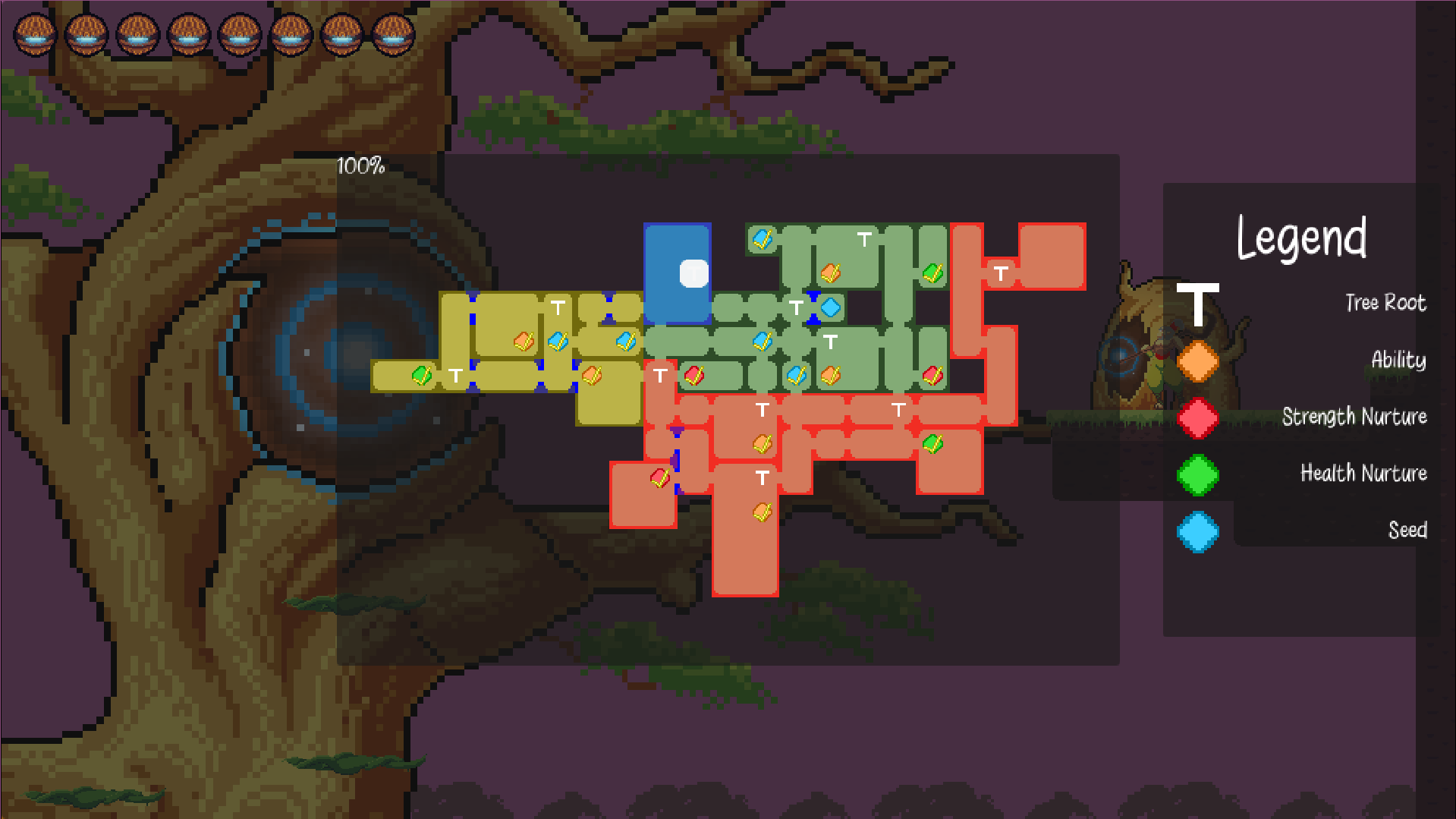
I really dig the art style and music. I think you nailed that aspect. The main character actually reminds me of Ty Lee from Avatar the Last Airbender. You also included your theme very well. Character movement felt good. Nothing stuck out as being odd. I like that you included a map and it updates accordingly. MVM entries with a small number of rooms can get by without having one, but there's a point where the player can't keep mental track of all the rooms and places they need to come back to. That being said there are a couple items that should be addressed.
First of all, spikes in blind spots. As a player, it feels really unfair. This might be the most noted feedback you receive throughout the jam. And its definitely something you should keep in mind in the future.
The other thing, and this may just be a personal preference, I feel like starting out the arrows you have to use the time slow on should be slower and gradually increase in speed as you progress through the game. You don't want to immediately frustrate the player. With this type of mechanic, (and it is a very cool mechanic) you want to ease the player into the flow of it. After a certain point of progression, step it up.
Other than that, you have a really cool idea that I think you should continue with it. SMVM is going on, so you can take the feedback you receive here and really step up the game's quality and submit whenever the deadline for that is. I would definitely give it another go to see how it improves!
Definitely loved the music. It was nice to finally play after seeing all the progress you posted. I will say that I was unsure of what the crystal powerup did. I thought it was for surfing safely across spikes. If so, it still needs a little work, because it was working for me. The bosses were easy enough fights and their moves sets and tells were executed well. I did have a lot of trouble in the fire section and getting to the boss in that area. A bug I did notice is that the second power up, the explosion shot takes out the save spots if you shoot them. Ran out of time because I shot one as i was running to refuel my time. Obviously from my score, I definitely missed a few optional rooms. There was also a camera bug in the water section. It only happened once, but i died and then the player was never in camera view so i just had to run the clock out and restart that area.
Overall, there's still some bugs to fix, but I always enjoy your entries. I say this is one that can be spruced up and submitted to the SMVM. If i remember anything else or you have questions, just hit me up on discord.
Overall this is a pretty solid game. I feel like the mechanics were clearly interpreting the theme. If it wasn't listed on this page, I'd still know what theme you were going for, so thats really good. I always like purchasing upgrades, so thats a plus as well. Enemies were simple enough, but provided a level of challenge.
I think the my main criticism would have to be the difficulty level starting from the first upgrade station. I did have to run that several times before I adjusted enough. After that section you enter the closed room with the skeleton and wall eye on the left side and after a couple tries, I got the hang of that, but was blindsided by the spawning of another wave on the right side, plus an extra enemy. As a player, I didn't expect that second round. After that, I feel like I had a decent idea of how to play the game. So i think the initial difficulty may be a little high, but i think after the room I mentioned it feels like how I would expect it to play.
The above is the only thing that I feel is worth pointing out. Other than that, very solid. Music and art meshed well together. None of the art, music, sfx stuck out or struck me as being an "odd choice". Congrats on a really solid entry!
No problem! Game jams are just like that. You make assumptions that are either decent or you get a comon or mixed reaction about it. I've made assumptions that were just completely wrong haha. And yeah, making music for games is hard, I'm still new to it and also pixel art. I started with programmer art, but I've improved, and to my surprise people think I actually have an art style which blows my mind. I'm colorblind and can't even name the primary colors haha. I guess its just practice and receiving good feedback from these jams.
Thanks for playing and the feedback! The gold dropping timing was a bit of trial and error. I toyed with which state to put the spawning of coins in. I think the real fix would have been making death animations shorter. I like them and death animations I always find fun, so they tend to be a bit larger than other anims. Regarding room transitions and enemies, I do try to make sure that the player doesn't feel like it was cheap shot, but I always miss one or two. I also made the assumption that the player would recognize the end room by its size, a save spot, and chest. It was one of those assumptions where I was partially wrong. It seemed like there was a mixed reaction with playtesters about that as well.
And yeah, I laughed out loud when the image of the final scene popped in my head and usually if something makes me laugh during development, 99% it goes into the game.
Once again thanks for the feedback. It definitely helps!
Unfortunately I didn't beat it, but I think I got pretty close. I got the pogo stick and made it back to the top floor and up to the point where you use the pogo stick to pop up and theres a trap almost immediately. I had no time to react. It took me a while to get there and I think I would have gone further if there was a save spot in a room right after obtaining the pogo stick. Other than placing a save spot closer to after getting a pogo stick, I think the game was pretty balanced. You nailed the theme you chose, the puzzles were generally straightforward but still challenging. The box mechanics were really solid. I didn't encounter any issues of getting myself stuck which happens a bit with box moving mechanics.
Besides the save spot distribution, I think the only other criticism I personally have is the lighting. I know the darkness was what you were going for, but I did have trouble seeing things. A map would have been nice. One that displays each floor and lets you know which one you visited, but I wouldn't count that against you because the routes were relatively straight-forward.
I'm not a fan of 3D metroidvanias, but this was executed well enough that I didn't have issues with the 3D aspect.
Overall, a very solid game!
Congrats on submitting! Except for the enemies, I feel like everything I saw and heard meshed well together which is an accomplishment because its so hard to find assets that mesh well together. I liked how you interpreted the theme, but I feel like there were some issues in how it was implemented. I think specifically having to write down codes detracts from the experience. I feel like that should be kept in the player's log that can be referenced in game or automatically input when the time came. There were also issues with the terminal staying open if I chose not to use it.
I think if those tweaks were made, the jump in quality would be significant. I still think its a great idea and with this being a game jam, there's going to be thing like this that crop up for all of us, but its definitely worth pointing out for improvement. Congrats!
Congratulations on submitting! That itself is an accomplish, both in terms of skill and putting yourself and your work out there. I definitely dug the music. That being said, there's a lot that can be improved here.
First of all, controls aren't mentioned in game or even on your page. That should definitely be a priority in the future for you. Making the player hit a bunch of buttons to figure out what they can do isn't great. Also, if you're going to make environmental pieces such as art that you don't interact with, they should be colored distinctly enough that the player can intuitively tell. Immediately upon loading your game I went to the right expecting to be blocked by the pillar because it looks like the floor and walked right through it and plunged to my death lol.
I'd also give the player more health. 1 hit lives aren't very fun and don't give the player the time to figure out how to progress. There were also some collision issues where I died and fell through the level and never respawned.
I would definitely read all the feedback you get and think about it This is what helps us all get better. Once again, congrats on submitting!
The idea of no jumping is really interesting concept and I feel it was implemented fairly well. I can tell what you wanted to achieve with this game, but I do think there are a couple things I want to point out.
- I don't see how the theme comes into play other than I die in one hit. If that was the intention, I'm not sure I feel good about that. In general, I personally find 1 hit deaths to be discouraging and unhelpful for the player. I think the player should take at least 3 hits. This gives the player a hit to realize they're going to have to be a little more careful, think things through, etc and 2 more attempts to get it right.
- I can tell that you wanted this very atmospheric feel to it and dim lightning, but with the rest of the mechanics, I think its causes some issues. Lighting was very critical and I don't mind it being something you have to replenish, but I do think that your enemies need to be more visible. Even with full lighting I couldn't see dangers, which isn't great, especially with 1 hit.
- The reticle for the gun probably should only turn a color if its hitting something interactable. Red for enemies, some friendly color or whatever to highlight that it can interact, but youre not in danger. Also, normally I'm not a fan of the reticles being smoothed in their movement, but it does work for this game, so kudos there.
- I had some issues with the shoot jump mechanic not working all the time which eventually led to me bugging out at some point near the power up and locking myself into a wall :'(
Overall, I feel like I know what you were aiming to accomplish in this project and it was ambitious and a bit unique, so congrats on going for it!
Haha thanks. Yeah regarding the attacks and small character size, I tried to really give the player a bigger hitbox without making it too big. I knew going in that would be a possible downside, but I liked that character art too haha. And I did plan on having the player go inside, but when I got to that point, I knew I didn't have time to do it and make sure it worked all correctly.
Definitely a lot of content packed in here. I definitely like the style of going for a DOS/MSX feel, but I do feel like that brings up some criticisms. While I like the music, I expected it to be in the same style. Combined with the lack of sound, which I personally would have prioritized over music, it does conflict with your goal of going with that style.
Level design was done well. The puzzles gradually increased in difficulty and the spell mechanics weren't game breaking buggy. I had one close call where I got a statue stuck on me and spamming buttons got me unstuck so I could continue. I do think with the amount of rooms you have, you should have a map. I got lost a little but not too much.
Also, some indication of what powerups do would be a good thing to have. I figured it out quickly enough, but its still a good thing to have.
Overall, I like this entry. While there's definitely room for improvement, I think it stands solidly as is. Congrats!


