Thanks Manisha! 😁
DrManticore
Creator of
Recent community posts
This is crazy for the amount of time you guys have had! Art is great, especially the backgrounds. Story presentation is excellent and the voice actors performed really well.
It's cool how the spells all have different utilities, though spell 4 (the sine wave) was a little tricky to aim and I pretty much never used spell 1 (the melee) because the cast time was so long and the range was so short. I always struggle with having up/w as jump, so the platforming was probably more difficult than intended, but the enemy variety made up for it.
Any rhythm game that does anything more complicated than 4-to-the-floor immediately has my respect! Having said that, I literally couldn't figure out how to jump over obstacles in time with the music 😅
Art style has tons of character and a really pleasing colour palette, and the music would have me tapping along even if that wasn't the core mechanic of the game.
An interesting mechanic, pressing the keys so they line up and the way they're positioned on the keyboard was something really unique and novel. The calming art and satisfying audio really complimented the experience.
I can't really think of any criticism, apart from maybe suggesting a high contrast mode available from the options or something?
The core mechanic was really novel and interesting with this, and I loved the cartoony art style.
It could have done with a bit more polish - maybe some vfx for the transformations, and there was no audio, so I can't really comment there.
Would love to see an updated version with more levels and some audio!
Hilarious interpretation of the theme. Quirky art style suits the humorous tone and the audio completmented the aesthetic well. There's also a surprising amount of polish - screen shake when you land, and a different, higher pitched jump sound when you're powered up.
Would have been nice to make a bigger deal about finishing a level - maybe a chime or stinger or a victory screen or something?
Overall, not bad for a comedy entry.
Love the concept and the art is gorgeous, but I found the actual cooking part to be a bit of a struggle. I never seemed to get the right combination of ingredients, so I spent the majority of my time playing the game just grabbing whatever dropped down, and dumping it out of the way of my Woryl so it wouldn't eat.
I still had a ton of fun playing the game this way, so it's not all bad, but maybe weighting the randomisation in favour of the combination you need a but would be a huge boost.
Character art and animation are great, and I adore the hand painted look of the scenery. Audio complimented the aesthetic very well, although it would have been nice to have more of an indication when the enemies were defeated.
Traversal mechanics and combat worked nicely, but the level design could have used more work. There were several instances where I didn't know where to go, because all of the available platforms were off-camera.
Great work, folks!
The ability tetris concept was really unique and interesting, and really well implemented. I'm always a sucker for cute pixel art and the colour palette was really pleasing to the eye. Audio fit the aesthetic very well, and you got a huge amount done in a small time.
I would say the controls and level design combined made for a very frustrating experience for me - I found myself over- or under-shooting every single platform, which kind of put a damper on my desire to explore the world, which seemed very well designed.
Still, a very impressive achievement, and I might try and make my way through the whole thing when I have more time and patience!
Really loved the interpretation of the theme! The minimalist art style really compliments the mechanics and the audio fits in without being intrusive. It would be nice to see some different challenges and maybe a confirmation sound or something when you go through a door, but it's a very solid effort.
Cedric killing it with the high quality animation again! 😁
Wasn't able to play multiplayer, but the practice mode felt like it had tons of polish. There's loads of abilities, so there's a lot to sink your teeth into. I would say that some of the ability cooldowns feel a bit harsh. I spent quite a bit of time just jumping around, trying to collect more mana.
Definitely looking forward to a full singleplayer mode, though!
So much functionality and a good chunk of levels! Art and audio, while not custom are well chosen to suit the aesthetic of the game. It also feels super polished, though it could do a tiny bit more to emphasize certain things - maybe a chime or a fanfare when you finish a level and some particle effects and audio for when an item ends up in the right gate? Those really are nit picks on a very well made entry, though.
Platforming took some getting used to, but was enjoyable once you got the hang of it. There was tons of content here, with lots of well considered level challenges, although some of the later platforming sections were a bit frustrating. Also, there were a few places where the screen transition hadn't been properly taken into account when designing individual screens.
Glad to see sorting your boilerplate stuff left you a fair bit of time for content creation. Looking forward to your next MVM entry, where you can have more time to polish things!
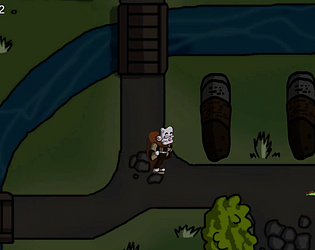
The art was great, especially the lighting and the audio suited the atmosphere, too. I'm always a fan of top down run and gun gameplay, so I really enjoyed this and I loved the level design, with all the secrets.
Lots of people have mentioned the framerate/spongy enemies, so I won't go on about that. It would be good if you made the enemy deaths a little more juicy - a louder sound effect and maybe some sort of explosion that would stand out against the slime puddle they're wading through, maybe?
Super polished and fun to play, especially in the short amount of time you spent on it!


