Play game
RobTheRobot's itch.io pageResults
| Criteria | Rank | Score* | Raw Score |
| On Topic | #56 | 4.174 | 4.174 |
| Simplicity | #270 | 3.826 | 3.826 |
| Creativity | #318 | 3.435 | 3.435 |
| WOWIE! | #482 | 2.783 | 2.783 |
| Fun | #572 | 2.522 | 2.522 |
| Sound | #611 | 2.261 | 2.261 |
| Visuals | #756 | 1.913 | 1.913 |
Ranked from 23 ratings. Score is adjusted from raw score by the median number of ratings per game in the jam.
Music Source
No music, just soundeffects found in the Unity asset store
Credits
234zu, Soundeffects and models from the asset store: Little Robot Sound Factory, Chris Nolet, Alstra Infinite, Olivier Giardot
Leave a comment
Log in with itch.io to leave a comment.


Comments
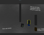
I think this is a really good idea! The wood wasn't that visible because it was dark... I enjoyed playing it and I think with a bit more work it could get really good!
Neat idea. If the robot dies while you're holding an object you respawn holding the object from really far away
Really cool idea, but i think gameplay can be improved.
Well, the wood should definitely attract attention to it. Current colors can not do that.
And i would really like to see robot detecting the wall while you are moving. That would be great :)
And maybe player could be just a bit faster. Not sure about this one.
I dunno these are my first thoughts. The idea was actually enough to make this game interesting, but i think that kind of stuff would make the game even better.
not sure if this is a glitch, but player movment gets worse.
what exactly do you mean with that
it started small on the first level, then on the second it got unbearable, the player jumped around, and whenever i tried to move up, the players speed was reduced significantly
Wow I didn't expect such a cool idea!
The wood material however doesn't stand out from other material, but nothing that can't be solved in future releases! :)
great puzzle desing but sometime the robot will go died even if I put the box behind but the best part is the intro !
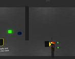
I really like the concept of the game. However, I couldn't get very far, because the bot seems to often ignore the box and even push it away.
The robot can only detect the block when you drop it again. Should have made that clearer though, so thanks for the feedback
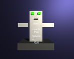
thanks for the feedback! In the how to play section of the menu it would have stated that you should bring blocks to the next level, but that became unreadable after i converted the game to a webgl build so yeah, unlucky lol
but even then i should have made that clear in the game as most people probably wouldn't read the entire tutorial
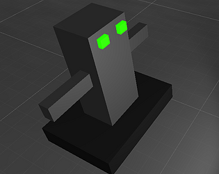
Nice game however the intro, I feel is kinda to good for the robot model, when you have a cinematic and cool intro like that and the robot looks like a square it doesn't exactly feel right. I was about to say why wood until I searched up is wood invisible to different wavelengths of light and saw it was indeed transparent to radar, if this was your intension good job!
thanks for the feedback! My intention with the "cinematic" intro was kind of a parody of cutscenes like this, where theres more and more tension what cool thing it will be and then it is just some ugly blocky robot lol but i probably didn't portray that understandably
Nice game however the intro, I feel is kinda to good for the robot model, when you have a cinematic and cool intro like that and the robot looks like a square it doesn't exactly feel right. I was about to say why wood until I searched up is wood invisible to different wavelengths of light and saw it was indeed transparent to radar, if this was your intension good job!
the intro scene is cool, but I don't like how you have to start from the beginning each time.
Fun little puzzle game! The intro cutscene showing off the robot was fun. If you wanted to improve it could be nice to see the path the robot's going to take, that way you can see the impact placing down obstacles has. Overall cool game!
Nice game!
Very nice! I love how its both a puzzle game AND fast-paced- really a mixed bag. One thing maybe to work on next time is adding music or more sounds, and just tidying up the visuals a bit. If you'd done that, it would've been a 5 star all round game imo!
Uploading the game threw off the UI so you can't read the "How to play" section anymore. The controls are explained though and I uploaded the how to play section as a screenshot here.