Play game
Wowie 4 - Hunt for the MacGuffin's itch.io pageResults
| Criteria | Rank | Score* | Raw Score |
| Visuals | #96 | 4.087 | 4.087 |
| Fun | #282 | 3.261 | 3.261 |
| WOWIE! | #362 | 3.043 | 3.043 |
| Creativity | #370 | 3.304 | 3.304 |
| Sound | #391 | 2.913 | 2.913 |
| Simplicity | #554 | 3.174 | 3.174 |
| On Topic | #598 | 2.609 | 2.609 |
Ranked from 23 ratings. Score is adjusted from raw score by the median number of ratings per game in the jam.
Music Source
Jonas' Wowie Resource Pack
Credits
Adroid Conceptions
Leave a comment
Log in with itch.io to leave a comment.


Comments
i find the idea to be quite interesting - having a Zelda-like isometric adventure game with a companion that you actually control (instead of having something like Navi annoying you all the time with dialogue...) and for a 4-day Game Jam game, the idea is quite well excecuted. i also really like the dialogue system and how the statue keeps on encouraging you to keep on going when you die!
my only gripes with this game are:
- the controls are really weird and i wasn't able to check back on them without restarting the game
- the game sort of just "plops" you into this world and doesn't really explain its mechanics
- fighting was bland and a bit clunky, for a full game you'd need to make it a bit faster and smoother and maybe add a few attack variations (light/heavy/charge etc), but i understand that it wasn't really manageable for a jam
- puzzles really weren't much of a challenge and didn't really feel rewarding. the game suddenly ends without much of a build up or anything, just some text
thank you for the play and feedback
Again, thanks for the feedback. Also sound like you didn’t get through all of the death dialogs, the tone does eventually change a bit.
Really a fun little game, great job!
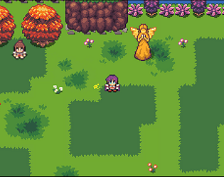
The visuals are incredibly cute and on point for an isometric “Zelda-like” adventure game, and the music is a pleasing background for it all. The controls, while a little strange to pick up if using a keyboard, are functional and reactive: I particularly liked the iconography for each action, it really is intuitive and eliminates the need for a tutorial; on this regard, your use of universally recognized videogame tropes like levers that need to be switched is really admirable, since they immediately explain the simple puzzle mechanics without the need for someone telling you what you should be doing.
Gameplay-wise the game feels good to play: the combat is fun and the puzzles, though really easy, are too. The only thing I’ll say is that having slimes immediately hit you on touch is a bit unfair when the attack range of the character is so short: maybe you could give them a short animation for an attack that allows the player to hit them and run away more easily.
Again, a really nice entry: good job and I would like to see more in the future! :)
thank you for the feedback.
keyboard controls - I wasn’t sure what the convention was for keyboard layout of the face keys of a controller, so I picked a set of keys that were the same spot for both qwerty and azerty keyboards and in roughly the same layout as the on screen indicators. I agree this is something that could have used some playtesting (with people who normally use keyboard) and/or research.
slimes immediately hitting you - yah, they are just randomly moving damage areas. The harm box of the player is actually quite a bit bigger then the animation - about as much better as didn’t feel weird) - if I had more time, I would go in and modify the animations to make the attack path visually bigger.
Artwork is very nice. Music is pretty cool but can get tiring to hear due to it being so upbeat while the action on screen is less so. I got stick where you're supposed to go south with a translocator? Couldn't figure it out. As others mentioned the AI feels more like an ability. Pretty solid start though, and nice that you included controller support.
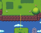
from were the NPC talks to you, you can do directly south and bridge a gap that you could not before. It sounds like some sort of setup so that you walk near it for some other reason to make sure it is visible is needed.
on the AI feels like an ability statement.
would you consider Navi from The Legend of Zelda: Ocarina of Time a character ability or companion?
if companion, what is different about this companion vs Navi that makes it feel like an ability?
Great game! The graphics are outstanding. I liked the control scheme, reminiscent of the Nintendo. My only concern is that there's not much "collaboration with the AI"; the AI is simply another player's skill. I also wish there was a bit more content. I felt the game finished before it had even started. But alas, this is a GameJam after all. The movement felt smooth, and I reiterate how good the art was.
You should feel proud of this game, and I encourage you to expand this project.
Congratulation on your submission!
thanks for the feedback.
I can see how the AI seems like a skill, it is a companion character and is completely driven by AI (it happens to have commands that it responds to that mostly drive its behavior)
more content - yah, I wanted to do more also, but between everything else taking longer then expected and creativity burn out, I ran out of ideas to work with to actually make more content to fill out the game play after the end of the first ‘quest’.
I have been thinking about undertaking a 3-6 month project as a ‘first try at something commercial [that gets finished… I had started one other project with that idea, but the scope was going to put it at a 5+ years to finish situation]’.
I have ideas that could account for a handful of bosses, a few more mechanics to add, an over world type idea and a few other things that could work well with the game play I have so far.
I love the perspective and the visuals overall! Very early nintendo vibes :D
Thank you for the play and comment.
Great visuals and mechanic! Well done!
thank you for the play and comment.
Fun game really liked the graphics,they give me some link to the past vibes
thank you for the play and comments
nice game love the art and the puzzle between the fight only things that could have been fun his if you had a collider to not fall from platform otherwise great start for a full game !
Thank you for the play and comment.
I would have to test it, but I think making it impossible to fall off the islands would remove much of the free flowing movement and most of the challenge around the translocation function.
Gives me nostalgia vibes, good work :)
Thank you for the play and comment.
The game is like Zelda. The same route for me. I know what I am doing -> I don't know what have to do -> Just read correct -> I know what I am doing.
Thank you for the play and comment.
I really liked it, short and sweet! The mechanic of swapping with the AI was really fun, especially when you got used to it and started doing it in a "rythm", going close to the ledge, pressing i and then o... Very fun! If I have to be picky, I would say the controls weren't very intuitive, but I got used to them!
Thank you for the play and comment
Short but very enjoyable, the pixel art graphics and animations are very well done and it is fun to play! I found the controls a little confusing to manage on keyboard with the IOJK keys being used, but I played it a second time with a controller and had a much easier time with it. Overall a very cool game!
thank you.
I have had a controller for this time of game for so long, I didn’t really know what the convention is for a keyboard for mimicking the face keys, so I picked JIKO as a set of keys with roughly the same layout and were in the same spot on the 2 really common keyboard layouts.
I wanted to setup keybinding, but every other step took a bit longer then expected and I burned out faster then expected. Key-rebinding was lower on the priority list then the ‘shipping’ line for this jam.
It feels pretty good with a controller, I found myself throwing the bot into slimes expecting it to do damage, it would be cool if it did for even more of a multipurpose mechanic.
I was kind of lost after killing the slimes, because for some reason I didn't know what south was on a topdown game. Would be cool if she just said it was under where she was.
Other than that it was really well made, art was good and the bot mechanic was great. Switching between them is genius too.
Thanks for the feedback.
To my knowledge north -> up, east -> right, west -> left, south -> down is fairly standard in top down games like this. From the character’s point of view, ‘down’ would be the clouds below them.
I did consider having the bot do damage when sent (or have it attack on its own or something), but I didn’t want to add any new mechanics late in the jam cycle [always a way to end up with bugs at the last second] If I was to expand the game, giving the bot more utility is definitely on the list [likely a whole upgrade tree for it].
thanks. I was reproducing what I remember from games like Zelda a Link Past, were if your moving a direction, then go diagonal, you keep the initial facing. It definitely seems like it could be worth testing that option, where the most resent input drives the facing (but that could cause problems with making the stick inputs work) and see which feels better.
the hitbox is actually bigger then the animation already, and yes I think Zelda’s animation has a larger swing (possibly bigger then my bigger hit box).
That is one thing that is hard to test yourself, as you start to internalize the ‘perfect’ time to swing the weapon.
the hitbox is 2 tiles wide and 1.5 deep offset a 1/2 a tile in the direction your facing (so roughly 1/2 a tile above and below the character if attacking left/right). I think I would be up to increasing the size of weapon in the animation and increasing the hitbox if I continued working on the game.
one thing that might have got you is that the directional input locks out while the attack animation is playing, so if you pressed the attack button a frame sooner then a direction, you could get locked into your old direction for the attack.
After playing your prototype on discord, I decided to try it with a controller this time. It definitely feels way better! I love the multiple death dialogs, and the funny ending :P
Feedback:
Fantastic job!
thank you for the detailed feedback, it is always nice to get actionable feedback in a game jam.
stick -> Worth testing and seeing how it feels (and if locking it to the nearest 8 direction input makes sense)
which dialog is selected - Definitely something the game needs. I got the same feedback from my kids late on Sunday, was just deved out at that point and didn’t want to open unity again.
translocate distance - this could use some play testing for sure, there is a fine line between ‘got to get it just right’ and ‘to close’. It might be easier to slightly adjust the distance the AI pet goes when you send it, as that would let me add a 1/2 a tile distance vs a full tile to move the platforms.
Wow! I mean wow! This is like a full blown RPG in just 3 days. Amazing! Bravo!
Thank you for leaving feedback, it is much appreciated.
Be sure to leave feedback, it is more useful then just ratings.