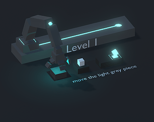
I also was not sure what I was mean to be doing. The animation and overall look and feel are top-notch however!
Play game
"Main Path" the game!'s itch.io pageResults
| Criteria | Rank | Score* | Raw Score |
| Visuals | #78 | 4.158 | 4.158 |
| On Topic | #461 | 3.000 | 3.000 |
| Creativity | #475 | 3.053 | 3.053 |
| Simplicity | #488 | 3.368 | 3.368 |
| WOWIE! | #525 | 2.632 | 2.632 |
| Fun | #612 | 2.368 | 2.368 |
| Sound | #805 | 1.526 | 1.526 |
Ranked from 19 ratings. Score is adjusted from raw score by the median number of ratings per game in the jam.
Music Source
i have no music or sounds
Credits
Elliott Friedrich
Comments
Very nice looking game! Tho it did take me a moment to even notice the tile I had to move, perhaps another color would make it stand out a little better (tho I imagine you're using a limited color pallet on purpose). Either way the movement of the robot arm was CLEAN
Nice and simplistic game, really fantastic IK on the arms. It would be a very good mobile game, if you add more levels and such.
It took me so long to realize you move the tiles and not player, because to me the player looked like a light grey piece. I had to look in the comments.
Aside from that issue it was well polished, just wish there was more
I feel like this idea has potential but it is unclear what you are supposed to do,
It's a really nice demo, with a lot of potential!
Though, you should really make it more clear, that the block on the ground is movable. The description "move the light grey block" made me think I have to pick it up. so I kept clicking without anything happening. I thought the game was broken until I looked at the Comments.
The block should be blue to make it more distinct from the background
Really cool game, looks awesome and really polished, good job!
Interesting, I would make it faster to operate. Next time if you have few levels maybe try to make them as different as possible. But combining the point and click with the rails to reduce your reach is a fun idea. Adding one or two more dimensions would be fun!


Leave a comment
Log in with itch.io to leave a comment.