Play game
SRunner's itch.io pageResults
| Criteria | Rank | Score* | Raw Score |
| Game Design | #62 | 2.121 | 3.000 |
| Overall | #63 | 2.222 | 3.143 |
| Fun | #67 | 1.919 | 2.714 |
| Theme | #77 | 1.919 | 2.714 |
Ranked from 7 ratings. Score is adjusted from raw score by the median number of ratings per game in the jam.
Did you use any assets? (Say yes even if the assets were premade by you)
Yes
Discord Username/Usernames
Lukyspore#9707
Leave a comment
Log in with itch.io to leave a comment.


Comments
Wow, pretty cool game, simple but efective mecanics. I saw that the wallrun was clunky but it was probably hard to code tho... what you probably did was something like "If both W and D where on the right wall, then wallrun"... you could have done something that conditions more on the collision while moving instead of a constant check of buttons, also sometimes when i stopped pressing one of the buttons i was still on the wallrun, but i coud't move...
But then again, the game is challenging while not being punishing, so it has a good over all desing, except for the weird ball on one of the levels, and the theme of the gamejam in this game i would say its kinda lazy. In conclusion, good game, cool desing, good mecanics.
Congrats man
I managed the first obstacle (wall jump). But being reset to the start of the level after failing first attempt of the second obstacle ... that felt really punishing.
Same with the replay. It took the momemtum out of trying right again. It is an interesting feature, but did not help the player. Also it made me take my fingers off WASD, to press K and continue playing. There was no permanent setting for that.
Wall jump could have cheated and glued me a little. I would not have minded the help. But it felt nice, the first time I made it work.
The whole design was very engaging. There was no question I HAD to attempt the obstacles. Just driven by the music and the aesthetics.
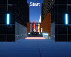
The menu screenshot you provide on the page, really does not advertise the true quality of the game. Wouldn't a screenshot down the starting position view motivate a download -- showcasing the level design?
Before frustrating out, I did have several minutes of fun with your game :)
Thanks for your feedback, it really opened my eyes to the game design and the difficluty of the game.
The movement is hella buggy, sadly I did not have enough time to iron out the kinks. It was my first attempt at a bit more complicated 3D movement.
The rewind feature was there just because I wanted to make it a bit harder. I thought the game was too easy and pretty short, so I thought adding a rewind feature would extend the replayability effect (But I guess not XD).
Nonetheless, I am sure, different players see what I said in a different light. Concerning the difficulty, replay, etc.
Just saying ^^
What are the controls? I can't even figure out the first jump.
You can jump by pressing space while running.
CONTROLS
Sadly couldn't get the game to load on either MacOS or Linux :(
I'm sorry you couldn't get the game to load. It was really only tested on Windows. I throw the Linux and macOS version there without even testing them. Now I see I should have tested them.
Hahah, don't sweat it :)
OK, I got it working on Windows. I like the idea behind it, it's just a steep learning curve! I think it would make a fun game if you ramp up the difficulty slowly. Nice job!