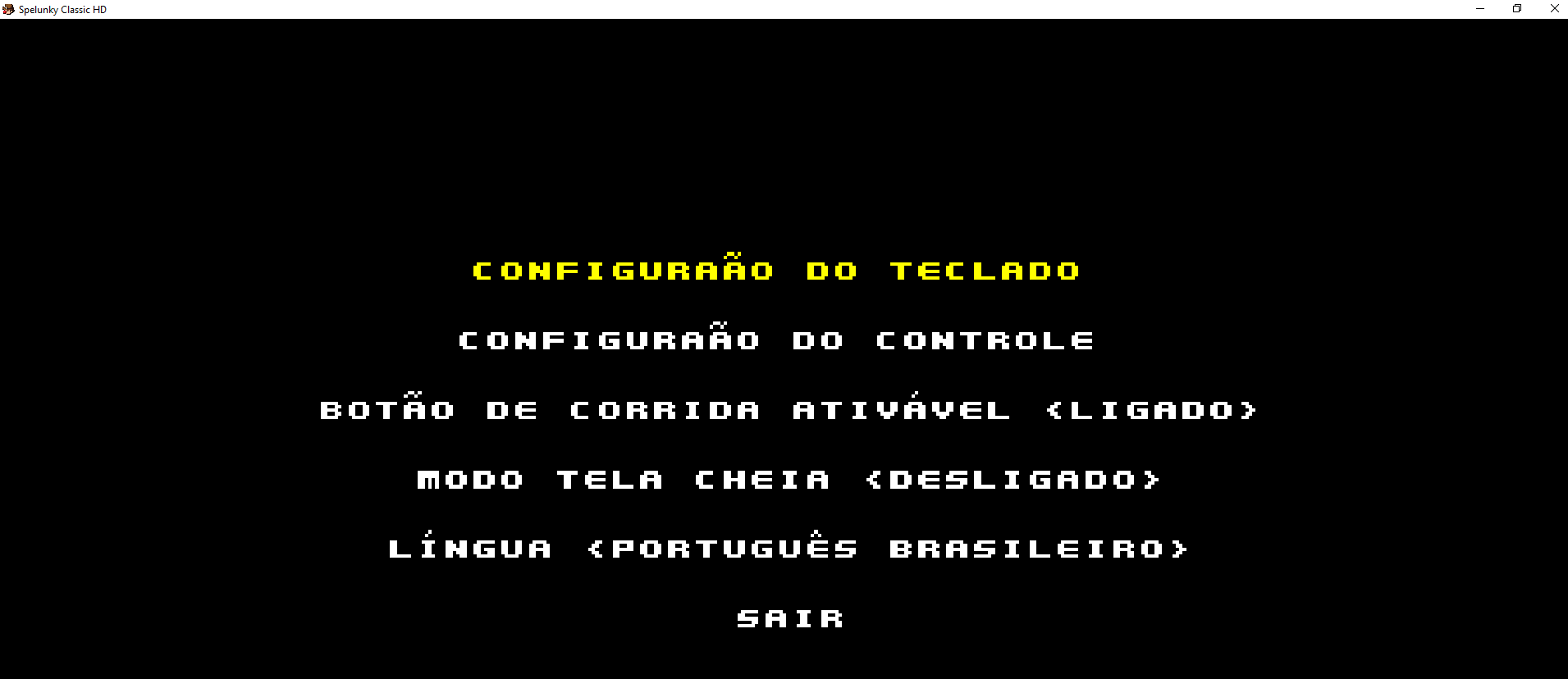
Done: https://mega.nz/file/TkpilbyA#xdNY_HGma6w5TvYiUFLV0uhNboV3I7GF5XXxOkhhwlc (place 'charset' directory to 'pt_br' directory next to 'text.json' file).
I changed the font size to add additional glyphs, so text placement slightly different from other languages. But I think it looks better that way (check Spanish or Esperanto translation to see how the text looks when trying to keep default size). Not sure about the letter 'Ê', maybe I should move the upper glyph a bit to the right?
I tested how the font looks in-game very briefly. You have to do proper testing and tell me what you think.
Also, I notice that some text in the intro too long (it doesn't fit on the 16:9 monitor, on 4:3 even more text will be cut). If possible, try to rephrase those sentences to keep them about the same length as the original. I had the same issue when translating, but then I realize that translation doesn't have to be perfect.


