Indie game storeFree gamesFun gamesHorror games
Game developmentAssetsComics
SalesBundles
Jobs
TagsGame Engines
(+2)

I feel the melee system could be made more fun if the player has just a bit more range than the enemies, but once I got the sword, that was mostly solved.

When I first got to the poison enemy, it was hard to tell where it was because it kept backing into the trees.  For situations like this, consider dimming the foregrounds that are directly in front of the player and affected enemy, with almost no exceptions even for ambushes.

I think you should have the "Switch between items" sign near where you can swap them out in the first place.

I appreciated the stab system once I learned it.  The game is surprisingly complex.

I think you should work on smoothing out the wall hitboxes to not just being an even 32x32

Consider speeding up the player's speed OR zoom in your camera a bit so it seems like everything is going "faster" because as it is it "feels" slow.

Playing with a KB/M setup it was awkward to even want to use the items besides the healing juice because they don't give enough benefit to justify me remembering to use them.  If poison was worse or the stamina potion recovered much more it could be worth it.

It was amusing to see all the enemies die to drowning, but I'm not sure that was intended?

The more systems that were added onto the game the more fun it was and I think that you have just the right number of active combat systems to not be too complex.  It surprised me that I finished it because it was hard at some points but I did get to where the sign said end of demo.  I explored a bit more (made it to the smithy place before giving up).  Overall, good demo.  I think it has great potential once polished up a bit.

(+2)

Hey, thanks for playing.

There will be other weapons in the final game too, so there will also be more options in general.

Yeah, I'm planning on adding something like that. I don't know if I'd want to stop the enemy from ambushing the player due to it, but I understand where you're coming from.

Not a bad idea. My only worry is overloading the player, which is why I save that tutorial for later on.

Glad you enjoyed the differences between attacks in the game.

Would you be able to elaborate on what you mean by smoothing out the wall hitboxes?

I'll consider it. Thanks for the input.

Hmmm, maybe I'll make poison worse. Or at least make the poison enemies deal more poison. Can you elaborate on what about the controls specifically felt awkward?

It was partially intended. Obviously if the AI was better they'd be smart enough to not do that, but for now they are not smart enough.

I'm glad you got all the way to the smithy. I'm unsure about anything saying it was the end of the demo. Do you mean the end of the tutorial?

Thanks again.

(+2)

>smoothing the hitboxes
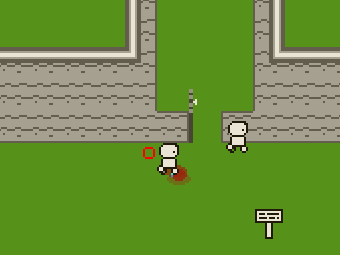
Going back into the game, it might have to do with the player's hitbox vs the walls.  This pic should illustrate what I mean.  You should be able to do what the character on the right does here:

>awkward item controls
It was probably just a case of too many buttons for me to want to bother to reach for 1 or 2 mid fight or while I'm in danger.  More a personal quirk than a flaw.
>end of demo
Yes, I guess I meant end of the tutorial.  I must have misread.  At that point it was more open and I ran out of time to keep going.  Don't know if there's a continue function, but it might be nice to have that in case a player drops the game and wants to come back later.