I was surprised by the completeness and depth of this game. Despite the complexity of the gameplay, I was able to understand the mechanics very quickly thanks to the detailed tutorials. There are a few minor issues and potential improvements:
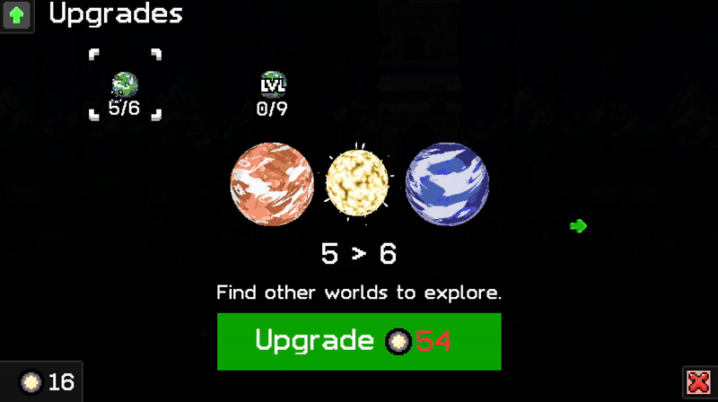
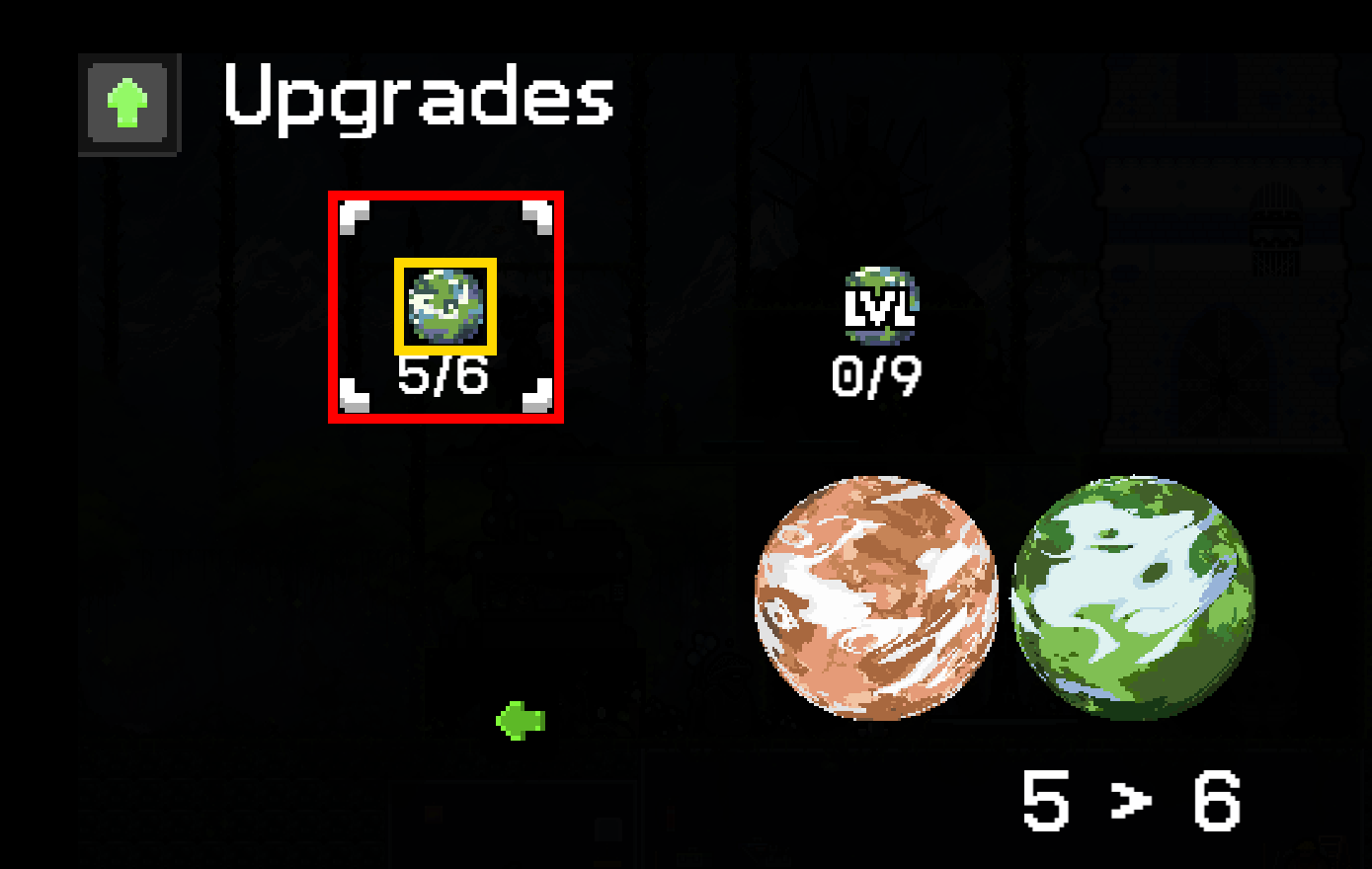
- hit test in upgrades screens are smaller than selection boxes, e.g. you need to click the planet icon to select it, not the area that is then selected
- similar issue, hit test of the lever in puzzle with torches, only the upper part is clickable
- when building rooms, the menu that lists items to build could use a background to improve the visibility
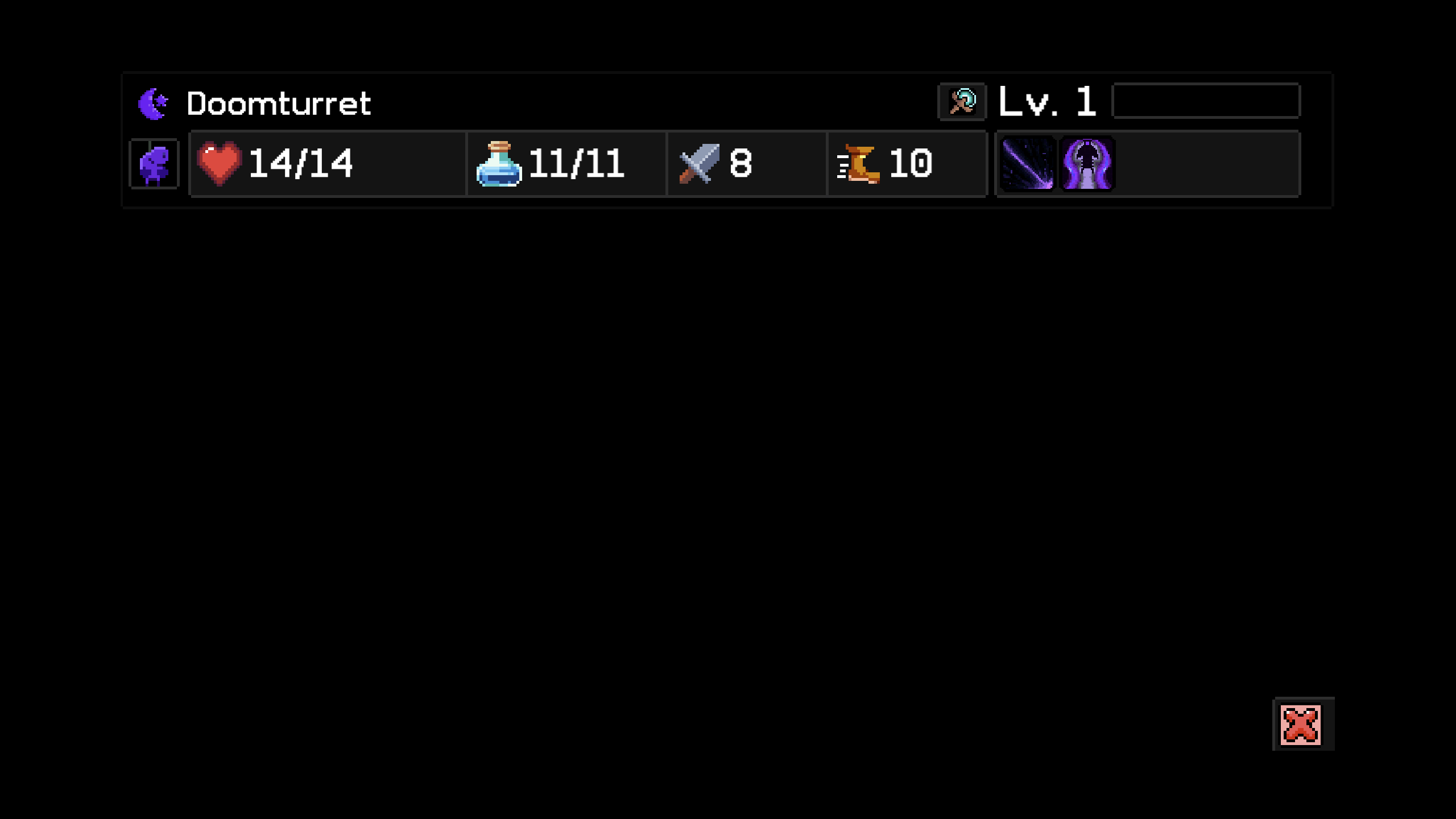
- encountered a black screen several times during combat, unfortunately, I can't reproduce it
- probably just my preference, but I would enjoy the outerworld more if I could choose where to go myself, like travel to one of the planets, walk around a static map to find & pick specific encounters
It's worth mentioning that I've only spent 6 hours playing, so I probably don't have a complete picture of the game yet. By the way, I like the defensive version that starts with three 0's:)