Play game
Rise of the Soulmancer's itch.io pageResults
| Criteria | Rank | Score* | Raw Score |
| Overall | #3 | 4.250 | 4.250 |
| MOOD | Did the game have atmosphere or make you feel something | #4 | 4.250 | 4.250 |
| AUDIO | Did the game have great music or sound design | #5 | 4.250 | 4.250 |
| VISUAL | Did the game have nice graphics or art direction | #7 | 4.500 | 4.500 |
| FUN | Was the game satisfying to play or did it bring you joy | #8 | 4.250 | 4.250 |
| IDEA | Was this game super interesting or innovative | #17 | 4.000 | 4.000 |
Ranked from 4 ratings. Score is adjusted from raw score by the median number of ratings per game in the jam.
Leave a comment
Log in with itch.io to leave a comment.



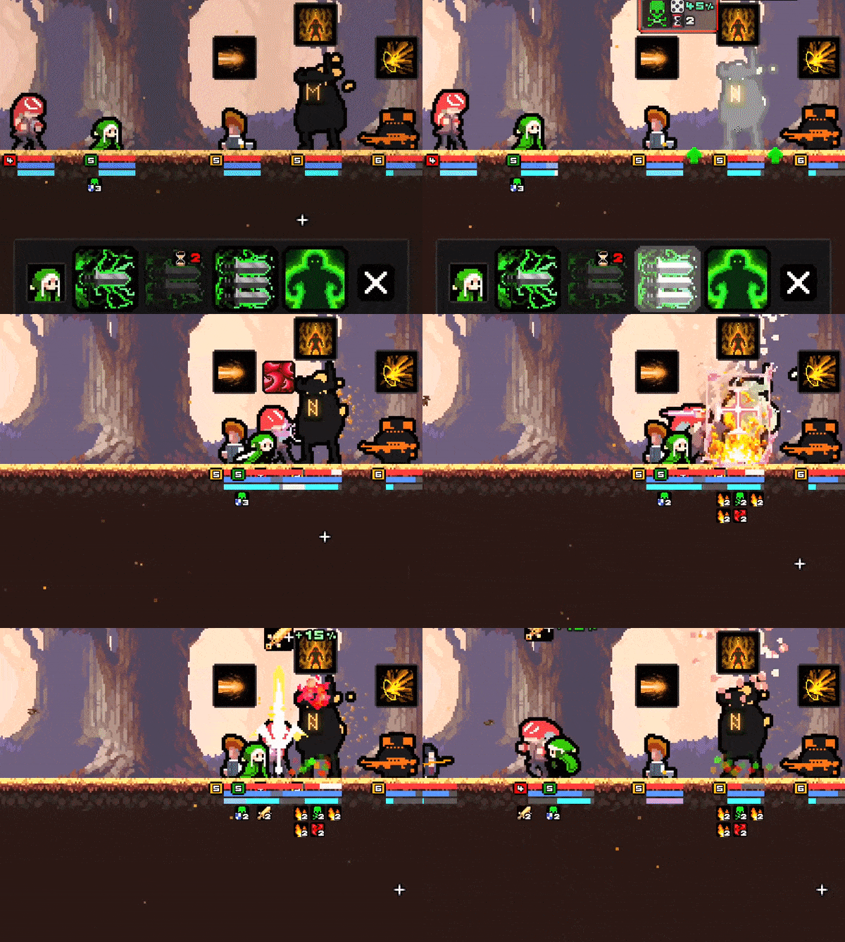
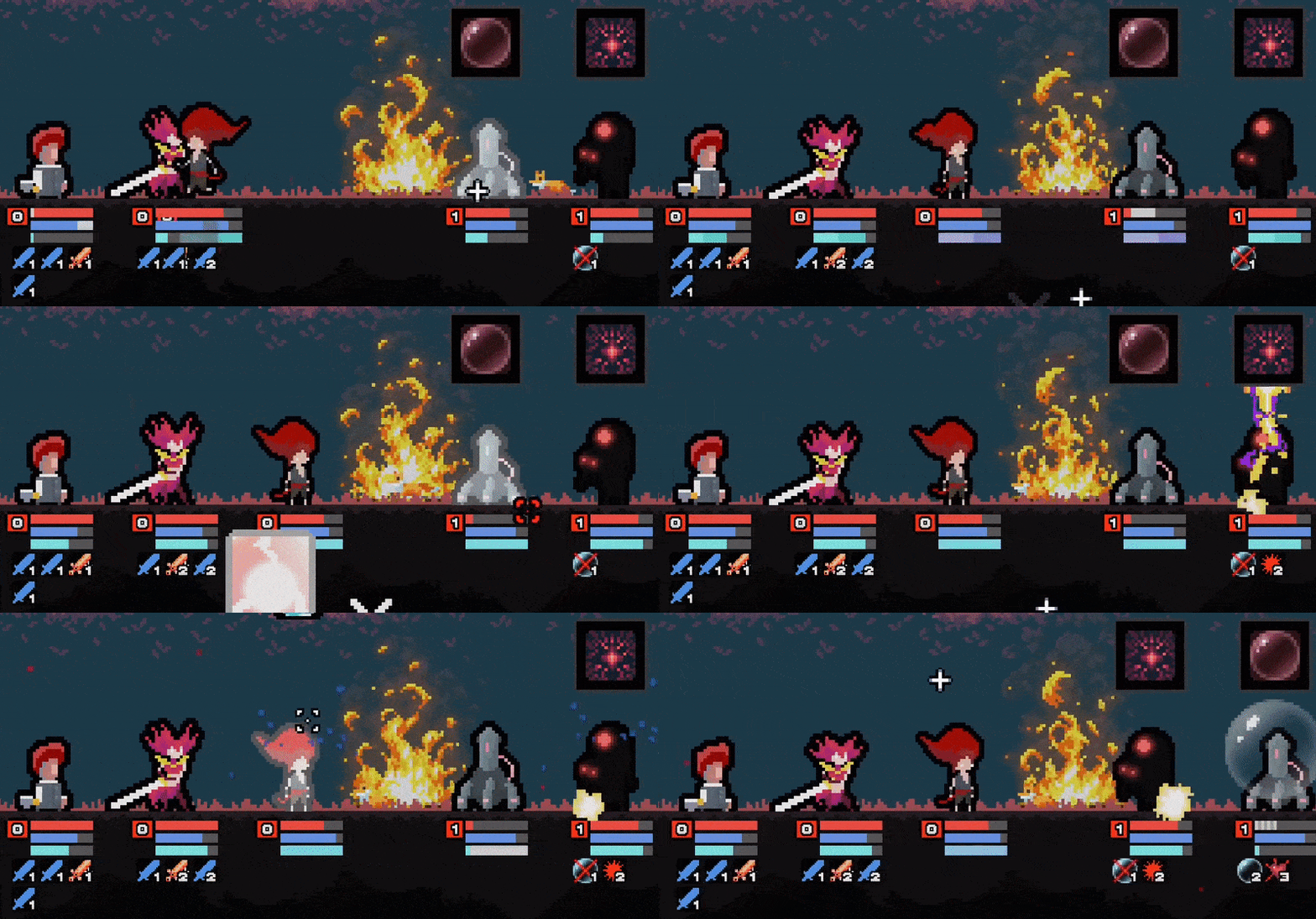



Comments
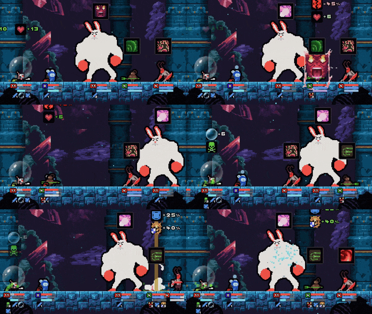
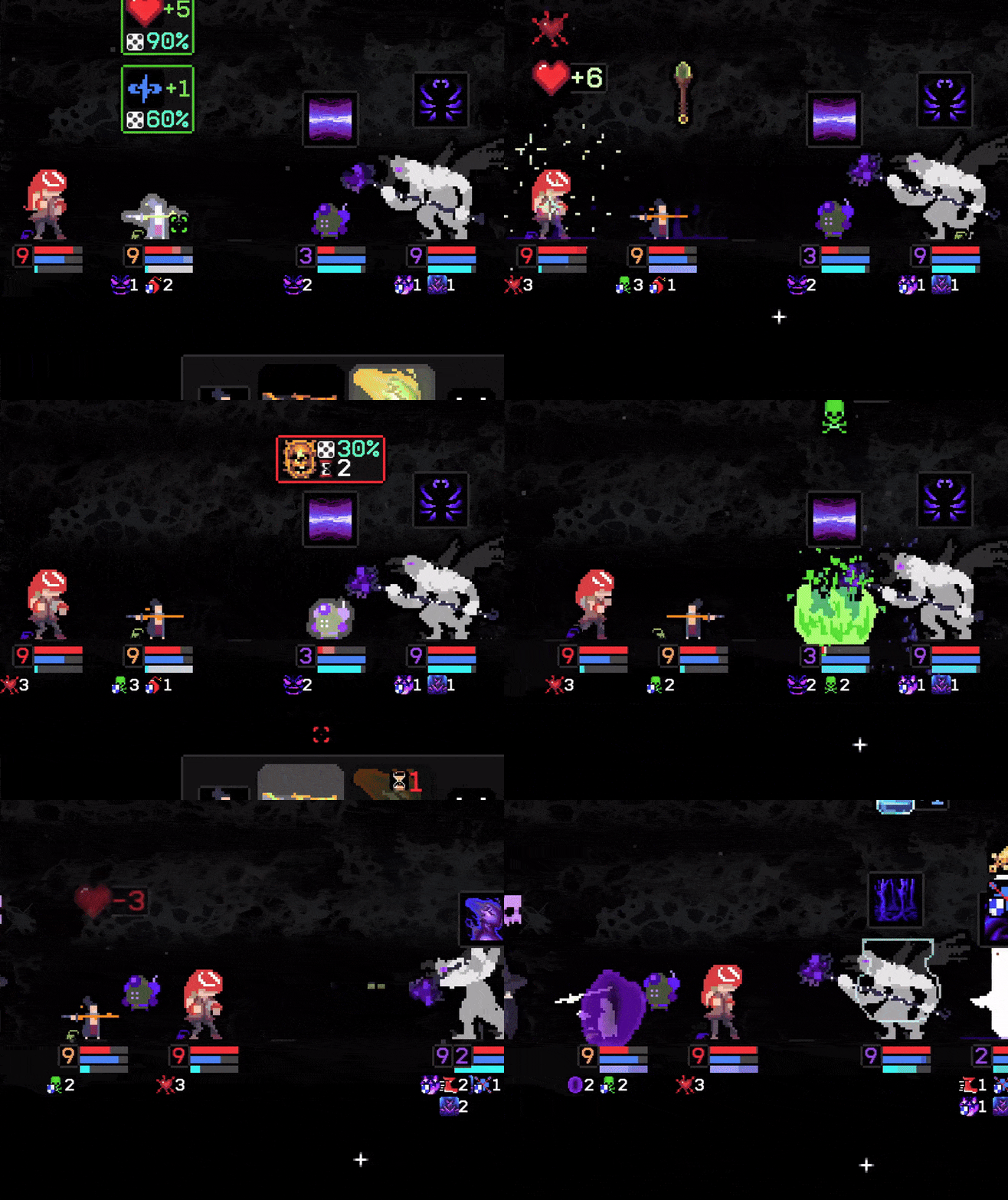
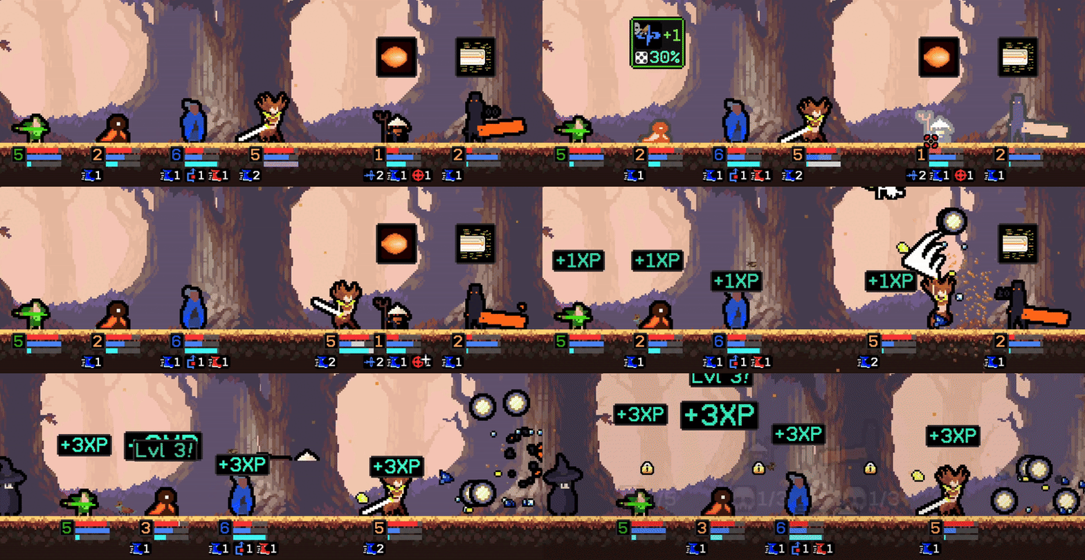
Ive never really played this genre of games so I was a little confused but it wasnt too confusing to play, Im most impressed by the pixel art tbh its very clean and consistent, and great animations
I was surprised by the completeness and depth of this game. Despite the complexity of the gameplay, I was able to understand the mechanics very quickly thanks to the detailed tutorials. There are a few minor issues and potential improvements:
It's worth mentioning that I've only spent 6 hours playing, so I probably don't have a complete picture of the game yet. By the way, I like the defensive version that starts with three 0's:)
trying to attach the black screen snapshot
Thank you for the report!
When you click an enemy in combat, there should be this exact same interface, but it shouldn't have the black background behind it.
Currently when testing this on my end, the black background doesn't show, so I'll investigate why this might be happening.
I remember it always happened without my input, usually after an enemy turn. I will try to replicate it tonight. It's minor issue, you can click the red cross button to get back.
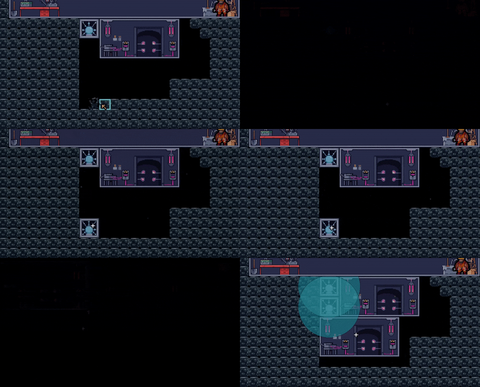
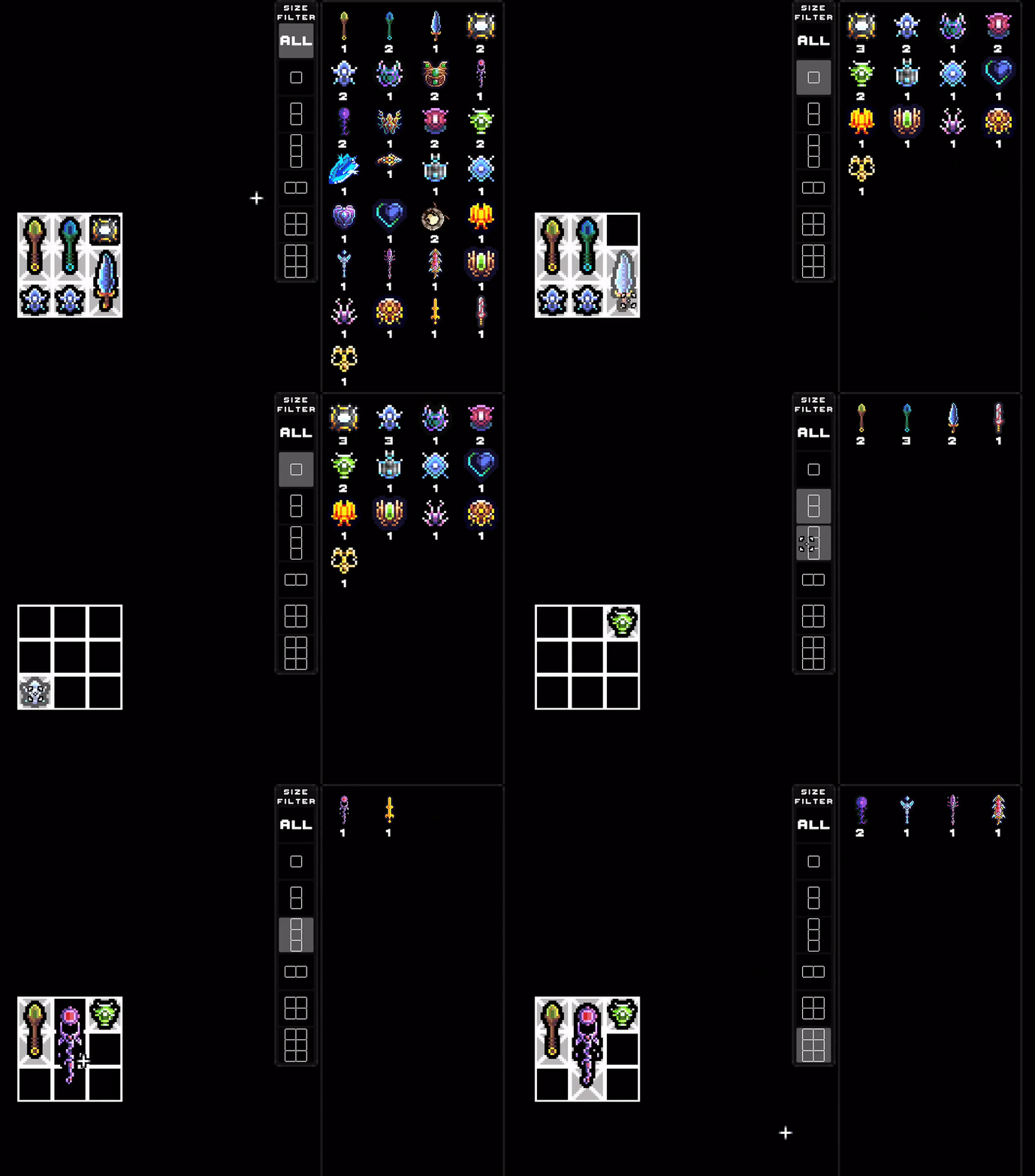
"hit test in upgrades screens are smaller than selection boxes, e.g. you need to click the planet icon to select it, not the area that is then selected"
To get a better understanding of this issue, I’ve included a gif, as I'm not quite sure what you're referring to:
It's probably just me, but it would be more convenient to be able to click anywhere in the red rectangle. I'm the king of misclicks, so anything that helps counts :)
0.85.16:
- Added higher res icons for most upgrade icons.
- Made the selection box around the icons more representative of the touch area.
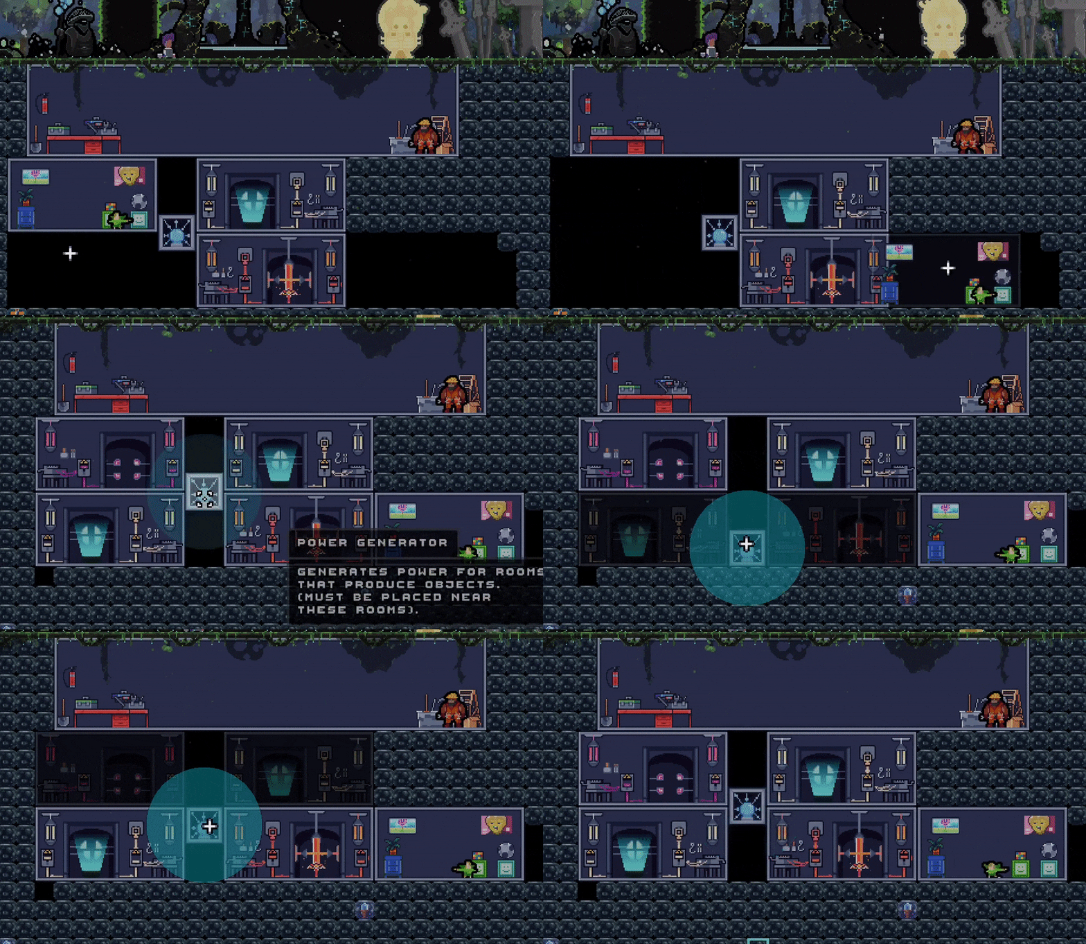
- Made the base builder interface darker too.
Thanks for the feedback!
I liked this game. It was neat. I thought it was a bit interesting in game play, I liked the line-shuffling to show whos turn it is. Beautiful game art.
I dont have much feedback on this one...
Good stuff!
Thank you so much for the feedback!
My replies to each:
I deleted one of my teammates because I thought I was supposed to for the tutorial and couldnt get him back.
This tutorial just shows you that you can clear space in your party. I'll try to make it seem less like it’s telling you to remove a member, and more that it's showing you that it's possible.
The game kept saying I could make a new character at the soul creator but it never seemed to let me do it, despite saying "character unlocked". This was a bit confusing.
The soul creator creates more souls for you after your run in the Outerworld ends. You might not have experienced this if you didn't make it through your first run.
Some moves seemed to do damage and also do stuff to the player as a buff but I could never see how much damage these moves do
Damage is indicated on the enemy's health bar when you hover over a skill.
I dont know how to heal. :( lol
Not all souls can heal, which is intended, however your party heals a bit per battle, there are also rest sites and encounters that regenerate your party.
Lots of tutorial sprinkled through the game play. I spent a lot of time going through talking.
Yes, there's a lot of different aspects to the game. In this sense, are you asking for them to be more spread out?
Game play started to feel a bit repetitive for me. It was like "appear from nowhere, kick a butt, jump through a portal". I expected a bit more story or story-facing direction when it comes to gameplay.
Do you have a sense of how far you progressed? There are sub-stories / dialogue sequences interspersed throughout the game as you progress and unlock more allies. Based on what you mentioned about not knowing how to get more souls, you may have not completed your first run, so I can see how this could be your perception. The game is quite long from a progression standpoint, I think it's hard to get a sense of all it has to offer in a game jam setting. In general you'll encounter a dialogue sequence / sub-story every 5 to 10 world levels, but perhaps you'd like one every 3 or so world levels?
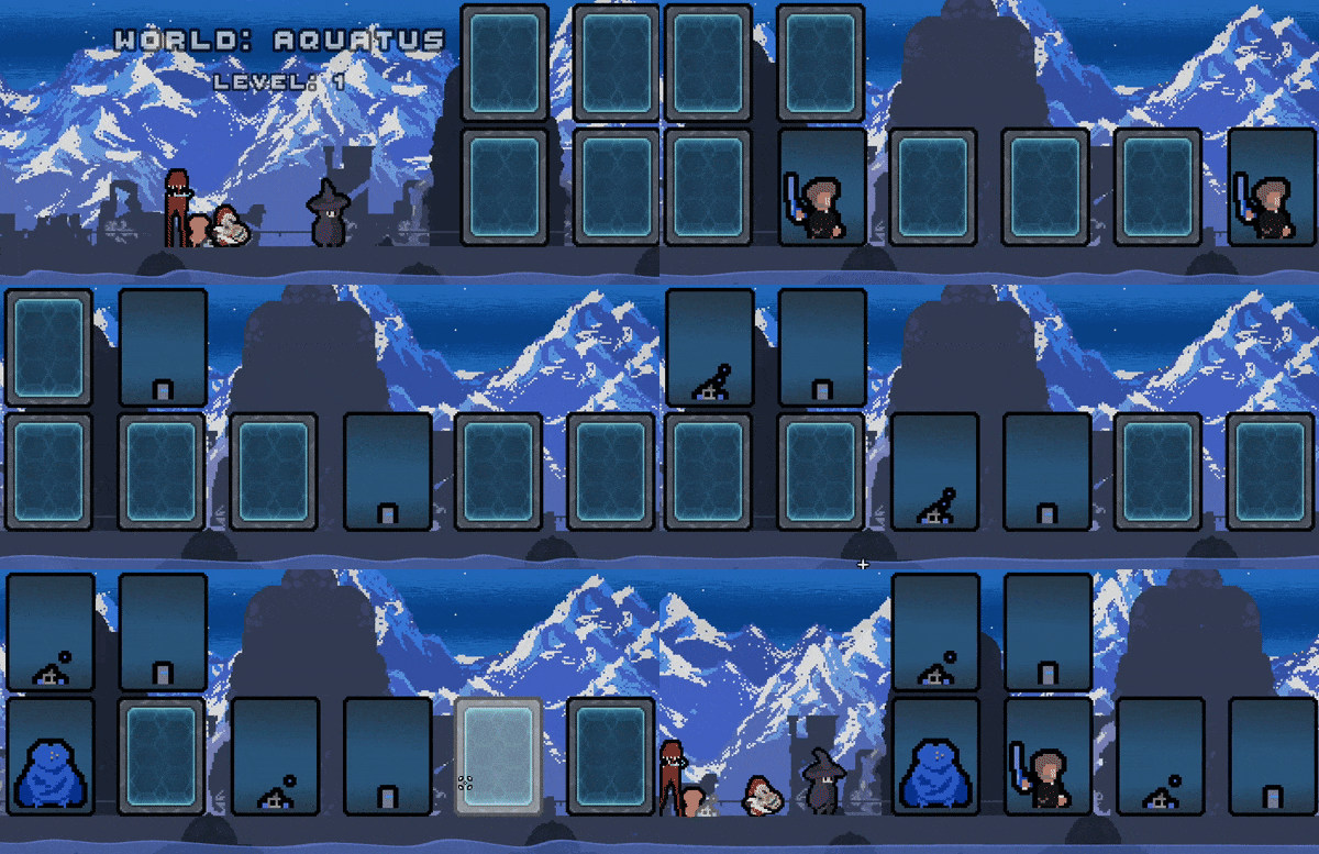
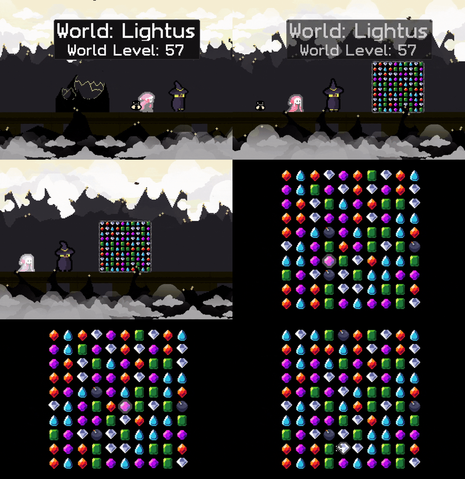
The mini-game puzzle was nice but I didnt know I was playing a matching game until after it was done flipping the matches down. This might be my fault, I just dont know what I expected there but after it happens once, the user should know what to do so even if this happens to someone else, theyll be ready the second time. :)
I think this is the tricky part, as you say above, you seem to feel there's already a bit (too much?) tutorial, so I was trying to implement puzzles that didn't need a tutorial, but I'll consider adding a brief tutorial for the card matching.
Thank you for the feedback!
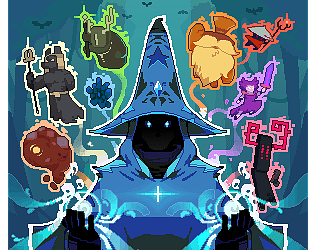
Been following this game for some time now, quite cool, I would say just you don't need the AI generated cover image, the pixel art in the game sells itself way better.
Thank you for the feedback Ludo!
Feedback applied, thanks again!
Progress since Finally Finish Something 2023: