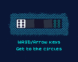
Thanks and fair enough. I agree that 3D graphics would make it easier to keep track of - I tried to substitute this with the grey dot indicators but maybe they're not as clear as they should be.
Ari Maddison
Creator of
Recent community posts
Wow, I really appreciate the in-depth feedback. It was reassuring to see you quickly work out what was going on in level 2 - that means my text prompts worked. I agree that the indicator should be clearer when you've got it right and you can move onto the winning space.
I can't blame you for getting stuck on level 4: one of the flaws of the concept is that it's hard to guide the player to the solution without showing it to them (like you said about the preceding levels). You either stumble into the right answer or you don't.
Anyway thanks for playing :)
Thank you so much for the detailed feedback :)
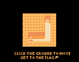
Visual clarity is something that has been mentioned a lot when people are critiquing my game and I completely agree. I was trying to mostly stick to the same four colours because I think it looks nice, but you're right that it's hard to balance that with readability. Maybe since enemies are red, and buttons are blue, I could have used more different colours to highlight the player and flag?
I also agree that it's hard to tell the enemies apart. I really struggled to work out what the enemies should even be, so I picked boring shadowy things, but given more time I would have been more creative, which would have also made them more visually distinct from one another.
I would also have liked to use vision cones to more clearly indicate where enemies are facing now, and where they will face next.
Your game is so creative! You presented the mechanic of managing two things at once in a very interesting way. The two screens reminded me of the Nintendo DS. The graphics are also very minimalist and cool.


