Thank you!
Sid Meier's Pirates was a big inspiration for this game!
As for how we managed to get this done so fast, three words - Global Signal Bus. Who doesn't love some spaghetti every now and then?
Good ship physics - I like that the wheel slowly returns to center (if it doesn't, you're about to capsize!)
Not sure how you keep fish from weighing down the boat (didn't even realize they sank it at first, but that's on me for not reading).
Really like the visuals in this one, although the ragtime music is a bit at odds with it.
Would make for an excellent peaceful sailing game with a bit of polish!
Quite fun!
There's a solid level of polish to this - the fact that you can smack the cat with the fork is pretty funny. Also didn't expect a full-blown shop to be in here.
One thing I'd recommend adding is a failure condition - maybe you can only get a few fish wrong, or maybe you have to get the next fish within a certain amount of time (kinda like overcooked).
Fun concept - plays out a bit like an RTS. I'd recommend adding a reloading indicator to each ship, so you can plan your shots accordingly.
Also, it would make sense for islands to block cannonballs.
As an additional incentive to keep your fleet small, your ships could be susceptible to their own side's cannonballs as well.
Loved the monochrome art style and music!
Thank you!
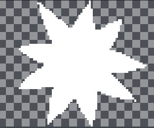
The footsteps are a small sprite that matches the shape of the player's foot.
From this, I created a footstep scene that fades opacity of the sprite over 30 seconds and deletes it afterward.
A reference to this scene is stored in the player script.
When the player walks, there's a script that plays a footstep sound on regular intervals (this was timed with the player's feet being fully extended in the sprite sheet (3rd and last frame in the sprite sheet (Although I think we switched the order around in game to make walking feel more natural)).
Since the walk sound already plays at the correct time, I can just instantiate a footstep in the same part of the script. I use an integer to keep track of which foot is stepping (1 for right, -1 for left), and flip the sprite along local y accordingly - there's also a positional offset, so it looks like it's coming the back foot of the current frame.
Hope this helps!
Edit:
The spritesheet above has 7 frames. The one we implemented in Godot actually has 8 frames, so one step always takes 4 frames.
Wow this is super fun. I like that you slowly understand what you're supposed to do organically without being told. The premise feels a bit like Space Team.
Mechanically, it feels a bit like the manual starting process of a synchronous where you have to match the phase and rpm with the grid. This game is very satisfying when you get that last node to light up.
However, I would recommend removing the node that lights up for charge level (or replacing it with something else). Clicking the charge button until the top bar is full isn't the most engaging mechanic.
Also, this would really benefit from some sci-fi beep boop sounds.
Excellent entry - had a lot of fun!
Absolutely!
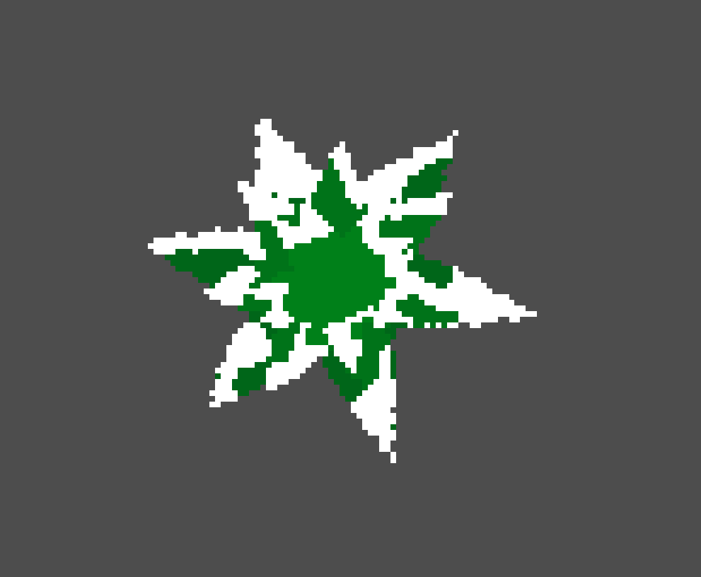
So I created a series sprites for the different leaf layers of a pine tree.
In Godot, on startup, I decide if a tree will have 3 or 4 leaf layers, scale them from 1 down to 0.5, and color them green.
(The white snow is from a another sprite that I place over top - if I did this again, leaves would have been all one sprite with the snow factored in, but I had originally planned to do some cool stuff with sprite masking - didn't have time to implement this)
From here, I pick a direction to sway the tree in, and select a point for each leaf layer to sway to (the amount the layer sways is based on the size of the leaf layer - the smaller the layer, the further it sways since it corresponds to the top of the tree).
Then I interpolate between the starting and target positions for each leaf layer (cosine function helps the swaying feel more natural than just linear motion between positions).
The period of sway is randomized a little as well.
The 3D effect of this was unintentional, but we loved how it looked when we tested it out, and it saved us from hours of drawing tree sprites by hand (we're not artists lol).
Hope this helps! The explanation is a bit of a mess mostly because the implementation is too!
Controls where a bit floaty, but that may have been an issue on my end. Fun christmasy theme, but the wilhelm scream on every death was a bit much.
I couldn't tell what grabbing did. I figured it was to refill your fuel meter, but it didn't seem to do anything.
Nice audio feedback on the candy cane thwack
Thank you for the review!
For the airplane animation:
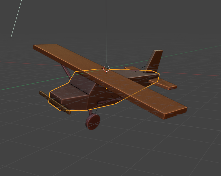
I made a simple plane in blender
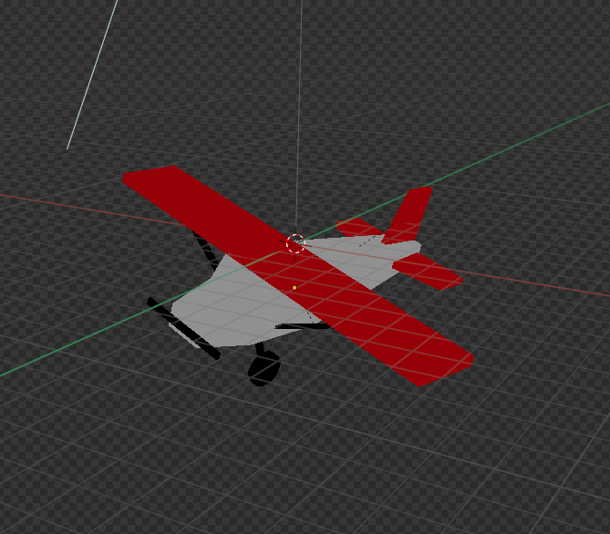
Added some color with emission materials (so no shadows)
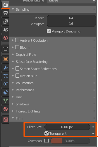
Set the background to transparent and the filter size to 0px (this removes anti-aliasing)
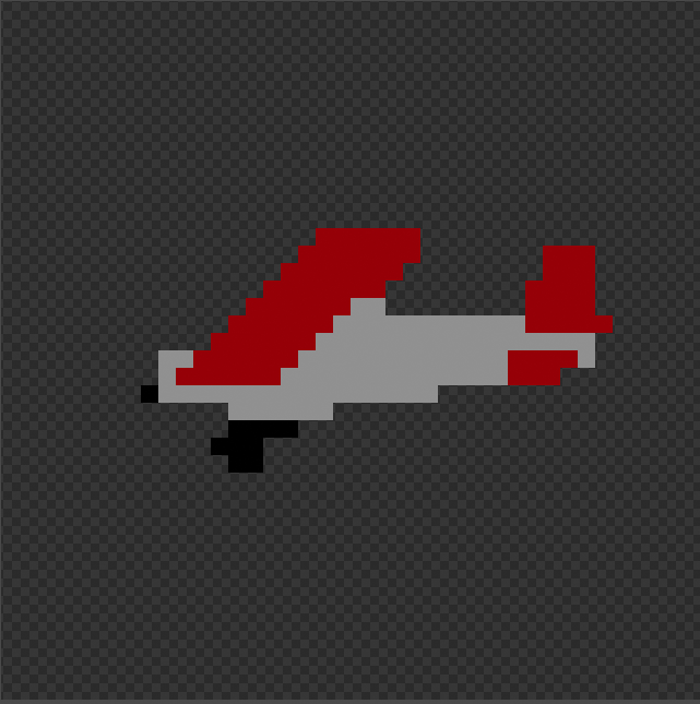
Then I dropped the render resolution wayyyyy down and rendered a few still images of the plane at different roll angles.
This is the raw render output.
In Godot, I animate the texture property of sprite to switch between the different rendered images.
Hope this helps!
Loved the art style.
Audio for footsteps and flamethrower was good.
Controls for moving felt off. I would have preferred it if it only took one key to move in the game's primary axis instead of two key presses simultaneously.
The jump felt weirdly linear as well. Made it difficult to time.
The character doesn't stick to moving platforms, so you fall off unless you move with them. This also feels odd. Would definitely like it more if the character's velocity was relative to whatever it was standing on.
I like the lighting effects, and the opening cutscene adds some good context.
Also, excellent options menu - pretty comprehensive and a nice bit of polish that often gets missed!
Difficulty curve is a bit too steep for me. Died pretty much immediately on all three attempts (probably a skill issue).
I think the point lights should be a bit more orange. They feel more like lightbulb light and less like firelight.
Has potential. I think I placed the turret to early the first time around because the helper text by the drill immediately switched to info about turrets and then wouldn't progress further until I had enough crystals to upgrade (which I didn't)
Particle effects and lighting are nice. Animations play a bit too slowly for my taste, and the shooting could be a bit punchier.
Gives off TF2 engineer vibes.
Nice job!
Very fun concept - Can be a bit easy since you can choose to leave certain slots blank.
+1 for a very solid UI in 48 hours!
Having the enemies telegraph their moves was a great decision! Very slay-the-spire-esque, and it only gets better when you have multiple enemies.
One point of criticism is that there are some situations where the dice you're given can't be put together to attack. I'm guessing the levels are randomly generated, so making the math add up, so there's always something you can do is difficult, but it can feel a little unfair when the enemy is defending, and your dice can't make an attack.
Solid dice rolling game. Best I've seen this jam. The 2D aspect works really well here. A bit of audible feedback as you move around would be nice.
The greatest strength here is the art. It looks really good - the rolling animation fits very well. However, it can be a bit busy when you're rolling the die around (I think partially because of the monochrome palette) - this issue is emphasized since the player is required to match the orientation of the top number with the target as well (the little dot to indicate on the '4' side was very difficult to keep track of).
Had a lot of fun - I would love to see a longer version of this!
Hey thanks for the detailed comment!
The red cube is meant to block you. When you have a 3x3 grid with no moveable space in the middle, it's not clear that you can't move to it, so we added a block to indicate that you can't move there. It should have been in the tutorial (which was a bit of an afterthought), but ideally, I'd like to remove it altogether - I don't think it fits very well thematically.
Took a few minutes to fully understand what to do. Once I did, it was a lot of fun. Having the different hazards start only after you passed a certain height is an excellent way to ramp difficulty without rushing the player.
Music, SFX, and visuals were all solid, I especially liked the style of the initial tutorial screens
It has a very addicting quality to it - I can see this making a fun mobile game (if you want to go that route with it).
A few pieces of constructive criticism:
I appreciate the feedback!
I had initially planned to give each friend some unique trait or tool that would be helpful in navigating the maze (or may even in combat) and letting you choose who you were leaving behind to give the game some strategy. That idea had to be cut for time reasons, but I just enough time to add the flashlight drop mechanic in at the end.
Pros:
Music/Sound - The music in here is really nice. I played for about 4 minutes, and it had enough depth to not get repetitive. Sound effects are good as well.
Art style - visually, it's a nice game to look at. The lit pumpkins for lives are a nice bit of added flair - they sell the art style a lot better than a typical life counter with a number.
Concept - Clear and simple with lots of room for expansion and the possibility for some pretty elaborate puzzles.
Cons:
Character Control - Controls feel like the character has way more mass than he should. Would feel a lot better to play if he accelerated and decelerated faster.
(If using physics-based movement, you can achieve this by increasing the force in the direction of desired motion when the character is moving in the direction opposite of desired motion)
Jump Spacing - It's very difficult to guage where to drop your body (and difficult to land on it when you respawn) since you can't see the entire obstacle. It would be good to zoom the camera out here to show the whole jump when possible.
Cool things you can add:
Respawn Point - Add the ability for the player to choose where to respawn, so they don't have to traverse the entire level to get back to the obstacle again. This may need to be disabled in some areas depending on if there's combat/bosses or difficult challenges where the difficulty lies in traversing them all at once.
Congrats on completing your game and best of luck!
Pros:
Art style is very fun. Seeing a bit of BTP influence which is always nice. The particle effects are great (The weapon pickup flair effect is awesome!). Sound effects are good for the most part. My favorites are the weapon SFX - each one has a unique sound that really sells which weapon you're using.
Appropriately challenging. Difficulty is hard to get right, but you did a great job here balancing the spawn rate of enemies with the power of the weapons.
Tower defense + top-down shooter is a nice combination with lots of synergy.
Cons:
Took a while to figure out what the enemy spawn sound effect was - I thought it was part of the soundtrack. Not sure how you could clarify what the sound is - maybe show an enemy spawn and play that sound effect to show players what it means.
Missile launcher weapon isn't very useful since the towers already use it.
Powerup orbs didn't spawn until after I died the first time. Maybe a status bool not getting set at the start of the game? Probably an easy fix.
You can use each weapon forever without penalty. An ammo counter or timer would go a long way here (probably should give the default weapon infinite ammo). Adding ammo would also solve the missile launcher usefulness issue since you don't get powerful weapons for very long
Not clear at first that you control the turrets (I was holding down the fire button, so the towers were firing as soon as they reloaded). The easiest fix to this is to add a simple laser line from the tower to the mouse cursor. This will make it immediately apparent that the player controls the tower.
When releasing the walking keys, the character seems to move until the animation finishes. It doesn't feel great for a top-down shooter - would probably be best to immediately stop movement and blend the walking animation into the idle animation.
Fun Ideas:
Different towers - maybe some shoot on their own. Towers could have different weapons and could be damaged and repaired/upgraded.
More weapons - maybe some that are stronger against certain enemies and weak against others.
More enemies, mobile spawnpoints, bosses, etc.
Great entry! I look forward to seeing it expanded upon!
The short look at enemy positions is a really good idea. You can already kinda do that by clicking the door and then the restart button, so the lack of information is an artificial restriction already. Another approach would be to always show the entire level layout but limit the total number of actions you can take (or set limits on the individual actions), leaning in to the puzzle aspect a bit more.
The icon hover/tooltip idea is good as well. I'll put that and the tutorial level on the feature list.
Thank you for the feedback!
Pros:
Well-polished (especially given the time constraints). Art looks good, music and sfx are welcome additions.
Ingenious system of collecting new weapons. Running back to an enemy's grave to pick up a new gun is dangerous because they are usually surrounded by other enemies. The risk/reward component makes getting a good weapon very rewarding.
The weapon card animations are very nice. And the tradeoff between spam-firing the pistol, so you can use the new weapon versus making every shot count adds diverging playstyles.
Cons:
The knockback on the pistol is a bit strong. I could see this kind of knockback on a much more powerful weapon, but it can get old quickly on the default weapon.
The weapons are fun to use, but I didn't get as much time to use them as I would have liked. A bit more ammo with each would have been nice (particularly the SMG - felt like I only got 1 or 2 seconds of continuous fire out of it, which is a shame, because it is IMMENSELY satisfying to unload it into a horde of enemies).
Hard to tell when I was hit. Could use some audio feedback, some sprite flash, and screen shake when hit. Would greatly improve game feel.
UI for gun cards is a bit small. I'm getting nitpicky
Cool Ideas:
Most arcade shooter ideas would work well here, such as powerups and bosses. New enemy types would go a long way as well. Maybe certain enemies could take away guns from the field or even revive fallen enemies. Others could sacrifice themselves and try to block bullets from special weapons.
Clear indicators for which weapon you get from each grave. This may have been in there already, but I couldn't tell amidst the chaos.
All said, excellent submission. I had fun playing it for the short time I had. That's what counts!
Pros:
Fun art style. A lot done with very little. Post processing + soft lighting and pastel colors go together nicely.
Intuitive controls
Simple but engaging concept. Lots of space for really cool levels
Cons:
Timer on levels hinders fun more than it adds challenge (for me at least).
Physics interactions are a bit wonky. When running into a platform and jumping at the same time, the jump is cut short.
No restart or undo button when placing platforms.
Suggestions:
Add some more juice (squash and stretch on the cube when jumping, maybe a bit of screen shake).
Have different types of platforms you can place (and that are already placed in the level) - Slippery platforms, spikey platforms, bouncy platforms.
I had some difficulty figuring out the controls. Just pressing 'N' and 'M' seems to shoot the ball down into you. Holding down 'v' while pressing 'N' and 'M' gave me much better results.
I like how punchy (lol) the punches feel. There's a nice feel of power with the block shaking.
It seems like the ball can just fall through your middle and there's very little you can do about it (This is also the case in action pinball, but the gap is much smaller).
My two main suggestions would be to close off the launch chute after launch (ball falls back in a lot) and add some interesting hazards that manipulate the ball in various ways (similar to traditional pinball games).
One fun idea to add would be to have the ball damage you (leaning in to the fighting aspect) upon collision - you lose when you run out of health. Add blocks to defend and have attacks affect the ball differently (straight punch could just launch the ball, hooks could add a spin so it would curve, etc.).
Pros:
Cons:
Suggestions:
Just needs a bit of polish across art, sound, and physics to be a very fun platformer with lots of verticality.