This means so much to us, thank you!
BalbiGames
Creator of
Recent community posts
Thanks for all of the kind words, we appreciate it! Our artists are Danesykins and FlyingMobula.
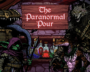
The shadow theme ties in two ways. The first and more literal interpretation is in the dark fantasy OSR art style with heavy shadows and thick ink lines. The less literal way is the mimic, a shadowy "hidden in plain sight" kind of creature; deceiving the player and always lurking.
Nice job making your first game. The recipe book was very helpful, thanks for including that. I think the pickup range could be expanded a little. I found myself standing on something and not finding anything, only to shift like 1 pixel and digging up the item. Do you plan to continue developing the game?
Hahaha, congratulations! The pouring slider is, unfortunately, a victim of time so the programmer who implemented it (me) also made the slider lol. We had some disagreement about whether the colors should be on by default or turned on in settings. My opinion was they made things super easy. So if we end up implementing difficulty options, we'll make sure that's part of it. The tutorial in the background was out of necessity. Unfortunately, at 5:30am (30 minutes before deadline) I quickly replaced the font we were using everywhere and ended up turning a 0 to a 1 on some of our UI components and releasing, not realizing I broke the tutorial until it was much too late (RIP). In the description is a link to a build with the tutorial fixed, didn't want to leave anyone hanging if they really needed it. Thanks for playing!
Thanks!! If we continue developing, we'll probably add a recipe book as a way to slow you down from time to time by asking for a specific drink. We'll also add more characters, more drink variants (still only have 10, but changing them out for other bottles with other effects). I'd probably redo the entire scoring system to be a lot better. So many things we could expand on and improve :)
I had fun playing this game. While it seems simple on the surface, the tech behind it was no easy feat. As a fellow web developer I absolutely appreciate the amount of work that goes into making a game exclusively using web technologies. After achieving an insane amount of health, an insanely large 1/4 screen sized fireball, and what can only be described as a firehose fireball cast rate, I decided to call it. With the player's power scaling quickly, either more monsters, tougher monsters, bosses, or a timer would suffice. As-is, there is no way to end the game other than to quit, but I had fun playing. Nice job!
I did figure it out on my own, but I made a LOT of mistakes along the way. In my "final" run before posting my review, all I had left was to return the crystal and I accidentally hit the button at the wrong times and totally ruined the run. After we talked on discord, as you know, I ended up finishing it just because I was curious what happens at the end. Great game, satisfying to complete for sure.
I was not expecting that challenging of a puzzle for my first review of the night. After about 1 hour I finally solved it and felt incredibly accomplished. Great Job!
Art & Sound
The art in this game matches the vibe perfectly. The simple color palette is very appealing. The sound effects and music mesh very well with the overall aesthetic. I loved the use of the frog as the main character for a jumping puzzle game.
Gameplay
The movement was very simple and familiar, but without reading the description it was very difficult to understand what was going on. After the first 30 minutes of struggling, I finally figured out how to really use the two tab mechanic. The guides in the game try to help convey the mechanic, but they didn't make a lot of sense until I accidentally got it to work the way I wanted to. After figuring out the mechanic, the guides made a LOT more sense.
Design & Difficulty
The design of the puzzle is both incredibly simple in concept, but still very difficult. I can definitely see this being among people's favorites if the genre is something they like. The items were very intuitive, although I frustratingly misused the block on the first try because I accidentally hit down. The two-tab mechanic, while confusing at first, is a breath of fresh air with how unique it is. I have never played another game like this and thoroughly enjoyed figuring out how everything worked.
Conclusion
An excellent game, well thought out design, incredibly unique mechanic. I look forward to seeing more from this creator.
Thanks!! We wrestled with the idea of showing the drink order on the mixing screen. Personally, I felt like it made the game a little too easy. It felt a little more fun/chaotic to have to remember the order and the type of customer. In the future, we'd like to add some difficulty options and this would definitely be part of it.


