Sound feedback is definitely something i want to add later on. I was actually planning to have Gura emit some red particles once she can't switch anymore. Thanks for your feedback!!!
blastoisenn
Creator of
Recent community posts
Thanks for the feedback!! I added the limit in order to add a bit more challenge + base one or two levels on this mechanic, making it so that you have to properly plan your pathing. I never thought about it being a way to look at the other side while designing the mechanic, but it's a very interesting idea that didn't occur to me xD. I'll definitely think about a way to check the other side of the board, thank you for your comment!!
Switching between the two different weapons is quite fun and feels smooth to use. For the feedback, some parts of the background were done with huuuge pixels and it looked way too out of place. Another thing that was a bit frustrating was that there is almost no invincibility frames after getting hit (if there were any). That meant that during the boss fight if kurokami teleported to your position you would received a ton of damage. Other than that, its a pretty solid game.







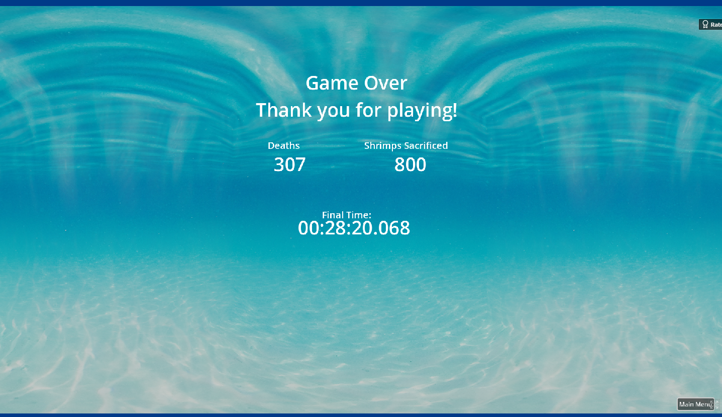 I managed to beat the game!!! You can get used to the clunkiness, but the main problem i had was the attack, because sometimes it teleported me to different parts of the shrimp i attacked. I love this type of games tho, so i had a lot of fun regardless.