Play game
LAPLACE'S DEMON's itch.io pageResults
| Criteria | Rank | Score* | Raw Score |
| Ambience | #1 | 4.793 | 4.793 |
| Gameplay | #3 | 4.345 | 4.345 |
| Overall | #4 | 3.938 | 3.938 |
| Innovation | #8 | 4.069 | 4.069 |
| Theme | #18 | 3.586 | 3.586 |
| References | #49 | 2.897 | 2.897 |
Ranked from 29 ratings. Score is adjusted from raw score by the median number of ratings per game in the jam.
Leave a comment
Log in with itch.io to leave a comment.


Comments
In the best way possible: This feels just like a fan-made Earthbound boss fight. (Or Undertale boss fight, depending on how old you are.) You've gone and demonstrated that less is more by doing one scene very well. The effect for getting the attack timing just right is very nice, and there is a bit of strategizing to do even with only two options for the player on each turn.
There should probably be an epilepsy warning on this, but otherwise I think it's very good.
Nice work!
This is some trippy presentation, in a good way! Reminded me of Earthbound! A nice short presentation of visual and the gameplay could be if its in a full game! Really wish to see Special Attack and how it would work though if you planned to make it a full game!
The music and presentation is really good!
The timing on those attacks is very tight but rewarding when hitting the perfect horizontal angle.
Improvement suggestions:
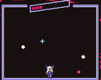
- Sometimes in the dodge minigame, the floating pickups move completely horizontally and spawn too high to be touched by the player, which is unfair.
- Sometimes a ball spawns very close to the player which give little time to dodge.
- Improve player feedback in the fight sequence. Just adding a small text reading "Hit!" or "CRITICAL HIT!" when landing an attack would help a lot.
- Add an in-game tutorial to explain a bit better the fight mechanics.
- Some backstory or narrative to let the player know where we are and how we got into this fight would be awesome too!
Good job!
This reminded me a lot of Undertale's combat, but considering this is inspired by Earthbound, that makes sense. This was fun. It was difficult, but it didn't feel unfair.
Great work! I love the idea!
Presentation is really engaging, big ups for the ost and art
Getting a crit during the fight section is very fun
The movement during the dodge section is pretty sluggish, and some hits feel unavoidable. Also feels bad when the extra turn pickup is never close enough to grab
Really great demo, this could definitely expand out to something awesome
Thank you for playing and for your insight!
The difficulty was just right for me since heals are generous past an amount of hp. I can see this being a possible Laplus backstory narrative if it ever were a full blown game!
I'm happy you enjoyed it!
OST in INSANE!!!! I really like the gameplay feel of the game. Attacking the boss feels incredibly satisfying. My only complaint would be the bossbar being hard to notice at first (I was streaming the game to my team on discord and until they pointed it out to me I haven't even noticed it's there). Overall a banger submission and I would love to see it made into full game with more encounters
Thanks for trying it out!
I made several changes to the boss health during the grace period but it seems I still didn't made it clear enough :(
I like this game. Sadly too short (1 boss?). Potentially it can be full blown game.
Thank you for playing!
The UI was insanely good and the music matched with the overall mod so well. I wasn't sure what an "extra turn" did at first so a bit more clarification on how the game works would be nice. Either way it was very enjoyable. Great job.
Ty for your time and feedback, it means a lot!
Liked the theme and bgm (most important), great job!
Thank you! I'm happy you enjoyed it
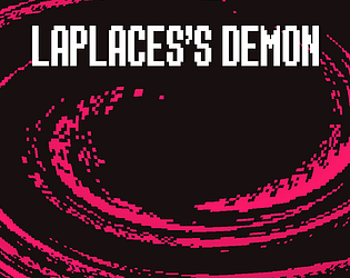
Really love the atmosphere of this! It's definitely got that Earthbound feel with the background and effects, but also mixed with some Undertale-like combat. As others said, the visuals are impressive, especially the UI!
A few things I wanted to point out:
Overall, great job with the game!
I appreciate your feedback and I'm glad you liked it, thank you!
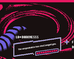
Love the ambience, extremely clean on the visual department. It did take me a bit to realize that the enemy's healthbar was at the top and that my life bar was the one next to the text. Weird but interesting game loop, having to dodge in order to gain health and time
tysm for your time and feedback!
This game is so cool. Its short and sweet. I love the art style, the UI and basically everything about it visually lol. I'm gonna agree with Alphros and say that the speed up bullets were very annoying and I wish they had less of a speed multiplier or didn't exist at all. Something on the UI for if this was an extra turn or not would've also been very cool but its good as is.
ngl I still don't understand what the lines turning blue mean but I don't think I needed to lmao.
Appreciate your feedback, thank you so much!
The blue lines does extra damage because they're harder to hit the center, that's about it.
Idk why I kept the singe ball attack because I also find it really stupid lol.
Very cool looking game, love the aesthetics and style! Interesting battle mechanic.
Would prefer if there are less of the "sped up" bullets that you can't do anything about in the dodging segments, otherwise I had great fun on this, thanks!
Thank you for playing and for your feedback!