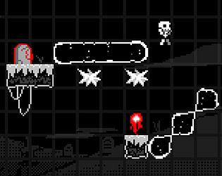
It is a crime that the perspective doesn't showcase the truly PEAK character design y'all cooked up for the main character. Easy 10/10 just for that.
connorak
Creator of
Recent community posts
Now this is right up my alley. Love the replicating mechanic you've got going here. It's super simple, yet affords a bunch of interesting design opportunities!
For feedback, I'd say tighten up that difficulty curve. While the first level is cool, I'd say an easier layout that requires only 1 or 2 replications would be a better fit for teaching new players the game! You can ramp up the challenge from there, since the levels you got rn are all real good.
You really nailed the optional theme here, like wow. The theme of connection really comes thru in the gameplay, and that's the mark of a good theme interpretation imo. Grats!
So far as feedback goes, I think a second pass at the artstyle is the only serious feedback I can give rn, since as much as I LOVE the Among Us cubes, a clean look would really make this game.
I dig the educational angle; mad respect for games that try and make learning fun. You guys definitely succeeded btw, this was unbelievably charming. AND it's a great way to visualize molecular structures, crazy.
Only feedback would be that this game seems more suited for 2D versus 3D, since aiming is a bit tricky in this isometric perspective. But since that'd require basically scrapping everything, it's more of a pipe dream on my part lol
Control 2 characters at once? With an interesting core mechanic? Sign me tf up. Really enjoyed my time with this one, reminds of a classic Nitrome game. Check the site out if you haven't, it's a great inspo: https://www.nitrome.com/
For feedback, definitely what my man Carsen wrote, since there were a couple of instances where a bat would spawn on top of a laser-disabling block.
I'm a real sucker for games that have you control 2 characters at once, so I already love this. Difficulty progression was clean, especially parts where you have to maneuver mid-air while gravity is being changed—real nice.
I think my only gripe was with some of the hazard designs? Ok maybe it's just me, but it was weird that Ranger could pass through electrical wires, since it is a robot lol
Oh man, that's so great to hear! Thank you! But yep, the scoreboard is bugged lmao. It still displays scores in order! It just... doesn't actually show the scores lol.
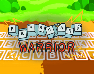
To your thorns idea: YES. Originally we were going to have a wizard variant that set keys on fire, but we had to scrap wizard variants in the end, since their AI requires a fair bit more work than the other enemies.
I feel ya. ngl, it's surprisingly hard to describe this game without visuals. I faced that challenge when pitching the concept to the rest of the team, so I 100% get the confusion on your end!
The number keys are yet another victim of scope lol, since we were gonna use them for the shop. Items would spawn on the keys in-between waves (waves used to be much more distinct) and you could buy them using gold coins.
Appreciate the feedback!
WAVE 29??? WHAT
You the one who put ABC for your leaderboard initials??? Since that's the score nobody can beat rn lol
Hard agree. Carsen and Arjun are both god-tier programmers.
Yes to all of that. A bunch of those were part of the og concept: a charge attack, a shop system, a dodge roll—you get the drift.


