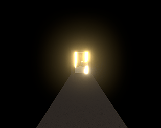
Thanks kasdf! Appreciate it. Yeah I think I've since fixed a couple of bugs I had regarding near frustum plane clipping and the portal sometimes flickering, and the lighting (not to mention texture mapping) does make the portal thresholds pretty obvious. Also the nested portals are a frame behind with aligning the camera it seems. Perhaps one day I'll go for a seamless portal with stylised shading or something. Yeah haha the cutthroat platforming has been a big let down, a center dot would be good, or even just better cues and some collision forgiveness. Thank you for playing!
DarthDeterminism
Creator of
Recent community posts
Thanks for playing and the feedback Teluri! I fully agree with your observations, most folks have said the same thing about the platforming control. I intended to splash some colour into my textures, which are currently only greyscale, calculated from neutral lighting, sadly I ran out of time though, so they are just greyscale multiplied with a flat colour. It's made worse by the extremely low resolution which is not at all an effect I wanted, I intended the game to be full resolution. The textures are actually 1024^2. The lights are also pretty contrived, and my biggest gripe with my lighting is that my interiors are barely touched by light sources, and are mostly ambient, and given that most of my texturing is done by normal maps, makes it look very dull and flat indeed. The aesthetics suffered mostly due to my running out of time, I might continue though and attend to these weak points for a more developed release. Cheers for the feedback!
Thanks so much for the feedback Apple Jacks! Really glad you enjoyed my game :) I get what you mean re. resolution vs the big shapes. I was a little perturbed because I had made 1024^2 textures and they were such a pain to make lol. If I were to develop the game further I would probably add layers of detail to break up the big shapes and spaces, add props, debris, add wear and tear. Initially I wanted quite a worn temple setting, Angkor Wat, Machu Picchu type of thing. I kind of overscoped it though and had to get somewhere, so it was pretty blocky in the end. Really appreciate the feedback and thanks for playing :)
Little heads up, Unity crushes the resolution on most PCs to a tiny texture. There are some moments where the heavy rendering does warrant this, but it is a bit unfair lol. You can add arguments to a shortcut target, or run via cmd, eg. "path to game.exe" -screen-width 1920 -screen-height 1080 if you'd like to see more. Sorry about that :D I shoulda tested it for a wider audience.
We thank you for playing and commenting! Yes the bunny bite is a bit one sided. I would have like to have developed it a bit further in such a way that level design could inspire various tactics, which would require a few more mechanics I'd imagine. I was kind of imagining some stealth platforming tactics from the little bunny, maybe dropping some boulders, also having the hunters cower from the monster bunny and retreating to lit areas might have switched things up, in combination with using little bunny to lure them in, or some ranged enemy types where alerting them should be avoided etc.


