


Play game
A Walk In The Dark's itch.io pageResults
| Criteria | Rank | Score* | Raw Score |
| Gameplay | #163 | 3.455 | 3.455 |
| Overall | #283 | 3.394 | 3.394 |
| Originality | #298 | 3.455 | 3.455 |
| Presentation | #400 | 3.273 | 3.273 |
Ranked from 11 ratings. Score is adjusted from raw score by the median number of ratings per game in the jam.
What do you like about your game?
Whenever anything started working even close to as intended, huzzah
Leave a comment
Log in with itch.io to leave a comment.
Comments
really cool non-euclidean adventure! there were some really clever bits, and I liked how I had to explore around to find the way forward. the portals aren’t always completely seamless, but they’re still really convincing and I kept being surprised by where I ended up.
I fell off the narrow plank a couple of times because I misjudged where the center of the screen was — I think this could be remedied by adding a small dot to help with the platforming.
minor gripes aside, this was a great trip!
Thanks kasdf! Appreciate it. Yeah I think I've since fixed a couple of bugs I had regarding near frustum plane clipping and the portal sometimes flickering, and the lighting (not to mention texture mapping) does make the portal thresholds pretty obvious. Also the nested portals are a frame behind with aligning the camera it seems. Perhaps one day I'll go for a seamless portal with stylised shading or something. Yeah haha the cutthroat platforming has been a big let down, a center dot would be good, or even just better cues and some collision forgiveness. Thank you for playing!
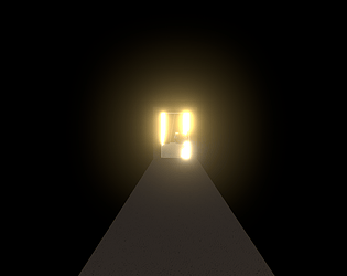
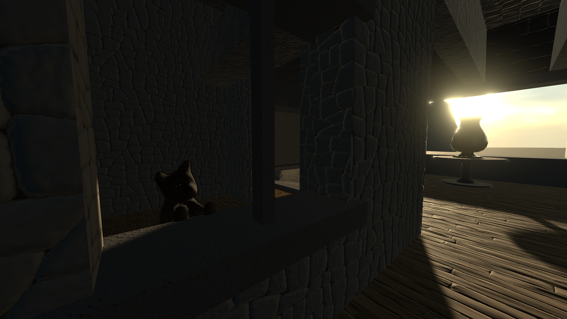
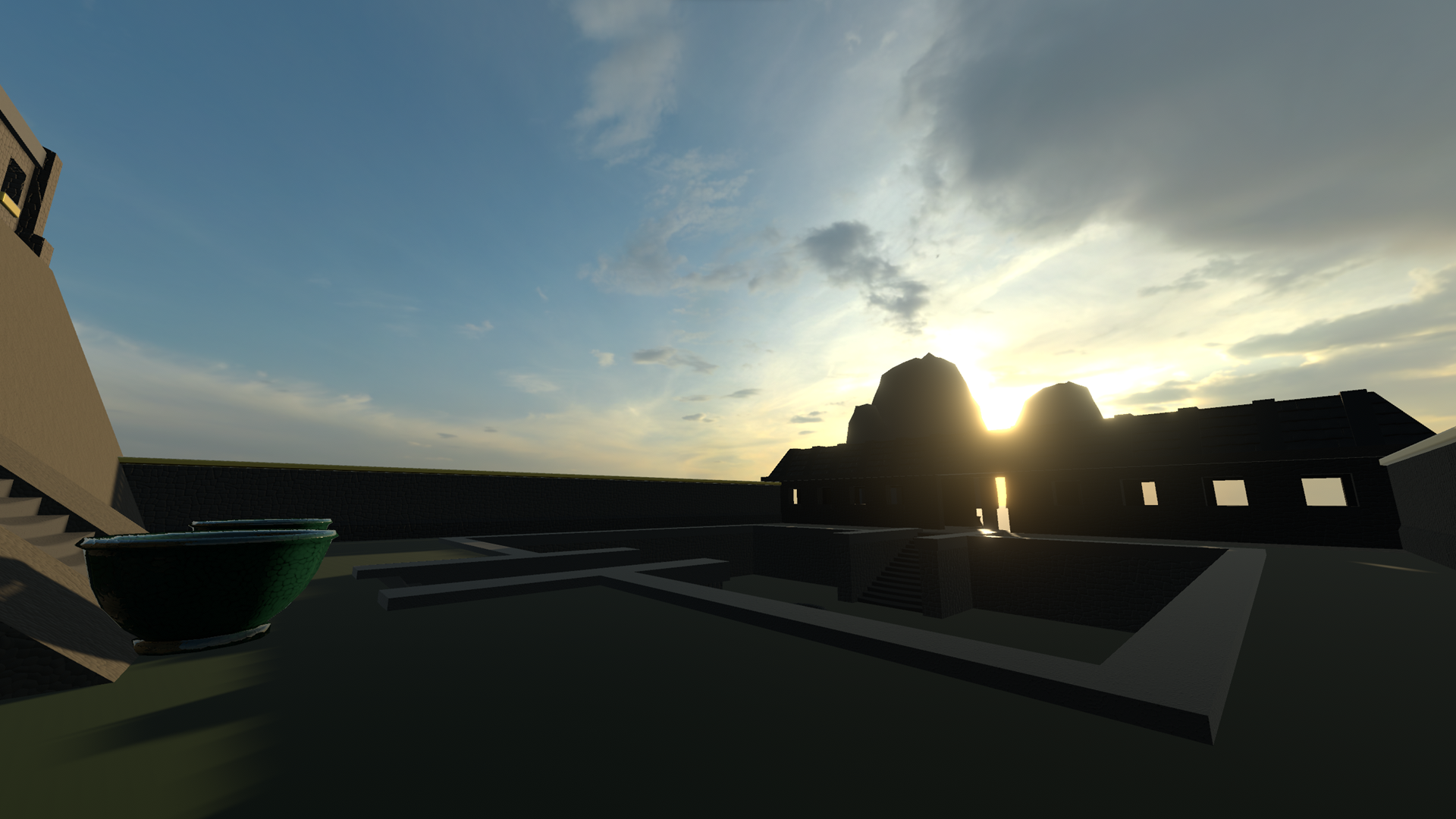
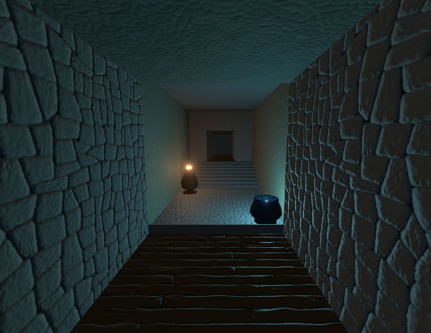
that kind of game is really my weak spot, wow i had a great time. really like the environment, the endless plane also hit my other weak spot, looking in the distance feel so great aaah. the temple design is simple but work very well (although some texture are hardly differenciable from a flat color). the settings is also great, inbetween an egyptian temple and a monastery and it just feel very good, wow.
tho, while this absolutely made the game really great, there’s still some important default. first, the physics settings you used for the character is really not adapted for platforming, i see it commonly used to be fair but it always feel terrible. slipping off platforms is really not compatible with platforming and it did made the thin bridge section a bit painfull. second, the low res+ blur while giving it a great 2000s game/movie look, its a bit overdone and does make it hard to see sometime. also a much smaller default, the lighting does feel out of place and a bit cheap, especially the orbs (i think too much bloom/it make the walls look too flat? maybe its too reflective? im not sure but there’s something about it that look “”“amateurish””” that clash with the rest)
overall, an amazing game tho, gg!
Thanks for playing and the feedback Teluri! I fully agree with your observations, most folks have said the same thing about the platforming control. I intended to splash some colour into my textures, which are currently only greyscale, calculated from neutral lighting, sadly I ran out of time though, so they are just greyscale multiplied with a flat colour. It's made worse by the extremely low resolution which is not at all an effect I wanted, I intended the game to be full resolution. The textures are actually 1024^2. The lights are also pretty contrived, and my biggest gripe with my lighting is that my interiors are barely touched by light sources, and are mostly ambient, and given that most of my texturing is done by normal maps, makes it look very dull and flat indeed. The aesthetics suffered mostly due to my running out of time, I might continue though and attend to these weak points for a more developed release. Cheers for the feedback!
oh i see. to be fair, i think your textures are fines overall, the normal maps does the job well, what i was talking about is just some specific textures that are too subtle to be visible through the low res. imo you could definitively try to go for a 50% res, imo low res does wonder to sell a mood, especially in combo with the rest of the visuals. (oh, by res i do mean the “pixel size”, not the screen size, just to be sure)
Thanks, nah honestly the low resolution thing is a bug :D
If you check out the screenshots of this submission it's way sharper. Maybe one day I'll go for the lo-fi, quantised, abstract kind of aesthetic, but I usually like to stick to medium fidelity.
wow, really cool exploration game! the game really sets up the portal mechanic well by having you chasing the dog only to end up back in the start utterly confused xd. the level design is low-key peak, with the labyrinth you're exploring feeling complex while also not feeling too overwhelming for the player to explore imo! the size of each "puzzle" segment feels just right, it helps that each segment kind of locks you into a relatively small space through the use of recursive portals until you eventually find an alternative portal to allow you to exit that space, avoids the risk of players feeling too lost, nicely done here! each puzzle's solution feels so smart and clever, really encouraging exploration and outside-the-box thinking, no joke i'd audibly go "ahhh" after i managed to find each solution, its so well crafted!
the visuals make the labyrinth feel so big and vast while making the player feel so small, which makes it all the more satisfying once you reach the end! i personally liked the game being low res for what it is, it reminded me of the original Myst look, though this is just my opinion xd. there wasn't really anything that required any detail to be shown to the player since a lot of the things you looked at in the game are relatively big in size and have strong shapes and silhouettes, so i could personally see the game taking on this low res look if you want to it to be stylized that way! also the lighting is really good as well, like the different colors used, added a nice variety of tones to the scene!
this was a really cool game, i enjoyed seeing what challenge each new area would bring me next! great work!
Thanks so much for the feedback Apple Jacks! Really glad you enjoyed my game :) I get what you mean re. resolution vs the big shapes. I was a little perturbed because I had made 1024^2 textures and they were such a pain to make lol. If I were to develop the game further I would probably add layers of detail to break up the big shapes and spaces, add props, debris, add wear and tear. Initially I wanted quite a worn temple setting, Angkor Wat, Machu Picchu type of thing. I kind of overscoped it though and had to get somewhere, so it was pretty blocky in the end. Really appreciate the feedback and thanks for playing :)
I really loved the non-euclidian spaces! So confusing but still you can find the way somehow :D
Thanks for playing schwertknappe! And thanks for the feedback :)
Wow, pretty cool game! I really like the idea. I got the low resolution bug, not only it decreases resolution it also changes the aspect ratio to 1. Didn't detract that much from the experience though, the only part where detail was important was the credits at the end. I like that you included a sprint button, made exploration smoother overall, although the jump was a bit unwieldy I think exploring the labyrinth was fine. I really liked the mechanic of non-euclidian stuff, with a little bit of creativity you could make some puzzles with it if you wanted to expand the game, but for a game jam you did nice environments, with good lighting and a sense of getting lost and mind blows when we realize where each place leads to. Really cool game, one of my favorites here, I love exploration games! Thank you for making it!
Yeah the aerial movement seems to be a common pain point. Thanks very much for playing and the feedback Rafael!
Hi, really interesting use of recursive portals, I had so much fun playing it! The movement when jumping was a little bit too floaty, and I could climb to places I should've not reached. Overall a really original concept, I liked this one a lot!
Great job, you should definitely continue developing it in the future, good luck with it <33333
Yo thanks for playing and the feedback LapoLinguini! Thanks I am fixing a few bugs like portal flickering and adding in some optimisation like only rendering through the portals and not everything else. I'll also add some more scenery, plants, grass, props, and generally tidy things up.
This is such a cool game! how does it still have so few retings?!
Thanks for playing and the kind feedback TheStripyCat! My initial cover art was super bland, plus it's a zip rather than WebGL perhaps?
Little heads up, Unity crushes the resolution on most PCs to a tiny texture. There are some moments where the heavy rendering does warrant this, but it is a bit unfair lol. You can add arguments to a shortcut target, or run via cmd, eg. "path to game.exe" -screen-width 1920 -screen-height 1080 if you'd like to see more. Sorry about that :D I shoulda tested it for a wider audience.
Fun little game kinder reminded me of Only Up but it wasn't a scam like Only Up, The objective was clear and simple you go up and get to the top, and the sound was good. The movement sadly was floating but that could be an intentional choice by the Developer, good game!
Ah yep good to know! I'll keep that in mind for future tuning of player controls. Thanks for playing xBlustone!
This game was really fun, it was a fun idea that made me really motivated to keep exploring once I realized what was going on. Some of the time I felt totally baffled on how to progress but ended up progressing anyway luckily lol, the credits at the end were kinda unreadable because of the low resolution, but yeah overall it was wonderful, great job!
Awesome! Thanks for playing and the feedback SubbyDoodles!
Oh wow I just played this on another PC and yeah the resolution is maybe 256 by 256. It could be how Unity's automatic quality settings work I suppose. Those portals could definitely be optimised a bit but I'm not sure how I would implement what I'm thinking of