That will possibly work. Will test it if you implement it
Digicode Labs
Creator of
Recent community posts
Thanks. Much better now. One other problem though... when you die and start back at the top you can sometimes start and instantly get hit by a hammer which means you lose another life before you had a chance to do anything else. When you lose a life anything near the spawn zone should disappear or change direction so that you're not trapped.
Not a problem, but a possible improvement would be to be able to shoot up or down. It would make it a little easier to destroy things.
Cool variation to the memory game, but it needs some visual aid to let the player know that they've made a match. At the moment all that happens is that the profile pic stays on the grave, but that also happens when a match hasn't been made. You have to tap after attempting to make a match to see if it's correct or not.
Thanks for the positive review. I had a go at text and sprite tweens before the jam ended but there isn't much you can do with those really when you look at the commands I.e. change color, size and angle. It probably needs like a full blown tween editor to be useful, but tweens is on the list. Just got to work out how I can make it useful.
The sin/cos part is something I always forget or have trouble with, I don't normally orbit something continuously but I was hoping it would help someone, and maybe myself in the future. I thought the waves would be useful for flying games or space games where the enemy ships move in a wave across the screen.
The particles editor is no doubt the most useful part so far.
As for the UI, it's not OryUI as that was designed for mobiles. The UI shown was built from scratch within the jam time, but is super messy codewise, and would be a nightmare to keep working with so I'm currently rewriting the UI so that I can at least rebuild the playground app again and add in the new stuff alot easier.
Thanks, I've fixed the first bug you mentioned and re-uploaded a new source code zip file.
I didn't really understand your second suggestion. GetColor* require an color to be created with MakeColor, and I don't know what you would pass in as parameters for that command other than the 4 individual bytes.
I finally got to test it on a PC and I can confirm that everything is working fine. The main digital display is a nice touch, and that's some cool programming behind the red button that can be used to scroll through the files, and also play them. As mentioned in a DM I think the source/media buttons both have a very similar meaning, and if you didn't read your instructions (like I didn't) then you can load the files with the wrong one which causes issues.
I like the way you programmed the selection tool. Very cool! And the new addition of zooming in and out of the animation was a nice touch too because the included dwarf sprites are really small. Even though I don't really work with sprite-sheets all that much it's quite a useful tool. Hopefully you can work on the UI that would replace or work alongside the F keys, now that the jam has finished and you have more time.
I experienced a few issues with this. Hope this feedback helps:
- When changing the grid size by dragging on the screen the grid can disappear completely and it takes a little bit of dragging randomly to get it to appear again. The grid size shown on screen was bigger than 1 x 1 when it disappeared so it wasn't due to it being that small.
- It took about 3-4 seconds to switch between the colour options under the mono button.
- Once you've pressed icon and placed the box you can't undo or remove it, so if you didn't place it where you wanted you have to close the app and re-open.
- I found one sprite-sheet it won't load. I don't own this image, I was looking for sprite sheets on google to test your app with. Attaching in case it helps you debug and find the problem. I know the layout wouldn't fit your grid system.
I should add that I was running your app via Parallels on a Mac as I don't have access to a Windows PC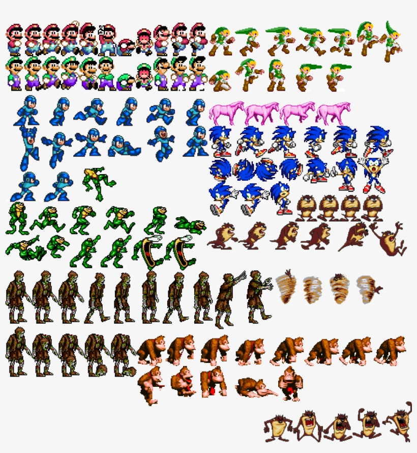
The missing file error I mentioned in my last comment seems to be related to the last wav file in the folder. It happens even when I reduce or increase the number of wav files. It's always the last file in the list it crashes on when touching the red button.
I found another bug, if you press the red button before it's properly loaded the files it will crash with this error: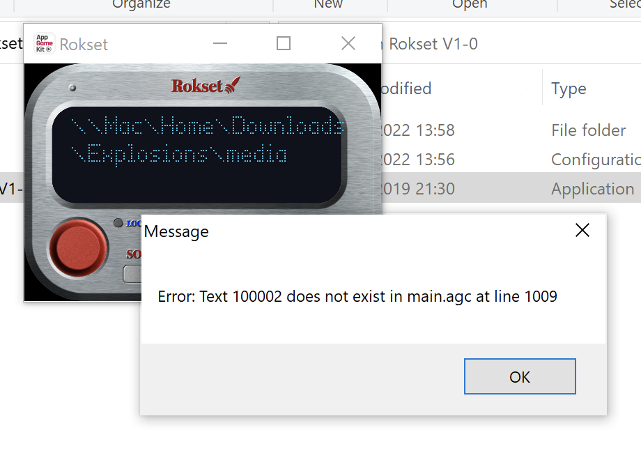
Happy to test the next version you release.
Hi, when I use the red button to scroll up and down, or press it to play, it keeps crashing with the error saying it can't find a wav file. The wav file exists, and was loaded with the 'Source' button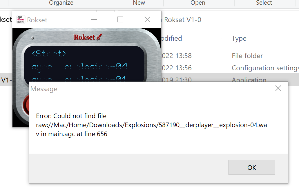
Another problem which I haven't been able to re-produce is that the text overflows when the files were first loaded. I was running it in full screen. You can however see text overflow slightly on the right each time it's used. Maybe changing the depth so that it's under the silver frame will fix it.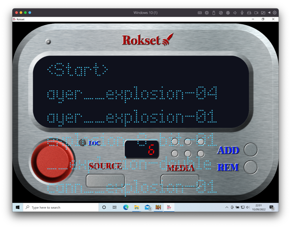
You may want to also disable fullscreen mode because in full screen mode when you press source or media and the file dialog window opens it opens in the background and you don't see it. This will be an AGK problem not bringing it to the front.
I also have problems with Dangerous Skies with the Mac version once it has been uploaded to itch.io (well, uploaded to any site actually). If you look at the Dangerous Skies page you'll see that I give instruction on how to run it on the Mac (https://kevincross.itch.io/dangerous-skies). I didn't think of trying the same fix with your game because your game is showing as a document rather than an application, but I'll test it out later after work to see if it helps
Thanks for the positive feedback. I'm glad you enjoyed it. Finding the right speed for the plane, missiles, and the angle that each can turn per frame was difficult, but the missile does have to be faster than the plane otherwise you'd always out run them. The missiles have a wider turn which is what makes it possible to avoid them if you time it right.
Thanks for the positive feedback. It was difficult finding a good balance, but you're right it's meant to be a little difficult, otherwise you'll get bored a lot quicker if you can get really high scores in your first go or two. There's a simple little algorithm/formula that increases the difficulty the longer you last in a single game. The gap between each missile launch gets shorter and shorter, but you're unlikely to really notice a difference until you're probably a minute or two into the game.
Thanks for the feedback, I'm glad you enjoyed it.
I had fun creating the sprites, and the clouds are probably my favourite. I originally wrote the code to create all of the sprites when the game first starts by placing characters on the screen and taking a snapshot/render of the screen for each sprite, but came across issues when it came to colouring them in the web export. It's a shame because the clouds would have been different every time the game loaded.
Thanks for the replies. I did try and compile the code with VS Code, the C# Sharp extension, and the .NET SDK but that wasnt working either so probably havent got things set up correctly. I'll have another go before voting closes
@luanmm, feel free to drop me a message before or after voting closes if you release a Mac version and want someone to test it.
Hi,
I've voted on all games except for one because I can't get the Windows exe file supplied to run via Parallels Mac OS. The ASCII Cat came with an exe file that ran on my system, but the Mysterious Death of Anna Gomide won't work for me.
I've never taken part in a jam before or voted on one so not sure if I have to vote on all for my votes to be valid etc. Is it a big issue if I don't vote on one?
I don't have access to a windows PC other than my work laptop but I can't put games on that one.
Simple and strangely addictive game, that makes you want to play again and again to beat your best score. I found that I could rack up higher scores by moving to a letter only when I needed to, so my aim wasn't to get all of the letters, but instead just to move out of harms way. This is because the scoring system is based solely on time from what I can tell.
I didn't experience the bugs listed, but I'm not sure the curly braces work at all as I wasn't able to destroy enemies after moving to the curly braces. I tried a few times.
1215 was my highest score, which may not be all that high compared to what others probably got.
Visually this is really nice. I love the glows you used on certain assets. Really fits with the old style PC monitor. The character and enemies looks great too. The exploding enemy characters was a nice touch too.
A couple of issues: I use a MacBook Pro as my main computer, and use the trackpad instead of a mouse so I found shooting awkward, it kind of needs a key mapped for shooting so that you can play with just the keyboard.
The other issue is that I got to a part of the level where I was at the edge of a ledge and I'd have to take a leap of faith because it's not clear on where I can safely jump to (screenshot attached). Platformers aren't games I would normally play, but I feel you should have an idea on where you can jump to, without taking that leap of faith, especially when dieing in this game sends you right back to the beginning.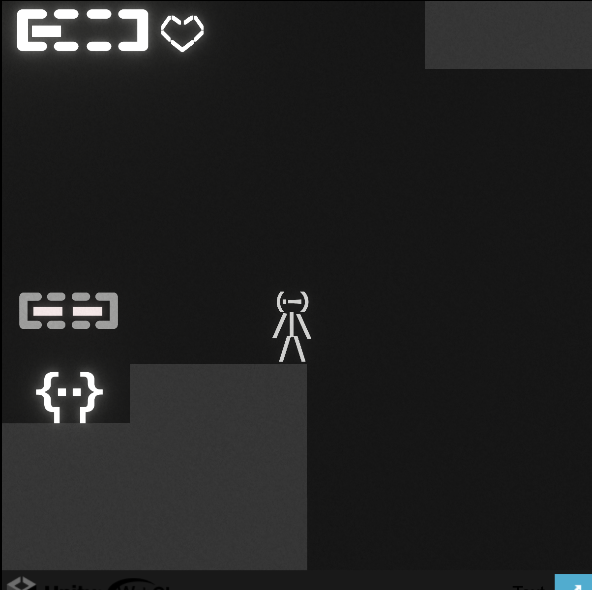
It reminded me of the time when I was a child and played horse racing/betting games on the spectrum with my family. Training your horse and rooting for it to come first as you watched it run across the screen. Good memories!
A few things I would have liked to have seen. Information about the different strategies the rival horses used before each race. Things like: first, front, back, tail. None of these strategies are ones you can pick for your own horse. Not that I can see anyway.
The other things that would have been good to see was your horse in the line up before the race where the stats for each horse is shown so that you can easily compare, and for the rival horses to have different stats from each other. From all of the races I saw it seemed like all of the rivals had the same stats.
Sadly my horse which always had better stats than the rival horses would never come first
A very hard game to master! I tried to find a good pattern of when to press the button to launch the dot for the next letter but failed many times. I think what it was missing was a clear indicator of how well you're doing, so something like 40 letters left, or 5 letters cleared etc. just something to make it a bit more obvious as to whether or not you're doing better than the last turn etc. Maybe a best score saved and displayed in one of the top corners inside the box.
But otherwise a cool game.
Sorry if this has already been requested, but it would be cool to be able to quickly view the model top down, to be able to correctly/easily position an object, likewise being able to view it from the sides. I can of course view it from the top by moving the camera around, but having a one button press option would make that a lot quicker, and it would be more precise.
There's a post in this community where DOS was approved:
https://itch.io/jam/retro-jam-2021/topic/1227653/platform-dos
That is one limitation that I'm going to try and stick with, but I don't know if its a rule. I really need two action buttons for my idea but have come up with a way to possibly do it with one to match the Atari 2600 joystick.
I guess you probably wouldn't get judged if you added an extra button, but maybe not a whole keyboard of keys. My answer is just an opinion. So don't take it as an official answer.
Some details copied from the Discord server which might help. So yeah you can add your own touches and mechanics. You're not meant to copy the game 100%. Add and remove bits as you see fit.
What is the jam about and what do I make?
Welcome to the retro jam 2021! This is a jam where you take a pre-existing game, and fit it in the style of a retro console! It's all about getting creative, or being more unique than just changing the colour palette. You could remake a pre-existing game, such as Portal, and place it in a SNES console's style, making it 2d, or redesigning some levels. You should not only convert the game into a different style, but also add some of your own stuff! You don't have to strictly stick to the limitations of the console, or the limitations of your game, but if you have the main idea there, and it is recognizable enough, then you're set!
What does redesigning the game mean?
So you have to create a game, based around the features of an already existing game. Say, if you did portal, it would be like a new character, with an obvious portal-esque style, and with a portal gun, but you should add new levels, some new mechanics etc.
This is tricky, because its very subjective, but it should not be a 1:1 copy of the game. Change up some stuff, add or remove some stuff and just be creative with it


