Haha thank you! It's not the best I could have done, but I got a lot out of attempting to do something in 3 hours!
dyve
Creator of
Recent community posts
This is such a stylish game! I can tell your team had a really fun time this game (hopefully that's correct) and it oozes into this game. It's got a lot of personality :) but I clicked on the ads and it broke my heart :(
I also really your implementation of the scale theme - it's really trippy and surreal. I'd love to see how your team would take the scaling idea further if you were to continue working on this game! I agree with a few others in that I had a hard time understanding how to use the bullet sucking move and the feedback did feel a little inconsistent. But all in all, I really love this game's style and your team should give themselves a big pat on the back, especially the artists!
Took me a while to get how the game worked as well but I enjoyed it! I feel like this game really fits the scaling theme in the sense that I felt powerful as the game went on, like you're scaling in power or something like that lol. I agree that working on this further is worthwhile -- leaning into that "super fast meteor zooming through space" power fantasy with more effects and maybe having the camera zoom in/out or use funky effects would help improve on the already great atmosphere this game has.
I really enjoyed the slingshot mechanic as well. The way you implemented the steering controls was pretty awesome, and I found myself replaying the game over and over and over so I could get a better grasp on the controls. I agree with what mjholdham said! Really great job on this game!
As a huge fan of city building games I absolutely LOVED this one! I love how frenetic it gets as time goes on and that you don't have to worry about much each tile costs lends itself well to the pace of the game.
I loved how the game gives you a real-world equivalent to your city - I never made it past the Lyon, France milestone but I really had a blast with this game. I'd definitely be interested to see where you take this game further, and from your itch.io page it seems like you have a good idea of where to take it :)
Love how stylish this game is! The writing and art all work really well to create a nice and whimsical atmopshere for the game. I've realized I could never be a scale oracle lol.
I could see my younger self playing this game for hours on a children's site for Flash games, this is such a cute premise that could work really well for an edutainment game for children!!! Congrats on your hard work
Really impressive that you built this from the ground up! You deserve some recognition for that
I agree with a few others that the player's a little slow and that the level design could benefit from being smaller and more intimate. I really enjoyed the vibe this game had though, and once again the no-engine thing is VERY impressive!
Such a stylish game (and respect for the Camellia addition, but be careful because of the copyright!)
Though I agree that it seems that you guys weren't able to get everything you wanted into the jam, I still had a fun time playing it and this is a great showing for your first game! It took me a while to understand everything that was going on but I had a fun time playing :) I'm excited to see how you build upon this project after the rating session, the vision and concept's really promising and I'd love to see a fuller version of this!
I really enjoyed this game! I'm a big fan of city builder games so I got a lot of enjoyment out of this game. I loved the sprites and the limited color palette -- well done!
Super fascinating concept of swapping between the robber, the policeman, and the mayor. Being an architect and having to consider how to expand the town in the way that benefited the robber and the policeman was a really fascinating mindset to get myself into! I agree with some others in the comments that it's too easy to camp the jail and arrest the criminal over and over as the policeman. I'd be interested in seeing this turn into a full game, the concept's really cool. Great work!
This is such an awesome interpretation of the theme! I'm a huge fan of city games so I got a lot of enjoyment out of this - I'd love to play a more expanded version of this!!!! Reminds me of The Sims Carnival's SnapCity game if you've heard of it :)
The game's pretty difficult, which I enjoyed. I found it fun to start again over and over knowing the new things I learnt and the difficulty put enough pressure on me to stay engaged with the game. The one thing I wish the game had was a rotating camera or transparency on some of the tiles, as I found myself accidentally putting buildings at the end of roads sometimes and not realizing my mistakes until it was too late.
Again, I'd love to see this expanded into a full game!
Thank you! With the atmosphere we were going for we were a little doubtful we could find church music that fit the game but we struck gold with what we were able to find. The songs we used are credited on the page in case you're interested in checking out the composers! (Elegy DM, the song used for the intro, is particularly great)
Really nice pixel art and audio mixing, the atmosphere's really interesting and your audio design really adds to that! One note I had was that the camera feels too zoomed in for my taste (I know others probably prefer it the way it is) and I fell into spikes a few times because I didn't know what was off screen, but overall this is a really well done game!
Really impressed with the amount of puzzles you were able to come up with and the fragments of story laid throughout the game - really motivated me to try and see everything each level had to offer. Being able to manipulate the lasers with the angle of each door was such a great incorporation of the theme, too. Really well done!
This is such a charming game, such a quirky atmosphere to it and I was rooting hard for that girl who had a Valentine's letter. I thought it was really clever to add some spooky effects to floors that didn't have any gameplay relevance, it kept me on my toes throughout my playthrough. Definitely one of my favourites from this jam - really well done!
I really like the core idea of swapping bodies and thought the way you put it - a co-op for people with no one to co-op with - was a really funny way to describe it. I thought having the keys clip through walls to get to the person that's being controlled a bit unsatisfying and I think future levels could definitely bring out the potential of swapping bodies to solve puzzles. Really interesting game idea!
I love the atmosphere, and I think you really nailed the tension and discomfort that comes with horror without resorting to a jumpscare like others have said here. It got really fun when the difficulty picked up and maybe this is just me being bad at the game lol but having to fiddle with the WASD controls and figure out which key shut the wardrobe door added a lot to the atmosphere.
I love how simple this game is, it's really challenging and makes me want to try and get through as many doors as fast as possible without making a mistake. It's definitely a great cognitive challenge, and I'm really curious to see what a full version of this game would look like without the time constraints!
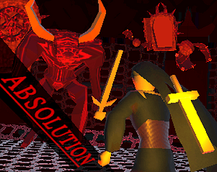
My team and I were really inspired by the DARK and TWISTED 90s, and now we're curious: what inspired your game's presentation and design?
https://dyve.itch.io/absolution
I saw this great forum post by Sven von Brand L. that asked developers why they made their game, and thought questions like that could be a great way for us to share our games while getting to talk about them a little more.
We took a lot of inspiration from dark and gritty PSX-era games like Silent Hill and Castlevania: SOTN to inform our game's graphics and presentation. I worked on the UI and took a lot of inspiration from games like Devil May Cry and Bayonetta for the in-game UI, then for the level opening UI a ton of inspiration from Melty Blood, Touhou, and Under Night In-Birth because those games love dumping entire paragraphs of text in their UI.
As for gameplay, we came up with the idea of the ranged attack being similar to Draven's axe catching mechanic from League of Legends - we're really happy with the way it came out and it even surprised us with how the player's ranged projectile can ricochet off of other enemies. It's janky, but I think it's really satisfying when it happens.
I'm really curious to hear if you had any other games that inspired you while creating your entry. Looking forward to hearing all of your responses and playing your games!
I think this is a great example of how less is more - the minimalist sound effects add a lot to the game and fit really well into the graphics, resulting in a really nice, cohesive piece. The enemies soaked up a lot of my bullets and I swear my shotgun missed point blank a few times, but overall I loved this game and kept replaying it with different weapons. Really nice!
It's great to see a game-sharing forum post with a prompt. I'm looking forward to reading about how everyone came up with their game!
My team realized early on that we wanted to create a game with a retro aesthetic, and we figured that our basic premise of fighting things that come from doors could lend itself well to a edgy 90s aesthetic that harken back to games like Doom and Silent Hill. When we figured that out I couldn't help but add in weird 90s tropes that were common in games without a lot of plot, like having to fight in Hell to REDEEM YOURSELF, to give our submission a bit of personality.
When it came to the gameplay we took some inspiration from Draven's axe catching mechanic in League of Legends and I think that came out well :)
Check out our game below, and vanquish some demons...


