

Sorry, there's no more room!
A member registered Apr 17, 2020 · View creator page →
Creator of
Recent community posts
I haven't noticed the ezcomposites going missing. You should probably set the ezCompositeIndex to like 1 or 2 so she appears more to the left (it keeps the positions more consistent with the regular composites).
There's definitely too much light going on with Kim's ezcomposites though. (Saiki and Elenas were fine). Some lighting probably somehow carried over from a previous scene. When that happens I usually just export only the model as a scene subset, then reload the office ezcomposite scene fresh, then merge in the model.
I've finally gotten around to starting rendering on Vivian, so that should be ready soonish.
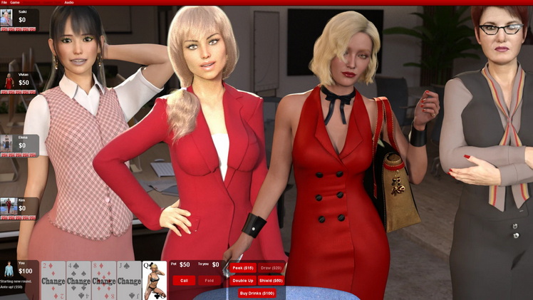
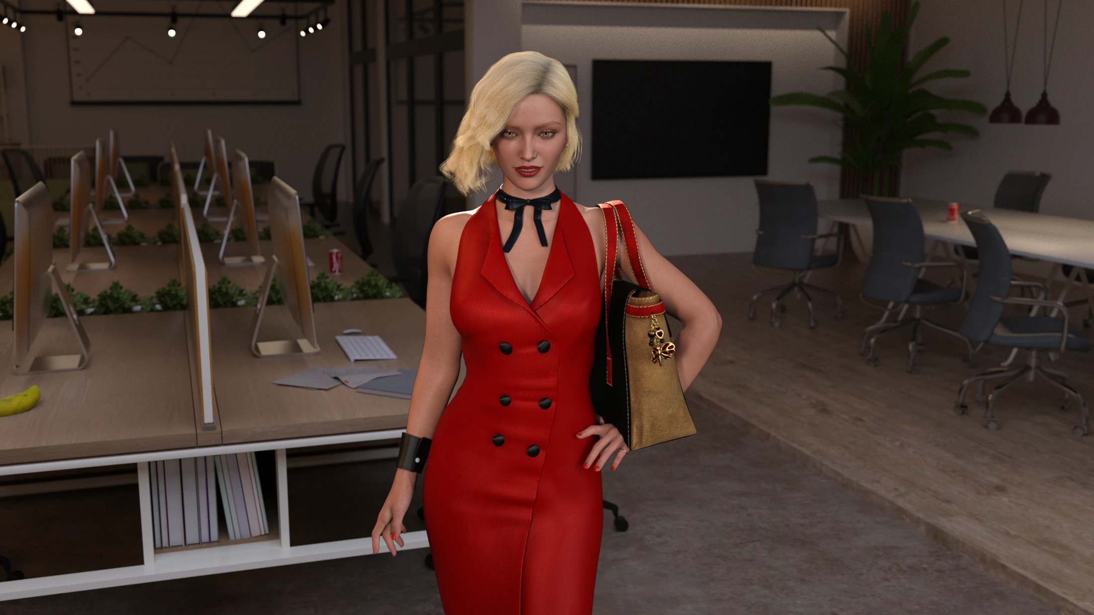
California Strip Poker community · Replied to stripe6499 in Watch out! Grumpy Elena is in the office!
A lot of the expressions start looking really cartoonish when you dial them to 100. Even the default smiles I usually keep dialed down to like 40% because of that.
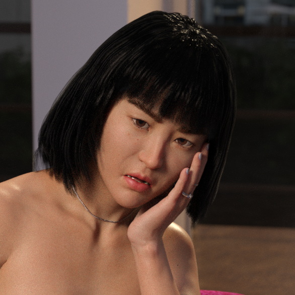
There's a couple that work really well all the way to 100. The expressions that came with Amira (aka Leah) look really good including on other characters. There's also one called "Bereft" that I use a lot on Crystal when she starts losing, combine it with open-mouth at 30% and she looks utterly devastated. Not sure what set that came with but I suspect it's a core one you might have?
California Strip Poker community · Replied to stripe6499 in Watch out! Grumpy Elena is in the office!
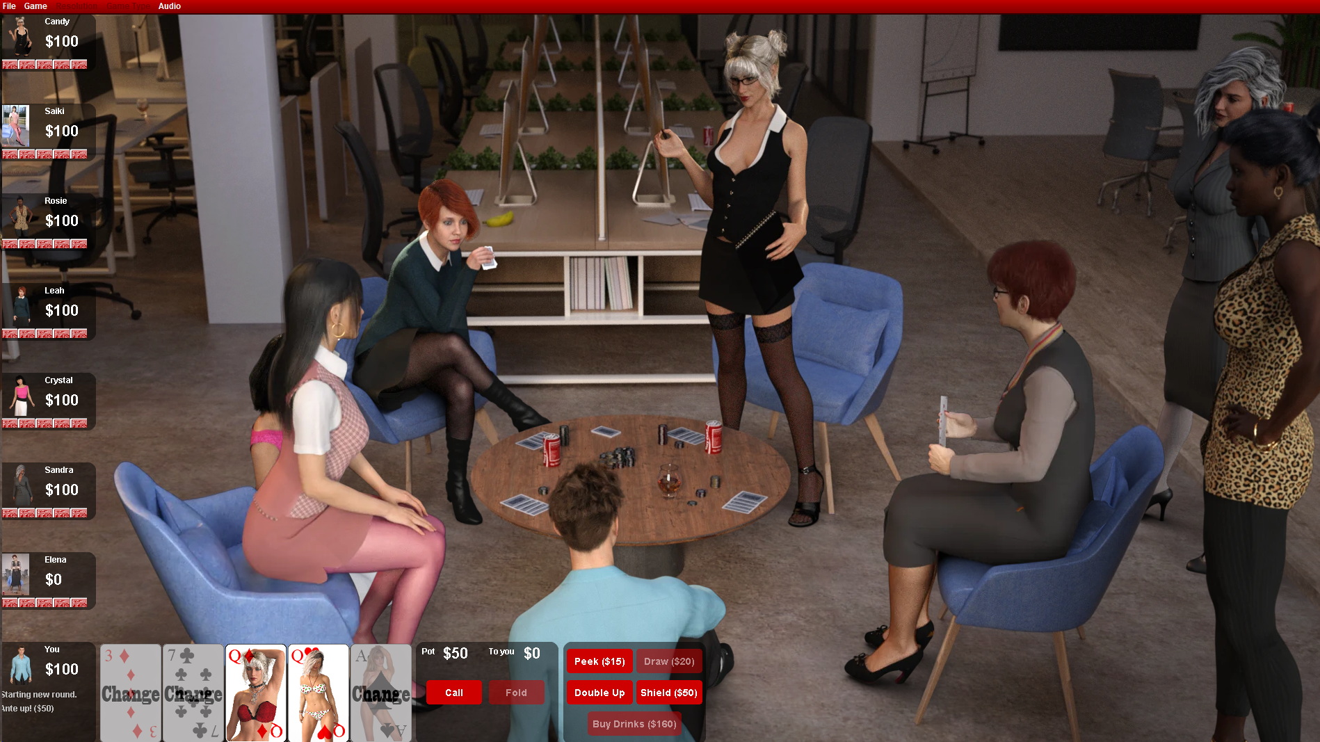
Woo, that office is getting crowded. Suddenly I'm a big fan of RTO!
A couple things I wanted to point out:
Elena's properties file should have the following values:
outfit.layer=2
outfit.ezCompositeIndex=7
Saiki should have the following:
outfit.layer=2
outfit.ezCompositeIndex=1
(also don't forget to dial the micropressure morphs back to 0 when the clothes creating them come off!)
Meanwhile I'm working on Denise's office set, here's a preview!
Oh wait, that's Vivian. My mistake. I'm working on Vivian first!
Next problem: Those chairs. They look too good. That yellow really pops. Unfortunately, it's going to outshine the ladies and clash with skin tones when under-dressed ladies are sitting in them.
And double-unfortunately, the office set does not come with alternate textures for them, nor does it have separate surfaces for the different parts of the chair, so changing their color is probably going to be more trouble than it's worth. Which is too bad, because they're kinda perfect in all the other ways. They look comfy and luxurious, they have detailed textures, they're the perfect height, and they're really easy to sit characters into in various poses.
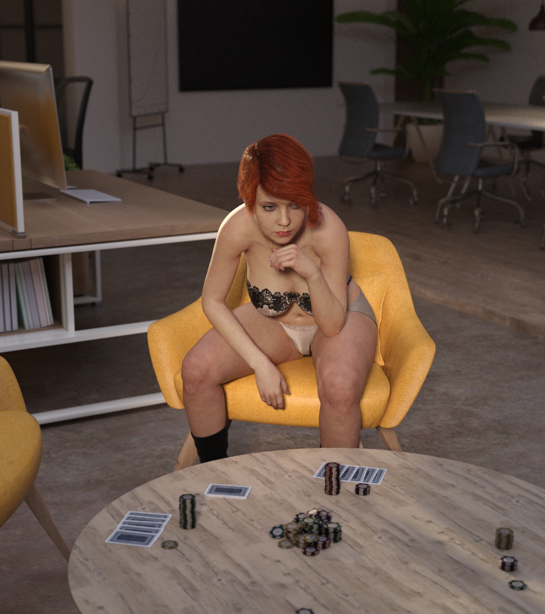
See what I mean? Leah's exposed skin should be the main attraction here, but instead it's getting lost in the yellow chair. Dark-skinned ladies will probably have issues here too: they'll contrast better with the chair, but since they tend to need more light for their skin tones the chair will get even brighter and colorful around them.
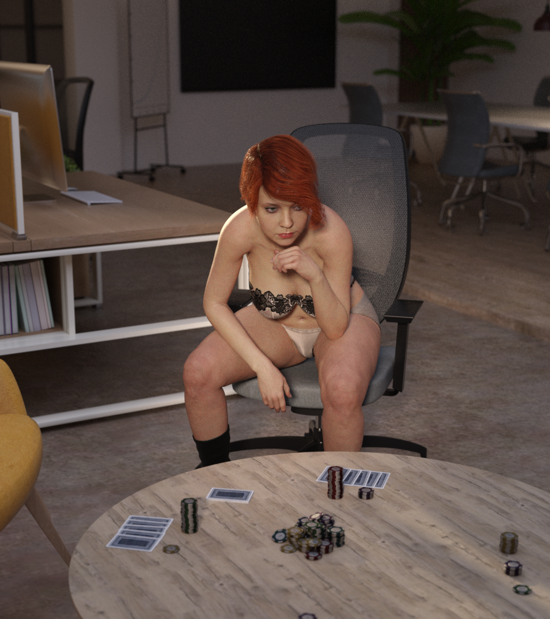
For comparison, same exact image with the boring grey office chair swapped in. Now you see Leah.
Now I'm realizing there's also a lot of skin-matching beige in this office. That desk could probably use a few more things on it to break that up. And that random coffee-table texture I threw on there was definitely not a good choice.
Ok so I spent like $30 on all these sets, and played a bit with that DAZ scene Stripe shared with me. So now you're all getting a free educational lecture. :)
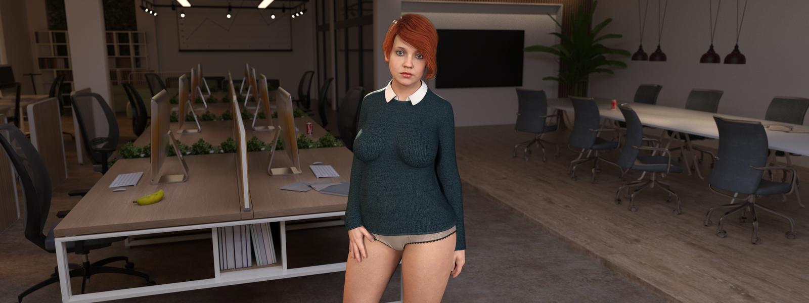
Here's the set as Stripe had it. I just dropped Leah in it and pointed the camera at her, and upped the depth of field to make the stuff in the back blurrier. No other changes. The lights do a fantastic job of lighting the room, but they're not doing our subject any favors:
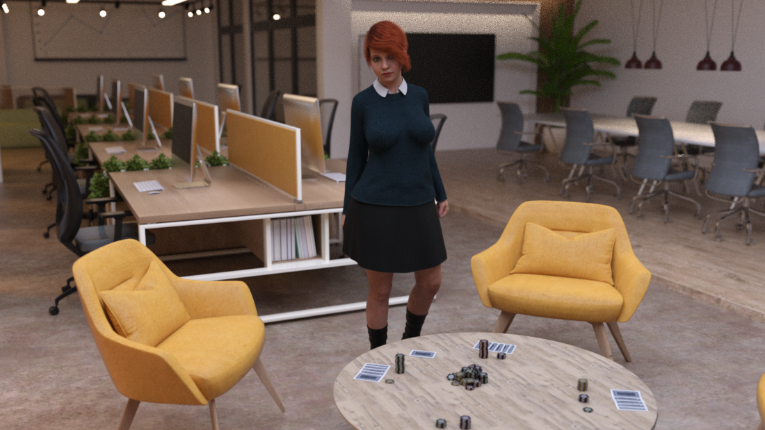
Note how this looks more like a nice picture of the office that happens to have Leah in it, even with her right in the center. . That dark outfit absolutely does not pop, even her bright red hair is barely standing out, and it's getting more light that the rest of her. Also, the light is mostly coming from above, so eyes are shadowed by the hair, and legs are shadowed by the skirt big time. Quite realistic, but also not optimal for the shot. Those yellow chairs look fantastic, but that's not what should be catching our eye here.
I tried keeping the same lights but added a couple spotlights pointed at Leah (one rear, one front), and then increased the exposure a bit to compensate for all the extra light. I only tried a couple values so this can probably be tuned a bit more, but I think it makes a pretty good difference:
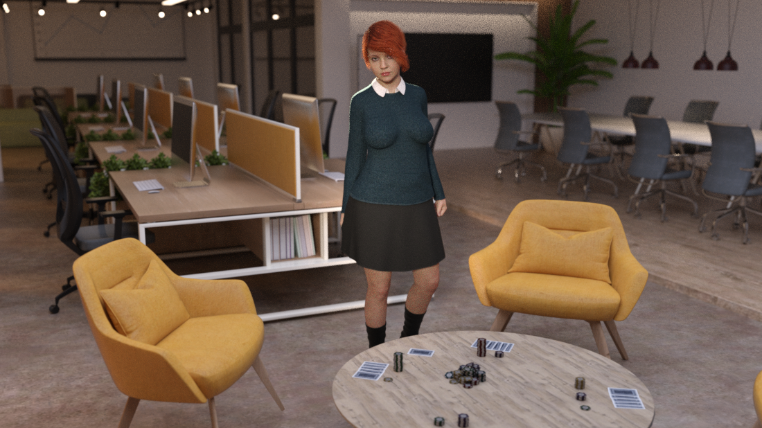
Now it actually looks like Leah's the focus of the picture. Her face is where my eye gets drawn to first, the light playing in her hair looks delightful. The sweater is bluer. And we can see her eyes and legs! (the legs should've gotten a bit more light, but I was afraid to light up that table too much and I got a bit lazy.)
So, yeah, those omni-lights are great, but you still need the spotlights.