I really liked it, it’s a fun twist on Breakout. Everything was super polished as well. My two critiques is that the paddle moves VERY fast, and the timing of trying to catch the ball would benefit from a taller game window. But other than that, very solid.
GoldenFlameZero
Creator of
Recent community posts
This is such a silly idea! When I loaded in and saw everything was blurry because of my poor timing I burst out laughing. I think you’ve got a lot of room to take this and expand on it. For improvement suggestions I’d leave the HUD visible while your character is blinking, and I’d make the cooldown between attacks a little bit more obvious (if not, an auto attack like Vampire Survivors). Excellent work!
Solid basis. I liked remaking my gun on the fly, and the lighting effect was really nice. Without having gotten too far into it, I’d like to see some tweaks in line with other Survivors games like Vampire Survivors and LoL Swarm, like auto-fire and auto-levelling. But other than that, this is pretty cool!
Honestly the core gameplay is really, really good. Having to balance building up your tower, managing solar plants and turrets, while your core structure slowly sinks into the ground from alien attacks - it really gives me a Plants vs Zombies 1 feeling in the best ways. I did have some issue with the controls, there always felt like a delay when trying to place blocks and it got a little frustrating. I also kept trying to make overhangs with my structure and it took me a while to realise I couldn’t do it. The core design is absolutely there - a little bit more polish (although yeah this was within 48 hours) and I could lose hours to this.
I really liked it! The aesthetics were clean and well polished, and the premise reminded me a lot of setting up for a Payday heist. You've got a lot of room for expanding based on secrets and weird layouts.
I understand why the clock ticks down and that putting a time limit on it really helps rush the player, but it did affect my enjoyment a little. My one suggestion is you could mix in some levels where the clock counts up instead of down, and then penalise players for taking too long. But I totally get why it's there.
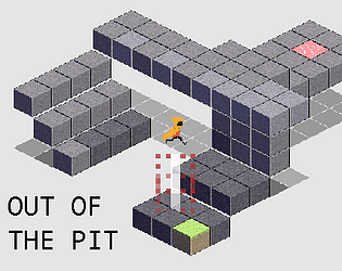
Yeah the controls absolutely could have done with more polish - up until like the last hour it was Q and E to cycle through spells. We did sort of get rotation working (although only 180 degrees) and we did try to correct for the isometric movement with the white and red falling indicator (there's also a blue circle at the bottom that doesn't show up often enough that should help you aim), but ultimately it would have played a lot nicer if we were writing this in a proper 3D environment.


