Indie game storeFree gamesFun gamesHorror games
Game developmentAssetsComics
SalesBundles
Jobs
TagsGame Engines

Indigo Blues

14
Posts
1
Topics
1
Followers
A member registered Jun 29, 2021 · View creator page →

Creator of

Recent community posts

(1 edit)

Robot Voyager

An endless-runner where you have to multitask to survive, play as a giant mech and traverse through the level as far as you can by maintaining the mech's various power supplies .

suitable for all ages 

available for Mac, Linux, and Windows

Download Game here --> https://indigo-blues.itch.io/robotvoyager

Title: Robot Voyager/URL: https://indigo-blues.itch.io/robotvoyager

Pitch/Information: A Game where you have to multitask to survive. The main goals of the game are to traverse through the planet without dying. Easier said than done, because while traversing the level, you have savage giants that you have to fight off while at the same time maintaining the different power sources that keep the mech and various skills running. There are different consequences if any of the power sources die out..

  • If your eyes run out of power, you won't be able to see anything.
  • If your arms run out of power, you won't be able to pickup powerups and or attack enemies (if you run into an enemy while your arms are out of power, the mech will be destroyed).
  • If your legs run out of power, you won't be able to walk.

I'd like feedback on: basically anything gameplay wise, and visuals, I'd like to see if people like the visuals

Thank you so much, you just made my day! I was worried the concept was going to be hard to make into a game but I'm glad with all the positive feedback it has gotten so far :) 

what do you think of this? I hope this will work for your game title

I made the title and the background separated so that it would be easier for you to change if needed

I could help, is there anything specific you would want in your title?

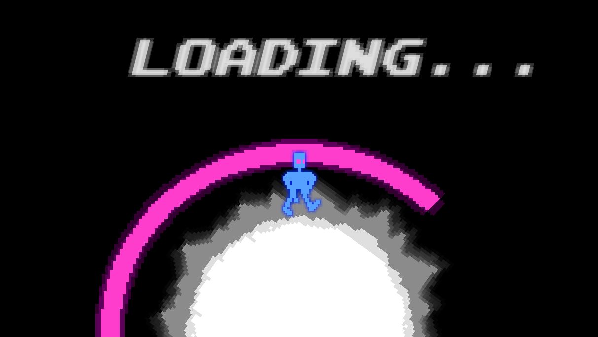
Day 9 Making a loading screen

This was the fast and easy part of developing the game, basically all I did was create a looping loading screen animation, and coded it to turn the loading screen on when loading a scene, and that's basically it for the loading screen.

(2 edits)

Day 8 - making the music

for the past few days, I have been working on the music part of the game so that it wasn't just pure silent during gameplay lol 

(which is the reason why I haven't posted anything recently.)

for the time I had, I have only been able to make 2 songs, 1 for the title screen, and one for the one level I've worked on.

Since I am not a master at writing melodies, I'm pretty proud on the end product and how it turned out, maybe not so much on the level 1 song, but this has been my first time working on original music, so I know I'll get better in the future. 

Level 1 theme: https://drive.google.com/file/d/1EUWf4tXm38yaClnpwvBI-yyCr0PdQ5dE/view?usp=shari...

Title Screen Theme:  https://drive.google.com/file/d/1D4RLWKPZnc6DGCYe-tQJQd7KXqApTlCo/view?usp=shari...

P.S: If anyone is struggling with making music for their games, then use this website to help fill out your song: https://openai.com/blog/musenet/ 
This site helped me out a lot when it came to giving the songs more variety :)

The music is really cool, and I really like the character designs. The way they are colored and expressed gives me really good details on  what kind of personalities they have just by looking at them, so good job on that. Also, the title is pretty catchy. 

I'm pretty sure it's Unity

This might sound random, but I like that the character has a cool top hat on, I hope that in the game, the hat is an item and when you equip it the game says "You have equipped top hat, you have gained 10 style pts."  Also, the weapons  look  awesome so far, I can't wait to use the boomerang weapon :)

Day 3, Polishing the visuals 

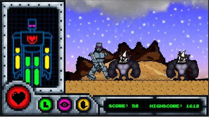
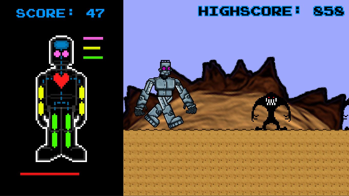
So today, I decided to now fix all of the Level UI Visuals so that they where easier to understand than the last one, and I'm pretty pleased how they turned out. Idk how I feel about the level's colors yet, I wanted to make it similar to earth but not too similar, so let me know weather the colors are fine, but as of right now I'm ok with the colors so far.  

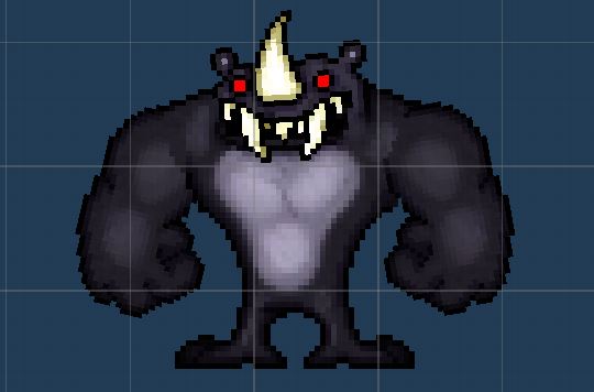
Also, as you can notice, I also have decided to change the design of the enemies drastically. I thought it would be funny if I combined a hamster and a Rhino to make a crazy looking monster.

speaking of enemies I have also updated the enemy spawning script so that it feels and looks a little better than before

Day 4 Getting Messy with 3D

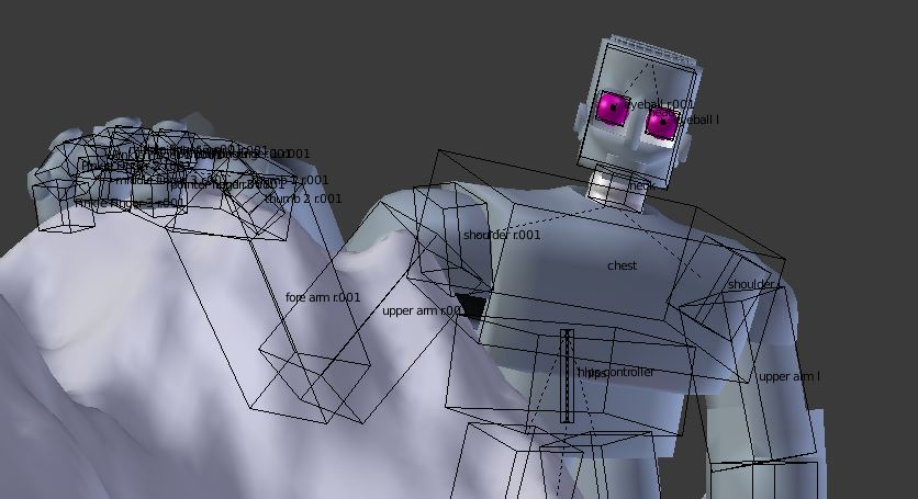
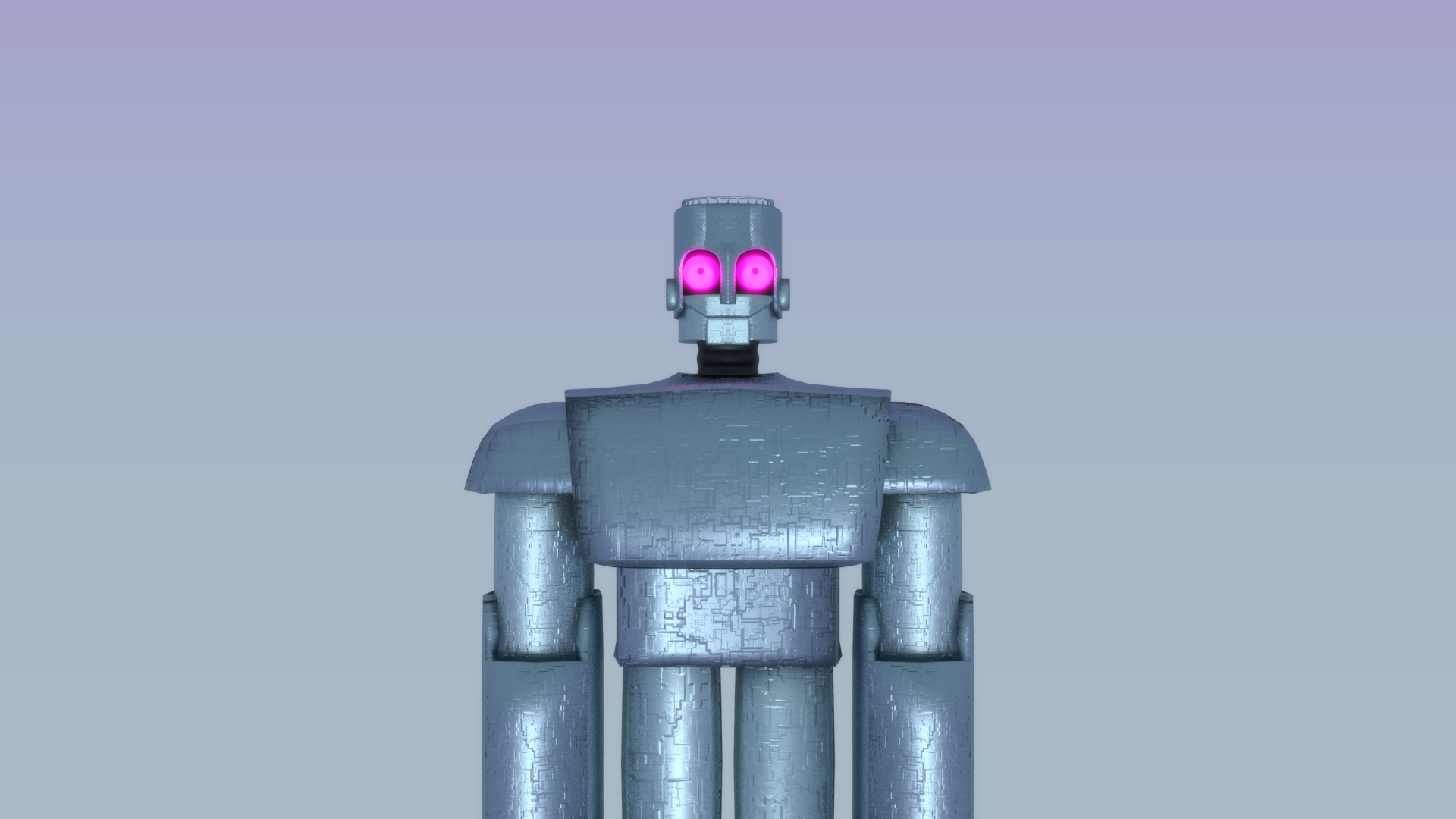
Yesterday I Decided to make all of the stuff such as the title screen, game cover,  and other things like that be rendered 3D visuals. There might not be a lot of these since the ones I have been able to finish took a lot of time due to the slowness of my computer lol 


(1 edit)

Thanks! right back at you :)

(1 edit)

Day 1, Introduction

Ok, so in this game jam I have decided to use one of my ideas I came up with a while back. In this game you play as a giant mech piloted by thousands of humans to find a habitable planet without the trouble of any space monsters on them. (it's basically an endless runner)

 The main goal of this game is to try and progress through the level as far as you can while trying to maintain the mech.  You basically have to multitask keeping the mech's various power supplies charged up while you are traversing the level.

Basically you have a list of things you have to maintain:

Legs: if your legs run out of power you won't be able to walk or jump

Arms: if your arms run out of power you won't be able to attack the various enemies.

Eyes: if your eyes run out of power you won't be able to see.

Heart/core: if the Mech's heart/core runs out of power then it's Game Over, the mech will die.

Those are basically the mechanics.

Day 2, Making the Game

For getting started on making the game, I started working  on the minimum mechanics for this game, I was worried that the format/UI of the game was gonna be hard to make but as of right now I am satisfied with the results. I basically only made the Player, the enemies, and some basic level art and platforms, I made the choice of making the parallax background more spherical because I thought it would give the idea that the mech was super tall, and also I just thought it was cool lol. Anyway, as of right now I got it working ok, but now I'm going to fix some things such as enemy spawning, player controls, and also the UI interaction.


I hope you guys like the idea so far, please let me know if you have any critique about the idea, feedback helps a lot :) 

P.S: also don't worry about the graphics, they will look a whole lot better later in the future ;)

(1 edit)

The visuals look AWESOME! I feel like there are just enough colors to give the game a unique style to it, the visuals look very cool, and also has a retro feel to it. 

I personally think a lot of the people who will play this will love the visuals . Keep up the great work :)