That sounds very viable, although it's going to be very frustrating to implement in javascript, which doesn't copy objects without a fight. I like the fact that it's calculating the trajectory gradually, I actually think that could be a fun in-game upgrade factor. Maybe your ship computer starts out being able to project 2 future frames per real frame, but you could upgrade that ratio in-game to much more so that you can more quickly see your projected trajectory. This has the added benefit of gating a potential performance bottleneck behind optional upgrades, so even if I can't afford 100 frames / frame of prediction on some devices, it's only an issue if a user on a slow device chooses to heavily upgrade that particular stat.
kanethemediocre
Creator of
Recent community posts
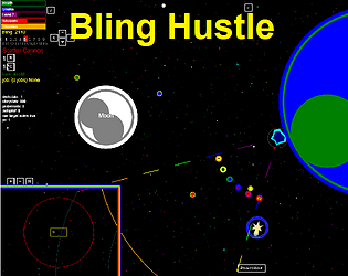
Thanks so much for trying Bling Hustle! Everyone pretty much agrees it's a nightmare for new players. I try to implement systems to make navigation easier on the players, but they don't help if the players don't know about them. For instance, the "air brake" system you suggested basically already exists as the "Autobrake" (Z key) , which automatically directs your thrusters to nullify your velocity relative to your nav target. Similarly, the "Autopilot" (A key) helps the player traverse vast empty spaces and slow down at the destination without needing to spam click the thrusters. And the "Booster" items (used with B key) can be used to quickly accelerate (or decelerate) in any direction without needing to spam the thrusters (1 booster is equivalent to 32 thruster clicks if I remember correctly).
The problem, as you've clearly seen, is that the player needs to know about these things and how to use them. Many games in the genre like "Elite: Dangerous", "Eve Online", or the "X" series expect players to spend lots of time learning how to play. However, I'm aiming for a faster paced experience than those games, and yet I still want all the depth and complexity of those nerd-gated space games. I'm confident I've achieved much faster pacing, but the learning curve is just as bad. The tutorial / text dump was never the solution I wanted, but I thought it was better than nothing. However, I'm starting to think that maybe I should delete the tutorial entirely and just tell people they need to read instructions or watch a video out of game.
If you do give the game another go, I'd strongly suggest trying the "Pocket Universe" option, which provides a much more action-oriented game without needing to worry about navigation through vast empty spaces. The physics is still basically newtonian, but there's no gravity and the distances are all very short.
Thanks for trying Bling Hustle. You certainly aren't alone in your navigation struggles. I'm always looking for ways to make it easier on new players. That said:
1. Moons/satellites have a very limited window for stable orbits, outside of which they will get gradually pulled out of their planetary orbits into a solar orbit. If I want a bigger window for placing moons, then the planets have to be proportionally farther from the sun, and the whole system gets very sparse very quickly.
2. I just really don't want ships to fly through planets. It takes too much away from the feeling of physical realism.
3. This is my preferred solution by far. I definitely WANT to do that. I'm good enough at physics to program my game engine to determine where things will be 1 frame in the future with good enough accuracy to make the world work, but AFAIK there isn't a general solution to predicting the positions of N gravitating bodies at arbitrary points in the future. The best I could do is simulate the universe for maybe 12,000 frames (about 3 minutes), and then plot the player's future positions based on that. This would need to be done every frame, and thus increase the computing requirements by a factor of 12,000. Also, the projected players position wouldn't be very meaningful, because the all the other things are also in motion, so the projected path wouldn't be in the right place relative to those other things. Anyways, it's hard, and I don't know how to do it, but if I did know how to do it, I absolutely would do it.
There are a lot of complicated systems that contributed to your experience. But one issue I can clearly identify here is that the default Nav target is the sun. It makes a symbolic, abstract sort of sense that probably isn't appreciated by players that fly into the sun the first time they turn on autopilot.
Thanks for trying Bling Hustle. If you do try it again, maybe try the "Pocket Universe" if you want to get in fights and not worry about gravity, orbits, or complex navigation systems.
Lots of potential here, but I had lots of struggles with the UI. I couldn't convince characters to open doors in front of them, although the menu item was there. I couldn't convince archers to attack at range, and only sometimes could I get an option to attack with their bow in melee range. My turns would often seem to end at random before I could assign moves to all my characters. In part due to these struggles I wasn't able to meaningfully progress through the game.
Lots of potential here, but I had lots of struggles with the UI. I couldn't convince characters to open doors in front of them, although the menu item was there. I couldn't convince archers to attack at range, and only sometimes could I get an option to attack with their bow in melee range. My turns would often seem to end at random before I could assign moves to all my characters. In part due to these struggles I wasn't able to meaningfully progress through the game.
I played in the browser. I like the core gameplay loop, but some UI quirks really slow it down. Oddly enough, the tutorials were short and effective. I'm not used to complimenting tutorials. Having lots of NPCs to chat with is great flavor even if most of them aren't meaningfully interactive, and having a significantly different layout to each location also adds good flavor even if they mostly have the same interactive features.
X to cancel doesnt work until you've made it to the yes/no dialog anyways. Filling cargo slots individually feels tedious. I see how the balancing right/left could be a fun gameplay element, but in most cases I'm just going to be maxing out on one cargo type anyways. I never found out how to see what the store items were, I only saw a price and the choice to buy it or not. Each menu action or dialog box skip also takes maybe a half-second of animation, which wouldn't be so bad if basic gameplay didn't require pushing through so many pages. The market prices could all be on one chart, and the bounties could easily be a single list. The player's current balance might be worth indicating on screen, so the player doesn't need to go to the bank to see it. All that on-station gameplay could be streamlined a lot without removing the charm of the process.
Los tiburones son rápidos y no es fácil ver cuando te lastiman. Un sonido ayudaría, o un imagen de diferente color para el submarino cuando está siendo herido.
La dificultad difícil no es muy interesante sin oxígeno. Quizás coloque menos oxígeno en lugar de nada de oxígeno.
I liked the art style and the music.
Played in browser, the game looked and ran great. Flat-ish art style and music were great. The perfect-traction physics model allowed for fun racing even without any elevation changes, but the collisions feel awful. Cars seems to sort of teleport away from each other, and don't exchange momentum properly. I can imagine that the perfect-traction model limits the sort of collision physics available, but perhaps a different compromise would be better. Maybe the cars exchange momentum a la Newton, but instead of sliding sideways they just turn into their new velocity vector.
The bots were good, but not unbeatably so. Still, they could use more variance, as getting 3rd place is about as hard as getting 1st. Give us one slow bot!
This seems like a solid and enjoyable base. A little extra would go a long way to adding interest to the game and it's tracks. Maybe boost (or bounce!) pads on the tracks, maybe some items to pick up or interactive environment pieces to set traps.
Collisions with planets were previously a fixed amount of damage. They now depend on relative velocity. This, in many circumstances, has made colliding with planets generally much less forgiving, although very low energy collisions will actually cause less damage. Impact shields, which might be enabled by default on some cursed worlds, still reduce impact damage, but high energy collisions will still be dangerous.
Thanks for pushing me to improve the collision damage system.
Aha! I think I fixed the targeting issue, T key should now properly lock on to current target or unlock target if you already have a locked target.
On further inspection, the mobile thrust hack should only be onscreen and clickable if your device is detected as a"mobile device", or if your resolution is at least 99,999 pixels wide. Not sure why either would apply, but the mobile device check is very much copypasta. I think the thrust/shoot toggle does show up the options menu (O key) can disable it but I'm not actually sure.
A bit surprised it was on the high end, but I guess I shouldn't be. I created a separate, more minimalistic HUD for lower resolutions, which I'd observed were a problem from interface elements being squished into each other. But I'd never done any testing at higher than 1080p, because that's my monitor. I'm guessing I did some approximate math with the text wrap that isn't close enough at very high resolutions.
The change between right/left mouse buttons was a button on the screen like the lettered shortcuts (which also indicate the keyboard key, V can turn them off if you remember those keyboard controls). But I apparently phased it out at some point, and have it in the options menu, which is unreachable without a keyboard anyways. So there's a mystery for me to figure out.
Also, the T key is supposed to lock onto a target, but I just tried it and it crashed the game, so that's a whole thing to figure out too. Really helpful to find these things.
Thanks for the detailed feedback, could you let me know what resolution you were running?
Lots of good ideas in here, I won't address every point, but the UI is definitely overwhelming and the tutorial is not a good solution for that. Tooltips might be part of a better solution.
Targeting isn't really controlled for the most part. It was too complicated and buggy, so I removed a chunk of that UI. Now, it mostly autotargets what you're pointing at. I'll fix it, there's nothing I love more than making bling hustle more complicated.
The thrust/shoot flip is technically a feature for touchscreen devices. Bling Hustle is a terrible game for a touchscreen, and touchscreen devices are terrible for everything, but 99% of the people I talk to about the game don't have or don't use keyboard and mouse. I haven't really figured out how to have that option available when needed without it being obtrusive to the high functioning users.
I don't think I really figured out the building mechanics or strategy. I just gave the spiky thing all the HP, and it won almost every match, quickly earning 1M from bets. Maybe there should be some sample bosses to build on so stubborn non-tutorial people have something to tweak and play with to learn the mechanics. And maybe whatever I did shouldn't be possible.


