The game was made with a modified version of RPGMaker 2003. The version of the modification in question that this game uses (the most recent at the time) is known to cause some anti-virus software to think the game is dangerous. I can assure you this is a false positive. I’ll try to update the game soon with a more recent version of the engine, where these issues are resolved.
Lumi
Creator of
Recent community posts
Gameplay: Voidskipper
Graphics: also Voidskipper
Story: Lee Harold Oswald
Comedy: IN
I did not like the music in any of the entries enough to be able to pick a favourite, so I didn’t award a 5 for music I also didn’t award a 5 for overall but that’s just because I forgot. I’m not sure what it would’ve gone to though, I liked a lot of entries for a lot of very different reasons so I would struggle to pick a true overall favourite.
I played only the Harold and Marsha stories but after that I decided I had seen enough. The battle system seemed interesting at first but in both the campaigns I played there was no reason not to just use attacking moves whenever they became available (Or harold’s buff skill, if a non-red attack was available). I never used the dodge moves, and never felt like I was in any danger of dying despite this. So with both characters I very quickly fell into doing the exact same thing each fight, and I was never forced to change my strategy. Writing was good quality, but I wasn’t particularly invested in what was going on, except for very quickly hating Oldhar (though that might be intended) Graphics were RTP. Music was good but didn’t necessarily fit the visual style which I can imagine would probably bother some people, but I didn’t mind it.
Gameplay: In a word, this game is slow. In slightly more words, this game is agonisingly slow. Movement speed is too slow, text speed is too slow, and the battles are far too slow and too frequent. Speaking of battles, you’re bombarded with an overwhelming amount of skills at the start, making it highly confusing up front and difficult to learn how to use skills effectively. Also, it’s weird to me that Damage numbers are all in the hundreds, yet MP is inexplicably in the thousands. You have 10,000 Max MP, but skills never cost less than 1000, so the gameplay is the exact same as if you had 10 MP, and skills that cost minimum 1 MP.
Music: I liked the map music, but the battle themes were all kinda annoying, and I thoroughly did not vibe with any of them.
Story: The writing of this game feels juvenile, in a bad way. Every character has an edgy design and even edgier skill names, and the self insert is included in the story about as gracefully as drawing your OC over an ensemble image of the cast of your favourite show in MS Paint - which is to say not graceful at all. The writing seems to really enjoy calling attention to his presence at every opportunity in often very clunky fashion, (“all of you and Josh” being a particularly egregious example)
Graphics: The art is the strongest point here to be fully honest. The designs are quite edgy which for certain characters doesn’t really feel like it makes much sense - like these guys are heroes why is Marsha dressed like she’d be the main villain of any other RPG (Harold is also dressed like this but I’m assuming that’s a result of the island) - but are generally well drawn, and I can appreciate a good edgy design, so long as it’s supported by decent writing. Bonus point for David’s gun blade, though. Gun blades are cool.
Comedy: there uh, wasn’t any.
Overall: Graphics are about the only nice thing I have to say about this game.
Gameplay - I’ll be honest I didn’t really like it. The keys were the most interesting part but it was otherwise mostly just “use the item type the game 4tells you to or scavenge if you don’t have it and hope you get it” Having your method of dealing states just be skills instead of items, and making the hints a bit more subtle would’ve improved it I think.
Music - was fine. I’m not a big chiptune guy generally, I can appreciate it when it’s done exceptionally well, but this was honestly just kind of okay. Nothing I can see myself jamming out to, or getting stuck in my head. It wasn’t bad though.
Story - Ended before it really got started. There was a building suspense and intrigue but it just ends with Fred and Eliza getting exploded without any further elaboration or aftermath, or really much of an actual resolution at all. A very “wait that’s it?” ending.
Graphics - This was the high point for me. Stuck to an aesthetic and executed it well, nothing bad to say about it.
Comedy - egh. I don’t think I laughed at a single one of the jokes. Really not my sense of humour.
Overall - It was okay, but not much more than that. 3/5
The Plains is definitely the area I can foresee the most people getting hung up on if they don’t immediately click on one or more of the puzzles. Area order is random so the fact it ended up being your least favourite and also your first is just bad luck. I’m glad you otherwise enjoyed it though. :)


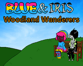
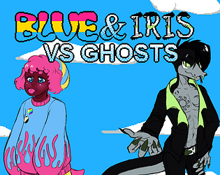
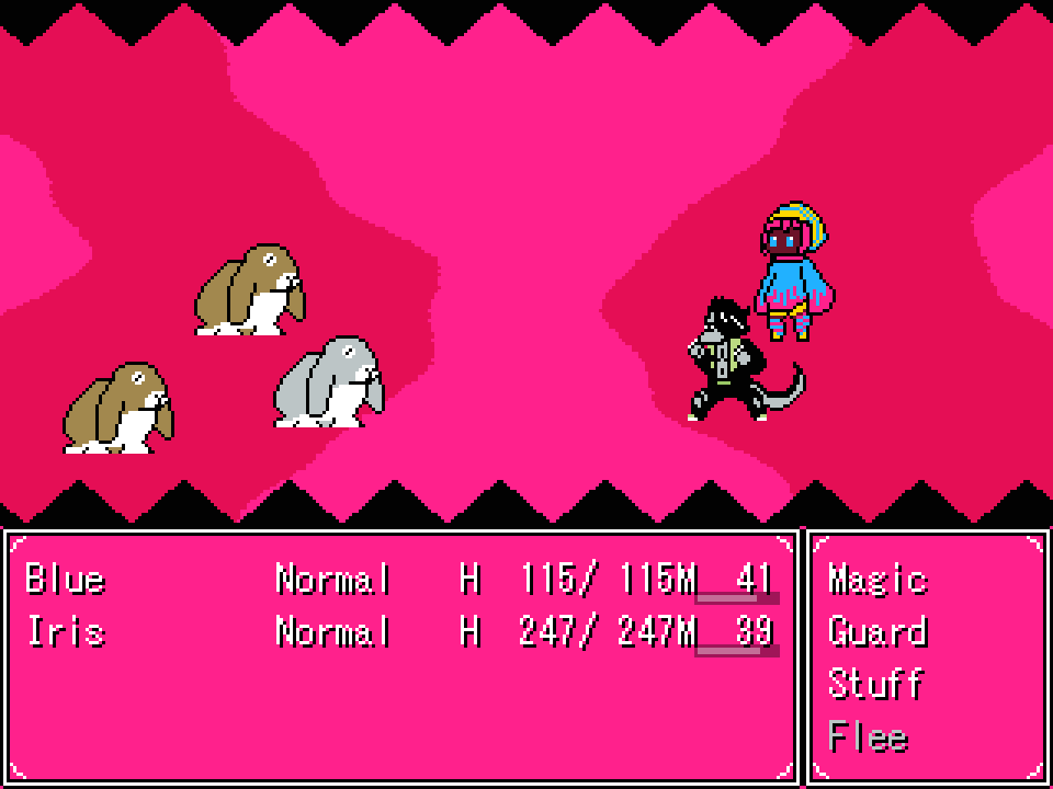
Blue - a human-dog hybrid - and his boyfriend Iris - an anthropomorphic snake - live together in the small village of Smalton. They live a generally peaceful and happy life together.
One day however, as they are going about on their daily errands - their home village is attacked by an army of ghosts. Thanks to Iris's brawn and Blue's magical abilities they're given the chance to retaliate. But it's not going to be that simple.

- Traditional Active Time JRPG Combat
- A variety of Puzzles and Challenges
- The occasional Secret
- A short (30 minute - 1 hour) experience
- Rabbits
https://lumiscorner.itch.io/blue-iris-vs-ghosts
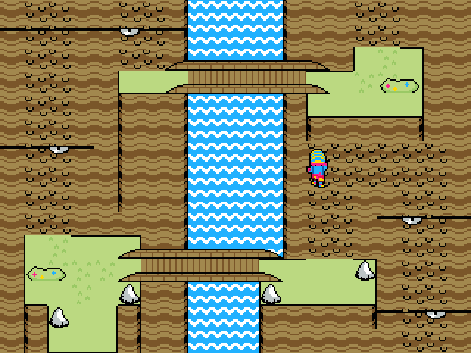
This is extremely impressive!
However, There's some jank where if you double tap the arrow keys too quickly the next press will cause a dash even after a significant waiting period.
The platforming could benefit from being able to hold down to fall through platforms instead of having to press it each time, and having a variable jump height mechanic (tapping jump results in a smaller jump than holding it) but, knowing the limitations of RPGMaker, I understand these may not be easy or even possible to implement, as its already a feat that this game controls as smoothly as it does.
I really enjoyed it though, and I'm very much looking forward to seeing further progress!


