I really like this one, very cute and chill actually. Clever idea, well executed. I like the movement as well, I wouldn't want to have any significant acceleration/sliding in a game like this. Great job!
melancholerik
Creator of
Recent community posts
One of my favorites of the jam. There's a lot of games that I like parts of, but I really like everything about this one and I don't mean just individual parts. Everything just works together very well, as a super polished package.
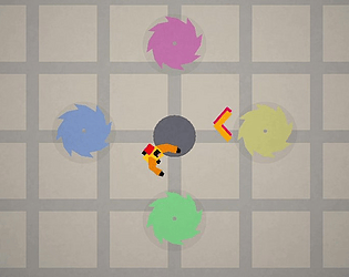
The core mechanic of stopping discs in place is fantastic. The tension it creates, making the game easier and yet harder at the same time...it's just so clever, I really love it. It feels really cool to time it so that the discs are clumped together to take as little space and possible, or to overlap previous discs.
Controls feel great and I really like that you can play with mouse only. Not my thing but hey it's cool to give players options. I like that, like Disc Room itself, you help players in some ways. Hitboxes are generous and slowmo when discs are near feels awesome - this is the thing that makes the game 10x better than it would be without it.
The visuals are clean, eye-catching and just really cute? But it doesn't just look great, it works in context. The game is super readable right away, it just makes intuitive sense. And audio as well, there's so much to like there. The adaptive soundtrack, the dark drone-y synth after you die, the chaotic percussions of discs bouncing around. Also, the intro music gives me Devil Daggers vibes, or maybe something else that I can't remember. Anyway, big fan of all of the above!
Y'all did a great job and I think you should expand on this and release it as a small Steam game, honestly. I can imagine there being more of a room sctructure, like in Disc Room. Or just keep the infinite mode and make it a score chaser with leaderboards.
Absolutely adore this one. Great job!
I really dig it, there's a lot of clever ideas here I think. Scoring based on how far away you are is such a cool way to create challenge, if one wants it. Having to literally go back and forth between picking up discs and throwing, spending additional time in this pixely hell...I absolutely love that. I also like when the last enemy goes berserk and starts throwing two more discs, that kept throwing me off for a while but in a good way! Or just how the game gets more and more mad, with big slow discs that just patrol back and forth, then those start shooting... :D All good stuff.
My main issue is that the game feels unfair - it's not, but it feels like it is. See, I really like the art style, but I find it hard to read while playing. It's often unclear how far away discs are, and sometimes you get hit when you feel you shouldn't. I think a couple of things would help. Having some sort of grid texture on the ground, combined with shadows below discs would help gauging the distance/position better. This game would also benefit from a lot of of invisible "helpers", just trying to be a little nicer to the player. For example making player's hitbox a bit smaller, or having an extra grace period after rolling, just for 2-3 frames. Just little touches like that, you know? Instead of thinking you died an unfair death, you'd get a lot of close calls without making it trivially easy.
I think otherwise you've got a really solid thing here! Good job!
Thanks for checking out my game and for the kind words!
Haha, I don't think there's any real trick to it! It's just timing shots precisely and, ideally, trying to do it in one uninterrupted combo (getting a successful hit within 3 seconds of the last one). Scoring may be too biased towards chain vs individual hits, but I really wanted to reward that.
As for "zen mode", that I'm really glad to hear! I really need to concentrate to do well and yeah, you enter this flow state when you try to push for high score. Although I'm wired in a way that once I make a mistake, I'm very likely to do very badly for the rest of the run :D
dulsi's comment gave me a laugh because I'm in the opposite camp :D "Hey Devolver, this is a pitch"...that's so freaking confident but also charming to me. Good on you for trying, why the hell not!
But like other's below, I did have a hard time to actually play it and process what's happening on screen. I don't think I get it BUT I like how weird and bold it is, it definitely left an impression. I'll try to play again and figure it out.
Hm, honestly, I feel like there's no reason to ever stop shooting. Yes, the recoil is there but it's not really that big of an issue and your own movement can fight it no problem. Once you get the minigun and say sawbreaker on top of that, the game becomes trivial, because you can destroy most of the saws before new one spawn in. If there was an incentive to stop, I think it would help a ton. Have limited ammo that recharges when you stand completely still. Or ammo packs that drop in random places on the map. Or something more original... :D I realize my suggestions are pretty basic, but I guess you get my point.
Besides that, I think the game is still well put together! I think it looks really good, simple but it works. I like the shop idea as well, grinding a little bit to unlock stuff but for just that one run. I think that's really cool. Overall I feel like there's potential. Good job!
Spent 30 minutes playing this just now. Got to 18, I don't think I can push it any more but I'll try.
Really A D D I C T I VE.
The idea is already good on paper but it's executed so incredibly well, it's ridiculous. No seriously, I'm literally laughing out loud because of how good this is. It's literally SCB x Disc Room and you freaking nailed it. Mega!
For transparecy's sake, I did update my game after submission deadline. I uploaded that as a separate build and that's also when I added the browser playable version. The original executable is still there, though, and I put the disclaimer on the game's page as well.
I didn't mean to cheat or anything, but if this disqualifies me then fine. I just had fun working on it and wanted to add a couple of things that I had to cut before the deadline, mostly UI polishing touches and bug fixes. Otherwise, the game is largely the same and again, the original version is there if anyone want's to check it out.
Hey, thanks a lot for the kind words! I'm glad you enjoyed it!
Yes, I'm aware that some stuff in the browser version doesn't quite work :/ Apart from the issues you mentioned, music doesn't loop smoothly as it should either. I'll need to work those out for future games because I'm not experienced with HTML5 builds at all haha.
Your comment also reminded me that I forgot to put a disclaimer on the game's page, but basically I did update the game one day after the deadline which is also when I added the HTML5 build. Never intended to hide that fact, literally just forgot. But the original version I submitted is still there for transparency and I added the disclaimer now. The differences are in some bugfixes and added juice to the UI, which I had to cut for submission.
Hey Daniel. I've been trying to make it work on this Unity version but with no success.
- SnapshotRP is assigned Project Settings > Graphics > Scriptable Render Pipeline Settings
- Snapshot RP is assigned in Project Settings > Graphics > Rendering
Adding renderer feature to selected renderer and setting doesn't do anything right away. Setting Render Pass Event to Before Rendering Post Processing turns scene view and game view black. Setting it to After, scene view is still black, game view is not, though the effect is still not applied.
I'm not sure if I'm missing something. Is the setup to use these effects more involved? Does it require multiple cameras, multiple renderers in the pipeline or stuff like that? Or is it just an issue with that specific Unity version? :(
Hey! Thanks for the reply!
For canvas size setting, I think it could maybe be something similar to color picker? Little icon that expands into two text fields after you click it, one for vertical and one for horizontal size? Or it can just be in the menus up top somewhere? Not sure haha.
As for the shortcuts...it's weird. Shortcuts for tools work perfectly every time. But those two I mentioned stop working after a while (although they still work when accessed from menus). H seems to consistently stop after interacting with canvas in any way. Then I toggle it from the menu at the top, or by rpessing icon at the bottom - after that it works again, but only until I interact with the canvas again. Undo is a bit trickier to pin down I think....sometimes it works ok for a while and then just stops, but I'm not sure yet what's causing it. Will investigate further once I get home and will let you know if I figure it out.
Moving entire layers - yeah I'm aware, although it's not present in manual on your site either, I think. I found out about it here in the forum post. But that brings me to another suggestion: could there be some visual indication of what layer is currently active? Or is there and I'm just not seeing it? I think that would help me avoid some incidents.
Yeah I thought so that you were using Ronin for that kind of stuff. Well, maybe I'll give it a go. I mean the app is super useful because of how minimal and restricted it is, so I get it - I was just hoping there was some hidden parameter I could tweak :) But I can live with that.
Been tinkering with Dotgrid more and more lately and there's a couple of things that stands out for me, that would make it a lot more viable to use. It's possible that these features are already implemented but are undocumented (I checked your guide before posting this but that's all about pretty basic stuff).
- Setting "canvas size"/number of vertices - I found this thread but CTRL+P isn't working for me. Is that feature still in there? Or was the shortcut changed? (speaking of shortcuts, some of them like H and CTRL-Z stop working for me after I interact with the grid itself)
- Alternatively, it would be cool if there was a rect selection to specify what to export. This kinda works but involves resizing the window itself and moving layers around etc. and it's just very...hacky? But again, there may be another way of doing it that I'm not aware of.
- Is there a way to set export resolution of PNG files or is that something that needs to be done in another app?
Otherwise, I really like Dotgrid! It's such a nice environment to work in and is pretty much what I was looking for. It would be super cool if I could do everything without a need for another app just to resize/crop stuff.
But regardless, thanks for making it! <3
Yeah no problem, glad to help!
Back to the stun thing - yeah, it would probably help if the player could see the HP. Although, what I meant was really about the specific effect and animation :) Like, if it wasn't smoke, but let's say stars circling around the poor guy's head, it would probably convey the stun state better...? Doesn't have to be stars of course, but that immediately came to mind since it's a common way to deliver that kind of information in games/cartoons/comics. It's really more of a visual language thing, you know?
Adding +1 action each turn helped *so much*! Really love where this is going so far. :)
Also, I have a bit of feedback if you don't mind:
- It would be great to have some sort of hp indicator on enemies. Right now, I'm not sure how exactly they work, how many hits they have to take etc.
- since it's possible to cheese madlads and trick them into attacking each other, it'd be probably good to know their turn order, similar to how ItB does it
- this is subjective, but to me, the stun effect looks like they're about to die. As if, you need to punch them one more time to kill them, which ofc doesn't have to be the case.
Thanks! Reinstalled and deleted save data like you told me and now it seems to work fine. I'm looking forward to play story mode :)
However, after I pressed the "delete all data" button, I couldn't interact with the game - seems similar to other two bugs. I couldn't tell if it did something or not, and couldn't go back either, so I had to quit the game from OS. Not a major problem, I opened the game again after that, and everything worked, I could create new save/character etc.
Hi, just tried the game, and there's a couple of things that didn't go as expected. I'm running a macOS version.
1. Not sure if story mode is implemented or not, but I'll get to this screen and can't progress. Clicking on either saves does nothing. Can't go back either, I can only force quit the game.
2. I went into offside once (it's been a while since I played or at least watched a football match :D ), the offside animation popped up, but after that I couldn't interact with the game anymore. There seems to be some kind of overlay going on.
Hope this helps. I'll let you know if I find anything else :)
Heyyy, sorry for the super late reply...and thanks for taking your time, playing and writing all this! <3 It really made me smile as I read it :)
Regarding the 'death screen' bit - what I wanted to achieve with that was letting players know that they're not off the hook, just because they died. I feel like in a majority of games, you either loose all your progress (roguelites, etc.), or too little of the progress. I wanted to make that risk high but erasing all your progress, but still give you a chance to fight against that. Also, I think it complements the whole 'you haven't done enough' idea. So yeah, those 5 seconds of mashing the X weren't supposed to be a nice, calming experience :D Basically, to let you know that if you've lost all your progress, it's all your fault...that kind of thing.
All that said, if I've learned anything from this game jam, it's that I really need to think about if what I think is obvious...is really obvious to anyone but me. Like, I realize there's a lot of things there, that aren't communicated very well...and I think this is one of them.
Now, I wanted to play your game and give you my thoughts on it (since this thread died off a bit), but I can't get it running. :(
Everytime I try, the error pops up saying some dll file is missing. Then it asks me to install some UE4 stuff, but that didn't help either, as it keeps throwing the same error at me, so... :/
Peldon:
I really liked your game. More than anything, I love that it's literally what the original Pippin's idea says. I guess there's a potential to make some really grim existential Twine game with that theme :D but I like your silly approach more.
I don't really have anything to criticize about it tbh. It was immidiately clear about what it wanted me to do, and even though it was a bit frustrating, it was fair (unlike some silly lol-so-broken-physics games), and weirdly, I felt really chill for those 4-5 minutes I played it.
I also like how the logo, font and the music go together and create this Stanley Parable-ish theme/atmosphere...it's almost ridiculous how little it takes sometimes, isn't it? :) OH and I love that stapler actually...staples. :D Took me a while to notice, but that sound is a nice little touch.
Overall - lovely :)
Here is my much less polished entry: https://melancholerik.itch.io/museum-avenue


