Thank you! Glad you like it :)
Miles Logan
Creator of
Recent community posts
Chrome Dino move over, Jericho is here.
Your art and music selection is as great as always, what more can I really say on those fronts? In terms of gameplay, I love the fact that objects can end up stacking on top of each other, It adds a nice aspect of strategy, where the game isn't all about reacting, but rather preparing in case a giant stack appears. But on the other hand, if you fall behind, you want to stand on the ground because you'll move back up away from the cat. Fun strategy.
My only critique is that sometimes the colliders, especially for the sword, feel inconsistent compared to the sprites and I feel like I occasionally just fall through them.
Even with that I really enjoyed the game! Great job Euris!
Hey Jordan! Great job! The art is great as always, and I LOVE the hand written words that have a little bounce to em. Sound effects are great, love the new uses for the classics.
My only slight piece of feedback is that I wish the opponent had a few different playstyles, and the game became more a game of strategy and figuring out the controls rather than luck. RPS generally seems like a luck based game, but there are predominant behaviors that emerge between players, so I think it would be nice to emulate those.
Regardless, the game is still very fun and has all of that good game juice. :)
Hey Santi!
Lots of great things here! Love the art all around, especially the pigeons. A big highlight for me is the audio which really creates a strong ambiance.
The one thing that feels a bit off for me is pressing space for food. While the game is from the perspective of a pigeon, the player is the one controlling the human throwing the food. I think a way to fix this dissonance would be to add a specifically loud cooing sound right before the food is thrown in order to have it feel like the player is asking and receiving food, as opposed to having direct control over it.
Still really love watching those pigeons! Great job!
Great job Gen! As always, love your artstyle, but I think the concept of the game is what really shines here. I love the idea of exploring your past and putting together memories, with the cherry on top being the nessescity for the player to remember key pieces of dialogue. I think there is so much here to potentially expand on and turn into a full game, so I really hope someone picks it up (I will def advocate for it if we aren't in the same group).
I think the one thing that feels off to me is the lack of clicking sounds when progressing through the visual novel portions. It feels a bit weird without that audio feedback and it just leaves it feeling a bit empty.
Still, thats a pretty minor blip in an otherwise fantastic game, great job Gen!
Hi Jordan!
REALLY great job with this one! The core design and aesthetics are amazing! It's a really unique concept and it's a very addicting gameplay loop. I could easily see this as one of those games that gets #1 on the app store because of how simple yet fun it is, especially with it looking this good.
My one critique is that I feel the difficulty could use a bit more tuning. Right now the game feels a bit more like a test of patience and interest rather than one of hardcore skill. I wasn't really ever worried about being caught and my longest playthrough was to around 22 minutes stolen until I lost on purpose to see what losing looked like. I think the time to react to the eyes could be decreased, especially when getting later into the game. I think that would take the game over the edge and make it the best version of the game it could possibly be. With a harder difficulty, I could see myself spending way too much time trying to squeeze out a couple of extra seconds past my high score.
I know this critique may read a bit harsh and I'm sorry :( but it's because you really nailed everything else and I legitimately think you should work on it a bit more and publish it on mobile app stores. I cannot stress enough how great this is. Phenomenal job Jordan!!
Also: Can I make it on to the high score board 🥺
Weird vibes and I'm here for it. Very entranced with the different aspects. Love poking the eyes and seeing the wild text compared to the pixel font. love scrolling through the text rapidly, it looks so smooth. It's weird and dissident but it is dissident in a way that ends up feeling cohesive (ik thats kinda paradoxical but idk thats what I'm feeling). The one thing that feels off though is the fact that you can't poke two of the eyes, it is weird since you can poke the rest. Still great job creating something with such a unique style and feel!
Great Job! The animation of the wheels is super smooth, the mechanics are easy to grasp, and my favorite part has to be that there is no win condition, only a loss condition. Very accurate to roulette and blackjack, the two games that I assume you were inspired by. My one gripe is that I wish there was sound. I think it would be great to hear the wheel turning, and maybe the sound of smooth jazz trying to get me to stay awhile and gamble more. Still, the fundamentals are here and they are done right so good job!
Oh my god this is so good and creative! I'm actually obsessed. You did such a great job turning the random pack of assets in to a cohesive whole and making a satisfying experience. It's fun to walk around and see how everything is displayed. I love Etheral Sprite. I love the faces constantly switching. I love the headless man with eyes that follow you around the museum. As mandated by the class, my one critique is that the mouse sensitivity is a bit high for my preference, but I also know that WebGL messes sensitivity up so I'm not bothered by it too much. Again, I cannot stress enough how much i love this, great job!
No more subways or taxis, only palm road :)
Great job, you have such a strong aesthetic with the lighting, music, floor, and palm trees. I could just see this as my desktop background if I could have a video for it. If I really had to suggest something, it would be that maybe the trees could spawn closer together? There are times where there is a gap between them which does break the flow a little bit. Not a huge deal, and the rest of it is so good that I'm not really bothered. Great job!
Hey Gabi! Great concept! Really fun to play around with the physics and not only stack things up, but push them around! One thing I think could be improved is making the colliders a bit more accurate, as some things feel like they stack a bit too effortlessly, with the bananas being a standout, since they have such a distinct curve. Still, super fun! Great job!
I love the void and I will cherish the void. Great job. Simple but well executed, perfect for a virtual pet game.
The one thing that I feel is lacking in the game are sound effects for petting and feeding the void. I know it's tricky to figure out what the void sounds like, but it does feel off when there is no audio feedback for my actions. Still since it's a void, I understand if you want to leave that slightly uncomfortable feeling in the game.
Again though, great job. I will forever be devoted to my little void.
Omg Siena I love it. First off, super creative making the room the virtual pet, its just so clever. Then also your art is amazing as always, and you topped it off with great sound design.
The only other thing I could possibly ask for is to have a progress bar that shows how much more happy the room could be, that way I know how much more furniture will pop up, since I wanna be sure I'm seeing everything.
I cannot overstate how much I love this. Great job!
Very simple yet funny concept, with great art to match it! Great job Ronojoy!
To be a little bit nitpicky, I kinda wish that the transitions between phases of goth-ness happened on different beats of the song. I was looking forward to see what would happen when "WAKE ME UP" hit, but nothing happened then and the transition only happened a second later, which felt off to me.
Still, great job, really funny take on the virtual pet genre!
Hey Abby! Great job! While I hadn't thought about it before, "spinning plate" games and virtual pet games are a pretty interesting match! Great idea to put them together, and you executed it well, with great style.
I think my one comment would have to be on control scheme, as while I think clicking works for the game, I can't help but feel like having to constantly mash buttons that are in four different corners of the keyboard to "calm the creature." I think that may give more of the frantic feeling that I got from the limbs moving. Still, clicking isn't bad, and you may have thought about/tested the above and it didn't work, but that was the one thing on my mind while playing.
Overall I still really did enjoy your game. I really enjoy the fact that you rejected the stereotypical "cute" vibes of virtual pet games :)
Great Job Philip! This game does a great job of subverting the genre of Virtual Pet games, and it was fun to go in three different directions (cute pet game, horror game, and meta game)
I don't have much direct criticism since I enjoyed it a lot, but I think if you were to further expand on the game, I'd hope to spend more time in the earlier two phases of the game. I think if you spent more time in cute pet land, it would help the horror reveal feel more impactful, and then the same from horror to meta.
Again, amazing job, it was super fun to play!
Wow Jordan, you did a great job with the design and implementation of this game within the week! It's so easy to grasp but keeps my interest high and makes me want to keep coming back. The difficulty scales super well too, as while it's not hard to balance the two colors, it can quickly get hectic to balance more and more. The segments between new colors are the perfect length, where they allow time for the player to get comfortable, but not too comfortable.
To give a pretty small nitpick, I wish there was a bit more space between when a new color is introduced and when platforms start to appear. On my first playthrough, I lost a heart right after green was added, because I wasn't sure where it was added in the rotation, and so I didn't know how many clicks were necessary to get to the color I needed. While this doesn't become an issue in subsequent playthroughs, it still felt a little cheap when I was first starting, and I wouldn't want that potential frustration to cause anyone to shy away from this otherwise amazing game.
Again, I cannot stress enough how great this game is. Maybe even better than Buford, Wyoming... But in all seriousness, great job!
Omg Abby, when you told me the name of the game, I didn't fully know what to expect in terms of gameplay, but this is amazing. Very satisfying to just continuously smash nuts. It has a peaceful feeling that not a lot of one button games do. It also feels great to see the visualization of all the nuts you've smashed just keep expanding.
An incredibly small nitpick that I have is that sometimes, while moving right to left, my hammer would move at around the same speed as the conveyor belt, which meant that I wasn't able to it anything for that short period of time. It's not a huge deal, but it was so satisfying to continuously smash nuts, that it did suck when I was taken out of that loop.
Still, that is such a tiny nitpick on an otherwise amazing game. Very cathartic to destroy the things that can kill me :) Great job!
Hey Lex! Very excited to see that you made a narrative focused game! I think most people took the prompt and leaned more towards action games, so it's nice to see your take. I also think the simplicity of the mechanics matches the simplicity of the inputs. Very easy to pick up and understand.
I think my one piece of critical feedback would have to be that it would be nice to have some sort of indication of how many dialogue options there are before silence is chosen as the response. It's not universal between options, and while I do understand the decision to make it "chaotic" on purpose, I think this little bit of polish could make it feel like a controlled chaos, where the player doesn't know what other options there are, but they do know that they could be locked into silence soon.
Even still, this is a great game! I always appreciate a nice non-linear narrative game :)
Hey Santi! Great job getting value out of the one button. The ability to move in both directions works really well, and creates some strategic depth as you need to figure out which direction to go in, and whether its one or two presses to go that way.
To nitpick a bit on this topic, I think it might be nice if when going straight down, the arrow gives some sort of indication as to what direction it will move it next. I would occasionally forget (because I have the memory of a goldfish apparently), and I think it would just be a nice polish/QoL change.
That's pretty nitpick-y and not a super necessary thing to address though, and I really want to double down on how much I love your use of movement tied to the one button. Very clever.
Hey Euris! Really great concept, I love that you've stuck with the Starducks brand for a while now.
I have to main points of feedback, albeit one is a bit more of a bug report. I think the game could stand to have more cups within a short period of time, as right now it doesn't feel like a "rush hour." I think you could really nicely adapt this to a level based game and have this be a starting level, with ones further down the line throwing things at you much faster. As for the aforementioned bug, it is possible to spam the spacebar while a cup of coffee is under the players hand to get additional points. I've managed to get like, over 150 points from one cup alone.
With all that said, your art is amazing, with the particle effects being a particular highlight, and your choice of music fits the mood really well. Great job!
Hey Abby!
I'm sorry you had that issue with the colliders. All the colliders on the objects should be identical (they may or may not be copy pasted...), but what I think may have been the issue was how the objects react and speed up on collision. The acceleration ends up being exponential, so if the object starts slower, it may take a hot sec before it feels like there is an effect.
My objects may accelerate slightly slower than the original which would also explain why you feel that the game is harder than the original too. I tried my best to balance the game in a way similar to the original, but its fully possible I went a bit overboard. I really struggled with the original and felt it was pretty hard, but i think I may have adjusted more to the controls as I created my version, and overcompensated for that fact. While I did ask a few people to test, I think I could have benefitted from asking them to play the original directly before playing my version.
As to your comment on the audio, I understand your point and why it might have been better to put the music in as it may fit more with the original vision of the creator should THEY recreate it on modern technology. However, when going about my clone, and when thinking about this very issue, I decided I wanted my clone to be faithful to the player experience of picking up and playing the game, not the original artist's vision. Ultimately the experience of the player is what makes a game, not necessarily the artist's intention, so I decided to replicate that on modern tech. I understand that it still is inconvenient, but I did ultimately decide that I wanted it to be that way.
However, in that same vein, your experience is what completes this game too, so I appreciate that you took the time to share that with me! Thank you!
Thanks for the feedback Jordan! Balancing the speed of the spinning objects was a pretty big concern of mine for the exact reason you hit on. When playing the original, it always felt almost impossible, and so I'm glad to hear that I recreated that feeling for you!
Also it makes me super happy to hear that you liked MOUSE! That's one of the few places that I moved away from the initial game, so I tried my hardest to make something that still fit the original feel :)
Thanks for taking the time to play it and leaving a comment!
Thank you for the feedback! Tuning the animation acceleration and deceleration was something I spent a lot of time on, as it affects both the look and the balance of the game, so I'm glad that it was a highlight!
As for the grid/step movement, I definitely agree with you that it adds some of that all important 80s computer gamefeel. It wasn't a huge consideration of mine while I was making the clone, but playing some other people's, if I were to go back to the game, I would revisit the movement!
Again, thank you for playing my game and giving some feedback!
This is an amazing clone, very true to the original! Visuals look great, and there's something endearing about the really grating audio (maybe thats just me though lol)
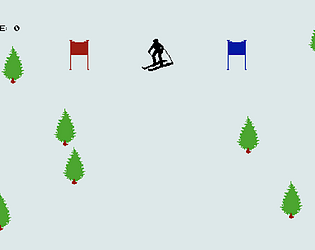
2 very small nitpicks. First, I think a life counter would be nice. From the lack of UI, I assumed you removed the mechanic of lives from the game. Was a bit of a rude awakening when I got a game over. Second is that it would be nice to create an area around the player on spawn where trees can't be instantiated. One night patrol, I spawned in and a tree was put directly in front of me. Even on the slower speed, it was impossible to avoid. I just had to take the death and reset, which felt kinda cheep.
Still, amazing job, a very polished final product even with the short turn-around time.
Hey Lex! Great clone! I love the fact that you got the game running on a grid system. It really helps contribute to the feeling of the 1980s computer game.
I do wish you could manipulate the speeds of the rotating/moving objects of the first 4 screens like in the original. While it's not much, it does give a bit of entertainment through those pretty long screens above just moving the cursor around.
That said, the 5th screen was very well done! It worked very well and brought in that feeling that was missing from before. Great job overall!
Hey Jordan! This is an amazing clone. While the core gameplay stays the same, there are some major upgrades in many departments. I love the change to holding for acceleration/braking. It adds a bit more depth as you need to start braking much earlier to avoid obstacles than in the original, where your speed would fall instantly. I think the shadows are a brilliant touch. The difficulty scaling in terms of the amount of trees over time is well improved over the original. Really good stuff.
The only gripe I have with this clone is the shooting. It feels a bit inconsistent. While the choice to not have shots fully auto-target enemies is not a bad decision, I really struggled to understand where my shots would go. Sometimes while turning, shots only went at a slight angle, while other times they would go so far to the side that there was no way that it would ever hit an enemy on screen. It ultimately led to some frustrating moments where the enemy was in front of me, and I thought I had a shot, but it would miss, and I would have to spend a fair amount of time to get into a position where I could make another shot (bc the later levels are v precarious)
Still an amazing clone, you did such a good job!
Hey Gen! Great job with the clone! You nailed the enemy bikers that you have to shoot. They move in a way that feels as though they are trying to avoid the player, but still move in a way that gives players plenty of openings, should they find their way around the trees :)
One critique I have would be that movement feels a bit slow. In the original I felt that I died a lot because when I was at the max speed in order to shoot, I couldn't maneuver around the trees. In your version, while it is easier to stay alive, it takes a bit away from the core "chase" idea of the game.
Still though, great job, you handled some really tough tasks like making those enemies and the random instantiation v well!
Great Job Drew! The visual style feels spot on to the original game, even in places where you may have made some changes.
To critique one thing, I feel that the way the cursor affects the speed of the object animations doesn't feel as good as it could. The acceleration speed was on the slower side, and the max speed felt a little sluggish compared to the original. It was impossible to keep everything but a select few moving at a time.
Still overall, you did a great job putting it all together, and it had the same weird vibe that the original did!


