In that regard, this is an amazing demonstration!
May I ask, out of curiosity, what made you device decide to code your own engine?
Nicholas Kuün
Creator of
Recent community posts
This is a surprisingly fun little game!
I won on my second attempt (after figuring out the mechanics on attempt 1) and I found myself frowning in commitment to saving poor private Bryan (love the name btw).
I only realised the timer towards the end, and I presumed it was a wave tracker, I almost wish it got insanely more difficult and were reversed to a highscore.
I really like the effort you put into it. I can see a lot of potential here!
A couple of things that stood out to me while playing:
- Maybe consider not spawning enemies right on top of the player and adding a brief moment of invincibility at the start.
- Having a quick restart option instead of going back to the title screen would improve the flow.
- WASD controls as an option would be great! Clicking to start and then immediately needing to switch to arrow keys felt a bit unintuitive.
You're on the right track! Keep making games—you're learning more with each project, and I’m excited to see what you create next!
Hi everyone,
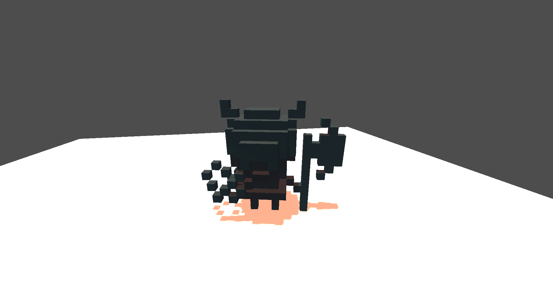
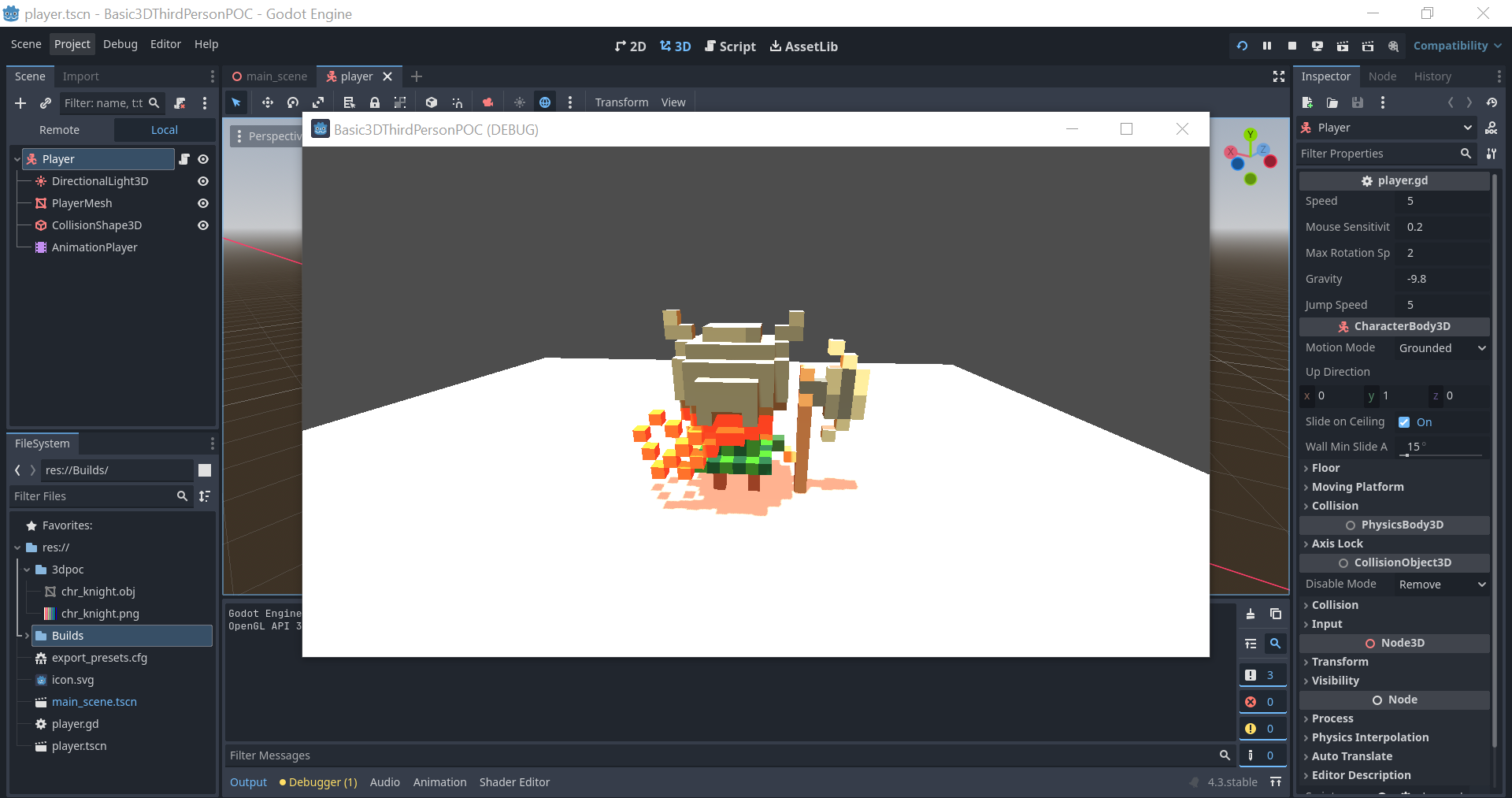
I'm new to 3D development, although I've been working with Godot for a bit now. Recently, I started experimenting with a 3D project using Godot 4.3. While testing the lighting in the Godot editor, everything looks good. However, when I export the project to the web, the lighting and colors appear completely different. It seems like the model is less vibrant, and the lighting/shadows don't behave as expected.
What I’ve Tried So Far:
- Adjusting light intensity and color in both the editor and environment nodes.
- Modifying the ambient light settings and environmental glow.
- Testing different settings for the DirectionalLight3D node.
- Experimenting with both the standard and compatibility renderers.
Screenshots:
- Godot Editor (working lighting)
- Web Export (different lighting)
Additional Information:
- Project Files: I've uploaded the basic project files and a sample export on Google Drive for anyone willing to take a closer look: Google Drive Folder
- Link to Game on Itch: Itch.io Page
Description of the Project:
I'm experimenting with a simple 3D character and lighting setup. The character is a voxel model with a basic directional light and ambient lighting for the scene. Everything looks fine in the editor, but when exporting to the web, the lighting appears flat and lacks the same vibrancy and shadow detail.
Apologies:
I apologize if this is a common issue. I'm still learning 3D development and would appreciate any advice or solutions you might have. Thanks for your help!
Adorable art. Loved the 3d animations and the feel of the world. I did however get stuck in level 4ish, just after getting the second round of growth-juice, I only had the ladder and it couldn't span the gap to the top? I could see this becoming a full title. Frodger was especially cute, has a lot of character. The third-person camera also really highlights the gamespace well. Good job for making this in such a small window, really impressive.
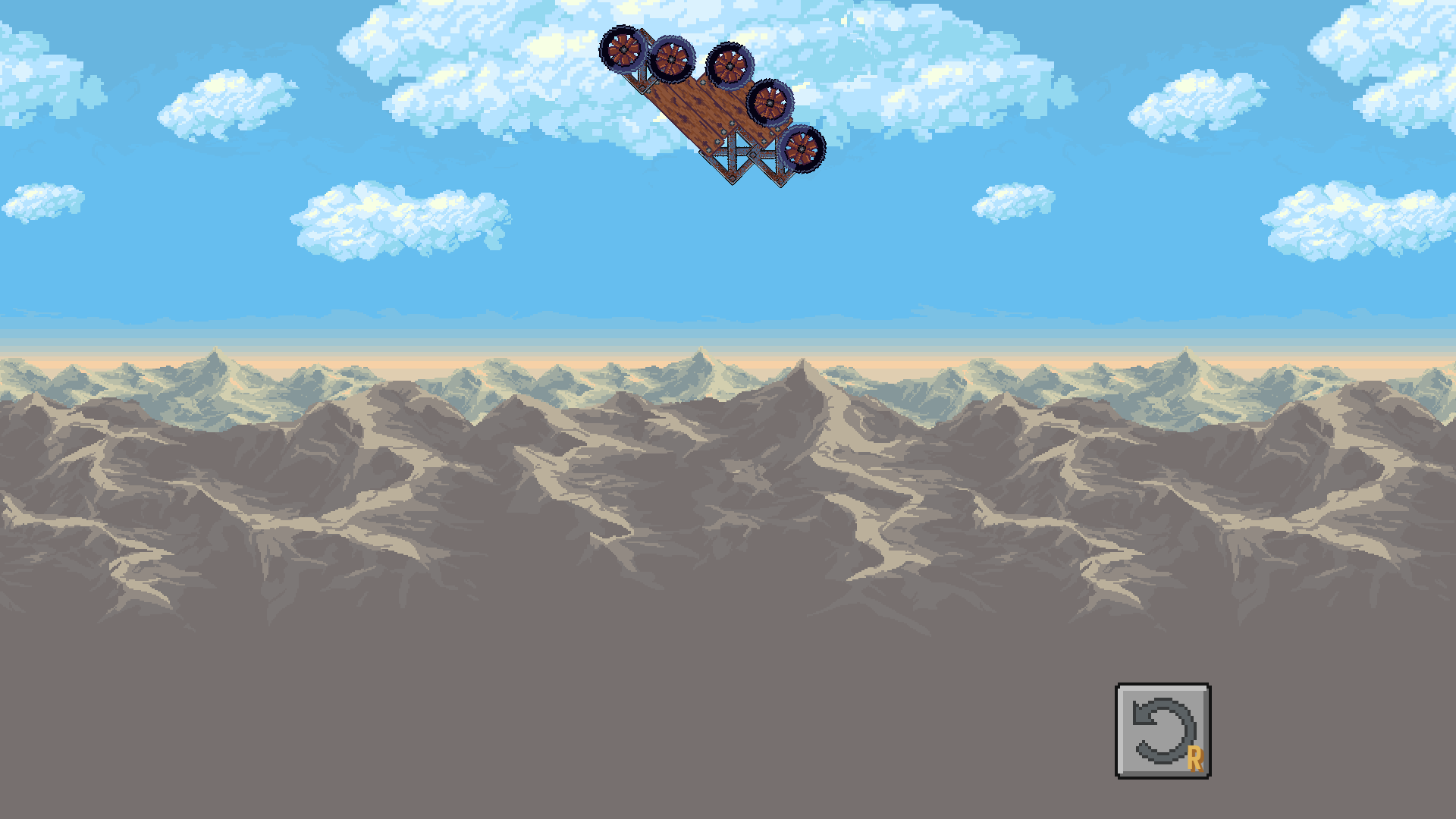 I downloaded your game from the description to avoid the physics bug, and I'm going to rate it as if this is what was submitted to the itch-jam. I understand that things happen during game jams, and it's all about learning, not scrutiny.
First off, I love the menu! It's really well done.
One thing I missed was the ability to rotate pieces. I think the game could benefit from a grid-based system, kind of like Bad Piggies.
Another minor gripe was the sound effect for 'can't place item' playing when swapping items in the hotbar. It made me think I was doing something wrong, even when I wasn't. Otherwise the music is great!
It would be useful if restarting a level kept my builds. Let's me more frequently iterate through solutions.
I struggled to get past level 2, even after multiple attempts. It seems like the wheels have no traaaction. That said, I genuinely enjoy the gameplay. This is the kind of game I love!
I noticed you're using Godot and mentioned switching the default physics engine. Do you mind sharing your preference for this choice? We also used Godot for our project, and I've been wanting to create a game like this myself. Great job overall!
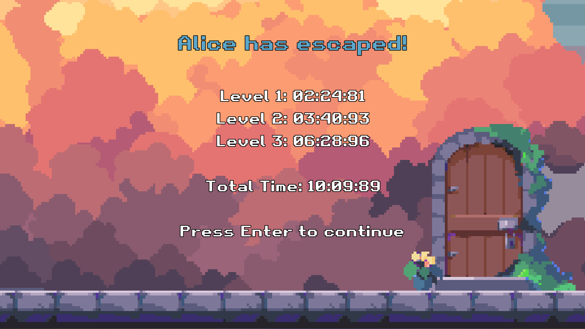 I enjoyed playing this! The levels are clean and you did a good job to make sure to never leave the player stuck. I usually do not like puzzle platforrmers, and I felt myself engaged with this. Appriciate the level design that went into this. Almost gave up more than once, but that's a me-issue. I think the checkpoints stopped me from leaving, because I got to just try something new right away.
Cute game! I definitely felt a little too big in this world. Some ambient music or sounds would have gone a long way in enhancing the atmosphere too.
I really liked the Pokémon-esque paths you included—they made me feel like I was traveling between towns, which was a nice touch. I also wished I could view my blog or even just my uploaded images.
Overall, there's a lot of good charm here, and it’s impressive to see a 3D game come together in such a short time. Great work! Thank you for rating our game. :D
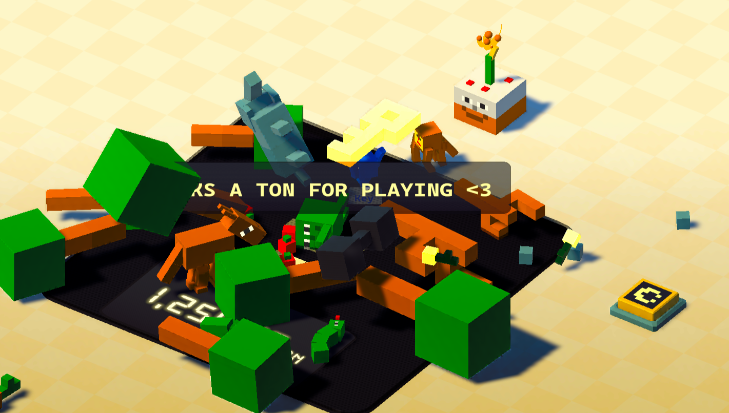 OMG, SO MUCH CHARM! I absolutely love the scale talking to me, the music, the aesthetics, the sounds—everything just comes together so beautifully.
I found myself really compelled to experiment and see how everything interacts with everything else. The water growing the tree? Loved it. And I have to admit, I kind of wished the snake would hit the button while he wiggled—so much potential for playful chaos there!
The elephant was a real turning point for me—just when I thought it wasn’t going to be possible, it all clicked into place.
You've done an amazing job. I’ve never tackled a 3D game before—it looks so intimidating, but you’ve pulled it off impressively. Great work, Jam Twin! <3
This game is pretty cute. The menu design and simplistic art style are spot on, and seeing another game made with Godot always makes me smile. Thanks for rating our game too!
I found myself wishing for a bit more control in how I interacted with the game. The bar at the top always starts in the same position at the same speed, and I think adding some variation or control could enhance the experience.
The difficulty curve ramps up quickly—I found it getting tough pretty fast. Maybe easing into it more gradually and introducing different shapes could add to the fun. You've clearly put a lot of effort into getting the stacking mechanics to feel good, and I'd love to see that applied to even more varied gameplay elements.
The aesthetics are well-done, with the camera movement and sound design adding to the charm. Really impressive work, especially considering you were a solo-dev on family vacation while developing!
One thing I’m curious about—how did you manage to remember the player's max-height for future sessions? That’s a neat touch!
Thank you for rating our game! Another team with Godot - represent!
I loved the ambiance at the start of your game; really set the mood.
I did struggle a bit with the controls at first. Using WASD to move and then "Z" and "X" to interact wasn't very intuitive on a QWERTY keyboard, but once I figured it out, it started to flow better.
I would have appreciated more checkpoints, especially since I'm not the most proficient at puzzles. That said, I did feel pretty cool when I eventually solved some of them.
Overall, it's a cute game with solid gameplay. Great work!
Yes, that was intentional! It emerged as a fun design pattern during development—finding the fun in guessing the weight was part of the challenge. The different physics properties were a rewarding challenge to implement, so I'm glad you noticed. Thanks for the comment, Kaylee! I'm excited to check out Frodger's Courtyard Quest too :)
Thank you so much for playing and for leaving such detailed feedback! I’m really glad you enjoyed the art style and the animated items—that was something our team had a lot of fun creating. I totally hear you on the music variety, and we’ll definitely take that into consideration as we expand our skillset.
As for the weight mechanic, your screenshot actually highlights something intentional: the goal is to get the scale's weight to match the target exactly, rather than getting the highest-possible value. I can see how that might not be entirely clear, so I appreciate you pointing it out.
And yes, game jams often come with their fair share of bugs! My favorite is when you select a level with many objects (like Level 3) and restart before it’s fully loaded—you end up with items that don’t belong! Definitely something we’ll look into post-jam.
Thanks again for the feedback, and I’ll be sure to check out your game as well!
I have some suggestions for improvements, which I am sure you have already considered:
- The default attack button takes away from one's ability to use the left stick to attack. Rebinding this button made my player only attack towards 5 o' clock.
- The first town the tree beneath the house with the slime, the ground around the water by the tree pulls me in more than it should.
- There was a bug where I was getting the third attack's combo distance strike on all of my attacks, this was tough to replicate though
- One is still able to spam attacks by spacing the attack key by about 0.2 seconds, it feels like the combo should chain more aggressively.
- I couldn't find your exploding rock. :c
The game is looking really good!
Love your YouTube content; keep up the good work.


