Thanks for playing the game! Also appreciate great feedback on the grabbing! I agree, it would definitely make it feel better if the player held on to objects until letting of grab, unfortunately ran out of time to refactor the grab spaghetti code I threw together haha
Not_Absent
Creator of
Recent community posts
What did this game do well?
****************************
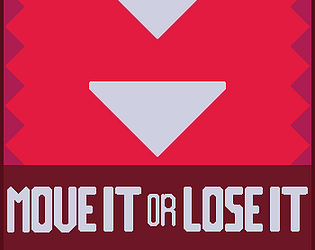
The game is simple in design. Kind of reminds me of some of the online reaction tests that I did. The art style and font are consistent throughout the game. I also appreciate the fact that the player data is persistent so my highest score is kept even after I exit the game page.
Conceptually, the goal is very easy to understand, and I like the bright colors. The ability to click the button multiple times as long as the shapes match was also a great addition, because it definitely makes the gameplay more addicting. I feel like the game does a great job of drawing people in, and keeping them hooked.
The shape match timing condition was just about right to ensure the player focuses on the game and gives a wonderful sense of acheivement on correctly matching the shape.
I love the idea where the player can click on the button multiple times when the two shapes match.
This game feature the Minimalism, and this game idea of shape-match is a good start.
As a player, this game is easy to get start and easy to learn.
This game's art follows the style of this game and I think it fits.
The replay could be ensure by just click the button.
It display my highest score, which is a good design that encourage players to retry it on.
I like the simplicity of the game. It really captures minimalism in spirit. The idea of a high score function is also smart to encourage players to get better and better scores each time. I think the health system has a good idea behind it as well, though I touch on the execution below.
========================================
What could this game have done better?
****************************
The controls are not intuitive. I had to read the game description to learn that the red circle is the button. The game could also benefit from more audio and visual feedbacks. Even though the game can feel satisfying when you're playing it right, I don't think the mechanism is interesting enough for you to want to come back and play it again.
The button in the middle very much looked like part of the shapes to be matched, which led to a lot of initial confusion. Therefore, the UI could be improved to make the actions more intuitive for the player. It would also be interesting if the intervals between shape changes varied a little bit more, because at the moment it feels quite fast-paced and it's hard to process that they're changing at different rates---perhaps they could start slower and gradually speed up as the game progresses.
I think there is some stuttering when the shapes change. This could be made to be a smooth transition. Also some music would have been nice.
First, I notice one thing that when a pair shows up, I can click the red-button multiple times before it move to the next pair, which means I can match more than one time by the same pair. I think a condition need to be add to the script in this.
Next, I think the highest score and the score could also be display to the end screen so that player could see what score they got there.
As the score went higher, I think it could be better if the pair can stay shorter period to increase the game difficulties. For now, it is easy to match up if player have time to sit there and play: I feel it does not have too much difficulties on it.
Last, I notice that when a new pair display, the top one always display first and then there is a small lag before the bottom pair show up, and that might be a problem when you try to speed up the refresh frequency later on.
The game is almost too simple. I think that the games depth can be increased in a few ways:
1) The health system is a good start, but more things should take away your health. Maybe if you miss a match you lose health?
2) The matching system should slowly increase in speed as your score increases to create a difficulty curve.
3) Another way to add difficulty is increase the number of shapes/columns that someone will have to match.
What did this game do well?
****************************
interesting! funny! and challenging! good idea and intuition
It's a fun and simple premise that is intuitive to understand, and makes you want to keep playing. Adheres to minimalism very well. Nice choice of chill music.
The game allows for a lot of skill expression and players can get better at the game with practice. The background music and simplistic color scheme also adds to the game feel and makes the game feel more peaceful.
The game's physics implementation was well done. The alignment of blocks mechanic was very unique and gives a wonderful sense of accomplishment to the player on successful attempts.
This game has very fun game mechanism. With such a simple rule, leveraging physics engine, the game has depth for players to explore and practice. Cute UI and soft BGM are also good property of this game.
I felt that the physics as far as the shapes falling on the table was done well. I think that the fact that the shapes don't just fall on the table and hold their position as soon as collision is detected is better for the game because it makes it more challenging in terms of you also having to factor in the distance between the top and the table since more distance means the impact will be greater.
This game successfully feature Minimalism and it attract players to keep playing for a higher score. As a Minimalism prototype, this game did great in game theme design and idea generation. Besides, the music is very smooth, which perfectly fit the gameplay. All in all, this is a great prototype.
Leveler did everything right as a minimalist game. It was simple to play, however it did everything right with it's game play loop. The physics felt right and I noticed myself trying to constantly get the high score which in my opinion is the most important aspect of a game.
========================================
What could this game have done better?
****************************
More accurate physical simulation
The visuals are a little plain, so adding colors to the different blocks could liven it up. A high score list would also be welcome.
I think the variety of blocks could be expanded upon to create a more interesting interactions between blocks.
I think with the blocks just falling down, the level of challenge the player experiences is easier than it could have been. For example, when the block fall off the base, there is no scoring system to reduce points scored by the player. Because of this, the game turns out to be just hitting the button to reach a greater height without a sense of urgency or cautiousness. Also maybe with decrease in time remaining the game could have sped up things like in classic tetris.
The line indicating scores is not that precise.
I feel like the line that detects the height wasn't very accurate or at least wasn't displayed accurately. I always feel like the line is always like a little below the top of the stack. I feel like that line could have been done better.
It is a good start, and some add-ons could be added later. I notice there is a little margin error between the Height green line cut-off and what it display on the screen. For example, if the green line will always be a little bit lower than the actual height I saw in the screen.
Other modifications are included during presentations, such as building different difficulties and set-up a global rank thing. In general, this game did a great job.
One more thing, I think the timer could be larger since it is very essential and sometimes I focus on the gameplay and forgot to see the timer.
What did this game do well?
****************************
Simple. Follow the rules of minimalism.
The game excels at offering a challenging puzzle dynamic by requiring players to select cubes in the correct sequence. Its increasing difficulty with longer orders keeps gameplay engaging and progressively harder.
This game achieved a minimalistic style well while still allowing for skill expression, both through memory and dexterity. The sound feedback is also a nice touch that adds to the game feel.
I like the theme and setting which are pretty aligned with Minimalism. The game has very smooth animation and clean game panel. The mechanism is simple but interesting enough.
The material is all very simple! Simple graphics combined with fun gameplay!
This game has a good concept, especially for a minimalist project. I like the use of memory in the gameplay loop, that was very unique compared to the other ideas and an element that can go overlooked in design. There's a bit of challenge with the dexterity required but mainly it challenges your ability to remember patterns.
The game is pretty clear with the goal and gives text instructions on which order to collect things in. Its a very simple game concept but provides a decent challenge
========================================
What could this game have done better?
****************************
The resolution has some problems which can not properly display the whole game. They don't mention which button to press so I can not picking up colored cubes. Better display. More detailed game description.
There is no instruction for the player to get start with, and introducing power-ups or special cubes might have added an extra layer of excitement and strategy to the gameplay.
The difficulty could have been modified so that the earlier levels have a slower moving claw. In addition, the time between the blocks appearing and the pattern being shown is perhaps too long and makes for an awkward wait in between.
The response is not strong. It will be better if it can make the box smashed when colliding with the claw to make a better visual effect.
Keeping the left/right movement of the claw but changing from a conveyer belt to an elevator of sorts which moves down (and eventually off the screen) might have been better for a few reasons. Namely, it gives you a chance to see all the options immediately, which means there's no situation where you're waiting an excessive amount of time for the next block in the sequence to arrive, and there's no edge case where once you reach a high enough level there's a chance that the last block in the sequence moves off screen the earliest and it's potentially impossible to solve. Having everything move as one so everything is equally easy to hit would make a big difference.
The game UI is a bit confusing and not properly aligned, and the blocks move very slowly into the screen. There is a lot of downtime if the first block you need to touch is last in the order. Also, slight differences in colors (cyan vs blue) may be confusing for players, and make them lose the level even though they thought they selected the right color.
What did this game do well?
****************************
I like the different ways to collect gems which was either through shape or color. I think this added another layer to the game which made it interesting. The sound effects for the gem collection was also satisfying
The game's graphics and concept are quite simplistic, and the sound effects are truly pleasing. The mechanism of having no more than ten different gems makes the game interesting.
Love the simple yet comfortable art style and the game mechanics are cleverly designed.
Very straight forward rules but engaging gameplay as an infinite runner. The combination of different methods to create a match and requirement of dodging spikes all while paying attention to your inventory played very well.
Implementing a shape/color maching gameplay system that's usually reserved for more static games with less dexterity into a spin on an endless runner was a great idea. It's always engaging enough without becoming too difficult or demanding, which is a nice sweet spot
The game had a very good core game idea of matching both shapes and colors. The game runs smooth and has very nice graphics in the background, and the simple shapes are easy to parse because of the outlines. Overall it has a lot of polish with nice animations.
========================================
What could this game have done better?
****************************
I wasn't sure when the game ended and how many lives I had. I think I could collect only 10 gems, but the gray box where the gems are shown is wider so I thought I could collect more.
The game's control mechanism (using the spacebar) could be enhanced, as players sometimes struggle to reach the higher gems.
The game is good but maybe the feel when jumping could be optimized a bit
Sometimes the inventory wouldn't be fully up to date and a match would occur when I didn't suspect it to which threw me off. A counter for the inventory would be nice to know how much wiggle room you had left to build combos. And even when I had a combo lined up and my inventory was just about to max out it would still result in a loss.
Some small tweaks to systems that had unaddressed edge cases (such as capacity being exceeded when picking up a block that should have created a match and deleted 3 shapes), but otherwise the best changes would be ones that expand the game further. For example- hazards to avoid, double jumping with shapes being laid out on 3 levels (high, medium, low) rather than 2, increasing speed over time to slowly increase challenge, etc.
The rules of the game were not immediately clear, I was confused as to whether I had to collect colors or shapes or avoid both like the chrome no-internet game. Even when I realized it was a collecting game in my first playthrough, I still didn't realize it was both shapes and colors.
What did this game do well?
****************************
The game makes you want to play again to get through the whole song. I thought it was really cool how well the gems aligned with the rhythm of the music.
The game is fun and I like the music choice. The game mechanism is very simple and easy to pick up. Some variables, like the speed of the block moving up and down is very fine tuned in my opinion. The game is overall very impressive especially given the fact that it was developed by a single person.
This game utilizes a single key, aligning with its minimalist theme. The gameplay strikes a balance between enjoyment and difficulty, with gems to gather and obstacles that can immediately end the game.
The game's soundtrack and clever gameplay mechanics combine well! It's a game that makes me really want to keep playing! Great job!
The music went very well with the level design, reminded me a lot of geometry dash. Very addictive in the sense that it is difficult but to the point where it's doable.
This game is genuinely so fun and I love how it mixes geometry dash and jetpack joyride's gravity power up. Syncing to the music is a great experience and I enjoy how your score is directly tied to you taking more risks in the song.
This game was very well made and its clear a lot of polish went into matching up the game level with the rhythm of the song. The gameplay is familiar enough with other games that it was very easy to pick up the gameplay. It provides a good challenge that makes me want to replay it to finish the song
========================================
What could this game have done better?
****************************
I think saving your highscore could be a nice feature so players can compare their old high score to the new one to see if they improved. I think adding more songs to the games so players can choose which song they want to play could also be a nice touch
The game is too difficult and should be more forgiving for errors in my opinion. Maybe adding a health point mechanism would be better. Also I think the rhythm of the music does not match the placement of the blocks in the game 100% but I would assume it could be quite technically challenging to make them match perfectly.
The design of the graphics can be enhanced to be more captivating, and the map can be adjusted to better match the rhythm.
The size of the player and the other aspects of the game are kind of small and the colors begin to mesh together making it hard to tell where you are. Because of this it felt like I couldn't accurately gauge the distance between me and the spikes and die instantly. If I could restart the level using the up arrow as well that would be convenient.
I think some added difficulty modes like other rhythm games have would be great. Maybe you can hit an overall higher score in a higher difficulty mode because there are more objects? I also think that the aesthetics of the game can be improved a bit because the black background is a little simple. Maybe having a color gradient that changes with the music?
The game is a bit too zoomed out so it's hard to keep track of the player and whether you will hit the obstacles. I was also confused about the goal, and thought I had to avoid everything, rather than collecting the blue and avoiding the red.
What did this game do well?
****************************
I really like how the game makes me want to continue playing. I found myself playing the game several times to get a new high score. I also really enjoyed the sound effects when slicing. The sound effects are good. The game is simple in design but also satisfying when you hit a high score. The mechanism also makes for an exciting and tense game play. I really like the concept, and how easy it is to immediately begin playing. It's very clear what to do, and the gameplay is addictive. The geometric foods were also quite impressive. The game also does a good job of giving feedback as you go, from the slicing animations and sound effects to the score tracker at the top. Love the concept of the game. The slicing of food is implemented great. It's very straight forward and the idea of testing your reaction time is nice and clear. Prompts the user to prove they have the dexterity to get a high score. The game is really cool aesthetically and has really nice music. I could not really get the game to work in my browser in the correct aspect ratio but remember it from the classroom. The gameplay is addictive and really makes you want to strive for a higher score.
========================================
What could this game have done better?
****************************
I think it would be cool to have a restart button instead of having the player refresh the page to play the game. Having the player's high score recorded even after replaying the game could be a nice feature to add The only strategy to win this game is to spam the spacebar key. I think it would add more depth to the game if the player is punished if their slices did not cut anything. The resolution of the game on itch.io is also problematic. I had to rescale my webpages multiple times for the game to become playable. I wish the game could last for longer (but of course within the prototype stage it makes sense to be limited), and perhaps have additional challenges as you get 'farther' in the game. Maybe there could be some objects that shouldn't be sliced (reminiscent of Fruit Ninja), to add to the difficulty. I feel like maybe more food types and keeping the highest score would make the game better. Also, it would be great if they have remaining time value or the number of foods left to be sliced. The aspect ratio of the game is off so I have to change the zoom in settings of my browser page to see the full game. Not being able to restart instantly is a bit annoying because I would need to reload the page. I feel as though it isn't reading my spacebar input or lags slightly behind. I think the game's sound effects could be improved as the cutting sound is very jarring. I don't really have any other complaints for the game in terms of fitting the minimalism requirement.


