No, this is Albanian only game.
Nate Smith
Creator of
Recent community posts
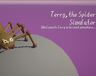
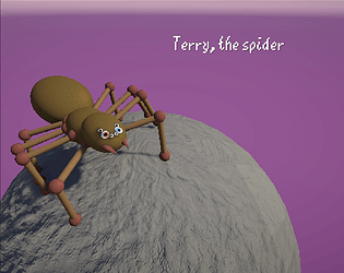
Funnily enough this actually is a prototype for a larger game :) https://nwlsmith.itch.io/terry-the-spider-simulator
This is awesome! Your use of shaders was great! I think it needs a bit more work to make the visuals reflect light more accurately because as of now surfaces seem to have different shadows based on the direction you're looking at them from. The ball also needs a shadow because it's very hard to figure out where it is in the air. The ball looks great too!
This was good! The art is awesome, the music is great, and I love the simple moves the character makes! My critiques are:
I wish the text font and arrows matched the art style of the characters
The best way to win is just to mash all the keys at the same time constantly, so you should add a penalty for pressing the wrong key
I couldn't tell when I missed something, so there needs to be an audio + visual que when you miss an arrow.
Overall though this is good!
Another awesome project! I love the color palette, the lighting and shaders. I love the cat paws and mouse model. I LOVE the visor, it's a great touch that I think makes the project work really well because of the goofiness of it. AI is really hard to get to work well, and very hard to balance gameplay-wise, so I think you definitely did a great job in just 1 week. Stealth is VERY hard to code, and I found myself just running straight at the mice when they were in the open. You covered most of my critiques already in your post-mortem, the one thing I would add is that the audio could be balanced better. The mice squealing was a bit too loud and I couldn't hear the music very well, and I never heard the mice walk at all.
Overall though, This is the same great work I've come to expect!
I like this! The characters have a great artstyle that gives them a lot of personality, and the idea of figuring out who you are is pretty well executed through the dialogue. A couple of bugs: The character at the end appearing in front of the text was a huge problem as others have mentioned. You should lock the cursor in the screen so it can't go to other windows and everything. Otherwise it's a bit awkward to move. But, this is a 1 week project so the technical shortcomings are understandable.
Stylistically, I wish the text boxes and font matched the art style. Same with the trees and bushes.
Overall, if the bugs could be fixed, this could be an awesome game!
This is awesome! It reminds me a lot of LunaWoolf's Space for Pause https://lunawoolf.itch.io/not-finish-space-for-pause , and that's definitely a good thing. Yours is certainly very unique, and I don't the critiques I had for her game. I love that the clock displays the actual IRL time, I love the dual visuals of the clock close up and far away, I like the sound and movement of the objects. My one critique is that it's a bit too easy. The time when you need to stop is too long after the visual queue, so it's very easy to notice and stop clicking. Overall this is a very solid project though! Good job!
I have no idea what this is and I love it. The music was excellent and really fit the atmosphere, the weird headless guy who is also you, who floats and turns with you, is a nice touch. I've never been more disoriented with controls in my life, which perfectly fits the atmosphere. One thing I can't figure out is why when you tilt the camera back behind you, you can see a mirror image of what's in front of you. I have no idea what that is or how you did it but I like it.
This was great! I was a bit worried that a museum might be a boring way of displaying the assets, but this was actually very good! I loved the intro, it was a great introduction that I think was very needed. The music was perfect for the setting. I love how you combined or modified the assets to actually look like art! The lighting in this is also incredible. I would've toned down the Chromatic Aberration a bit, because it can be kinda hard to see things. I also wish you had included the sounds in some way, but the huge flowing wall of the text files was great too. Your Headless statue was also fantastic. I think everyone was having trouble with the meshes being inverted, but somehow it worked in your scene. Great job!
I liked this! It was very simple but the visuals were effective and did the job. The sounds were good, but I would have liked a slight amount of variation with the letter presses (you could do audioSource.pitch = Random.Range(.95f, 1.05f)). I like how it loops back to the beginning by making you write start again. The font is also great. I think there should be a penalty for pressing the wrong letter though, maybe you just restart the word? That could create a problem where some compound words look like 2 words because of the letter spacing. Either way, great job!
I love this. I love how the dialogue and head move, I love the use of pixelation, although I wish there was a way for it to be more consistent, like the text matching the pixelation of the face, but honesty it still works. I love the humor. I love the pauses. I love the gameplay, the linerenderer looks great! You made the movement work really well, and the collision detection just works (except for the letter G). Are the words randomly generated? If so, that's amazing. The transitions and movement are great. My one critique is that it needs a full screen button because some of the dialogue gets cut off. Also you can color outside of the letters. It reminds me a bit of my game, INK, but even weirder. Great work!
Thank you so much! Honestly the limits of the pathfinding prevent you from seeing just how awesome Inverse Kinematics can look, and I wish I could've gotten the organic movement that's possible when the movement is fully physics based.
For just inverse kinematics and the algorithm I used:
https://www.reddit.com/r/Unity3D/comments/fqabkx/i_tried_to_explain_procedural_a...
https://www.reddit.com/r/Unity3D/comments/fuj4sy/i_tried_to_explain_hoverboard_p...
Good luck!
I am almost positive I had a nightmare like this when I was 10. I played a lot of flash games back then and this reminded me a lot of Torture Game 2 on NewGrounds. It's so weird and confusing and I have kinda no idea what's going on but I love this. Good art work, works perfectly for the setting - Horrifying music - Great choice of fluids(?) Also is that a picture of you? I have so many questions and this game simultaneously answers them all and creates more - just like the glorious, infinite, expanding loop .. oh god - even in the real world I cannot escape it . it will follow me always .,. the only solution is to give into the awe inspiring , all encompassing cycle
Thanks for the feedback! I agree about it feeling incomplete, I didn't have time to implement everything I wanted. There are actually only 2 animations in the entire game, a blinking animation, and a death animation. All the other movement is procedurally generated. You may notice that the spider's legs adapt to different heights - that's because it needs to actually physically touch the ground to move.
Visually stunning. Amazing work! I love how you use particles in this game and your last. The music choice was spot on. An extremely creative imagining of virtual pets. Seriously, this is great.
Some (light) criticisms:
- I think the visuals would be better served without the eyes on the stars. They aren't quite consistent with the cool theme you're trying to push.
- Calling the brown dwarf a "failure" felt oddly harsh/out of place in this environment.
- This would take more work but I would've loved to see the particles being sucked into the star's gravity, rather than floating around and away.
- I wasn't able to get past the Yellow Dwarf section bc the particles were off-screen, so I couldn't click on them.
Otherwise, really great work! :)
Great work as always. You did a lot with very little, and made a surprisingly very deep rhythm game. You nailed an awesome combination of dark, cartoony, niddhogg-esque aesthetics while also making a really awesome game.
Any criticisms I have are for slightly janky enemy pushes but they actually work perfectly for the aesthetic so honestly I have no complaints :)
This was great! All the art was simple but perfectly on point for the aesthetic. The font was cute and fit the setting, but it was just a little bit hard to read it bc the spaces are very small. Music is adorable and contributed a good amount to the experience. I love the reward for maxing out the "friendliness" meter, very cute, but it could have used a small sound effect. The only think that I didn't love was that the player only needed to let go of the spacebar for a split second to prevent the bar from going over, and then you'd just go back to vigorously petting the bunny.
Awesome job though!
I liked this one! reminded me a lot of flash games. I loved the mix of aesthetics/images, love the office setting/story, and that the human isn't even looking at you. The gameplay was solid too, I never felt like the controls were unfair. The one thing I wish the gameplay had was music, and better/more sound effects - Just a bloop sound when the player gets a piece of trash. The munching sound was funny, but I wanted more feedback. Maybe a jump sound too? Either way, a very solid project :)
This was great! I love the concept - super simple, super relatable, and executed perfectly. I love basically every artistic decision - the faceless corporate drones, the boring cubicle, accompanied with a very pleasant pastel coat of paint. The music was a great choice. I love the catdeathchase asset, especially how it contrasts with the rest of the grim aesthetic of the game.
My only criticisms would be that the game starts with the video on in front of your boss, and that the boss gets mad before you see him/slightly after he leaves the screen. Otherwise this is awesome.
This is great! The visual style and gameplay remind me of the many many puzzle games made in flash, the concept is simple yet works really well, you have a good amount of interesting things (ie, buttons, platforms, etc) that I could see you expanding this even further. The one thing I felt was missing though was sound. I think this definitely could have benefitted from a drop sound, an impact sound, and a sound for when you complete the level. I also felt that the initial push you need to give the ball was a bit clunky and unpredictable, but it did the job in the end.
Overall though, great work!
I love this. I'm getting slight Robert Yang vibes. I love the entire concept, the title, the music, the thought bubbles, the art *chefs kiss* I love the androgyny of some of the characters. A couple of notes though: the instructions were kind unclear, I didn't know why there was a second set of bars on the left side bc I didn't know the other characters would also be trying to smooch me back, so that was really confusing. I didn't understand why my bars were moving art different speeds, what the winking meant, etc. Definitely more control feedback is necessary, maybe better instructions, and some visual distinction between my bar and my homies'. I also found out the best way to kiss every time was to mash the spacebar because there didn't seem to be much of a penalty to missing your smooch. I also wish the "homies kissed" thing was behind the heart particles.
Other than that I love this so much. Really awesome concept and executed well too.
Basically every artistic decision you made was perfect. I love the mix of organic shapes and perfect triangles, the color, contrast, font, everything. One small note I really liked was the end screen fading into the start screen - awesome touch. The one thing that I'm not completely in love with was how slow the end stats displayed. Other than that this is an incredible visual work :)
I have no idea how you made this. As far as I can tell this is actually in 2D, which is awesome and very impressive. I think it was missing a lot of visual flair/polish, like the lack of explosions and helicopters moving in front of very close trees.
While the 2D was impressive, super awesome, and I applaud you for accomplishing it, it was also extremely disorientating. It may just be me or it may just be sleep deprivation, but it made me nauseous and gave me a headache, and I've never had that happened to me before
This was awesome. Definitely my favorite Death Chase clone so far.
+ UI was faithful to the original
+ great details like the helicopter and range indicator
+ The cat theme was awesome. I loved it.
- Turning pivots the player instead of rotating
- Hitting one enemy twice made the game think you hit both
----- Doesn't say "Night/Day Pawtrol
I loved the aesthetics of this one. I like that you really leaned into the aesthetic you chose. I also love that you kept the original control scheme, but I wish you had more of the UI and score etc. The projectile also moves with the player, which seems like it could be an easy fix - yet somehow, after playing 8+ other clones, I liked how janky it was, even though it wasn't faithful to the original.
I think the lack of sound slightly hindered the experience, but going the route of making turning rotate the player instead of pivot was definitely a good decision. I would have made the bark of the trees the same red as the original. They look great and I'm glad you made your own, but with the brown color they look like... uhh... poop...
I loved the visuals of this one. The new trees look awesome - although they did have some shadows on them occasionally. I think this is definitely missing something from the lack of rotational turning. I was also never able to hit the enemies so I don't know if that's because I was going too slow (I couldn't tell my speed bc there was no sound), or because the hitboxes are too small. Either way, visually impressive.
This was a good take on the game. I think the sprites could have used more work though. They looked like a high-res-but-also-compressed version of the ones from the original game. While I'm sure that it made it easier to replace the turning with pivoting, it made movement a lot harder as I couldn't tell if I was about to hit a tree. It didn't help that those tended to spawn in in front of me too. Otherwise, this was a good clone.
Great job with this. I'm curious how you made the trees. Do they spawn dynamically or are they all pre-placed?
I'm sure others have mentionned this but the bullet moving with the player really messed me up. I think the bullet may be a child of the player, so I'd spawn it as a child of the world instead. Also, the turning felt really fast to me.
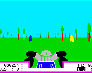
Thank you! The way I got that visual look was by rendering the player camera to a RenderTexture with a resolution of 360 x 180 pixels, turning the framerate from I think 300 to 10, and giving everything an unlit color material. All the models in the game like the player's bike, the enemys, the trees etc and the helicopter + tank in the back are all just cubes. Since they're unlit they appear as flat textures.


