Indie game storeFree gamesFun gamesHorror games
Game developmentAssetsComics
SalesBundles
Jobs
TagsGame Engines

pkiesshauer

44
Posts
5
Followers
A member registered Apr 13, 2022 · View creator page →

Creator of

Recent community posts

I feel like the game is a bit all over the place, which is kind of standing in its way.

First impression was I was completely lost and didn't really know what to do. I saw the controls, but they didn't really seem to do anything or weren't relevant in the beginning.

Next thing I knew, I was wondering around and the fireball now worked, so I just wandered around aimlessly killing slimes and at some point skeletons. The overall goal is stated in the beginning, but it doesn't really mean something to me as the player at that point or give me something to work towards. Places where I would transition between screens were not really clear as well, so in the beginning that felt like stumbling around.

The mechanic I really liked was "Shift Reality". The puzzles around this, for example in the tree stum maze, were really cool, and I felt clever solving them. I feel like maybe a level based approach around solving levels with this mechanic in the center might have been a better choice than what feels like an open world. But take that with a grain of salt, because I really like puzzle games. It's also that the Shift Reality part didn't feel like it was ingrained with the rest of the mechanics, so I feel like this mechanic could very much stand on its own.

If you want to keep things mostly as they are, I would say giving the player a clear direction and sense of progression would help. Like "ok, start by going to the wizard's tower to the east" or something along those lines. A clear visual language also helps to show the player what he can and can't do and what he is supposed to do. For example starting with a small tutorial area and then having a bridge away from it can help show the player that he's meant to leave that area and in which direction to progress.

Feels a bit like a classic point and click puzzle game, but with wasd controls. I liked it, though as someone already mentioned, there was a bit of repetition, for example the fire puzzles while I really liked them, annoyed me eventually.

Overall though, well done.

Thank you for playing.
I know that there's a huge lag problem like that on Firefox. If you're using that, maybe try another browser, that should fix it.

Hunting down the shadow critters like that is a really cool idea. Had a great time playing.

Real fun and challenging. The combination of destructible environment puzzles and line of sight is really cool.

I really like the idea, and it worked well enough that I could play to the end with all the potions found.

However, the game could use a bit more visual cues as to what I'm actually doing. Unless I am completely mistaken, there's nothing hinting at what is the right shadow, so what could be a challenging puzzle game kind of turned into "run around every object until you stumble upon the correct one" for me. Which was still enjoyable, but it was less of a game than it could have been in that regard.

Great puzzle idea very well put together. Really would have liked a few more levels. :D

Only thing that I would like to point out is that the contrast between the different light can be challenging to see. But I don't have any good solution for that either.

Really fun game, love the idea of switching out the elements on the fly to create different spell effects. Also really challenging. Great job.

Just a fun idea that came up while making the game and I liked it so much I used it.

Thank you for playing, glad you enjoyed it.

Yes, interacting with the bard was on my list, but it was cut due to time.

Thank you for playing and thank you for your feedback.

Thank you for playing and for your feedback.

Thank you.

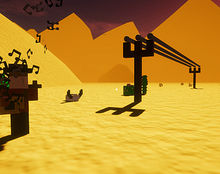
You can build telegraph poles with a right click on the ground in front of you. You use them to connect all the cities on the map. You have a list of cities that are on the map and a compass to guide you.

Yes, unfortunately, Firefox seems to have an issue with WebGL. I only tried in Chrome and was alerted to the bug too late to try and fix it in time, unfortunately.

Thank you for playing and for your feedback.

This is really lovely. Was a bit confused at first, but that gave the game a very "I want to explore this" feeling, which was really nice. The minimalistic art is very cute, and oh does it pack a punch in the end.

Tiny sidenote: The connect/disconnect animation is a bit slow and could be sped up. 

Overall a really fun experience, well done.

Lots of fun as long as it works, but sadly a few bugs (getting stuck, for example). Art is charming as usual. The oncoming waves make for a hectic and challenging gameplay. Would love to see you working on it to iron out those quirks.

Really nice job. I love the artstyle, this 2D/3D mix is really great.

Gameplay wise, there's a few bugs still there, which make it hard to play. Once you're stuck in a charging station with an enemy around, the game is pretty much over.

Still, some more polish on those aspects, and it's a really great entry.

I'm sorry to hear that. Not sure why that would be, maybe it's a browser thing.

Thank you for playing the game and for your feedback. :)

Glad you enjoy it. Thank you for playing.

Thank you very much. :)

Thank you for your kind words. :)

(1 edit)

You guys absolutely nailed it. Great idea, great implementation, great art, great music, everything. Really one of the top entries for me.

One thing that especially stood out to me was the way you introduced new mechanics to the game. That went really smooth throughout the levels.

The lack of other audio was deliberate, because I wanted to interrupt the music as little as possible. But now that you mention it, a sound indicator when placing a pole and if it connects to something would have not been too bad and would help a lot.

Adding the amount of poles used is also a good idea, as is a restart button. I'll add those to the next version, once the voting period is over.

Thank you for playing and for your feedback. :)

Yes, a limited number of poles was a gameplay mode I was thinking of implementing, but I felt just going for a time would be more fun for people to compare.

The worldgen was quite a challenge, yes. Thank you for playing and for your feedback.

Got a 461, almost beat you.

I had an idea for a game with a similar mechanic not too long ago, now seeing you do this so easily, I might follow up on that, thanks.

This is addicting. Such a simple concept, well executed.

This is a cool game. The levels are challenging but doable. The artstyle is great for what it's going for.

You're right, I meant to add that and completely forgot in the end. Thanks for playing. :)

Interesting concept with a lot of potential, but far from being polished. It was a lot of just clicking and guessing at this point.

Fun little platformer. Movement is a bit sluggish, but it fits the bulky space suit. Great artwork.

Really interesting concept. The mechanics might not be quite refined, but that's part of the fun, maybe. You can really cheese your way up by just jumping and moving the cube a bit up. Lost my cube at one point, because it was outside the screen and I couldn't reach it anymore. A recall button or automatically moving the blue box to the edge of the screen would really help.

Took me a while to understand what's going on. That's a whole new level of chess. I think I'll need some time to actually understand it, but it's a cool concept.

I'm not much of a platform player, so I'm really bad at this. I love the concept, and the implementation is really solid. The story adds a nice touch and wraps up the atmosphere nicely.

Interesting game. However, I can't seem to be able to progress past level 2, the jump was just too short, no matter what I tried.

Interesting game. I kind of teleported all over the place and couldn't find the hive so I died. Not an easy game. :D

Had an absolute blast playing this. I probably died like a hundred times by falling into the lasers in the last room, but I always felt like I could do it if I just tried enough. Really great balance.

Coordinating both hands like that is not easy. :D

You really connected my two hands there, props for that.

Really cool idea. Unfortunately, I'm not really good at this game. It is nevertheless a lot of fun.

Really fun game. There are a few places where the visibility could be a bit better, jumping into the unknown is never fun.

The characters remind me a bit of an old cartoon I think I watched as a kid. Cute sound effects.

Nice. I didn't expect a game like this, but it's really fun.

I think more visibility for the trigger zones would be nice, since they are really small. That would make it a lot more possible to do.

Though simple, the artstyle is really nice.

This looks really great, and I started multiple attempts, because I wanted to like it. The game just kept frustrating me at every corner, to the point I just gave up.

Simple, known concept. The fact that the pipes don't leak makes the game a lot easier than it should be. It's a bit annoying that you have to click the pipe directly, not the pipe tile, so when you need to turn multiple times, you sometimes miss when you're not in the center.