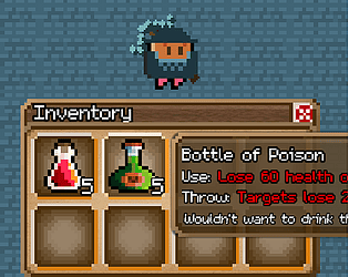
the skill system is the next immediate thing to be reworked. i know how unnatural it feels to continuously press the 1 button to fire arrows. keybinds are planned too. thanks for playing!
rfmm
Creator of
Recent community posts
Thanks for the feedback!
I don't like how the instant skills feel right now. It just feels unnatural to be walking around with a weapon on your back and then at the press of a button you fire instantly at any direction. It's something I'm working on with the skill/casting system.
>arrows speeding up
Yeah, projectiles are a bit broken at the moment. I should fix them after I finish the skill/casting stuff.
>holding down button to repeat cast
That could be an option. I know tapping the 1 key feels kinda silly right now.
>potion throwing
It'd be cool to see your take on it. I've always been a fan of games that allow you to throw items.
>damage indicators piling up
Good point. I'll think of something to improve visual clarity, or maybe just a simple distance change or fading the numbers out faster.
>drag and drop
It's not as responsive as I want it to be right now. In addition to what you said, the drag icon doesn't show up until your mouse leaves the item box. Which means if you start the drag from the middle of the box, you don't get visual feedback until your mouse clears the box.
Thanks. The skill/casting system is incomplete, the jank should be gone once I work on it more. (you can fire arrows right now without a crossbow equipped or ammo in your inventory).
>is this going to be a ragnorak like
I'm aiming for a game thats fun to play with friends. It certainly has inspirations from mmos.
i've been thinking about this for the past few days actually, the balancing of synonym support vs more consistent and rigid descriptions.
i think its important to play into the strength that text based games have over more visual ones. with text games, you have the entirety that is the english language to craft scenes and situations with. forcing descriptions to always call a "bag" a "bag" (atleast in the look and examine descriptions) takes away from your ability to describe a scene to its fullest.
maybe i'm pointing out the obvious, but it was fun to think about.
Thanks for the feedback!
I think when I add shadows and landing effects, it'll help make the throw more convincing.
>When you select a potion, aim with your mouse and select another one, it throws it without having to left click.
The target/confirm logic needs to take into account the item being thrown. Currently it just sees your trying aim a throw, and then confirm a throw. (Without checking if the item being thrown is the same or not)
>I see that you're shooting by clicking the hotkey which maybe better to play with a controller, but i think it might be better if left click was used to throw the selected spell (i'm not used to this kind of game so i might be saying something stupid)
Your right, its awkward right now, especially having to reach for those higher numbers (4+). I plan on adding keybinds for the action bar, and maybe have the basic attack of a weapon be left click (also bindable).
>Also the potion amount in the inventory isn't going down when they are thrown
Resource checks and consumption for actions are in the near term pipeline.
Hi, some notes I took while playing:
-in windowed mode, the windows bar keeps flickering
-the font isn't very easy to read. its pleasant to look at though.
-in the main menu, the left side options are center aligned. maybe they'd look better left aligned so it forms a straight line down (personal preference i suppose)
-in the item menu, the labels for the categories are hard to make out. (field, battle, weapon ...)
-the particle effects that come out of the feather selector in menus can be distracting in smaller menus (like the town crier in the starting area)
-i like the birds on the trees, some variation would help make it look more natural
-you can walk through the right side walls of some of the stairs in town.
-the townsfolk dialogue clips through the text box.
"the temple looks different because it was the first thing built..."
"the rangers are tough but their hearts are golden..."
veteran ranger "don't pay attention to them..."
-the sign outside the rangers guild's says hunters guild, the area inside is called hunters hall
-when entering the new areus inn, if you want to leave immediately, trying to go down does nothing. if you press right however, it causes you to leave the inn. you also spawn on the door mat, compared to 1 square up like the rangers guild
-when entering a new area and interacting with a menu, the feather appears from the top left from the screen to the first menu option. this does not occur again if you reopen the menu. example (enter inn and talk to inn keeper, cancel, then talk to him again)
-the "we're still repairing the wall" guy, you can't move to the left of him.
-in the rangers guild first floor, the left most top bookshelf can't be interacted with from the left side.
green conclave temple:
-you can walk on the 2 pillars outside
-the earth mother has a yellow ! on top of her. when i speak to her, nothing special happens
path to ruins:
-there are alot of missing collisions starting from the bottom of the steps. the cracks in particular. i could get to the roof.
-after the armored beast fight, my beast leveled up and said something like "Ah I'm stronger now", i don't think they're supposed to be able to speak?
-i'm stuck after going up the stairs after the armored beast fight, my beast doesn't seem to be able to learn anything that can cut or break the rocks. the field skill it could learn is "push". (though maybe i was supposed to learn smash?)
-the game crashes for me when i select "quit game" from the title menu.
some thoughts:
-there should be a way to indicate what name should be used when trying to interact with an object.(examine note vs examine tiny note)
-support for synonyms would be helpful. for example, the beginning prison cell, the "sack" is also referred to as a "bag". but only "sack" works with commands
-it would be helpful to show what travel directions are currently available (for example in the beginning prison cell: "to the north you see a path leading to a forest")
-commands and targets on a single line would be great. (examine sack vs examine. sack.)
-auto "look" when arriving to an area
-maybe you can refer to monsters in combat by a number? like attack 1 vs attack goblin 1.
i gave up after failing to figure out how to take or wear "copper tipped boots". maybe i'm just smol brain.
i think if you work on qol, it would benefit the gameplay significantly. too much friction at the moment.
i like the aesthetic you have with the font + blueish black background. gives off a sense of elegance.
cute graphics. i like how the slimes seem to take extra fire damage and how its hinted at by one of the npcs (or maybe i was just imaging it). red guy is cool.
some things i noticed below:
-npc:"saving restores your health", might be worth adding it also restores SP.
some typos:
-"the slime desintegrates", disintegrates
-"the mimic dissapears", disappears
-"...and many other responsabilities so", responsibilities
-"for this project it's limited", is
-after trying to use a skill/spell with not enough sp, the buttons lose keyboard focus. you have to click on them to regain focus.
-if you stand still after running away from a fight, the enemy is able to push the player around slightly
-player sprite direction during diagonal movement is inconsistent.
up + right: player sprite faces up
up + down: sprite faces down
up + left: sprite faces left
down + left: sprite faces left.
-pressing z while moving causes the player to stop briefly
-the pace of the walking animation is different when moving up/down compared to left/right
-the player sprite shows on top of the wall of trees when approaching the wall from above.


