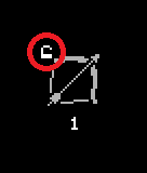
was a bit weird that Skill didn't unlock when clicking on the Skill, but only on the icon at the Top. Was initially thinking I needed 10 Points to unlock a Skill, not that its 10 Stages of a Skill.
Why does moving into the top room return me to the Title? Could use a clearer differentiation between new Room and exiting.
+10 HP Belt doesn't work. Needs sound feedback on hitting/getting hit etc. No Idea what half of the Stats do, if you shorten them, a long explanation on hover, at least in the stat menu could work. Whats the difference betweeen Red.Dmg Rst.Dmg and Block?
Your Skill menu is laid out pretty terribly, why are there small easily overseeable Arrows at the Bottom to change in Subtrees, but then not at the opposite end to change back into previous Tree, but instead the topleft has fixed directions? Why are there so many subtrees with so much space between every option? Makes it really tough to move through all of them to see which Tree to pursue. Also I can't move Skills/etc. back out from my Hotbar once assigned? Update: Found out I can rightclick them. Why doesn't drag and drop override whats on the Slot?
At least its rather clear what Stat affects which Stat, since its always the one on the Right, but why not have me level HpR directly then? Unless Stats can affect multiple other Stats, like in DS, at which Point a Highlight might be useful.
Why do I have to let go off moving before I can dash? Died at 3-3 ~lvl 20. Why is both your level (as in status) and your level(as in floorlevel) named level?
Overall feels very clunky and slow, dodging seems useless, and with how much Points I had to investigate to get a build focused on a single spell feel okay-ish, I don't think it invites at all to any experimentation or going for "higher-level" skills. In the End, I just put 50 Points or so into spRegen to get some useable amount of Manaregen, and a few leftovers into health and healthregen to avoid getting oneshot, and to counteract burn a bit, and at the beginning 10 or so into accuracy since I thought I'd be going melee, which I weren't. As for Skills, 1 into lightning bolt to use it, 1 into poison bolt because I thought poison would do continous damage, and not just slow enemy regen a tiny bit, and 10 into spellcastspeed in lighting and poison. Or however close I got to 10 in both. Plan was to continue the same way until I had all spellcastspeeds for every tree, then max lightning bolt for damage. As for Stats, I wanted to reach 2 MpRegen which I did, so I could reliable regen my MP quickly enough to cast more or less continously, then dump everything into damage and occassionally health to keep up with not being oneshot.
Inventory was just full of red and blue Potions, everything else was crap, so threw it away. Then I found the Vendor at 3-0, so that felt wasted, but its not like Vendor has anything useful anyway.
As for Equipment, nothing fancy, except for a legendary Wand for 10-20 spell damage or something.
> skill upgrading is unintuitive Yes. I need to figure out how to invite people to read the description or I will be doomed to make ingame explanations. I'll prob add tooltips for the skill menu.
> zone 1 exit point exits game (returns to title) Yeah, I thought it was funny, but I already removed that from the new build I'm working on.
> +10 Hp Belt dont work Maybe it was a +Mp Belt? I myself sometimes can't tell because of the text. And I really don't want to change the game's text but maybe in a much later update.
> No Idea what half of the Stats do, if you shorten them, a long explanation on hover I mean we can deduce within a few moments what is what, but I should not expect anything and prob need to make sure and tell them what is or let plebs filter themselves jk
my initial design was only for 800x600 screen, I don't have enough space in the attribute menu to display the full descriptions, I had to make it look clean, so I went with what we have rn. Hover tooltip on the attribute menu seems overkill to me but I'll see what I can manage.
> Skill Menu's unimpressionable navigation buttons I actually wanted to make a skill tree similar to PoE's colossal passive tree, but I've yet to figure that out, so I went with the 'browser look' hence the [home] and [back] buttons are on the top left.
I placed the other branch/navigations buttons at bottom of the menu so the skills in a branch gets focused on.
I'm leaning too much in the minimalistic design aspect, I didn't want to take away too much attention off your character and what's happening around it.
> Why doesn't drag and drop override whats on the Slot? I have this 'Synergy System' where you can combine compatible skills, you place another on the base skill and it gets the added skill's mods. It makes crafting skills tedious because you sometimes need skills from different skill branches, but I've yet to have a better idea on how to do this. Do you have any suggestions? let's make this game good :)
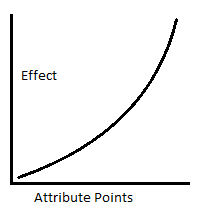
> but why not have me level HpR directly then? Unless Stats can affect multiple other Stats Yes, in the Attribute Menu the stats on the left are 'Prime Attributes', they affect the 'Basic Attributes' to their right (in increasing returns). Basic Atts have 'Sub attributes' (eg STR(Strength) - PAtk(Physical Atk) - MAtk/RAtk(Melee Atk / Range Atk)) - Basic affects Sub. And we also have 'Super Attributes' - notice in the menu attributes are grouped together, those have the same super attribute. Super Atts affects Basic & Sub Atts of that group (eg POW(Power) affects lower atts of STR & INT attributes)
My game has Stat/Attribute autism.
> dodging invu frames We don't have that here. We dodge by letting 'hit vs dodge' do its thing (for physical attributes only), getting out of strike range, and getting out the way of projectiles.
> Why is both your level (as in status) and your level(as in floorlevel) named level? Character level and when you open the Map it shows Area Level, we can distinguish that much. I can switch the Area level with 'Zone'.
> attribute point, not going melee, shifting to lightning/poison hybrid My (barely a) game has a learning curve, git gud jk (dont hate me bro haha)
It was a good idea to invest in the Constitution/Restoration attributes (Health, Stamina, Mana / Endurance, Resilience, Spirit) to get decent flat values, then unlock/upgrade passives from the 'Fortitude' skill branch to multiply the flat values. My suggestion for is to max your prime resource and dump 30-50 for other supplementing resources.
Elemental property effects
Fire burns for ATK/3s
Cold chills (reduces Speed by 30%) & freezes (cold stun)
Lightning does a 0.3 mini-stun
Poison burns for ATK/6s - I wanted to incentivize players to combo poison property skills with 'Toxin' support skills - with the lengthy poison status you will notice the toxin effects
If you're willing to give my game another go I can make you an early game guide, you'll only use your first 8 levels (fast, high regen, hits hard).
> Vendor You can access the Vendor and Stash at the beginning of every zone - Respite Zones have a zero sublevel. Yeah, Vendor doesn't do anything special atm, you can sell and buy pots though
> As for Equipment, nothing fancy, except for a legendary Wand for 10-20 spell damage or something. You might find an item with a nice base mod with 3 bonus mods but only 1 is useful, equipment will stay like that, fully random mods (not exactly). My modifier generator rolls through a table, randomly selects a mod then checks if it's compatible with the base item (some mods can only spawn in some base items).
I have an item crafting system in the works. When it's done this will let us upgrade the base item, upgrade mods, extract mods, add mods. This is far down the list though.
If it were in a pretty physical Handbook, People would be reading your Description, but I generally just hover through the itch Page quickly to see Controls and specific Places People want Feedback on. (Hence why I figured out how to upgrade them. It'd work with a bit of randomly clicking around aswell, but the lock/+ don't really feel like they are a button of any kind)
>return to title
It's fine if its marked as that. But just a regular entry/exit like others isn't very good. A simple Door or a different color or just the text "return to title" or something works enough already.
>HP/MP Belt
Don't know, maybe? Your Font should really be clear to read on that tho.
>Stats
I'm not talking about the obvious stats PAtk/SPAtk/HpMx etc. are clear. But whats AtkRt/CstRt? I know it stands for AttackRating and CastRating but what does it do? Speed of Attacking? Critchance? Affect the Formula in some weird way? And with how little you get per Point on Stuff thats not damage/HP/MP/etc, I'm not really invited to just put one or two points into it to find out. This isn't so much an issue with the Names, but what the Stats actually do. Same with RedDmg RstDmg and Block. I still don't know what RedDmg means or does, seeing that the stat Screen has resistances, I can deduce that RstDmg probably means Damageresistance, but thats also not clear? Is it a flat redcuction to Damage I take? All Damage or is that just physicial damage? Whats block then? Chance to block? In percent or just in some Formula again? In both cases, whats RedDmg? RedistributeDamage? ReduceDamage? If its reduce and reduces my Damage, whats Damageresistance then? Chance to not take Damage? But then whats Block?
>Skilltree
If its massive putting it into subclasses makes Sense. But I just think the navigation Buttons are at the wrong Positions. Just have it be an actual Tree, if I go down from Venomancy into Toxin, have a big arrow at the top to take me back up, if I go into Wizard, a big button on the right to go into sorcerer, and if I'm there, a big one to the left to go back to Wizard. Not just a small one topleft to go back to the previous Place, and multiple Arrows at the Bottom. The one to keep at the top left is the one to return to the startscreen of the Layout.
In any case, if I see it right, you have Fortitude in the Center, with 4 Baseclasses around them, and then a combination class in each of them, and a "advanced Baseclass" so to speak. You have more then enough empty space on the Screen to put all of those into one Screen, just radiating outwards, and adding some Lines in between to indicate which classes are connected.
>Skill synergy
Is there any indicator which Skills are synergizing with each other? Or is it just trial and Error? Because I'm very much not inclined to pick up any Skill apart from passive improvements like + castingspeed to the Skill I'm choosing right in the beginning as my only damage Source. Is it something that can be reversed, or changed at will constantly? Can there me multiple Skills combined into one, not just 2? Or is it just 1 active and 1 passive or something? Either Way, you could always just put in an NPC in your HUB-Area with the Shopkeeper and Stashchest, that allows you to merge your Skills together, so you don't have to do it all in one Place. Fills out the Area a bit more, and frees options up for your Menues.
>Attributes
No, I got how they worked, as long as their Names and Roles are clear, see above. I mean, why do I have to level Strength if its only affects PAtk? Why not remove Strength all together and have me level PAtk at that Point? Derivated Substats are great if you have multiple Stats being affected by one Attribute. If Strength would affect HpMx or SAtk aswell i.e., but this isn't the Case. And if its for Melee range or whatever aswell, why are those Stats not shown in the Menu?
>My game has Stat/Attribute autism.
Nothing wrong with that if done well.
In the End, I wasn't complaining about the Build I got, or the Items, both work, I just died to not paying attention. I'll play it again later to see if I can figure out which Skills combo with each other, but the general Way will probably stay the same, that I'll just have one spammed Attackskill, and level all the support Skills otherwise.
Update:
Did another quick run, realized now the support skills are the one ment to be slotted into the active ones? That could really need some ingame explanation somewhere, I was assuming they were just passive Skills, hence why casttime increase did so little. Its pretty useless tho, makes them far too expensive for little to no benefit, so just putting one point into the Skill itself, and then dumping everything into Stat increases seems way stronger then all other Options. Also somehow ended up with 59XP, even tho every Enemy gives 10XP? I lost a XP somewhere along the Way.
Also checked through the Spells. Channeling ones are pretty useless, with the Amount of Time you have to stand still and the Amount of Ressources you have to burn for the Buffs, that only last 15s, you might aswell just pump those Points into actually powering up your Spell.
And apparently other Actives can be slotted onto aswell? Can I just slot every Skill into one? Or only if they at least share a common Element? Because that'd just mean I'd be spamming one skill even more. Sure, it gets more expensive the more I slot, but it caps out easily enough, with the amount of bonusMP/SP Skills that are available. But then I can't slot Toxic Orb onto Poison Bolt, so no Idea what merges with what anymore.
> my minimalist UI biting me back took this from my game's description
I'm working on cursor indicators - when you hover over interactable objects this will surely help figure things out when they still won't read my barely a game's description.
> environmental indicators for entry/exit points I'll add that to my growing list
> replacing my sprite font I couldn't find I font I liked so I made one myself, nothing special about it, but it's good enough for now.
> Attack Rate / Cast Rate AGI(Agility)=fast, so I attributed WIZ(Wizardry) to speed too
> granular attribute output
The attribute system behaves in increasing returns, it's a barely-a-demo but I don't want to make things too crazy too early
> Red(Reduction), Rst(Resistance), Block I swear my brain told me I had answered that, and it's nowhere mentioned in my reply.
Reduction is flat value subtracted from incoming attack
Resistance is percentage reduction after going through above
Block will protect you from incoming damage and status mods
> Property types
class
sub class
Attack
Physical, Spell
Physical
Melee, Range
Spell
Magic, Fire, Cold, Lightning, Poison
* Damage is after going through Reduction & Resistance formula
> Skill Tree navigation Man, i tried that, placing the navigator buttons on sides and corners it looked ugly. I'll try again, might figure it out and make it work, but it aint today.
> Skill Tree's base
It was deliberate that the more advance classes were not so hidden. I wanted players to wander a little bit, but my current design seems unintuitive and needs some work.
> Skill Synergy There are 3 skill types Active, Passive, and Support.
Active - your base skill (or use as Support)
Passive - will modify your character directly
Support - you can add these to your base skills
> Trial & Error Synergy I wanted players to do trial & error to find compatible skills but that's too much to ask, I'll create a guide soon.
> Multiple Skills in 1 I wanted to cap the skills added to 10 skill levels, but I don't have to, there is no cap, the resource cost will render skills unusable
> Skill NPC Nah, loadout shizz don't make sense here, I'll let you edit skills in the middle of the zone, while you get dogpiled by mobs.
> Prime Attributes They're your character's foundation, high flat values coupled with decent multiplier is the way to go, high multiplier with low flats result are meh
> Sub Attributes not displayed They are though, in your skill's description
> 59 Exp That means your level is greater than the current area level, diminishing returns, fight in areas equal or greater than you
> Channeling & Buffs You'll sweep early game with and will probably be hard to survive without in later levels Priest Buffs
> Channeling Skills I need to make a quick guide for this class
Channeling gets faster the more Cast Rate you have
Priest Buffs has a max 'Channeling Time' of 10, Wizard attack skills has no cap
Higher Cast Rate will let you accumulate 'Channeling Time' quicker
You gain 3 seconds of status duration per Channeling Time, and Cast Rate is a multiplier of that duration
Wanna here about my level 8 guide now? haha jk
> Skill Synergy Special Cases You can add 'Poison Bolt' to 'Poison Orb' but not the reverse, because poison bolt does not benefit & have Poison Orb's AOE modifier if that makes sense, and this is the usual logic
But as you already clearly recognized, nobody is going to read through your itch Page, it should be either intuitive on where to click to unlock, or explained somewhere in Game, ideally not in some submenu on how to play, or a textdump at the beginning, but along the Way.
>it's good enough for now.
If even you yourself get confused sometimes wether its a H or an M, it clearly isn't good enough.
> granular attribute output
How you handle Statgrowths or anything doesn't matter, you can give +0.01 for the first level and +2.5 for the second or whatever, if I need to level strength only to increase pAtk, just remove strength alltogether and let me directly click on pAtk to increase it.
As for Skilltrees, just include the Diagram you posted in your Reply in the Game, no need for all the subtrees. Use Icons instead of Text, and display the Name of the hovered class on top of the Skilltree Window when hovering, and you don't need any submenu navigation.
>Trial & Error Synergy
Thats fine to have, if your Game encourages or supports trying out different Things. With 1 Skillpoint per Level and continously scaling difficulty, it doesn't.
>I'll let you edit skills in the middle of the zone, while you get dogpiled by mobs.
Noone does that, you can't attack with the skill menu open, so you'd just get pummeled down.
>Prime and Sub Attributes
Again, I'm talking about Strength as an Example. It serves no purpose being there, it doesn't add anything. Just apply all your modifiers, all the Levels I can spent etc. directly to pAtk. Or let strength affect more then one Stat.
Sub Attributes displayed in your Attribute Window, I never said anything about a spells attributes there. There is no Block or RedDmg there or anything, nothing to see how my Stats would affect those. Which they probably aren't anyway, see above.
>diminishing returns, channeling
You don't need diminishing returns. You have a constant increase in difficulty with a set amount of Enemies per Level. If I defeat every Enemy in every Level I should be right on curve. If I rush past Enemies, I'll naturally fall off due to missing out on experience. You should have just the Amount of Enemies per Zone thats intended so I keep on curve if I defeat all, it shouldn't be possible to overlevel with that layout.
If I channel in the beginning of a Zone, the buffs run out by the Time I hit the first Enemy. If I channel when I start combat, I loose multiple seconds where I just get pummeled and could counterhit them.
>Skill Synergy logic
Why doesn't Poison Bolt allow to increase its radius with Poison Orb? It clearly explodes when hitting an Enemy, it'd allow the Skill to be turned into an AoE by leveling the AoE skill and combining those. I'm on board with skills needing the same Type like Poison to be matched together, but then all Poison should be able to be matched together, or at least all support into all Actives, and no active+active or something coherent. Just allowing all same types to be mashed together until you as the dev feel like it wouldn't make Sense is stupid. If you only allow specific Skills to be matched with each other, without any global underlying logic, or with exceptions like Bolt+Orb, you need to indicate that in your UI somewhere. And it makes even less sense if Bolt+Orb isn't allowed but Orb+Bolt.
And stop trying to sell me your early Level build, if you talk about wanting People to trial and Error, and then try to give them a fixed built for the first 8 Levels or so, so they can actually survive, you're disencouraging trial and error even more then your Game itself does, and are basically telling everyone they need a very specific build to actually be able to get further then 20-30 Levels. At that Point, you might aswell just remove the first 10 Levels the Player gains automatically, and lock it behind a tutorial. So on level up, it goes to the status screen and tells you: You can spent points to increase Attributes. Try it and level Health 5 times this level. If you go to the Skilltree, you can click on the lock to unlock a skill. Here, try and unlock this Priests buffskill, etc. That way you avoid your UI being unclear, as you explain everything, 'and' force every Player to use your early Game build, which according to you is apparently required. Of course, its not going to be Fun, and People are just going to use the exact same build every run, since they're forced to do it, but thats a different Issue then.
> you can't attack with the skill menu open You can still play on half the screen when one menu is open
> remove STR replace it with PAtk nah
> Sub Attributes in the skill description Let's say with a Sword equipped you 'Basic Attack' skill will display Melee Attributes (not explicitly) and when you swap with Bow it will now display Range Atk/AtkRt/Hit/Crit, people can distinguish that.
> enough enemies in an area to keep you in the curve Nope, everything is random, it depends the generated area's size on how many can spawn so it wonn't get to crowded too early. In the new build though in later levels spawn points get a chance to spawn multiple mobs.
> Priest Buffs Yeah those need to be learned to efficiently use & cheesed.
> bolt orb the small explosions bolts make are just vfx, Orb explosions are different though
> build shill It's guide to use Priest Buffs so we can see how basic attributes interact with each other, Channeling mechanic, resource management. This is a singleplayer game so I have the Priest Skills help you help yourself, but you can go pure and hardcore in your build route too.
Wow, just had a giant post typed up with a lot of feedback and accidentally left the page. Damnit that's annoying. I will try and recreate it...
Excellent core gameplay demo. You put a lot of work into the messaging and systems design. This is already fun, and I think once the actual game is built out on top of it, you will have a great game to show for it.
Some thoughts and feedback:
I would increase the base zoom level. Most players wont alter it. Higher zoom feels a lot easier to control, because your click targets are bigger, and you can more clearly see what is happening.
Increasing the click radius for enemies and items would be nice. Just makes things easier, and makes you feel more in control of whats happening.
Highlighting an enemy or item when you hover over them would be a great feature. Right now I feel that it's a little hard to tell exactly whats going to happen when I click, when it isn't what I want it feels frustrating.
Shift+click should be added, it makes ranged weapon use so much easier. When holding shift, every click should be an attack, not movement. It is especially important for kiting enemies with a ranged weapon.
A little indicator on the ground when you click to move is a nice feature. Not crucial, but nice.
Great work dude, really looking forward to seeing this evolve.
> I would increase the base zoom level. Most players wont alter it. Higher zoom feels a lot easier to control, because your click targets are bigger, and you can more clearly see what is happening. Solid point, to make it more playable for people just starting/trying out.
> Increasing the click radius for enemies and items I get it for enemies. Though for Loot you can hold down space bar to show their names and you can click on that to select. I'll test things out for both and see it from there.
> highlight enemies or item Yeah, I have that on hold. Tried do that but didn't quite get it yet.
> Shift+Click You can use Shift+Click, but mine doesn't auto-select targets atm.
> move indicators Yep, I have that on my list to do, cursor indicators for interactable objects.
that was fun. wish there was more item variety in the shop, though maybe that improves after stage 2.
adding a toggle for auto pick up for gold/potions would be nice. stopping after fighting to click each gold piece was a bit disruptive to the flow of things.
> wish there was more item variety in the shop, though maybe that improves after stage 2. Vendor Shop does add new items in higher respite zones (you can read about this and other things in my last devlog) - Respite Zone 3 onwards will start selling tier 2 Potions, Armor, Accessories - Respite Zone 5 onwards will start selling tier 2 Weapons and tier 3 Armor, Accessories - Respite Zone 6 onwards will start selling tier 3 Potions - Respite Zone 8 onwards will start selling tier 4 Armor, Accessories But these items are just normal base items. In a future update plan to make vendor items roll [Rarity/Quality] so you can buy better stuff.
> auto loot gold & pots That's a good idea - auto looting gold,
but for pots how should we go about it? - auto loot ones present on the hotbar - auto loot ones present in the inventory - auto loot all (seems like a bad idea to me)
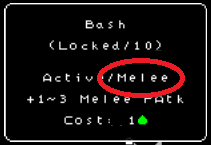
I can't figure out the skill menu. The first time I managed to get the bash skill, but the second time I can't invest into it despite having the 1 skill point needed.
When I hold mouse button to walk around and I hover over an enemy for a moment and move the mouse away, the character will lock into combat instead of walking again. That makes navigating around enemies annoying. It might be a matter of preferrence though.
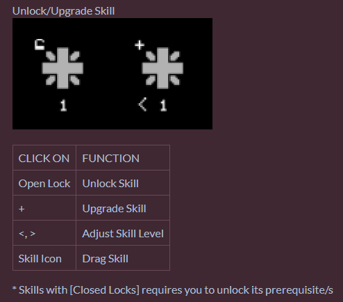
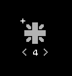
> can't invest in skill What did the skill look like? Aside from the icon, did it look anything like below?
> M1 Attack lock-on Right now you can place [Basic Move] skill in M1 and assign [Basic Attack] skill to another slot, or assign [Basic Move] skill to another hotbar slot and use that to navigate. I'll try to switch up the controls and maybe change some things then.
The second time it was the left variant for sure, but the first time I have no idea. My brain didn't register ever seeing the right variant.
It would be perfect if there was a mix of Basic Attack and Basic Move, and it would do action depending on the click target, with hover in move mode doing attacks temporarily.
> The second time it was the left variant for sure, but the first time I have no idea. My brain didn't register ever seeing the right variant. I'm stumped too, but what I can do though is update cursor indicators for next DD, so its appearance will change when it's over interactable objects.
> It would be perfect if there was a mix of Basic Attack and Basic Move, and it would do action depending on the click target, with hover in move mode doing attacks temporarily. Diablo 2 did it like that too, I'll try and make some changes then.
appreciate that you improved the text scaling so quickly.
i liked the mechanic of combining spells and adjusting its strength to `craft-compose` spells, but this needs ingame explanation, had to do more experimentation then i`d like. the padlocks as you can see from many comments are not very intuitive, i`d get rid of it tbh... maybe have the skills light up when you have the points, then click on it to `learn` with a confirmation dialogue. locking-auto-attacking is a bit clunky. clickable ui elements(+ - < ) should probably be a little different then regular text. could not ever use the Vendor, reading the page it seems i need to be at a specific area, but did not find any.
poison felt like a weak branch, but perhaps it has effects that i did not understand
got to level 4 or 5 a few times but would eventually die. a bit weird because i felt like i was fighting the same enemies, but this time they just killed me instead of me killing them
leveling up needs some fluff. a bright effect on the character or something. must be eventfull, my first few runs i did not even notice that i had leveled up and could distribute attributes
with enough variety i think current graphics can work, this minimal style has its charm
> skill crafting ingame explanation Maybe I can make a detailed explanation in the description? or place a link in the description to a skill crafting devlog? haha I'm just used to reading manuals before screwing around too much, not a fan of those ingame 'hand-holding' shizz gets annoying too fast
> skill indicators (lock, +, <, >) My UI design leans to minimalism, and maybe leaning too far. I'll try out some things and see how it goes.
> could not ever use the Vendor, reading the page it seems i need to be at a specific area, but did not find any.
You can access Vendor and Stash in Respite Zones, these are the starting level of each zone. You can press [M] to open Map and see what zone-level you're currently in.
> poison skills Poison skills are dope. You can find the 'Toxin' branch in the 'Venomacy' branch, these hold support skills for poison property skills. eg you have 3 Attack, Burn will do 3 damage in 3 seconds, Poison will do 3 damage in 6. Poison damage is small but poison status lasts longer. Poison is suppose to weaken a target, the 'Toxin' support skills will help you maim a target.
> dying to higher level enemies Yeah, enemies grow stronger with every sub level and gain new skills and passives with every new zone, and if you manage to go beyond zone 10, monsters become crazy strong
> level up fluff I can do that
> with enough variety i think current graphics can work, this minimal style has its char Thank you, everything right now are placeholders. I do plan to update the sprites but after I'm done with other features.
> maybe add a home town type location Only Respite Zones atm, these are the areas with a zero sub-level. I'll eventually expand the zone and add npcs to make it a proper hub.
So far, the combat works well, but it's a bit bland if I'm honest. With how sparse the enemies are I have the impression you want each encounter having it's weight instead of Diablo's slaughterfest but it's not really present at the moment. Being able to see enemy silhouettes through the fog of war is also pretty OP at the moment as with a ranged characters you can easily kill them before they are even able to get into your range of vision.
Some starting money or a way to select your starting equipment would be nice, as one run I started specing into spells but only found a wand at level 3 and had to make due with a bow until then.
Speaking of spells, right now I didn't really felt the need to upgrade them apart from Lightning bolt, as that was the only one that increased damage. Projectile speed doesn't really matter with how slow everything moves, and AOE felt unnecessary with how sparse the enemies are.
Stats seem fairly straightforward of what they do, though it feels like the point system is way too granular for the effects they give. Many times I had to dump 5 or so points into a stat before I saw a miniscule effect. Cutting down so you have less points to spend but each spending is meaningful might be better - at any rate, could be would be worth experimenting with.
Some kind of indicator on the main screen when you level up and have points to spend would be nice too. Many times I only realized I have points to spend after levleing up 3 or more times already.
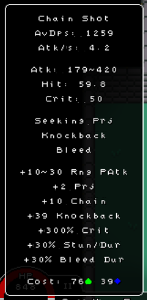
Support/passive skills are also a bit confusing. The UI mentioned cost for them to cast but I wasn't able to draw them to the quickslot bar.
As for the quickslot bar, it would be nice if you could reorder already existing items there, so if you want to move something you don't have to delete and find it again in your skill book/inventory.
Still, for all it's faults a solid prototype so far.
> sparse enemies I plan to change that for the higher levels by giving spawn points a chance to spawn additional mobs
> Being able to see enemy silhouettes through the fog of war is also pretty OP I know :D
> Some starting money or a way to select your starting equipment I wanted to make the player feel like a novice (like the starting character job in Ragnarok Online), get familiar with melee a little bit, grind a bit more then decide on a specialty to advance to. Or you can scour the first level then return to the respite zone to sell loot and buy gear.
> skill incentive Yeah, alone some skills are kinda meh, but when combined with others is sorta fun eg [Lightning Bolt + Chain Lightning + Seeker Shot] will have a high damage tracking projectile that can hit multiple times
> Support/passive skills are also a bit confusing Passive skills will give bonus directly to your character while Support skills can be added to (compatible) base skills in the quickslot bar by placing it over the base skill. You can use other Active skills too to support compatible base skills.
> As for the quickslot bar, it would be nice if you could reorder already existing items there, so if you want to move something you don't have to delete and find it again in your skill book/inventory I'll add that to my to do list
Controls feel janky, having to accurately click to do perform each attack is tedious (after experimenting more I found out you can hold down shift to shoot in a given direction but it wasn't intuitive). In my opinion it would be better to do it like POE and press a button to attack in the direction of your cursor.
The skill tree was confusing, couldn't figure out how to buy a skill after leveling up.
The bow draw animation that stops movement feels annoying too (muh realism isn't fun imo).
I don't know if you're familiar with that game, but this feels a lot like Ragnarok Online. The weakest link currently is how bland and samey every room is. There needs to be more going on with the environment, both gameplay and graphics-wise. This better have a fully fledged grid overworld by the end.
> The weakest link currently is how bland and samey every room is. There needs to be more going on with the environment, both gameplay and graphics-wise Bruh, cut me some slack, this is a prototype. I'm still not done with the core gameplay, everything you see are place holders. I know there's lacking of objectives, and I have a whole list I've yet to implement that I'm crawling towards.
> This better have a fully fledged grid overworld by the end. Bruh
I like the cute way-zoomed-out perspective, and the little sprites are cute too.
I feel like the default accuracy on attacks is way too low, I had several times where I missed three or four times in a row, and on a small sample I averaged 50% accuracy. Personally that feels like a bad way to stretch combat, but there may be more that I'm missing (accuracy items etc). I would rather see the miss chance drop, which would truncate combat, and make your character more apparently fragile. When I did die, I was a bit disappointed to lose all progress, but I understand the logic in that I think too. Lastly, and most important, I think you need to add something for the player to do idly while moving. Some games allow you to jump for instance, even if it doesn't make you move faster. Adding a hotkey to press to make your character do something idly while moving would be nice, because the movement felt a little uneventful, even just being able to trigger a 2-frame animation on command would fix that I think. Good work. I played on mute, so I can't comment on any sounds if they are present. OH, I also wanted to mention I really like the shadow enemies in the fog, that's a good effect and good value. Also, there was a gap that it looked liked I could fit through but I couldn't, consider closing it or letting the player go through.
> hit vs dodge My formula for 'hit vs dodge' results 70% chance to hit and 30% chance to dodge with equal hit & dodge values, mob was lucky, invest in Dex
> progress & death You can open the [Options] menu using [O] or [Esc], click on 'SAVE' to retain your progress
> extra shizz I'll eventually get to a point where I can add some pizzazz, right now though I'm still on the core gameplay loop
> playing on mute My game has no sound lol
> fog of war and enemy silhoettes Glad you liked it :D
> gaps between walls Yeah, with my current wall tiles it looks like that, but don't let it bother you :)
Aside from the obvious need for sound, one thing that kinda pissed me off was the fact that if I was moving and accidentally moved my mouse over a guy, I'd start trying to attack that guy instead. I want to have to click, not just mouse over them with the mouse button held down. I also never figured out if there was a hot swap button for the gear sets.
> moving and accidentally moved my mouse over a guy, I'd start trying to attack that guy instead Yeah, there's an actual reason for that - before I had the screen zoom i/o function and fullscreen scaling, sprites were really small, and click-to-lock-on needed some getting used to so I made 'single-target and M1 skills when held down and hover over target to lock-on.' I'm kinda used to it now. For an alternative you can place [Move] basic skill on [M1] and assign another hotbar slot with the attack skill.
> weapon swap It's [Tab], you can read about the hotkeys in the games description.
Hey, nice seeing your game here. I saw many of your updates. Your game has a quite unique look, specially the UI. I usually dislike it when games use recolored enemies, but in your game its working well. Its like scorpion and sub zero. Idk if it's a problem on my end, but on fullscreen my screen kept the same size with black borders around it. I'd like to suggest the [optional] QoL to click on an enemy just once and have your character auto-attack it until told to so something else. I can't remember Poe/diablo having this, but Ragnarok online did, so for Auto-attack builds it was very useful. Just a thought. What Evilous was pointing out is that players tend to go upwards in the first screen of games, so it feels a bit counter intuitive going downwards right in the beginning of your game. There is nothing wrong about it, but a good amount of players will probably go back to the new game screen (I know I did lol).
> fullscreen About that, the game's resolution is fixed atm, I'll add that to my to do list edit: game now scales on fullscreen mode
> auto attack For [M1] skills, hold it down with the cursor over a target and it will lock-on that target (even projectile skills) even when the cursor is not over the target anymore so long as it's pressed down. And for keyboard hotkeys and [M2], only single target skills will lock-on using the same method.
> disjointed point of entry Yeah, the level generator atm generates the level and picks the corners furthest apart and places entry points, and (I need to work on this part eventually) rotate the generated level to make entry points coherent.
>Enemies won't aggro if you attack and miss, they just walk away
>Going to the top makes it a new game? It's really dumb at the start
Outside of that it is pretty fast. I would recommend the ability to use a keyboard as well in game instead of almost everything through the mouse. With all the menus that can be used. Keyboard shortcuts would be very good too. Since wanting to access the inventory has you pause in place, then click on it hoping you didn't click on the ground and then interacting with it. 100% it's like Diablo, but it needs some work to get there, especially with how small the enemies are where you can click on the ground by accident. Make the hit box bigger for enemies.
>Enemies won't aggro if you attack and miss, they just walk away Yes, for easy early game - zone 1 & 2 can spawn non-aggressive mobs, zone 3 and over mobs are 100% aggressive.
>Going to the top makes it a new game? It's really dumb at the start Only in the first respite zone (zone 1 sub level 0) going up will exit your current game
>Keyboard shortcuts for menus There are, you can read all about it in the description
>Small enemies/hitbox You can zoom in/out the screen using keys [Z/X]
full draw appears locked for me. are there any pre reqs for this? it seems to be the first skill of the archer tree and i have 3 skill points. i hope i'm not missing anything obvious.
Comments
overall the game is good but the movement feels a bit too slow for an orblike
also there are quite a few readabilty issues with the UI, text is pretty hard to read and its hard to figure out how it works in general
other than that gameplay wise most seemed fine though, the rest of it was pretty intuitive for me
was a bit weird that Skill didn't unlock when clicking on the Skill, but only on the icon at the Top. Was initially thinking I needed 10 Points to unlock a Skill, not that its 10 Stages of a Skill.
Why does moving into the top room return me to the Title? Could use a clearer differentiation between new Room and exiting.
+10 HP Belt doesn't work. Needs sound feedback on hitting/getting hit etc. No Idea what half of the Stats do, if you shorten them, a long explanation on hover, at least in the stat menu could work. Whats the difference betweeen Red.Dmg Rst.Dmg and Block?
Your Skill menu is laid out pretty terribly, why are there small easily overseeable Arrows at the Bottom to change in Subtrees, but then not at the opposite end to change back into previous Tree, but instead the topleft has fixed directions? Why are there so many subtrees with so much space between every option? Makes it really tough to move through all of them to see which Tree to pursue. Also I can't move Skills/etc. back out from my Hotbar once assigned? Update: Found out I can rightclick them. Why doesn't drag and drop override whats on the Slot?
At least its rather clear what Stat affects which Stat, since its always the one on the Right, but why not have me level HpR directly then? Unless Stats can affect multiple other Stats, like in DS, at which Point a Highlight might be useful.
Why do I have to let go off moving before I can dash? Died at 3-3 ~lvl 20. Why is both your level (as in status) and your level(as in floorlevel) named level?
Overall feels very clunky and slow, dodging seems useless, and with how much Points I had to investigate to get a build focused on a single spell feel okay-ish, I don't think it invites at all to any experimentation or going for "higher-level" skills. In the End, I just put 50 Points or so into spRegen to get some useable amount of Manaregen, and a few leftovers into health and healthregen to avoid getting oneshot, and to counteract burn a bit, and at the beginning 10 or so into accuracy since I thought I'd be going melee, which I weren't. As for Skills, 1 into lightning bolt to use it, 1 into poison bolt because I thought poison would do continous damage, and not just slow enemy regen a tiny bit, and 10 into spellcastspeed in lighting and poison. Or however close I got to 10 in both. Plan was to continue the same way until I had all spellcastspeeds for every tree, then max lightning bolt for damage. As for Stats, I wanted to reach 2 MpRegen which I did, so I could reliable regen my MP quickly enough to cast more or less continously, then dump everything into damage and occassionally health to keep up with not being oneshot.
Inventory was just full of red and blue Potions, everything else was crap, so threw it away. Then I found the Vendor at 3-0, so that felt wasted, but its not like Vendor has anything useful anyway.
As for Equipment, nothing fancy, except for a legendary Wand for 10-20 spell damage or something.
> skill upgrading is unintuitive
Yes. I need to figure out how to invite people to read the description or I will be doomed to make ingame explanations. I'll prob add tooltips for the skill menu.
> zone 1 exit point exits game (returns to title)
Yeah, I thought it was funny, but I already removed that from the new build I'm working on.
> +10 Hp Belt dont work
Maybe it was a +Mp Belt? I myself sometimes can't tell because of the text. And I really don't want to change the game's text but maybe in a much later update.
> No Idea what half of the Stats do, if you shorten them, a long explanation on hover
I mean we can deduce within a few moments what is what, but I should not expect anything and prob need to make sure and tell them what is or let plebs filter themselves jk
my initial design was only for 800x600 screen, I don't have enough space in the attribute menu to display the full descriptions, I had to make it look clean, so I went with what we have rn. Hover tooltip on the attribute menu seems overkill to me but I'll see what I can manage.
> Skill Menu's unimpressionable navigation buttons
I actually wanted to make a skill tree similar to PoE's colossal passive tree, but I've yet to figure that out, so I went with the 'browser look' hence the [home] and [back] buttons are on the top left.
I placed the other branch/navigations buttons at bottom of the menu so the skills in a branch gets focused on.
I'm leaning too much in the minimalistic design aspect, I didn't want to take away too much attention off your character and what's happening around it.
> Why doesn't drag and drop override whats on the Slot?
I have this 'Synergy System' where you can combine compatible skills, you place another on the base skill and it gets the added skill's mods.
It makes crafting skills tedious because you sometimes need skills from different skill branches, but I've yet to have a better idea on how to do this. Do you have any suggestions? let's make this game good :)
> but why not have me level HpR directly then? Unless Stats can affect multiple other Stats
Yes, in the Attribute Menu the stats on the left are 'Prime Attributes', they affect the 'Basic Attributes' to their right (in increasing returns). Basic Atts have 'Sub attributes' (eg STR(Strength) - PAtk(Physical Atk) - MAtk/RAtk(Melee Atk / Range Atk)) - Basic affects Sub.
And we also have 'Super Attributes' - notice in the menu attributes are grouped together, those have the same super attribute. Super Atts affects Basic & Sub Atts of that group (eg POW(Power) affects lower atts of STR & INT attributes)
My game has Stat/Attribute autism.
> dodging invu frames
We don't have that here. We dodge by letting 'hit vs dodge' do its thing (for physical attributes only), getting out of strike range, and getting out the way of projectiles.
> Why is both your level (as in status) and your level(as in floorlevel) named level?
Character level and when you open the Map it shows Area Level, we can distinguish that much. I can switch the Area level with 'Zone'.
> attribute point, not going melee, shifting to lightning/poison hybrid
My (barely a) game has a learning curve, git gud jk (dont hate me bro haha)
It was a good idea to invest in the Constitution/Restoration attributes (Health, Stamina, Mana / Endurance, Resilience, Spirit) to get decent flat values, then unlock/upgrade passives from the 'Fortitude' skill branch to multiply the flat values. My suggestion for is to max your prime resource and dump 30-50 for other supplementing resources.
Elemental property effects
If you're willing to give my game another go I can make you an early game guide, you'll only use your first 8 levels (fast, high regen, hits hard).
> Vendor
You can access the Vendor and Stash at the beginning of every zone - Respite Zones have a zero sublevel.
Yeah, Vendor doesn't do anything special atm, you can sell and buy pots though
> As for Equipment, nothing fancy, except for a legendary Wand for 10-20 spell damage or something.
You might find an item with a nice base mod with 3 bonus mods but only 1 is useful, equipment will stay like that, fully random mods (not exactly). My modifier generator rolls through a table, randomly selects a mod then checks if it's compatible with the base item (some mods can only spawn in some base items).
I have an item crafting system in the works. When it's done this will let us upgrade the base item, upgrade mods, extract mods, add mods. This is far down the list though.
If it were in a pretty physical Handbook, People would be reading your Description, but I generally just hover through the itch Page quickly to see Controls and specific Places People want Feedback on. (Hence why I figured out how to upgrade them. It'd work with a bit of randomly clicking around aswell, but the lock/+ don't really feel like they are a button of any kind)
>return to title
It's fine if its marked as that. But just a regular entry/exit like others isn't very good. A simple Door or a different color or just the text "return to title" or something works enough already.
>HP/MP Belt
Don't know, maybe? Your Font should really be clear to read on that tho.
>Stats
I'm not talking about the obvious stats PAtk/SPAtk/HpMx etc. are clear. But whats AtkRt/CstRt? I know it stands for AttackRating and CastRating but what does it do? Speed of Attacking? Critchance? Affect the Formula in some weird way? And with how little you get per Point on Stuff thats not damage/HP/MP/etc, I'm not really invited to just put one or two points into it to find out. This isn't so much an issue with the Names, but what the Stats actually do. Same with RedDmg RstDmg and Block. I still don't know what RedDmg means or does, seeing that the stat Screen has resistances, I can deduce that RstDmg probably means Damageresistance, but thats also not clear? Is it a flat redcuction to Damage I take? All Damage or is that just physicial damage? Whats block then? Chance to block? In percent or just in some Formula again? In both cases, whats RedDmg? RedistributeDamage? ReduceDamage? If its reduce and reduces my Damage, whats Damageresistance then? Chance to not take Damage? But then whats Block?
>Skilltree
If its massive putting it into subclasses makes Sense. But I just think the navigation Buttons are at the wrong Positions. Just have it be an actual Tree, if I go down from Venomancy into Toxin, have a big arrow at the top to take me back up, if I go into Wizard, a big button on the right to go into sorcerer, and if I'm there, a big one to the left to go back to Wizard. Not just a small one topleft to go back to the previous Place, and multiple Arrows at the Bottom. The one to keep at the top left is the one to return to the startscreen of the Layout.
In any case, if I see it right, you have Fortitude in the Center, with 4 Baseclasses around them, and then a combination class in each of them, and a "advanced Baseclass" so to speak. You have more then enough empty space on the Screen to put all of those into one Screen, just radiating outwards, and adding some Lines in between to indicate which classes are connected.
>Skill synergy
Is there any indicator which Skills are synergizing with each other? Or is it just trial and Error? Because I'm very much not inclined to pick up any Skill apart from passive improvements like + castingspeed to the Skill I'm choosing right in the beginning as my only damage Source. Is it something that can be reversed, or changed at will constantly? Can there me multiple Skills combined into one, not just 2? Or is it just 1 active and 1 passive or something? Either Way, you could always just put in an NPC in your HUB-Area with the Shopkeeper and Stashchest, that allows you to merge your Skills together, so you don't have to do it all in one Place. Fills out the Area a bit more, and frees options up for your Menues.
>Attributes
No, I got how they worked, as long as their Names and Roles are clear, see above. I mean, why do I have to level Strength if its only affects PAtk? Why not remove Strength all together and have me level PAtk at that Point? Derivated Substats are great if you have multiple Stats being affected by one Attribute. If Strength would affect HpMx or SAtk aswell i.e., but this isn't the Case. And if its for Melee range or whatever aswell, why are those Stats not shown in the Menu?
>My game has Stat/Attribute autism.
Nothing wrong with that if done well.
In the End, I wasn't complaining about the Build I got, or the Items, both work, I just died to not paying attention. I'll play it again later to see if I can figure out which Skills combo with each other, but the general Way will probably stay the same, that I'll just have one spammed Attackskill, and level all the support Skills otherwise.
Update:
Did another quick run, realized now the support skills are the one ment to be slotted into the active ones? That could really need some ingame explanation somewhere, I was assuming they were just passive Skills, hence why casttime increase did so little. Its pretty useless tho, makes them far too expensive for little to no benefit, so just putting one point into the Skill itself, and then dumping everything into Stat increases seems way stronger then all other Options. Also somehow ended up with 59XP, even tho every Enemy gives 10XP? I lost a XP somewhere along the Way.
Also checked through the Spells. Channeling ones are pretty useless, with the Amount of Time you have to stand still and the Amount of Ressources you have to burn for the Buffs, that only last 15s, you might aswell just pump those Points into actually powering up your Spell.
And apparently other Actives can be slotted onto aswell? Can I just slot every Skill into one? Or only if they at least share a common Element? Because that'd just mean I'd be spamming one skill even more. Sure, it gets more expensive the more I slot, but it caps out easily enough, with the amount of bonusMP/SP Skills that are available. But then I can't slot Toxic Orb onto Poison Bolt, so no Idea what merges with what anymore.
> my minimalist UI biting me back
took this from my game's description
I'm working on cursor indicators - when you hover over interactable objects this will surely help figure things out when they still won't read my barely a game's description.
> environmental indicators for entry/exit points
I'll add that to my growing list
> replacing my sprite font
I couldn't find I font I liked so I made one myself, nothing special about it, but it's good enough for now.
> Attack Rate / Cast Rate
AGI(Agility)=fast, so I attributed WIZ(Wizardry) to speed too
> granular attribute output
The attribute system behaves in increasing returns, it's a barely-a-demo but I don't want to make things too crazy too early
> Red(Reduction), Rst(Resistance), Block
I swear my brain told me I had answered that, and it's nowhere mentioned in my reply.
> Property types
* Damage is after going through Reduction & Resistance formula
> Skill Tree navigation
Man, i tried that, placing the navigator buttons on sides and corners it looked ugly.
I'll try again, might figure it out and make it work, but it aint today.
> Skill Tree's base
It was deliberate that the more advance classes were not so hidden. I wanted players to wander a little bit, but my current design seems unintuitive and needs some work.
> Skill Synergy
There are 3 skill types Active, Passive, and Support.
> Trial & Error Synergy
I wanted players to do trial & error to find compatible skills but that's too much to ask, I'll create a guide soon.
> Multiple Skills in 1
I wanted to cap the skills added to 10 skill levels, but I don't have to, there is no cap, the resource cost will render skills unusable
> Skill NPC
Nah, loadout shizz don't make sense here, I'll let you edit skills in the middle of the zone, while you get dogpiled by mobs.
> Prime Attributes
They're your character's foundation, high flat values coupled with decent multiplier is the way to go, high multiplier with low flats result are meh
> Sub Attributes not displayed
They are though, in your skill's description
> 59 Exp
That means your level is greater than the current area level, diminishing returns, fight in areas equal or greater than you
> Channeling & Buffs
You'll sweep early game with and will probably be hard to survive without in later levels Priest Buffs
> Channeling Skills
I need to make a quick guide for this class
Wanna here about my level 8 guide now? haha jk
> Skill Synergy Special Cases
You can add 'Poison Bolt' to 'Poison Orb' but not the reverse, because poison bolt does not benefit & have Poison Orb's AOE modifier if that makes sense, and this is the usual logic
But as you already clearly recognized, nobody is going to read through your itch Page, it should be either intuitive on where to click to unlock, or explained somewhere in Game, ideally not in some submenu on how to play, or a textdump at the beginning, but along the Way.
>it's good enough for now.
If even you yourself get confused sometimes wether its a H or an M, it clearly isn't good enough.
> granular attribute output
How you handle Statgrowths or anything doesn't matter, you can give +0.01 for the first level and +2.5 for the second or whatever, if I need to level strength only to increase pAtk, just remove strength alltogether and let me directly click on pAtk to increase it.
As for Skilltrees, just include the Diagram you posted in your Reply in the Game, no need for all the subtrees. Use Icons instead of Text, and display the Name of the hovered class on top of the Skilltree Window when hovering, and you don't need any submenu navigation.
>Trial & Error Synergy
Thats fine to have, if your Game encourages or supports trying out different Things. With 1 Skillpoint per Level and continously scaling difficulty, it doesn't.
>I'll let you edit skills in the middle of the zone, while you get dogpiled by mobs.
Noone does that, you can't attack with the skill menu open, so you'd just get pummeled down.
>Prime and Sub Attributes
Again, I'm talking about Strength as an Example. It serves no purpose being there, it doesn't add anything. Just apply all your modifiers, all the Levels I can spent etc. directly to pAtk. Or let strength affect more then one Stat.
Sub Attributes displayed in your Attribute Window, I never said anything about a spells attributes there. There is no Block or RedDmg there or anything, nothing to see how my Stats would affect those. Which they probably aren't anyway, see above.
>diminishing returns, channeling
You don't need diminishing returns. You have a constant increase in difficulty with a set amount of Enemies per Level. If I defeat every Enemy in every Level I should be right on curve. If I rush past Enemies, I'll naturally fall off due to missing out on experience. You should have just the Amount of Enemies per Zone thats intended so I keep on curve if I defeat all, it shouldn't be possible to overlevel with that layout.
If I channel in the beginning of a Zone, the buffs run out by the Time I hit the first Enemy. If I channel when I start combat, I loose multiple seconds where I just get pummeled and could counterhit them.
>Skill Synergy logic
Why doesn't Poison Bolt allow to increase its radius with Poison Orb? It clearly explodes when hitting an Enemy, it'd allow the Skill to be turned into an AoE by leveling the AoE skill and combining those. I'm on board with skills needing the same Type like Poison to be matched together, but then all Poison should be able to be matched together, or at least all support into all Actives, and no active+active or something coherent. Just allowing all same types to be mashed together until you as the dev feel like it wouldn't make Sense is stupid. If you only allow specific Skills to be matched with each other, without any global underlying logic, or with exceptions like Bolt+Orb, you need to indicate that in your UI somewhere. And it makes even less sense if Bolt+Orb isn't allowed but Orb+Bolt.
And stop trying to sell me your early Level build, if you talk about wanting People to trial and Error, and then try to give them a fixed built for the first 8 Levels or so, so they can actually survive, you're disencouraging trial and error even more then your Game itself does, and are basically telling everyone they need a very specific build to actually be able to get further then 20-30 Levels. At that Point, you might aswell just remove the first 10 Levels the Player gains automatically, and lock it behind a tutorial. So on level up, it goes to the status screen and tells you: You can spent points to increase Attributes. Try it and level Health 5 times this level. If you go to the Skilltree, you can click on the lock to unlock a skill. Here, try and unlock this Priests buffskill, etc. That way you avoid your UI being unclear, as you explain everything, 'and' force every Player to use your early Game build, which according to you is apparently required. Of course, its not going to be Fun, and People are just going to use the exact same build every run, since they're forced to do it, but thats a different Issue then.
> you can't attack with the skill menu open
You can still play on half the screen when one menu is open
> remove STR replace it with PAtk
nah
> Sub Attributes in the skill description
Let's say with a Sword equipped you 'Basic Attack' skill will display Melee Attributes (not explicitly) and when you swap with Bow it will now display Range Atk/AtkRt/Hit/Crit, people can distinguish that.
> enough enemies in an area to keep you in the curve
Nope, everything is random, it depends the generated area's size on how many can spawn so it wonn't get to crowded too early. In the new build though in later levels spawn points get a chance to spawn multiple mobs.
> Priest Buffs
Yeah those need to be learned to efficiently use & cheesed.
> bolt orb
the small explosions bolts make are just vfx, Orb explosions are different though
> build shill
It's guide to use Priest Buffs so we can see how basic attributes interact with each other, Channeling mechanic, resource management.
This is a singleplayer game so I have the Priest Skills help you help yourself, but you can go pure and hardcore in your build route too.
Wow, just had a giant post typed up with a lot of feedback and accidentally left the page. Damnit that's annoying. I will try and recreate it...
Excellent core gameplay demo. You put a lot of work into the messaging and systems design. This is already fun, and I think once the actual game is built out on top of it, you will have a great game to show for it.
Some thoughts and feedback:
Great work dude, really looking forward to seeing this evolve.
Thanks for playing!
> I would increase the base zoom level. Most players wont alter it. Higher zoom feels a lot easier to control, because your click targets are bigger, and you can more clearly see what is happening.
Solid point, to make it more playable for people just starting/trying out.
> Increasing the click radius for enemies and items
I get it for enemies. Though for Loot you can hold down space bar to show their names and you can click on that to select.
I'll test things out for both and see it from there.
> highlight enemies or item
Yeah, I have that on hold. Tried do that but didn't quite get it yet.
> Shift+Click
You can use Shift+Click, but mine doesn't auto-select targets atm.
> move indicators
Yep, I have that on my list to do, cursor indicators for interactable objects.
Appreciate the feedback.
that was fun. wish there was more item variety in the shop, though maybe that improves after stage 2.
adding a toggle for auto pick up for gold/potions would be nice. stopping after fighting to click each gold piece was a bit disruptive to the flow of things.
> that was fun.
Glad you enjoyed it!
> wish there was more item variety in the shop, though maybe that improves after stage 2.
Vendor Shop does add new items in higher respite zones (you can read about this and other things in my last devlog)
- Respite Zone 3 onwards will start selling tier 2 Potions, Armor, Accessories
- Respite Zone 5 onwards will start selling tier 2 Weapons and tier 3 Armor, Accessories
- Respite Zone 6 onwards will start selling tier 3 Potions
- Respite Zone 8 onwards will start selling tier 4 Armor, Accessories
But these items are just normal base items. In a future update plan to make vendor items roll [Rarity/Quality] so you can buy better stuff.
> auto loot gold & pots
That's a good idea - auto looting gold,
but for pots how should we go about it?
- auto loot ones present on the hotbar
- auto loot ones present in the inventory
- auto loot all (seems like a bad idea to me)
Autopick up for pots in the hotbar is similar to how poe works, where combat refills flasks.
Could also explore those health/mana motes in the earlier versions of diablo 3 (they mightve changed it now)
It works fine.
I can't figure out the skill menu. The first time I managed to get the bash skill, but the second time I can't invest into it despite having the 1 skill point needed.
When I hold mouse button to walk around and I hover over an enemy for a moment and move the mouse away, the character will lock into combat instead of walking again. That makes navigating around enemies annoying. It might be a matter of preferrence though.
> It works fine
Nice.
> can't invest in skill
What did the skill look like? Aside from the icon, did it look anything like below?
> M1 Attack lock-on
Right now you can place [Basic Move] skill in M1 and assign [Basic Attack] skill to another slot, or assign [Basic Move] skill to another hotbar slot and use that to navigate. I'll try to switch up the controls and maybe change some things then.
The second time it was the left variant for sure, but the first time I have no idea. My brain didn't register ever seeing the right variant.
It would be perfect if there was a mix of Basic Attack and Basic Move, and it would do action depending on the click target, with hover in move mode doing attacks temporarily.
> The second time it was the left variant for sure, but the first time I have no idea. My brain didn't register ever seeing the right variant.
I'm stumped too, but what I can do though is update cursor indicators for next DD, so its appearance will change when it's over interactable objects.
> It would be perfect if there was a mix of Basic Attack and Basic Move, and it would do action depending on the click target, with hover in move mode doing attacks temporarily.
Diablo 2 did it like that too, I'll try and make some changes then.
appreciate that you improved the text scaling so quickly.
i liked the mechanic of combining spells and adjusting its strength to `craft-compose` spells, but this needs ingame explanation, had to do more experimentation then i`d like. the padlocks as you can see from many comments are not very intuitive, i`d get rid of it tbh... maybe have the skills light up when you have the points, then click on it to `learn` with a confirmation dialogue. locking-auto-attacking is a bit clunky. clickable ui elements(+ - < ) should probably be a little different then regular text. could not ever use the Vendor, reading the page it seems i need to be at a specific area, but did not find any.
poison felt like a weak branch, but perhaps it has effects that i did not understand
got to level 4 or 5 a few times but would eventually die. a bit weird because i felt like i was fighting the same enemies, but this time they just killed me instead of me killing them
leveling up needs some fluff. a bright effect on the character or something. must be eventfull, my first few runs i did not even notice that i had leveled up and could distribute attributes
with enough variety i think current graphics can work, this minimal style has its charm
Thanks for playing my game!
> skill crafting ingame explanation
Maybe I can make a detailed explanation in the description? or place a link in the description to a skill crafting devlog?
haha I'm just used to reading manuals before screwing around too much, not a fan of those ingame 'hand-holding' shizz gets annoying too fast
> skill indicators (lock, +, <, >)
My UI design leans to minimalism, and maybe leaning too far. I'll try out some things and see how it goes.
> could not ever use the Vendor, reading the page it seems i need to be at a specific area, but did not find any.
You can access Vendor and Stash in Respite Zones, these are the starting level of each zone. You can press [M] to open Map and see what zone-level you're currently in.
> poison skills
Poison skills are dope. You can find the 'Toxin' branch in the 'Venomacy' branch, these hold support skills for poison property skills.
eg you have 3 Attack, Burn will do 3 damage in 3 seconds, Poison will do 3 damage in 6. Poison damage is small but poison status lasts longer. Poison is suppose to weaken a target, the 'Toxin' support skills will help you maim a target.
> dying to higher level enemies
Yeah, enemies grow stronger with every sub level and gain new skills and passives with every new zone, and if you manage to go beyond zone 10, monsters become crazy strong
> level up fluff
I can do that
> with enough variety i think current graphics can work, this minimal style has its char
Thank you, everything right now are placeholders. I do plan to update the sprites but after I'm done with other features.
nice, seems like you've got most of the stuff you need for this type of game done.
didn't find any bugs, I assume this is inspired by diablo maybe add a home town type location
Thanks for playing!
> I assume this is inspired by diablo
It is :D
> maybe add a home town type location
Only Respite Zones atm, these are the areas with a zero sub-level. I'll eventually expand the zone and add npcs to make it a proper hub.
very nice
So far, the combat works well, but it's a bit bland if I'm honest. With how sparse the enemies are I have the impression you want each encounter having it's weight instead of Diablo's slaughterfest but it's not really present at the moment. Being able to see enemy silhouettes through the fog of war is also pretty OP at the moment as with a ranged characters you can easily kill them before they are even able to get into your range of vision.
Some starting money or a way to select your starting equipment would be nice, as one run I started specing into spells but only found a wand at level 3 and had to make due with a bow until then.
Speaking of spells, right now I didn't really felt the need to upgrade them apart from Lightning bolt, as that was the only one that increased damage. Projectile speed doesn't really matter with how slow everything moves, and AOE felt unnecessary with how sparse the enemies are.
Stats seem fairly straightforward of what they do, though it feels like the point system is way too granular for the effects they give. Many times I had to dump 5 or so points into a stat before I saw a miniscule effect. Cutting down so you have less points to spend but each spending is meaningful might be better - at any rate, could be would be worth experimenting with.
Some kind of indicator on the main screen when you level up and have points to spend would be nice too. Many times I only realized I have points to spend after levleing up 3 or more times already.
Support/passive skills are also a bit confusing. The UI mentioned cost for them to cast but I wasn't able to draw them to the quickslot bar.
As for the quickslot bar, it would be nice if you could reorder already existing items there, so if you want to move something you don't have to delete and find it again in your skill book/inventory.
Still, for all it's faults a solid prototype so far.
Thank you for trying out my game!
> sparse enemies
I plan to change that for the higher levels by giving spawn points a chance to spawn additional mobs
> Being able to see enemy silhouettes through the fog of war is also pretty OP
I know :D
> Some starting money or a way to select your starting equipment
I wanted to make the player feel like a novice (like the starting character job in Ragnarok Online), get familiar with melee a little bit, grind a bit more then decide on a specialty to advance to. Or you can scour the first level then return to the respite zone to sell loot and buy gear.
> skill incentive
Yeah, alone some skills are kinda meh, but when combined with others is sorta fun
eg [Lightning Bolt + Chain Lightning + Seeker Shot] will have a high damage tracking projectile that can hit multiple times
> attributes granular effects
It's intentional. Attributes behave in increasing returns
> level up indicator
I will do that
> Support/passive skills are also a bit confusing
Passive skills will give bonus directly to your character while Support skills can be added to (compatible) base skills in the quickslot bar by placing it over the base skill. You can use other Active skills too to support compatible base skills.
> As for the quickslot bar, it would be nice if you could reorder already existing items there, so if you want to move something you don't have to delete and find it again in your skill book/inventory
I'll add that to my to do list
Thanks again!
Controls feel janky, having to accurately click to do perform each attack is tedious (after experimenting more I found out you can hold down shift to shoot in a given direction but it wasn't intuitive). In my opinion it would be better to do it like POE and press a button to attack in the direction of your cursor.
The skill tree was confusing, couldn't figure out how to buy a skill after leveling up.
The bow draw animation that stops movement feels annoying too (muh realism isn't fun imo).
> Controls feel janky
You'll get used to it
> The skill tree was confusing, couldn't figure out how to buy a skill after leveling up.
click the [lock] to unlock, click [+] to upgrade, click [</>] to adjust
> The bow draw animation that stops movement feels annoying too (muh realism isn't fun imo)
noted
I don't know if you're familiar with that game, but this feels a lot like Ragnarok Online. The weakest link currently is how bland and samey every room is. There needs to be more going on with the environment, both gameplay and graphics-wise. This better have a fully fledged grid overworld by the end.
> ragnarok online
I love that game
> The weakest link currently is how bland and samey every room is. There needs to be more going on with the environment, both gameplay and graphics-wise
Bruh, cut me some slack, this is a prototype. I'm still not done with the core gameplay, everything you see are place holders. I know there's lacking of objectives, and I have a whole list I've yet to implement that I'm crawling towards.
> This better have a fully fledged grid overworld by the end.
Bruh
I like the cute way-zoomed-out perspective, and the little sprites are cute too.
I feel like the default accuracy on attacks is way too low, I had several times where I missed three or four times in a row, and on a small sample I averaged 50% accuracy. Personally that feels like a bad way to stretch combat, but there may be more that I'm missing (accuracy items etc). I would rather see the miss chance drop, which would truncate combat, and make your character more apparently fragile. When I did die, I was a bit disappointed to lose all progress, but I understand the logic in that I think too.
Lastly, and most important, I think you need to add something for the player to do idly while moving. Some games allow you to jump for instance, even if it doesn't make you move faster. Adding a hotkey to press to make your character do something idly while moving would be nice, because the movement felt a little uneventful, even just being able to trigger a 2-frame animation on command would fix that I think.
Good work. I played on mute, so I can't comment on any sounds if they are present.
OH, I also wanted to mention I really like the shadow enemies in the fog, that's a good effect and good value. Also, there was a gap that it looked liked I could fit through but I couldn't, consider closing it or letting the player go through.
> hit vs dodge
My formula for 'hit vs dodge' results 70% chance to hit and 30% chance to dodge with equal hit & dodge values, mob was lucky, invest in Dex
> progress & death
You can open the [Options] menu using [O] or [Esc], click on 'SAVE' to retain your progress
> extra shizz
I'll eventually get to a point where I can add some pizzazz, right now though I'm still on the core gameplay loop
> playing on mute
My game has no sound lol
> fog of war and enemy silhoettes
Glad you liked it :D
> gaps between walls
Yeah, with my current wall tiles it looks like that, but don't let it bother you :)
Thank you for trying out my game.
Aside from the obvious need for sound, one thing that kinda pissed me off was the fact that if I was moving and accidentally moved my mouse over a guy, I'd start trying to attack that guy instead. I want to have to click, not just mouse over them with the mouse button held down. I also never figured out if there was a hot swap button for the gear sets.
> no sound
I'll dabble with that eventually
> moving and accidentally moved my mouse over a guy, I'd start trying to attack that guy instead
Yeah, there's an actual reason for that - before I had the screen zoom i/o function and fullscreen scaling, sprites were really small, and click-to-lock-on needed some getting used to so I made 'single-target and M1 skills when held down and hover over target to lock-on.' I'm kinda used to it now. For an alternative you can place [Move] basic skill on [M1] and assign another hotbar slot with the attack skill.
> weapon swap
It's [Tab], you can read about the hotkeys in the games description.
Hey, nice seeing your game here. I saw many of your updates. Your game has a quite unique look, specially the UI.
I usually dislike it when games use recolored enemies, but in your game its working well. Its like scorpion and sub zero.
Idk if it's a problem on my end, but on fullscreen my screen kept the same size with black borders around it.
I'd like to suggest the [optional] QoL to click on an enemy just once and have your character auto-attack it until told to so something else. I can't remember Poe/diablo having this, but Ragnarok online did, so for Auto-attack builds it was very useful. Just a thought.
What Evilous was pointing out is that players tend to go upwards in the first screen of games, so it feels a bit counter intuitive going downwards right in the beginning of your game. There is nothing wrong about it, but a good amount of players will probably go back to the new game screen (I know I did lol).
> weird UI and recolors
Thanks :D
> fullscreen
About that, the game's resolution is fixed atm, I'll add that to my to do list
edit: game now scales on fullscreen mode
> auto attack
For [M1] skills, hold it down with the cursor over a target and it will lock-on that target (even projectile skills) even when the cursor is not over the target anymore so long as it's pressed down. And for keyboard hotkeys and [M2], only single target skills will lock-on using the same method.
> disjointed point of entry
Yeah, the level generator atm generates the level and picks the corners furthest apart and places entry points, and (I need to work on this part eventually) rotate the generated level to make entry points coherent.
Thanks for trying out my game.
>Enemies won't aggro if you attack and miss, they just walk away
>Going to the top makes it a new game? It's really dumb at the start
Outside of that it is pretty fast. I would recommend the ability to use a keyboard as well in game instead of almost everything through the mouse. With all the menus that can be used. Keyboard shortcuts would be very good too. Since wanting to access the inventory has you pause in place, then click on it hoping you didn't click on the ground and then interacting with it. 100% it's like Diablo, but it needs some work to get there, especially with how small the enemies are where you can click on the ground by accident. Make the hit box bigger for enemies.
>Enemies won't aggro if you attack and miss, they just walk away
Yes, for easy early game - zone 1 & 2 can spawn non-aggressive mobs, zone 3 and over mobs are 100% aggressive.
>Going to the top makes it a new game? It's really dumb at the start
Only in the first respite zone (zone 1 sub level 0) going up will exit your current game
>Keyboard shortcuts for menus
There are, you can read all about it in the description
>Small enemies/hitbox
You can zoom in/out the screen using keys [Z/X]
Thanks
cool game. how do you allocate skill points? it says i have 2 points and clicking on full draw didn't do anything. do i have to be at a certain level?
On the skill icon it will have a [lock] on the top-left corner
The lock will be open if you have skill points and have unlocked the skill's prerequisites
Click on it when it's open to unlock the skill
The lock when then turn into a plus sign (+), for upgrades
You can also adjust the skill's level to use by clicking '<' to level down, and '>' to level up
Don't forget to combine skills!
full draw appears locked for me. are there any pre reqs for this? it seems to be the first skill of the archer tree and i have 3 skill points. i hope i'm not missing anything obvious.
Clicking on the [lock] on the top-left corner of the skill icon will unlock/upgrade the skill.