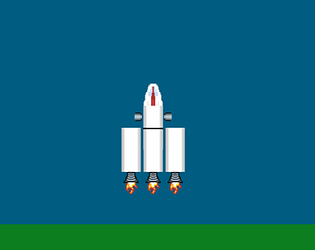
We had 1 out of 5 of our playtesters give the same feedback but it was too late to fully address the dizzying effect some people get. We only moved the planet up a bit to give you a better focal point. First time I've personally run into an accessibility problem in my software :D
Sno0pyP
Creator of
Recent community posts
Seemed like it was going to be a fun time after loading up and getting into the rocket. Unfortunately, I couldn't play this game and experience all the content.
Doesn't seem like you clamped the turning speed to the game's update time. I have a pretty good frame rate and tapping left or tight will make me do 90-180 degree turns.
Also like Michael said I didn't realize I need to tap thrust until I read his post. Maybe the thruster sound should have been an indicator to me because it wasn't continuing while I was holding W or S. I just thought that was a bug though.The thing is it's not easy to tell if you're moving because of the background image. Sure the asteroids help but are they moving or am I??? both???
Lastly, when I got trapped in space I just started spamming click and all these explosions would happen like 30 seconds later. We're these the asteroids? a planet? who knows cause I couldn't see them.
Ok, cool idea? Ya. Polished? No. The rope needs to fire regardless of it being able to hit anything. How is the player supposed to know the game is actually working if they are spamming space and it does nothing???
The second thought is you must play a lot of mobile games. Not sure why you went with the joystick control for a desktop game. It's not really a hindrance on mechanics but it is an odd choice. I'm positive the time it took to implement such control could have been better spending on polishing the overall experiance.
Cool little puzzle game. Wish there was a restart button, a "you lose" indicator when the solution is no longer possible, or the first level was a walk-through. Took me a couple of alt-f4s to figure out this is actually a decent math puzzle game. Could definitely see this as a mobile game if you flushed out some of the gameplay. Also, don't underestimate the benefit of adding sound effects to your game. Even the simplest sounds make a HUGE difference.
The longer you play this game the more fun it gets and the more the player understands. Good job with this entry. Agree with the others that a score indicator could help me understand what to do faster. As an improvement (not that one is needed) maybe could toy with different powerups or spend a ton of time tuning the interactions of the current gameplay features.
I agree with the comments below in that the tutorial is too long. I didn't spend the time reading through all the words to understand what I had to do within the game. I was clicking around all the planets trying to find a correlation on what would affect my score but it took a while. When "Selecting a Planet" I sometimes got a mini-game with a rocketship that would zoom across my screen at the speed of light. It was not apparent what I should do to get through the big asteroid shield of the planet. Tried ramming them, nothing. Tried clicking to shoot, nothing. All in all, I think this is a nice game jam concept but leaves too many question marks for us players.
Not bad. I like the art theme and think you put in some effort putting this together. Needs some adjustments. It may be a personal thing but having to wait for the text is exhausting and if I quickly press space I miss your content. Would like to give it another go but would want to wait till i can go through the text faster. Think there might be bug; at the angel, if you just sit there you can get the dialog of many different characters after the angel has told you his part.
Nice looking game with a good mood. Loved the SFX and the overall ambiance. The movement was fluid and drifting was a great touch. The thing that threw me most was the dimensions. It felt like control was designed for 2.5d while the graphics were designed for 2d front facing. For example moving upward just felt completely wrong. Maybe all that was needed was a slight skew to the parachute but I'm not sure. Secondly in terms of the core mechanic would of liked to had more options. In the battle royals you can change your speed and more. It provides a nice way for me to feel in control rather then feeling like the game is controlling me.
Neat game guys. Definitely ambitious for a game jam and it shows a lot of work went into it. Having played solo, It's difficult for me to give feedback on the full experience. Could see this type of game being successful in an IO scenario. While playing (again solo) it felt like I could benefit from more intuitive controls. With that said I see why you do things like aim with mouse. Would love to see you refine this a bit and perhaps add non-local multiplayer and some different game play mechanics like smaller faster bots and different types of weapons.
https://sno0pyp.itch.io/space-program
Took the opportunity to see what a 2d Kerbal could be like
To me what makes these games great is that it feels like you're playing along with the music. The audio, the appearing nodes and the player's interactions all work together to create a beautiful experience. I feel this one missed the mark on that. The collision or "success" sound was distracting from the song rather then adding additional value and the nodes seemed to appear with little flow between them. I haven't played beat saber but after watching videos its right on point with all the other same genre games (guitar hero and rock band for ex). You definitely nailed the graphical theme from 3d Beat Saber to 2d Beat Squares but failed to emulate the experience of this genre :(
Please take this as constructive criticism rather then a bash


