Indie game storeFree gamesFun gamesHorror games
Game developmentAssetsComics
SalesBundles
Jobs
TagsGame Engines

ThexUnkn0wn

20
Posts
A member registered Apr 17, 2023 · View creator page →

Creator of

Recent community posts

The visuals of the game look nice.

There are quite a few functional problems that is stopping the player to progress.

Some observed issues:

  • Only the first crystal can be collected, the blue and red crystal are not interactable
  • The wall right of the red crystal has no collision an you can fall through it
  • The lights have little to no effect on the player
  • "Grab wall: L-SHIFT, when on wall" this is not working

The core gameplay is nice and quite addicting. Loved the sheep art and animation.

Some personal observations:

  • Would have loved an option to quit/exit the game.
  • There were a few light that were to short and their top was visible.
  • You can place the sheep's in the corners and on objects and they would not move from there. Maybe consider to restrict the player from placing the sheep there. I was exploiting this by placing the sheep on a fence and stacking them there, as you can pick them all up in one go.

The gameplay was fun and the idea was quite unique.

 The controls and the camera are a bit wonky. There are angels where you can not reliably move as the camera changes perspectives and there are angles were you are invisible to the camera or the camera can not reach/follow you.

There are areas where is quite difficult to tell if the area is illuminated or not.

Loved the looney tunes like intro. Visually the game looks good.

The side to side movement might felt a bit to slow or unresponsive. If I was on the left edge and had to glide to the right to fully clear the cart I was always to slow. In this case the cart was moving from right to left, so the only way to avoid it was to move to the right.

Visually the game looks good.

I could see this game be quite fun as a rhythmic game, where the tiles would light up on the bit. 

I quite enjoyed the gameplay and the combat. Loved the animations and the isometric camera.

I think I personally would have preferred that the kick(E) direction to be based on where the cursor is.

Would have  love to know what the effects of the buff/debuffs are.

The lantern companion speed might need to be increased, I felt like some times it was left way behind and even off the screen.


Some observed issues:

  • Dead body of worms can get stuck to the player.
  • Room 2 barrier is lifted when there still is 1 enemy left.
  • Info page has some misaligned elements that are over the text.
  • AI path finding around islands might need some improvements. The enemies tends to go around the island and do not follow the shortest path to the player.

Thank you for your feedback, much appreciated. 

  • Agreed the UI was a bit rushed and will need some love  and attention :))
  • Regarding the difficult of differentiating the light sources, I will keep that in mind. I will try to experiment more with them to find a way to better distinguish them. Will look maybe to try color tints and/or directional dmg indicators.
  • Dark black goop? could you offer some more context about this, as I am not really sure to what you are referring? I can assume that it might be do to the lighting and how I draw the lights. The lights are draw in by shapes and are dependent on the form. I observed that when the shape is concave it generates some really dark areas, and in this case I do need to update my drawing method to minimize or eliminate those dark spots.
  • The invisible colliders, are indeed a bug created by the way I do the dmg handling. It seems that while in a damaged state the player can interact with all the layers of the levels. In this case it was hitting a wall that was 1 level down while he was damaged. Will work and fix this :D
  • Regarding Lvl3, there were no extra levers/plates to be found it was the first room where it was more of a puzzle. It was a combination lock type puzzle (although it has 2 valid combinations instead of 1, functional bug XD). Intended solution was to flip the 3 levers whit a candle above them.
    • I agree that the levers blends to much with the ground/environment, I will plan to update their appearance.
    • As I wanted to have some more puzzle like solutions to some rooms I considered that a counter of levers to be found was not appropriated as some solution might be more dependent on an activation order, or combination of levers.
    • Could add maybe a hint button or have some more rooms to ease in on the more puzzle like rooms. Would love some more feedback on this if possible. :D
(1 edit)

I had a go at the downloadable version also, and it worked and i managed to bet the game, with 2:44 left on the timer :D

Although my platforming skills aren't the best, the game was enjoyable and overall I had fun.

The last jumping section was a bit to hard, in my opinion. It was not very clear what was the intended method/path there, in regards to using the dash. I simply double jumped on the middle column all the way to the top.

Had a few issues with pushing the button, sometimes I was landing on it but it would not press down. 

Also consider to give the player a feedback for any action performed, especially if the result is not immediately obvious. As in this case try considering having the button to stay pressed or have an audio cue so that the player will know that it had an effect and that it is not bugged or stuck.

Quite nice and interesting idea. Good art style and sound effects.

But i feel like the game is to hard. It might be this way, because I am unable to reliable use the Flick/Dash ability to catch bugs.

Nice game, I quite enjoyed it. I also loved the idea of adding secrets. 

I think that level 2 had some sort of filter/overlay that  was, at least for me, a bit to much. I personally enjoyed more the other levels where this effect was not present.

It might also be a personal thing, but maybe consider not making the UI black while in a dark room, I would have loved to see how much life I have at all times :D

Quite a nice fun game. Loved the multiple functions and interactions of the Parasol.

Also appreciated the help menu, it was quite useful and made my gaming experience much more enjoyable xD

The art style, music and ambiance are quite nice. 

The first area where you can move it seems like it has a parallax effect, but not the the rest. The effect looks quite nice, was hopping to see it also in the other areas :D

Moving left at the start of the game seems to bug the game. Maybe you may want to put a invisible barrier there to stop triggering a transition and to stop the player for going there. Or to remove or disable the transition trigger while going left in the first area.

The controls might need a bit of an improvement as a platformer.  I personally had some issues with them.

  • Left / Right controls are responsive and are working nice.
  • SPACE / E / F for me were not always registering.
  • Placing the box with by clicking always worked, but for some reason while facing left and jumping(SPACE) it would also place the box down. This started around 2 and 3 lamp post.

Quite a fun game, the controls feels great and the ambiance is nice.

Loved that there are some secrets here an there, could be great to place some optional collectables in some of those places .

Although the final boss I felt like it was a bit of an overkill, I can see it being enjoyed by some players. 

It might be more of a personal opinion, but at the boss fight, I think I have died a few times form the day/night transition while in the bat for. It might help to have it a bit more telegraph. Like to wait to have the transition completed before applying damage. Or have a video/audio cue just before the transition.

Loved the visual aspect, the music and the happy beach vibe that the game offers. Hope to see you improve the controls a bit and the collision with objects.

Personal notes and suggestions:

  • Had an instance where the umbrella (F key) did not worked at all. Maybe some more game testing of this can help here.
  • Also for me it was some times hard to differentiate between the foreground objects (nearby objects) with which the cube collides and the background objects (far objects) which are only decorations.  Some suggestions: 
    • Visual differentiate the objects by aspect and color. For example maybe only the interactable closer objects can have a dark/back border and the background objects can have lighter/pale color.
    • Create visual planes and layering. Maybe you can try having the foreground objects resting on some sand dunes, as well as the cube (the player). As this way they will look closer.  You can also try to group and place objects on different layers.

Depending on your experience you can also have a search for how to create a "parallax effect" in Unity, although it might be harder to understand and learn, but could be a fun future project.  :D

Keep up the good work!!

Loved the angry lightbulb, broth up some memories of playing Pac-Man. xD

The game looks, quite atmospheric and has good esthetics.

Assuming it should be an action game with fluid movement,  i wasn't able to play it do to low frame rates, may be it could work better with a downloadable version.

I had hardware acceleration enabled and have tested it with two different browsers(chrome and mozilla), same results.

My PC specs should not be an issue:

  • CPU: i5-6400 
  • RAM: 32 GB 
  • GPU: Nvidia GeForce RTX 2080 SUPER

I feel like turn base games are so underrated xD. Quite a fun game, i loved the trial and error learning curve of the game and the tense atmosphere it creates.


There are some detection issues: 

  • I was once detected through a wall
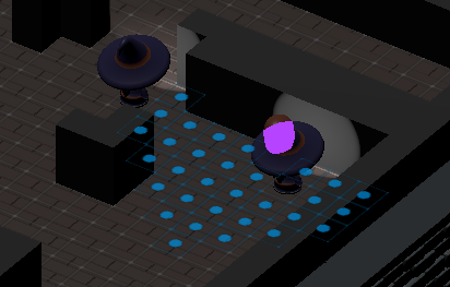
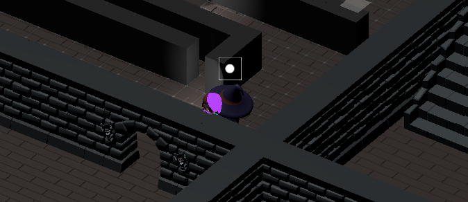
  • In Lvl 2 i was for sure in the detection range of the enemy, but it failed to do so. (pic for reference)
  • There is a bug where the game gets stuck as the Enemy turns/rotates into the Player.
    The Player blocks the enemy's path, the enemy fails to detect the Player but the enemy collides with it and it is stuck in a walking state.

I am glad that the game it is fun and enjoyable. xD

As for the light and hitbox effect it was done using raytracing. Unity provides a custom Light2D and a Poligon2D collider, that can be free formed to take any shape you like based on a array of points. I basically used unity raytracing to draw the needed shape every frame based on the ray collision.

Here is the video tutorial that i used as a reference:  Field of View Effect in Unity (Line of Sight, View Cone) by Code Monkey

Yes, indeed i overlooked the fact that i used the same tag on the prowler as on the player as i needed them to do so. But will be an easy fix :D

Thank you for your feedback, much appreciated. 

As for the player and objects getting stuck it is because of the unity tile sets. It was my first time using tile sets/tile pallets in unity.

 As far as i observed the object/player gets stuck between 2 adjacent tiles. There might be some option that might improve this collision or i might need to round up the corners of the collision boxes that interact with the tile sets.