Indie game storeFree gamesFun gamesHorror games
Game developmentAssetsComics
SalesBundles
Jobs
TagsGame Engines
A jam submission

Glimmers in the DarkView game page

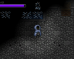
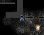
Simple fun, puzzle game, where you would need to be wary of the light as it may harm you.
Submitted by ThexUnkn0wn
Add to collection

Play game

Glimmers in the Dark's itch.io page

Results

CriteriaRankScore*Raw Score
Theme / Limitation(s)#93.9233.923
Overall#223.3853.385
Gameplay#283.2313.231
How Fun#293.1543.154
Audio#363.0003.000
Quality#363.1543.154

Ranked from 13 ratings. Score is adjusted from raw score by the median number of ratings per game in the jam.

Rule of Three Limitation used?

Yes

At least one rule have applied

Leave a comment

Log in with itch.io to leave a comment.

Comments

Submitted

Nice game, good work!

Some feedback:

  • UI was a bit glitchy. I pressed settings and then restarted the game, but the settings menu was on the screen still. Not a big deal.
  • It's difficult for me to tell where the player light starts/ends and where the environment light starts/ends, so it's hard for me to tell how which light source/direction I'm being damaged from, so I don't know which direction to move away from the light.
  • There was a weird dark black goop on the ground occasionally. I wasn't sure what that was or what I could do with it. I don't think any of the tutorials mentioned it to me.
  • Level 2 - There's some invisible colliders near some of the lights near the top-room's bottom-right corner?
  • Level 3 - Invisible colliders in another light near the top room's bottom-right corner.
  • I got stuck on level 3, since I couldn't find the last thing to open the door :(
    • Levers are the same color as the ground, so sometimes it can be hard to tell where they are in the dark. It's easy for me to miss the shininess of items since I'm moving around often.
    • Having some kind of indicator to help the player know how many pressure plates/levers they need to open the door would help, so I know that there's still something left in the room.

Regardless, I had fun playing and exploring around the dark rooms. I like the light effects, but I think it could use some more work to make it more visually accurate where light starts/ends. Good work!

Developer

Thank you for your feedback, much appreciated. 

  • Agreed the UI was a bit rushed and will need some love  and attention :))
  • Regarding the difficult of differentiating the light sources, I will keep that in mind. I will try to experiment more with them to find a way to better distinguish them. Will look maybe to try color tints and/or directional dmg indicators.
  • Dark black goop? could you offer some more context about this, as I am not really sure to what you are referring? I can assume that it might be do to the lighting and how I draw the lights. The lights are draw in by shapes and are dependent on the form. I observed that when the shape is concave it generates some really dark areas, and in this case I do need to update my drawing method to minimize or eliminate those dark spots.
  • The invisible colliders, are indeed a bug created by the way I do the dmg handling. It seems that while in a damaged state the player can interact with all the layers of the levels. In this case it was hitting a wall that was 1 level down while he was damaged. Will work and fix this :D
  • Regarding Lvl3, there were no extra levers/plates to be found it was the first room where it was more of a puzzle. It was a combination lock type puzzle (although it has 2 valid combinations instead of 1, functional bug XD). Intended solution was to flip the 3 levers whit a candle above them.
    • I agree that the levers blends to much with the ground/environment, I will plan to update their appearance.
    • As I wanted to have some more puzzle like solutions to some rooms I considered that a counter of levers to be found was not appropriated as some solution might be more dependent on an activation order, or combination of levers.
    • Could add maybe a hint button or have some more rooms to ease in on the more puzzle like rooms. Would love some more feedback on this if possible. :D
Submitted (1 edit)

Nice game. Love how you could push object to block out the light. Sometime player or object just get stuck, you might want to look into that.

Developer

Thank you for your feedback, much appreciated. 

As for the player and objects getting stuck it is because of the unity tile sets. It was my first time using tile sets/tile pallets in unity.

 As far as i observed the object/player gets stuck between 2 adjacent tiles. There might be some option that might improve this collision or i might need to round up the corners of the collision boxes that interact with the tile sets.

Submitted

Loved your interpretation of the theme, your artistic and musical choices!

Submitted

nice job i love it

Submitted

liked this game, but I found out that we can just solve the puzzle with just prowler xd

Developer

Yes, indeed i overlooked the fact that i used the same tag on the prowler as on the player as i needed them to do so. But will be an easy fix :D

Submitted

a lot of fun! i like how moving the boxes blocks the light, both visual and hitbox. curious how you achieved that?

Developer

I am glad that the game it is fun and enjoyable. xD

As for the light and hitbox effect it was done using raytracing. Unity provides a custom Light2D and a Poligon2D collider, that can be free formed to take any shape you like based on a array of points. I basically used unity raytracing to draw the needed shape every frame based on the ray collision.

Here is the video tutorial that i used as a reference:  Field of View Effect in Unity (Line of Sight, View Cone) by Code Monkey