On Sale: GamesAssetsToolsTabletopComics
Indie game storeFree gamesFun gamesHorror games
Game developmentAssetsComics
SalesBundles
Jobs
TagsGame Engines

tomo ge

19
Posts
12
Followers
A member registered Sep 07, 2017 · View creator page →

Creator of

Recent community posts

Dashing's something I need to work on, I've been considering giving it damage or I-frames.

The ressource that limits it right now isn't thought out and doesn't regen fast enough I agree. 

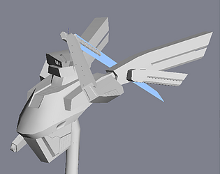
"Strafing" is out of the question though, the game's supposed to be like Luftrausers, which is all about dogfighting, though I may add some slight "aiming" towards the mouse within an angle from the ship.

I want it to be a definitive game, the scope of it seems small and reasonable, and so far the project has only been going on for about three weeks.

hi it me

- Control wise I think it's a little weird having so little acceleration in a platformer (more so with the cat, with the fairy she's flying so that makes a little more sense), in mario you almost instantly get to your maximum speed. Likewise it takes a noticeable time to stop. It makes things feel a little sluggish in my opinion.

- The pacing is a bit off having such short levels, the whole demo could be 3-4 levels with checkpoints and it would feel better

- Add a button to skip the current text box to the next one

- I had some odd behaviors with the fluids where the character would sometimes dive into it after a jump

- The boss wasn't particularily interesting as there was no way to tell which movement pattern it would do, having a different frame or move before each individual pattern would help against that

- Levels were simple so I can't quite comment on the platforming itself, but I don't see why it would be bad  when more complex

- 3d doors were hella cute

- I thought the cat was a boy wtf dude

So yeah hard to say much, the presentation is nice, but the game doesn't really go deep enough

So before criticizing I'd like to say that I never played Kings Field or Shadow Tower, so I don't really have any element of comparaison.

- The art mostly fits the aesthetic, though some of the enemies are a little too cartoony-looking compared to the realistic inspired environments

- The environment is a little too samey, I get that it's hard to make entirely different looking environments with procgen but some texture swaps or landmark props would help getting around

- Combat is slow and not very interesting or fun. I get the point of the game is to make you feel helpless and weak, but with how slow the weapons swing it feels more like I'm a grandpa that shouldn't be here, and that's my biggest issue with your game. 
There's also a fundamental misunderstanding in how you animate attacks. Everything is linear (use easings instead) and the swings take a long time. I get that you're "not an artist" but this can be fixed in code.
The general structure of an animation can be broken into 3 phases : an anticipation phase (= raising your sword), the action phase (= the actual swinging part) that is almost always faster than any other, and a recovery phase (= getting your balance back).
So where you want to modulate based on stats is mostly on the anticipation and recovery phases. Think of it this way : a weak person will take more time to lift a weight than a stronger person (=anticipation phase), but in both case the weight will fall at the same speed if they drop it (=action phase).
Again, I get that the aim is to get close to old dungeon crawlers, but it doesn't have to feel like I'm swinging my weapon 10 feet underwater.

- I will say that it was a lot more enjoyable playing with a bow as it did not suffer from those animation related issues. With less frustration over the melee combat, the game's mood takes a bigger place and becomes a nicer experience

- I wasn't a big fan of how quickly equipment breaks though the system is a good idea

- weapon swings can clip through enemies and hit the wall somehow, leaving you in a stagger state

- I really liked not being able to go as fast when strafing, it helps feeling as if you're moving an actual character and not a magic floating camera. Having to turn your back on an enemy to run away is fairly immersive. 
If you wanted to play more into that idea, you could add a keybinding to look around (within limits) while maintaining the orientation of the player. 


Overall my biggest issue is with the combat itself and how the animations play against the fluidity of the experience. Not so much the slow speed or pacing, but rather how it makes it unclear whether you're gonna hit or not, or what the enemies are doing.

(1 edit)

So here are my thoughts on it :

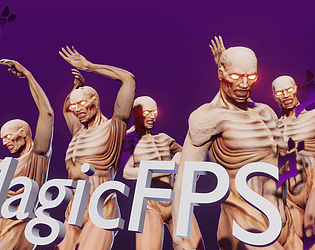
- Gets more fun the more you understand it, i.e. once you understand how to control the crowd, how to dodge the flying little shits so they kill themselves into walls, getting back ammo between rounds, focusing the big boys, etc.

- Cool enemy aesthetic

- Guns feel ok, at first I thought the silenced pistol was weak (why do I even have a silenced pistol fighting eldritch alien monsters ?), before realising you could take off the silencer for big crowds and it was more precise/powerful with it (which seems counter intuitive to me, the sound also has more OOMPH without the silencer).
The shotgun recoil is weird too, but the rest of them felt good (really love the spread on the rocket/missile launcher).

- Gun key mapping is annoying, I get that there'll probably be other weapons in the yet unassigned bindings but it's confusing.

- Map design is the weakest part here imo, the arena is just a box with a center part you only go when you're out of ammo, so you're just always circle strafing without any objective.
You've got flying enemies, it would be interesting to vary between enclosed areas that can protect you from them but make melee enemies faster due to their layout (flat ground, no obstacles) and ones that are open but with obstacles you can climb around.
In that regards I think it should be much better with actual levels instead of arenas

- Enemies don't distinguish so much between the background, more so for the big tentacle monster once it's bloody. It's fine at the highest display luminosity but I feel like it could be a little better - Second jump feels too weak ?

- All around jumping is a little off with the platforms in the middle, I'm guessing due to the velocity of the player, you're propelled back up a tiny bit and you're not able to jump again, despite having landed.
One thing that helps to avoid that is having a tiny buffer that allows you to jump something like 0.2 seconds after leaving a platform

- Ammo balance seems off, why does the dual pistol less much ammo than nailgun while being seemingly worse ? (more spread, as much damage ?)

- Not sure about the time slowing mechanic right now, it doesn't feel too useful in the state the game is in, though I could see it useful in linear levels

So yeah good work overall, I feel like it could be much better with a few tweaks but it's still fun to play around.

Here's my thoughts over it :

- It's fun. Real fun big fun kind of fun, everything's responsive, I spent about half an hour in it and could easily have spent more
- It's hard. Punch hitbox is very small (too much for my taste), there's no HP regen, HP pool is small and it's easy to chain mistakes.
- By opposition, magic can be used to cheese stuff
- Cant buy the skill in the tutorial (not enough money)
- Not sure if it is explained in the tutorial that roll makes you go through enemies ? I kept getting blocked by them before I figured that out.
- Cosmic arsenal can be cast without MP, locking you into the casting pose without being able to cast (roll cancels it out)
- lack of HP regen makes the game a bit unfair (I feel like there should be one at least after you clear out the boss)
- Ran into a level that was all green with no displayed geometry, looked like it was a bug ?

Thanks for playing.

I won't continue working on it, I have other projects and it would take too much time.

Everything was done in blueprint, I think UE4's C++ is not very accessible so I have not looked too much into it.

As for the assets, they were either made from scratch (gun, enemies, level geometry...), or tweaked from existing content (mostly SFX).

Thanks for playing !

That's noted, I didn't really think about the user access and it's good to hear an outside opinion on that.

I was aware about some of it but thanks for pointing it out in any case. There is more spaghetti that shouldn't be there in the demo so I'll try and fix it this evening and upload a new build.

(1 edit)

Juicy. The core feels great, all the mechanics are intuitive. The level was fun to explore and I liked the subtle, less shooter focused things like platforming or using the vinyl launcher's bounce to toggle a switch. The goal felt a little obscure but that's something you can easily fix by adding more landmarks and misc props. (it also took me more time than I'd like to admit to figure out you had to dive at one part, thought that was just a puddle).
I also had a harder time aiming the pistol than any other weapon, I think because the projectile had a tendency to blend itself with the rest of the map. But that might just be me, I easily have trouble discerning some colors moving over some others.

I'd have liked a bit more shooting too, it felt a little tame in that area. But overall, nice demo !

p.s. - Also some music would give it a lot more atmosphere.

(1 edit)

Quick heads up - Turns out I had an issue shipping the game and the navmesh was non-existant on the second and third level.
The fixed version can be downloaded here, I'll replace the game's file once it's possible to edit downloads.


https://drive.google.com/file/d/1mEEScQv90u2Wne-FPsHAb1js7UOf_gkZ/view?usp=shari...

Like everyone mentioned, the camera is really annoying, it's practically impossible to aim with it unless you stand still, and as soon as you shoot, your aim is thrown off. Just anchor its origin point until you move X units and lerp whenever you cross that, it would improve it a lot.

Performance wise, I had a steady 30fps with "medium" settings. Which I find weird because the game doesn't look visually demanding.

Other than that, I somehow got stuck in the ground on the first level.

Thanks a lot ! Your video is very in depth and precisely defines several problems I had not thought about, I really appreciate it.

I won't go back onto bugs (particularily for weapon selecting with the stick, I forgot to check a bool for the input to be consumed during pausing so it stays stuck) or sfx mixing because these are genuine issues I need to fix.

But for controls, I personally have the index on the bumpers whenever I'm using them, so it made sense to me when I was coming up with them. Anyway I'll just try to have re-bindable controls by next Demo Day.

Thanks for the feedback !

Concerning melee, I'm not too hot on the idea of completely aiming attacks, it still needs some degree of snapping. But I'll agree with you that it is a little too generous right now.

As for spawning enemies, the demo is limited to 5 instances of each enemy. There's not much of a point to more of them, and most importantly they're pooled now instead of being spawned. But I'm not sure how you got only 3 spawns since it should go back to 5 if you put more, I tried to replicate that but to no avail.

I'll refer to your game as Tomato Juice because not only it feels very juicy but it also looks like tomato juice with all that blood being thrown around.

Jokes aside, I don't really have anything to add to what the others said, I've had a pretty similar experience. Blocking is kinda weird too, I didn't really manage to use it (I'm not saying it's broken, I'm just referring to the fact the time frame for it is kinda short).

All around a very impressive demo, everything I've seen is finely polished and the game plays very well. 

However I have to admit I do have some trouble noticing where my character is, despite dimming the background and making the bullets pink. I think they would read better if they were the brightest color they are when strobing.

Aside from that, I've found speeding up to be kinda counter intuitive as someone who's only experience with shmups are Touhou and Mushihimesama, you get used to it after a while but I'm still not too hot on that choice.  And there are some enemies which you can't really shoot unless you absolutely master the movement, which kinda feel annoying, but aren't that awful.

As most of the other people pointed out, the game is a little easy as it is. But it is well polished, the visuals are clear and go straight to the point. 

My only gripe with it was that I felt everyone was a little too slow, both the character and the zombies. However it may be just an issue of lacking any proper environment other than a squared floor, which gives no context to compare the movement to.

I just found it a little weird that you need to aim before you can shoot, not really sure why that is there but it might make sense if you'd use melee when not aiming.

Thank you !
I definitely will,  as it is the game doesn't read as well as I want it to , and if I want fast gameplay I need to focus on that.

Thanks for your opinion !
Concerning Lock-on, your post makes me realize it might not be as intuitive as I thought it out to be, you have to first press F to lock onto the enemy, then V if you want the camera to fix itself on said enemy. 

For the difficulty, it does get harder the more enemies you kill as they start to dodge and attack more but as you mentioned, it's pretty easy to abuse the dodge button. The main reason for that is that I haven't gotten around implementing a more accurate target leading formula.

By the way I'm glad you're mentioning Z.O.E. it's the main inspiration for this.