Sounds good - The game "Old World" has a very easy to use implementation of trading, right in the upper interface, where the ressources are displayed. Take a look at that, maybe that's something you'de like for Stellar Sovereigns too.
Best
TG
Ressource-Exchange-Trade System?
I have been wondering if you plan to integrate some form of interstellar trade, beside the import/export function between colonies. I have found myself in a situation where I lack one perticular ressource but have enough of every other thing and credits in general. Having the possibility to trade would be great in such moments since the only other thing you can do is wait and that is neither engaging nor fun :)
Best Regards
TG
Ps: Flat Ui Colour option is great!
You are totally welcome! Solo Devs like you are the only hope for gaming fans with "exquisite" tastes like myself to get decent games nowadays so it's me who has to thank you :)That is one of the reasons why my channel is mostly focused on showing off promising indi titles.
And Yes! Sliders to optimize the UI to the liking of the player are an even better idea. Post Processing options are very welcome!
Yap the move order would kind of be special in that regard, another consideration would be a dropdown when keeping the right klick pressed and allow to use the other options as well, that would be kind of an old school approach I guess :D
And yeah feedback is taken :D That is actually on purpose because I think that the combat and how it plays out is a thing that people would want to see therefore I'd rather sacrifice my game to provide some more entertainment factor - playing on my own I would probably crank everything up because I do like those epic games with huge universes.
Have a great day as well =)
No Worries - I have framed the "imperium galacica" thing as a question, for a reason :) I would have compiled some stuff in English so you don't need to bother your friend.
- I didn't complain about the colony ship Model, When I looked at models I just stated that what I wanted to do instinctively was to hold the mouse button and drag to look at it from all sides - but clearly, it is only possible to do it via the slider. On the contrary, I really like the look of the ship models :)
Everything is just my opinion and thoughts on stuff which - truth be told - while backed by a lot of experience with a lot fo 4X games with varying degrees of "tediousness" :D, is still subjective. I won't quote UI-Design state of the art books or something to back my arguments, just examples.
This one might be rough - I know that UI design is a necessity and no fun at all.
- UI/Graphics
You clearly went for a very blueish look (like everything is a hologram or an actual screen), that is an artistic choice and I would not want to critique that since my thumbnails, for example, are also heavily stylized but,... take a look at the UIs of Crusader Kings 3 or Stellaris (as Examples of good modern UI Design, TW: Three Kingdoms or TW:Troy are also good examples) and ask yourself, which ones are more intrusive on the eye. Especially with 4X Turn Based Games which people tend to play for a long time with the UI being displayed all the time a more pleasant experience would be favorable. Its mostly just too bright and shiny, you don't really need to build a new UI just tinker with colors a bit I think. This also applies to the star map and the stars, everything is just a bit too shiny and bright.
The Top Bar would need some color coding to differentiate all the resources (like in the mining report diagrams) easier.
- You have clearly gotten the critique of the movement system. The problem with a system in which you can't give simple move orders with one right-click for example and you always need to hit a button or a hotkey is that it makes a slow game (Turn based nature) even slower and more cumbersome.
I have more "nice to have" Ideas like being able to see fleets and stations in the graphical inner system view or when you really got time to spare after adding the other features on the list. Like making exploration more enjoyable with events and such.
Best o/
Hey! Playing in Windowed Mode: Off, the renaming did work, but the cursor remained invisible as you can see the the short video below.
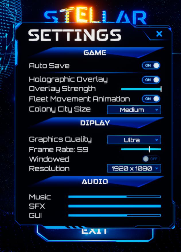
My Settings look like this: 
I did record it (That shouldn't be an issue since the Gaming PC doesn't actually do the recording, recording software runs on my Streaming Notebook):
Best o/
Hey Mate! Thanks for being inspired by great classics like Imperium Galactica and Sword of the Stars. I wanted to make some german videos about Stellar Sovereigns and have been wondering whether you are aware of possible copyright issues with the ingame music or if I can leave it on.
Best Regards
Toryn Gent