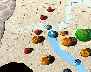
Hi! I played and enjoyed this little toy sandbox! It's nice that it comes alive. There was one thing that, in terms of UX, was frustrating - you sometimes can't place a block behind other blocks. After finishing the diorama I learned you can rotate the screen, but anyway it's something I'd consider worth tweaking.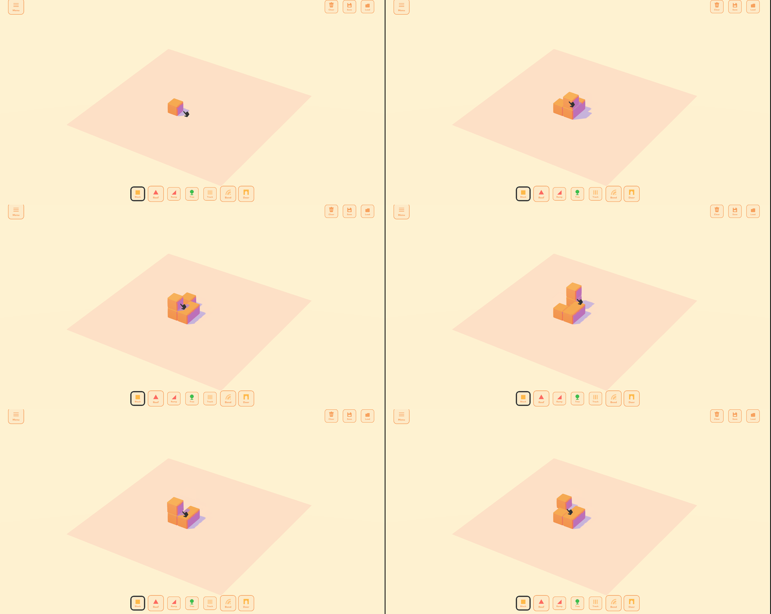
Warjoy Heir
Creator of
Recent community posts
This is probably the highest rated game for me so far. I loved it. It was simple but really fun! The way that the fish evolves was surprising and awesome. Each time I felt like I gained a new skill with that level up too. The visuals were very nice, especially for the fish and the effects felt juicy. Definitely felt better to play with mouse and keyboard than just keyboard. I wonder where it could go next, but what you did, you did great. Nice one!
I really like the idea. It provides some unique gameplay. On first playthrough I got really bad rolls and didn't think much of the game cause all the pizzas were pretty much good. Second time I got a nice spread, still I think some easy bad pizzas at the start would have worked better to hook the player. Sometimes the sizing was a bit iffy, I saw less then 14 inch let's say but my report got flagged still. I'd say the gameplay loop is lacking when it comes to discarding good pizzas. I'd rather be able to rate them well, just throwing them to trash without rating wasn't intuitive. Other than that the interface worked really well. The descriptions for the pizzas were great and funny. Good job!
Whoa, I wish I knew that! Seems like a great way to fix the problem! I guess playing with the keyboard was the issue. I think I'd even recommend disabling it, or better - making it so that on button press it does the little tweak to show where it will move and the board turns on key release after press :)
Great art! Especially on the Leader character. The platforming was pretty good, you could get skilled at it, though there were parts that were a bit too frustrating, some head banging and slightly to tall platforms. I finished it without damaging the aliens and hoped for a different ending :< but it was still cool to play as the Alien Leader. Loved his character design but the dash attack was a bit weird, really hard to land. At first I didn't even know I had a second attack. Anyway I think that adding a jumping behavior to the robot character at the end would make the "boss fight" much nicer. Anyway, great little game! Liked the twist on the alien theme as well :)
Really nice! Love the idea. It's well put together - the music, font, character. The table and holes could be better but I get it - you get 48h you put in the most important bits, the characters! The only thing that was bothersome was that the hammer had no real telegraphed movement it felt. I there would be some information about attacks, at least some, like with bosses, but it felt like I just had to kinda go on reflexes which is cool but I'd love to see some mix ups. Very solid entry! I love how clear and concise it is!
Looks very nice. Plays well and is quite understandable. The Leveling Up menu can be sometimes not noticed cause it's in the same spot as the spawn menu so it is prone to missclicks. The screenspace is a bit small and because the units spawn off-screen I wasn't sure it worked sometimes. I won twice, it was rather easy but felt nice. With some iteration this could be really fun. Well done for 48 h!
At one hand this is really cool and challenging, at the other it constantly makes you mistake which way you are supposed to turn. Like you had the right plan in mind but then press a key and the board turns the other way than you imagined. I think the arrows in the UI could better portray how the board will turn. You could say that these mistakes are main part of gameplay but I feel like they add a bit too much frustration. Well put together game, congratz
There is a lot to like about this but also a lot missing. I loved the character design, really interesting characters that I wanted to stay with for longer. The music was quite nice too. And the approach to the topic I liked too. First time I see the "Be the NPC" played out well, like I felt like I was actually doing NPC stuff.
What was missing though was good UX. I wasn't sure when something was selected or when I had to press play (for first few minutes I didn't even see the play button). I was not sure whether I am removing an item or giving it at times. I'd say highlighting stuff more and maybe adding another tab to show which item is currently being given would help that.
What was nice at first but later fell a bit flat was that the responses from the "players" didn't relate much to the quests. I also felt that I didn't have much control. I had a random set of quests to give and had no idea which rewards would they get from it. Most of the time I felt like I had to give the characters some item that wouldn't help them.
Again love the idea and the characters but it felt a bit lacking in the design.
Haha, I love that reply! Especially the end bit.
Definitely could see this going into a speed run direction. I even felt myself doing so while testing it. The end goal of the game could go in multiple directions right now, we are thinking about which would be the best. A more rpg-like combat and character based version, or a maze survival version, or twisting the topic even more and making traps into treasures and for us to try to hold the enemies back from taking it!
Really cool twist on Jump Hero. I'd say successful, cause the game creates the same frustrating emotion when you fail xD. But platforms are well placed that it is not too punishing. Quite similar to our idea when it comes to moving the level actually. Didn't play all the way through cause it's too hard for me :p but I liked it
I like the idea. I wish the uncommon placeholder parts like twig or screen changed more about the skin to really drive the "I wonder what will come out!". Scoring could also include some artificial connection to what you've created. Maybe a comment or objective judgment - "Oh, that's an interesting place for an eye" etc. Controls are a bit clunky. I see the potential in this with the parts getting gradually weirder. You could even tell a story like that. Creative idea!
On third playthrough I tried to do bad on purpose to see the losing ending, haha! This is a great game. It is surprisingly intricate. The way the skellies move, the music, colors, animation, change of pace, sfx, mini cam. There has been a lot of either great thought or just experienced intuition put into this project. Best one so far for sure. The line for the AI knight was also a great design touch. Stellar job!
So far I went through 2 areas feet only. I love the soundtrack and how it dynamically changes. Love the monster bottles. I recon you should die after gulping 5 or more in a row xD. I wish there were more edibles. And waiting for enemies at doorframes is super powerful but to make feet only possible I guess it's the only way. One super cool thing about it, that's a bit like surprising stealth game is that you can actually see them coming over by the shadows on the floor and their sounds. Really neat.
There is a bug sometimes when you drink stuff too fast and the can appears on the left side of the screen, not in the hand, after which you cannot grab items.
Man, I was lucky to have found this. This is a lovely game, but extremely difficult. Sometimes too much. The fact that enemies attacks are totally random and you have almost no way to gauge them is super frustrating. Like why do they attack some many times :<< I am kind of venting.
The game is very promising and very fun as it is. I wish I could get better and better and I know I can but I also know I need RNG blessing first to allow it.
After 2 days, I did get better. I'd say the game is really well tweaked for the amount of content it has. Provides challenge for a bunch of runs and later on can still get you down if you are unlucky. All in all mechanically the only issue for me would be that it's really difficult to know what an opponent will do. The only opponent I feel like I could almost always read is the boss, though her first attack is without telegraphing I think which can take you off guard.
The base mechanic of placing dice to attack is super satisfying and something worth building on.
Hey! I played your game as research and found it very fun. I made some feedback notes for myself and thought you might find them useful. Keep in mind these are just my personal thoughts.
1. Pleasant cause:
• Cute.
• Simple, the enoguh amount of challenge, requires little thought but still some.
• Constant mini-reward cycle/influx.
• Constantly evolving emergent story.
2. Engaging(might be a little bit too engaging) cause:
• Unlimited amount of elements - constant question "what will you do with this one?" is being asked.
• Even though the Macro loop is super basic it's enough because the Micro loop is very satisfying.
• No end points (kind of result of no macro) - no satisfying moments of overcoming a big challenge and no moments where you feel satisfied enough to put it down, which results in putting it down either because you got tired or because you are a resposibile adult and you just can't let yourself play anymore xd.
• Random tiles and elements, sparks very basic-level curiosity.
• Constant mini-reward cycle/influx.
• Constantly evolving emergent story.
• Very little new elements, after a while there is no new gameplay (2nd point where the macro gameplay is lacking).
3. Why would I play this again:
• To have a pleasant relaxing time.
• Because I want too see what kind of world will evolve, what kind of little story I can imagine in it.
4. What more would I want from it:
• More opportunities for emergent storytelling, more diverse elements, maybe also something living, like animals and people, some unique elements that are very rare.
• I saw this awesome modular game(Tinytopia), also a city builder, where when you put few building next to each other they combined, I feel like with the tile based system you have it would work very nicely and would add some more character to the landscape of the whole map.
• Some macro loop moments where I could feel bigger achievement, like completing a city, finishing a level, reaching a goal. These would also make me feel less of a prisoner of the mini-reward dopamine loop and more in control. I would prefer to be fully conscious that I decided to play more rather than realize at some point that I am just getting sucked in by the perfect micro-loop and getting a bit addicted.
• The challenge of finding the right place for an element could be harder, felt like it involved only basic addition and didn't use stuff like the order of placement very much.
• The interface could be clearer in conveying information. The +X signage on the element when placing was very clear but the numbers around it were not. Sometimes there were situations where there was green 1 and 4 and I only got +3. This system was hard to understand and I just used the middle number with the "+" to guide my decisions along with the colors of the numbers.
Overall I loved it, I wanted to do a little research play for 10-15 minutes but I think I played for a bit over an hour. I loved the approach of unlimited elements and the macro progress being allowed through enlarging the map. With a little love I could see this have much success like Islanders or Dorfromantik, thanks to the system I mentioned a moment ago I feel like the game is unique enough to be it's own thing. I wonder what more gameplay specific ideas can grow out of just that border enlarging system. Good luck!


