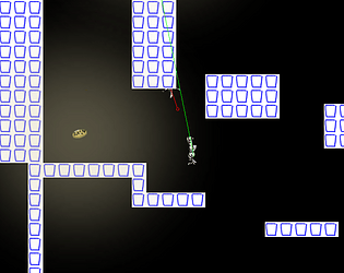
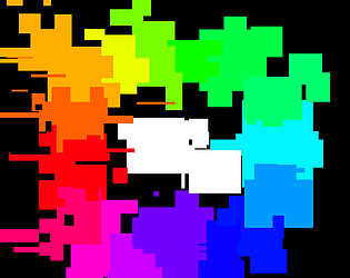
Just looking at it the way I'd recreate it is through marching squares. Sebastian Lague has a video on the topic. The adding some noise to the vertecies to make it more worbly.
Wistpotion
Creator of
Recent community posts
This was actually incredible to play, it's solemn. I think it hit me so hard since this is how people actually act in the world. Some just won't change, no matter what. And that costs themselves and everyone else. I feel like you also managed to kind of point at the cost of in-action, which is not something I expected to write about a game (anti-game? interactive thingie) ever. I won't forget about this soon. Fantastic work.
Oh piano is a thing? Hell yes. I didn't find any of the melodies to be that memorable, but it was really pleasant to listen to. It really set the tone for the game, together with the theme of stars. It almost feels post-apocalyptic, or pre-industrial revolution. It feels like the game is hinting at the dark ages (when science essentially got reduced to nothing in europe for three hundred years). You've sparkled in a bit of religion, a bit of science, a fair bit of beating the shit out of orange blobs and I'm really enjoying it.
I feel like this game is so much more feeling than it is mechanics. The combat and platforming is okay-ish (though the "heavier" / delayed and more thoughtful combat was quite an interesting change), but the mood is what really makes it interesting for me. I adore the characters, the music, the interaction. I got shivers really early in the game from hearing the little snoot pal speaking about the stars. When I got to the end I really went "the fuck? there isn't more?". I'd love to play more of this.
Fantastic work.
That was fucking terrifying. Great work!
The mood here is really good. I like the little hints that "hm maybe time is fucked up here" that happens before you actually get to the generator part. The dread I felt when they started to get out of sync with each other, even before they themselves pointed it out got me really engaged. I really like coppers and jodys military style chattering, and novas more relaxed speaking.
I do feel like I'm a bit helpless as the player. I feel like I should be having a larger influence of the game. There are a lot of ways to interact with the game that are unused (being able to pick up stuff around in the van, the microphone) but the only actual way to influence what is happening is with visual novel style popups. It's like the game is trying to be a lot of things at once, but failing to do anything really well. (suggestion part incoming) I would have liked to see the game doubling down on one style of gameplay more. Some suggestions are to focusing on semi linear visual novel style gameplay, or turn it into more of an rpg where you click to send them around the map.
I ADORE the artstyle. The blending of 2d and 3d looks great, and the photos looking like lowrez flash art just makes me happy. Character art is really great, and the little "cutscenes" make the characters feel a lot more alive. The color choices are also really good, the desaturated look along with some saturated bits here and there works really well for the rugged aesthetic. Good picking.
For reference, I got the ending where we all got out but both cooper and me fainted.
All that said, fantastic work! I really enjoyed sitting down with this, it's really moody and I was engaged throughout the whole thing.
Oh this exist? Hell yes.
I really like the concept of this, this feels like the interactive tutorial taken to its extreme. And it's really good as well, I like how story is baked into it. That theming combined with the scenery (wind blowing the capes, a knight training you) does make for a really intriguing setting. Kind of makes me wonder what could come after this...
I'm not entirely convinced about grading the tutorial phase. It makes me feel anxious rather than challanged. It feels like the opposite of having a safe playground to learn in, here I'm immediately being tested. Might just be me who is student-damaged. I enjoy the "get up" system much more than the grades in the tutorial.
I adore the attacks, and the combination of parrying and attacking is way too much fun! I feel there was a lot of variation here, and all the attacks were interesting on both their own and in combination. The switchup phase was really cool as well! It was a good balance between having to improvise while not being overwhelming.
The music was really good too! I do feel like you are starting to get a bit too comfortable with the style that you have though? You have changed up the instrumentation a bit between, but it's the same slightly melancholy mood in pretty much all tracks. I've been using chiptune.app to get midi files to learn from. Might be worth checking out.
Also, the animations are so so smooth! Especially the black circle, then red circle combo. It looks really powerful. And I love the squash and stretch in the jump, it just looks fun! Makes just jumping around feel good. The animation work really feels like all of your best tricks coming together.
All that said, fantastic work! This was a good way to spend an evening.
I adore the authenticity in this. I didn't exactly enjoy playing this game, but it felt like time well spent. This feels like my own childhood memories, I can really feel how much this loss of butterflies actually matters to you. It also reminds me of a song by Porter Robinson, a bit about nostalgia, but also about the beauty of the world as it is.
"Growing blind to the butterflies around me
Knowing I'd remember it accurately"
Thank you for making this.
This was way too much fun! First off, really love how you worked with the pico-8 limitations, it feels great and looks great even with the 128x128 and limited color palette.
Making mistakes in this game is punishing, but thanks to the 25 year cycle it's very much contained, so mistakes only matter for a short (well, round an hour) long run. Compare that to stellaris, where if you colonize the wrong planet at the start you really have to go for an uphill battle the rest of the game. Here it's more of a "oh fuck I probably shouldn't have done that, I'll do it differently next run".
Overall, this is really impressive work, good job!
This was super fun! Or engaging at least. Poor things.
First off, fuck you. I actually feel sad about loosing my units. All the bits and pieces of the village making it feel alive like the pool, the large house, the table, the units chatting with each other makes me feel almost connected to them. At the end of the game I pretty much knew all my units by name, who to put together with who and so on. I also really liked how different the classes were, with the knights only regaining motivation upon actually passing a fight, the AOE fireball throwers, and the fucking idiots that were the valkyries. Note the were. None of the them survived. On that note, the graveyard was fantastic move.
I think the group management is a bit too punishing. I think the 3 "moves" is good, but the swapping is a too random. I'd like to be able to manage my teams a bit more (on the level of selecting who to switch with), but I think the limit of times you can do it is great. You shouldn't have too much control. Also never used the kick function, don't see why you would ever use it either.
Another thing I really liked is the bouncyness of the pixelart. I'm very much a purist when it comes to pixelart. I want it to be pixel perfect. That said, I think you did a fantastic job making "modern" pixelart look good. The bounciness is as said fantastic, the juice is good and overall it's really appealing. Also banger music.
Also the demons with the whips were very hot. I would definitely end up as one of the gravestones if I was one of the heroes.
Congrats on submitting!
To be completely honest, I think a team retreat would be great for the player, but terrible for the game. For me a lot of the appeal with the game is the tension when you send out your beloved villagers. If you can instantly recall them at any time, that tension would disappear completely. Seeing one of your units have low health but high morale, and slowly getting chopped to death is absolutely horrible, but the game becomes so much better thanks to it.
Personal sponsor is a pretty good idea, and I'd love to see more management of the village itself. Maybe putting heroes behind the counter of the shops could be cool?
This was really cool! I went for the middle satan, messed it up first time but got it second. Super satisfying to play! The medusa like thingy was really powerful, and I based my main deck around them. Though, in preparation for the battle against satan I stocked up on the 17 point self sacrificing ones.
A note of feedback though; currently there is no incentive to restart other than "I want to fuckin summon satan". Into the breach has a great mechanic, when you lose, you get to pick one of your units to bring along to your next run. It gives you a bit more of a reason to start another run, and honestly selecting a unit to bring along just feels better than clicking a restart button.
Edit: bonus note; steam users seem to like demos, and you have a playable game that could work really well as that. Could be worth thinking about.
Also, the music is incredible, and I adore the visuals. Fantastic work!
Thanks!
Being able to spam like that is not fantastic. I don’t think a cooldown will do it, but I think you are onto something good. Maybe if the players mash long enough then a cooldown is initiated.
Yea the menus are a bit cheap when it comes to the theme to be honest, I could have made something that felt more connected with the theme.
Thanks for trying the game!
This is a really cool idea! I like how distinctively different this feel from other sokoban style puzzles (I think that's what the box moving puzzlers are called, correct me if I'm wrong). Agree with audio being annoying, ripped off my headphones after fifteen seconds. I think the first two puzzles were really interesting, and 3 and 17 looked really cool too, but I couldn't manage to wrap my head around them and after a few minutes of poking around trying different things I called it quits. Difficulty curve was too steep for me, but really interesting mechanic!
The medals being hard to get is very much the intentional. I think that most players need a bit of quick progression in the start, so they get into the game. Then I can start challenging them with harder stuff, like the gold medals (or blood heart medals if you are really going for 100%). It’s a tiny bit of game design that really goes a long way, the “easy to learn hard to master” thing. Thanks for trying it!
Timer is a great suggestion! I’ll definitely add that if I make a post jam version. And no you are not supposed to be able to select a level after the fifth one (I’m guessing that’s what you mean), that’s my shoddy late night code doing silly stuff. I’ll fix that in post jam as well. Thanks for playing and for the feedback!
I find the bit about art as poison really interesting. I think Adriel Wallick said a similar thing a similar thing, but in the context that (paraphrased) “there will always be more ideas”. I think Ed Sheeran (unexpected connection there) also said something along the lines of (also paraphrased) “get the tap flowing, and at first it will be muddy but just keep going and eventually it will turn clear”. I think a good mentality is just to “get it out”, preferably as quickly as possible so you can move on to new and even more interesting ideas. A potential new challenge: make 14 games in a week, max 4 hours for each game. Kind of ridiculous, but I think one could learn a lot from it. Might try.
Oh yea music is fairly restricted as well. The restrictions are there to protect me from things that I spend way too much time on, and the two biggest things with music are:
- noodling around with the instrument synth for hours
- noodling around with effects to make the instrument synth sound less shit for hours
So the restrictions I put in place are to protect me from doing that:
- I’m only allowed to use soundfonts to generate sound. No straight up samples or 3xosc either.
- I have like 6 plugins that I’m allowed to use for effects, that covers 90% of what I need and everything else I’ll just have to not be bothered about.
I don’t have any restrictions on voicings or otherwise, there I can go as ham as I want. Bonus thing but I try to to use hardware to put in notes. Either my launchpad or dx7, it’s a lot more intuitive and you can improvise it out fast let than with just clicking in notes.
It was pretty magical when it all came together, and I completely get what you mean by the pianist “leaning in”. If I don’t misremember, the top fast moving part that’s kind of like an arp but a bit more complex is a rhodes soundfonts where the louder velocity layers are a bit distorted and the lower velocity layers are super smooth. I play with the velocity throughout the track, and that’s what gives it that motion. I absolutely adore it, it’s the kind of attention I couldn’t give my notes before, but now when I’m working with soundfonts it’s just comes a lot more naturally to sit and fiddle with small velocity changes and automations. And my tracks sound a lot more alive thanks to it I think. Thank you for trying it!
Thanks for trying it! The concept is actually snatched by a mobile game I played way way back where you would draw to reshape your squad and then pew pew with color bullets to take over objectives and stuff. One of the most fun games I’ve played on mobile. Pacing was a bit slow, not too unexpected. I didn’t make time to playtest, something I’ll prioritize in the future. Thank you for trying it!
”With nicely aligned pixels” YES! I hate when pixel art doesn’t line up, and I adore the developers who take the time to make it actually render at a lower resolution and then scale it up. Which is exactly what I’m doing, with a few modifications. The height is exactly 180 pixels and doesn’t change, but the width can actually increase and decrease to support mobile devices. The games are built to look best at 16:9, but when I built the framework it was my intention that it should work for web platforms like poki who require that the game fits the whole screen. Also yes there should be a boss! It was on the original plan, but I spent way too much time making an overly complex system for controlling the lil shooters, and ended up with only one day for actual content making. I wrote a post mortem about this.
The difficulty being overkill is definitely something I’ve caught by now. I forgot the age old saying “if it’s difficult for the developer, it’s impossible for a player”. So more telegraphing and a bit slower attacks would have improved things.
And absolutely there is a lack of feedback for getting a counter. I think the audio saves it a bit but it’s still not super satisfying. Something I was aware of, but time simply ran out. I wrote a whole post mortem about this.
Thank you for trying it out!
Noise is intentional, but I didn’t realize it might irritate some players. I’ll try to add some volume controls in the future.
More specifically for the parries, what is it that you’re missing? Would you like a button you can mash to constantly deal damage, or something more sophisticated? Or is it that the parry is not super satisfying currently?
Also yes parries are delayed with 0.05 seconds from when the enemy strikes, I’m impressed you can hear that.
“SID MEIER: One of the responsibilities I think
we have as designers is to protect the player from themselves” - from gmtk
I think we are doing something like that with out limitations. Lower resolutions, quite 8bitty / similar music and sfx. But I think we both want that unlimited code, to be able to barf out as much content as we want to. Because that is what we think is enjoyable. Pretty funny that the developers develop the development process to make it more difficult to do things that are unfun. Maybe we were just designers all along.
I don’t think I mentioned any of the platforms I was looking at in the devlog, but there they are;
- Kongregate
- Crazygames
- Armor games
- Poki
- Game distribution (distributes to a lot of places)
- Y8
There are also two others I’ve seen floating around:
- Addicting games (not using this because they seem to be hooked on games that players just can’t stop playing, not a fan of that)
- Yandex games (has a bit too many connections with a certain not too appreciated country at the moment)


