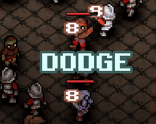
Mmm no, the Tilemaps / Gridmaps in Godot were not very helpful. I made the entire map in Blockbench actually, and textured it like a normal 3D model, so really the map is just one mesh and is almost entirely distinct from the actual navigation. Navigation is setup by way of a GridMap; I just have a Gridmap with one, 50% transparency red cube in its mesh library and I draw that cube everywhere that is walkable (so on top of every "tile"). So there really are no tiles per se. At runtime, I just get every used cell from that Gridmap, where a red cube was, and register that position's X and Z value to an Astar2D object. I also track the y position in a separate lookup/dictionary, one where I can provide an astar ID (or position, doesn't matter) and get back a Y value - that way I can easily translate a 2D position to a 3D position. Why don't I just save the 3D positions? Well thats a good point, but most of the game logic runs on a 2D basis for simplicity and easier math since the Y value is rarely used in most cases.
Yesterday Development
Creator of
Recent community posts
You dont want to see the source code lol... but as far as porting 2D to 3D, in all honestly I use mostly 2D oriented data with some lookups for things like height at a given position to help translate a 2D position to a 3D position. In other words, I have plain 2D map /data but track the heights in a separate data set, so for the most part its just 2D rendered in 3D.
Would you consider making a tileset with walls as parts of the tiles (something that would work with like autotiling the walls for connecting in different directions)? I've been a fan of your art, but I think the lack of the walls is something that stops me from grabbing it (because Im too lazy/incompetent to make em myself)
Hey Richard, thanks for the feedback! The UI is where I probably spent most of my time so I'm glad to hear its well received haha, took a lot of work to get is 'just right'. As far as the Turn Order GUI, its kind of a lengthy explanation so I'll have to post a video to YT with more details and let you know when that happens. For now though, the general idea is this:
1. PanelContainer -> HBoxContainer -> Control -> TextureRect(s)
The Control under the HBoxContainer lets the inner TextureRects move around freely, while still letting you inherit what their size should be based on the constraints of the PanelContainer/HBoxContainer that holds it all.
2. Outline Shader on the character images
The TextureRects each have the corresponding character image, and this has a Canvas shader that outlines the texture with a color that is picked based on whether the character is an enemy or ally.
3. TurnManager (class)
This isn't GUI itself, but its the data that drives the GUI. It holds all of the character's and their turn orders in an array, where turn order is implied based on index. When the array changes, the TextureRects are updated. If there are, lets say, 8 texturerects - each rect is assigned the nth index of the array from the TurnManager and just displays that character's texture. So rather than having a TextureRect assigned to each character implicitly, its more about being assigned to a specific index in that array the TurnManager maintains and then updating the GUI state whenever that array changes.
I hope that maybe gives some idea. I hope to put out videos soon going over the project and discussing more of the ideas and topics to help other people, its just kind of hard to compile all of that information so I've been putting it off haha
Im not going to use this asset pack only because the theme of it doesn't fit what I'm trying to do... but I 100% shamelessly copied the design of it to fit my theme/needs. I love it, and I hope this doesn't bother you. Will definitely (try to remember to) share any end results with you and give credit for the inspiration.


