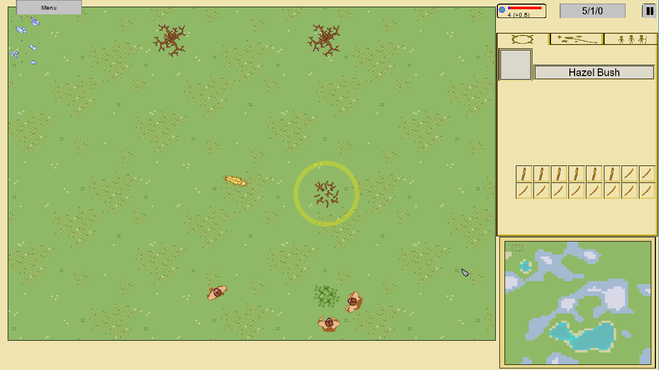
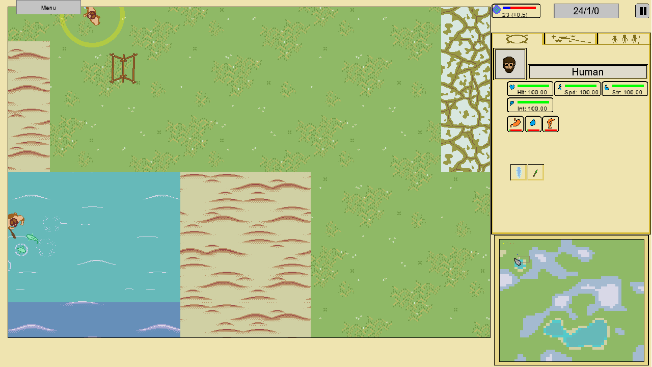
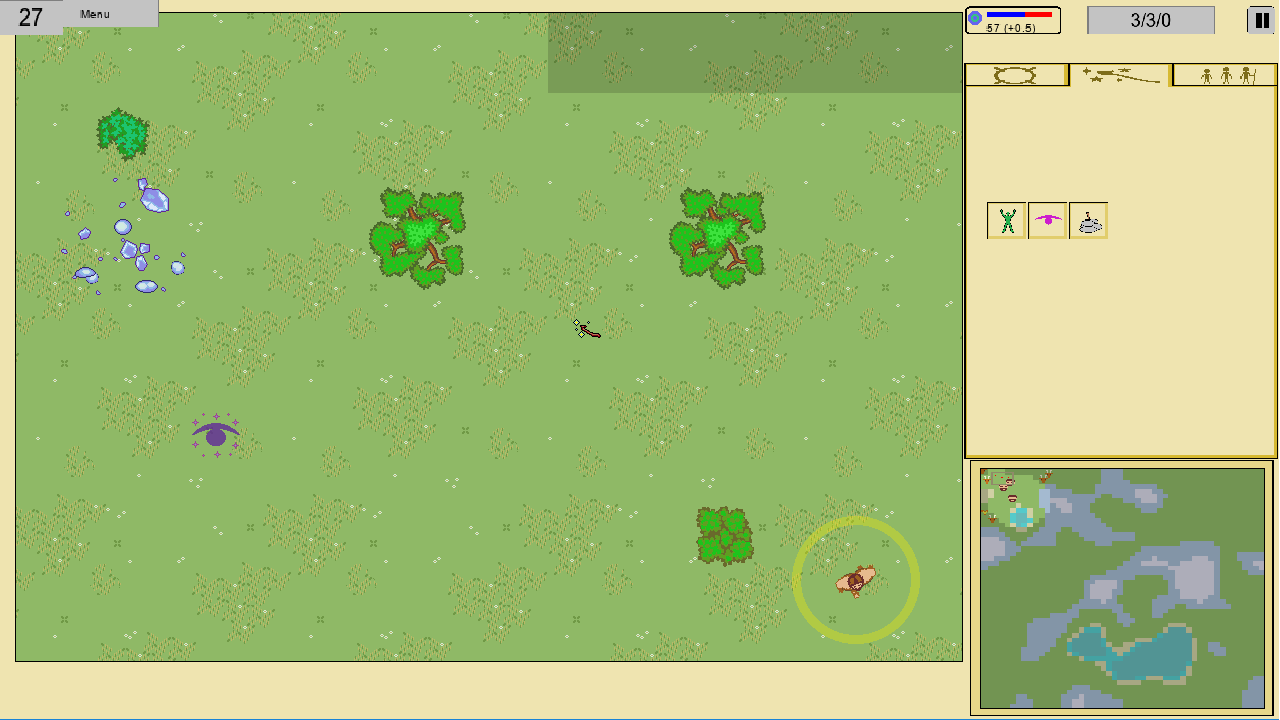
I'm currently working on a 2D god game. I'm a programmer first, but since I don't really have a budget to hire an artist I'm doing all the sprites myself. I've had some godawful colors (think everything fully saturated), so recently I did a little bit of reading on selecting colors and came up with a palette. Anyway, my strategy is to use less saturated colors for terrain and more saturated colors for game objects, to make them easy to spot for gameplay purposes, but I'm concerned the saturation difference just doesn't look very good. I'm also been looking at my own artwork so long that I have zero objectivity on it's quality. So yeah, I could use some outside opinion on whether my artstyle is serviceable or whether it'd turn away potential players. Pointing out specific mistakes I'm making with colors and sprite detailing would be great. The UI is just a placeholder, but I'm not sure on whether it should be using terrain or objects palette when I make a proper one, so any opinions on that are also welcome. And yes, I plan on doing some kind of tile transitions eventually, but it's on the backburner right now.
Anyway, here's a couple of screenshots:


And here's my palette (objects left, terrain right):


