Play game
What the road brings's itch.io pageResults
| Criteria | Rank | Score* | Raw Score |
| Most improved | #1 | 4.533 | 4.533 |
| 90's | #1 | 4.867 | 4.867 |
| Fun | #1 | 4.800 | 4.800 |
| Overall | #1 | 4.733 | 4.733 |
Ranked from 15 ratings. Score is adjusted from raw score by the median number of ratings per game in the jam.
Link to pre-jam game
https://www.youtube.com/watch?v=HfSjkC8m-4A
Leave a comment
Log in with itch.io to leave a comment.


Comments
Very cool! I enjoyed it greatly. The aesthetic is spot on
This game is very fun and addicting. I really like the 90's graphics. Great entry!
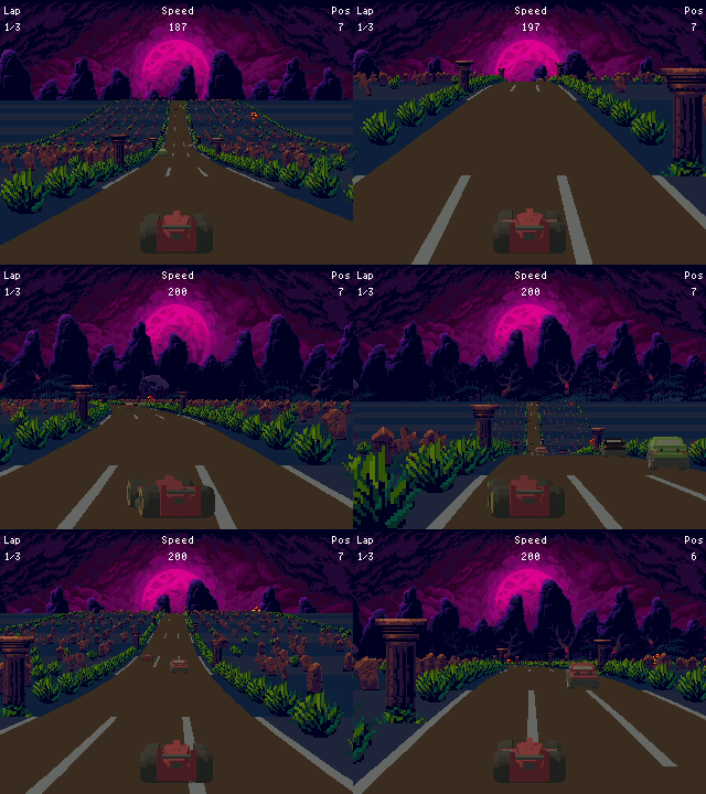
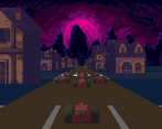
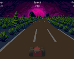
wow this one's FUN! I'm super impressed by the graphics! The whole aesthetic styling of this game, the pixel art, the menus, the Poe quote, the SKYBOX!! What the Road Brings is a slam dunk.
Really enjoyed this one. It's pretty fun and has solid gameplay. Maybe the non-racing cars were a tad annoying, hard to avoid. The pseudo 3D effect is superb, and graphically the game is well put together. I'd say the moon never moving when you turn is a bit odd ( like its following me :O ), but that's about it. I can see myself wasting time with this game.
The sprite scaling effects are pulled off very expertly on this, and the game is very fun to play!
super fun game, i can play this all day! i love the graphics, it’s so awesome. Good game!
I played it twice (and got fifth both times). It was pretty fun, so I want to play it again and see if I can do better.
There’s music, but it feels a bit repetitive. But it does give a sense of speed when you’re racing. A fun idea to try out could be making the music slow down when you go slower, and maybe have some instruments that only play when you’re going fast. But for a jam game, that music is definitely good enough (and you have different music on the main menu too).
As for the visuals, I really like them. The colours add an interesting atmosphere. And the cars look nice (and so does the level, but when you’re moving fast, you don’t really stop to look at the sprites you zoom by. But the parallax background is pretty. But I feel like the text in the menu, level description and credits screen look a little bit off. Not so much the title of the game (even though it looks like it’s drawn in a lower resolution and scaled with a good pixel art scaling algorithm). But it’s a bit hard to read the letters m and w in the credits screen and track description. The track description would have been easier to read with a one-pixel gap between lines of text. (The H below the y looks like an A because the letters touch). 32-bit consoles could handle proportional fonts, and usually they’d keep text short or not show all of it on screen at once (a track selection screen could have an image of the track and a scrollable description below or next to it. At least the text has a colour (white) that’s easy to read on the background (purple).
And one nitpick about the second line in the game’s title: The horizontal stroke in the A is a bit low and the one in the G is a bit high. I think it would look better if you matched them to the height of the joints in the middle of the B and the R. In a short bit of text like a title it doesn’t really matter that much though. But I thought I’d mention it anyway. (I’m not an expert i this, just a bit of a nerd.)
Of the games from this jam that I could play in browser, I think this is the one I like most.
Thanks for the comprehensive feedback, I’m glad you enjoyed my game! I will continue developing this game, so this is really useful to me!
The title font is actually not upscaled, its the Mr Henry Font (CC0), it just doesn’t work well with low resolutions (the same font is used in the high res banner on the game page).
As for getting fifth place, I always find it hard to adjust the difficulty of my games (I’m able to catch up to first place during the second lap)
Gotta admit: a gothic racer was very unexpected...and also very good!
Big vibes of Speed Haste on a Pentium from it! Loved it!
Really good! I felt in my childhood playing this game, I like the cars that aren't runners togheter driving by the way. And I found no bugs, It's a good experience to play, balanced.
This looks amazing, especially taking into account the difference with the pre-jam version!