Play game
runner's itch.io pageResults
| Criteria | Rank | Score* | Raw Score |
| Overall | #6 | 4.545 | 4.545 |
| Roguelikeness | #17 | 4.455 | 4.455 |
Ranked from 11 ratings. Score is adjusted from raw score by the median number of ratings per game in the jam.
Successful or Incomplete?
Success
Did development of the game take place during the 7DRL Challenge week?
Yes
Is your game a roguelike?
Yes
Turn-based
Yes
Roguelike Elements
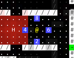
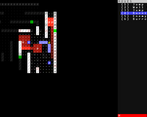
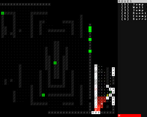
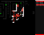
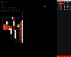
Traditional display style (ASCII terminal), top-down grid-based world, permadeath, turn-based, exploration. Maps are procedurally generated, but nothing else.
Screenshots
Yes
Leave a comment
Log in with itch.io to leave a comment.


Comments
This has been another one of the different entries from this 7DRL that I've dedicated the most hours to playing. With a 100% ASCII and traditional aesthetic, but with fresh and innovative gameplay, full of dynamic movement and action.
I really like that the abilities have a cooldown and that the game forces you to correctly choose the action you must use to survive. I've had moments of pure tension when surrounded by different guards without being able to escape because I had no more jumps available.
It's incredible that you've been able to create a traditional roguelike implementing action mechanics, speed, and movement that are not commonly seen.
And I don't want to leave without highlighting your effort for having dedicated time to program a tutorial that teaches in a basic but very complete way how to play your roguelike. I really have to congratulate you for that.
I hope you're encouraged to continue creating different games within the roguelike world.
Great game, every mechanic is laser-focused on one target: getting the player moving forward. I'm yet to complete a run, but I'm sure to keep trying.
Any chance of releasing a downloadable version as well? I'd love to load this on my Steam Deck for a run on the go.
Im glad you’re enjoying it! I don’t know much about stream decks. It’s just a single webpage inside. Does it have a web browser?
Either way, I’m working on a next gen version now. It will have an executable. That piece is working, but nothing else yet. 😉 it’ll be a month or two realistically. I’m learning a bunch of new tools.
Great game I loved it!
Thanks for playing! Glad to hear you enjoyed it.
Excellent game with fun mechanics and a great difficulty curve
This game is a lot of fun, I like the simplicity of it and I think it works very well. It's challenging and I like that!
Great game!
* tutorial level worked great!
* wish S also worked for jumping X
* great levels, very interesting procgen
* very smart to use the red line to show the direction p's are moving
* didn't notice my health bar for a long time; maybe just put it above the moves?
* thought the red circle thing was "noise" level, not distance to hunter
* the moves felt just right, really sold the feeling of being flitty and outmaneuvering opponents
* wish I could do diagonal jumps off wall!
* Felt the game had a clear singular vision that was executed well!
* 3 levels felt just right
* Now that I know how to play level 1 feels pretty trivial
* nice animation on main screen to signify what the game's about.
* wish doors were colored blue so the objectives (key/exit) were uniquely identified by the green
I recorded my playthrough with don't-wake-my-housemate-quiet-commentary:
Oh thank you! Very good suggestions. I took many of them just now!
Diagonal movement I’ve thought some about but it’s not really viable in this version. It makes some hard assumptions right now about movement being essentially one dimensional.
Curious what you think about tuning it. It would need to be tuned to not be absurdly strong. Could just be the total distance is ~half of what you get moving in a cardinal direction to compensate for the 1.4 diagonal distance thing. Maybe handle via longer CDs. Hmm. Interesting balance question.
Very cool, both in concept and execution. Now I want to make something completely movement focused, too. :)
A few suggestions:
Yeah agree 100% with those suggestions. I have a hunch that if I can build the first one (i.e. wall run for 2 spaces if 3 is not possible, or enemy jump from 2 spaces away but only get 2 spaces of distance on the other side) it takes a lot of pressure off the live preview idea. Which is harder for some stupid internal architecture reasons. Third idea I will just … do. That’s correct. Whoops.
Thanks for playing and I’m glad you enjoyed it and are inspired! That’s the best possible outcome for me, someone who thinks “this design space is interesting enough that it makes me have ideas of my own that extend or expand it.”
Okay, shipped that third idea. It feels great. One line change. :D
Added leeway, too! I know you know, but just in case anyone else is reading this later and thinking “it DOES work like that!” Rest assured it didn’t always! Thanks for the suggestions!!!
The leeway was a good choice imo!
Nice job! The moves are very interesting.
A RUNNER ESCAPES. CYBERNETIC MOLE MEN REJOICEEE!!###