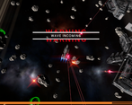
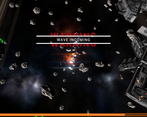
The menus look nice but you should make it more obvious how to start playing. Maybe highlight the "embark" button? Also clicking on the ship in the selection menu doesn't seem to be working.
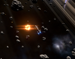
The camera gives me motion sickness. Have you considered making it a fixed angle and more zoomed out?
The volume on some of the sound effects for getting hit is very loud compared to others.
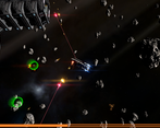
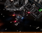
It's hard to understand what's going on because although the graphics are nice they're not very readable. It's the exact opposite of Vampire Survivors.
You are right about the menus. I've considered your feedback and made starting the game easier.
I have thought abut making the camera fixed angle, controlled either by keys or mouse. There are pro's and con's, but as you pointed out it might be necessary.
Sound effects are very much a work in progress. I haven't spent much time on them at all. I'll check the volume and make adjustments.
I'm working on the UI and user feedback to make the game easier to understand visually.
not totally sold on the way enemies attack, might be interesting if game was based around slower moving projectiles the player could navigate around. Right now you can't do much but soak up damage and pray
I've been thinking about this and I agree with you. I'm planning a pivot with more realistic ship control and slower, more tactical gameplay. In regard to the combat system. Current plan is scissors paper rock style system, with projectiles being analogous to melee (close range, penetrate shields, bad against armour), beams being like magic (medium range, can't miss, bad against shields) and missiles which are like guided arrows (long range, slow, tracking and guidance, can be destroyed by small weapons). Additionally, I want objects and velocity to play a greater role, with asteroids acting as cover and ship velocity having a greater effect on accuracy and evasion.
I like the UI, it looks pretty clean. Also the weird space-y noises in the Title give me a real space feeling, nice.
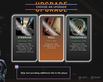
Don't know what the Points in Outfit selection do tho. I know it says increases stuff by X%, but the value doesn't change, I don't get any kind of currency or loose any when I activate/deactivate some, I can just toggle them in a random order, so its not like I know that I have currently 3/6 active or whatever.
Opening Resolution says 640x480, but it cleary is native first, as switching blurs it all out. Also the points below it clip out of range, which looks ugly. And the UI doesn't properly scale with resolution, so when changing between them it the buttons keep jumping to different positions, making changing slower as it already is, since its not a dropdown where I can select mine.
Why is there a Title subsection that does nothing? Why not cut the embark section into a seperate button somewhere on there, or just have the title be the embark screen already, but with some ui adjustments?
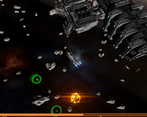
in Game the control section on the bottom right overlaps itself, making everything impossible to read.
But A/D/Space seem to be the only buttons anyway.
Once you hit a wall you can't really turn away, thanks to always acceleration. Controls are pretty bad either way, its boring to just A/D. Its space, and loot spawns below me anyway, if the enemies die there, let me fly up /down left/right, let me adjust my speed, shoot manually all that stuff. don't just let me drift passively.
Restarting doesn't work, it doesn't zoom in on my ship, and from out of Planet range view I can't see anything, so controlling is impossible.
Picked some velocity control boosters after restarting the Game, couldn't control velocity. Also have no Gun now, so it'll be interesting to see how I'm going to handle the small ships who just kind of hug me instead of doing anything or trying to fight or whatever?
Crashed a bunch of Ships, got a Cannon finally, then exploded myself. No Healthbar no Nothing, just a weird number in the bottom right going up and down however it wanted. Your Camera lacks super behind the Ship on rotation, and its making me nauseous.
I have mixed feelings about this, I like your Space stations, and the ship modularity has potential, but I kind of was expecting a different kind of Game. I know this is not what you're going for, but it really has the Feeling of some nice Space-y RPG, flying around abandoned old settlements or whatever you wrote on your Page, doing missions, upgrading your Ship. Similar to what Underspace wants to do I assume? But less fantastical and more hard Sci-Fi? And I do like the Space feeling your Game gives off more. But the Gameplay being a kind of VS Clone is not really Fun as it is now I think. But again, I think I'm expecting a different kind of Game here then what you're actually going for.
I'm planning to do some more work on the UI. I'm not 100% happy where it is now. I'm glad you like the title music.
I'm not sure if the Outfit screen was fixed in 001. It should be working in DECO version.
I'm still working on UI reactiveness. I'm wondering if I should scrap it all together because of how much work it is. Maybe just support everything above 1920x1080.
Planning to put patch notes in title. Might move embark to first selection as you suggested.
Yeah, controls is still WIP.
I'm thinking of reworking the movement system into something more hard scifi like from The Expanse. I'll be adding thrusters to all sides of the ship and thrust control.
The original intention was to build a VS clone, but the market is now saturated with VS clones that are better than anything I could make in such a short time. I'm thinking of pivoting into something that is more Slay the Spire meets Diablo in space with VS style upgrade system. I'm still looking for that x-factor.
Thanks for your feedback and input, it's highly appreciated.
-The game goes all the way to the back instead of second place when I tab out in borderless mode.
-Resolution should be a dropdown menu instead of having to cycle through all of them. The button changing place all the time makes it even worse.
-The field of view and draw distance settings don't seem to do anything.
-The texture resolution setting affects some UI textures.
-I don't like the language in the options menu. Using words like "ftw" and "potato" makes the game come across as un-serious. The tooltips are also a strange mixture of being too non-technical to be useful, and too technical for the average player.
-There are no controls listed anywhere, and I couldn't figure out how to control throttle.
-The game shouldn't allow you to start without a weapon. I didn't know you could select different starting items at first because the controls in the bottom right weren't anchored properly.
-Needs a health bar. I also have no idea what energy does.
-Needs the option to select targets manually.
-Big ships keep rubbing themselves against you and there's no way to get them off since they're the same speed.
-How are you supposed to avoid damage? Enemies swarm you the second the game starts and pelt you until you inevitably die 2-3 minutes later.
Comments
The menus look nice but you should make it more obvious how to start playing. Maybe highlight the "embark" button? Also clicking on the ship in the selection menu doesn't seem to be working.
The camera gives me motion sickness. Have you considered making it a fixed angle and more zoomed out?
The volume on some of the sound effects for getting hit is very loud compared to others.
It's hard to understand what's going on because although the graphics are nice they're not very readable. It's the exact opposite of Vampire Survivors.
You are right about the menus. I've considered your feedback and made starting the game easier.
I have thought abut making the camera fixed angle, controlled either by keys or mouse. There are pro's and con's, but as you pointed out it might be necessary.
Sound effects are very much a work in progress. I haven't spent much time on them at all. I'll check the volume and make adjustments.
I'm working on the UI and user feedback to make the game easier to understand visually.
Thanks for your feedback.
awesome idea for a vampire survivors style game
not totally sold on the way enemies attack, might be interesting if game was based around slower moving projectiles the player could navigate around. Right now you can't do much but soak up damage and pray
starting captain looking fine btw
I've been thinking about this and I agree with you. I'm planning a pivot with more realistic ship control and slower, more tactical gameplay. In regard to the combat system. Current plan is scissors paper rock style system, with projectiles being analogous to melee (close range, penetrate shields, bad against armour), beams being like magic (medium range, can't miss, bad against shields) and missiles which are like guided arrows (long range, slow, tracking and guidance, can be destroyed by small weapons). Additionally, I want objects and velocity to play a greater role, with asteroids acting as cover and ship velocity having a greater effect on accuracy and evasion.
Thanks for the feedback. Always appreciate it.
Played for maybe 20 minutes.
I like the UI, it looks pretty clean. Also the weird space-y noises in the Title give me a real space feeling, nice.
Don't know what the Points in Outfit selection do tho. I know it says increases stuff by X%, but the value doesn't change, I don't get any kind of currency or loose any when I activate/deactivate some, I can just toggle them in a random order, so its not like I know that I have currently 3/6 active or whatever.
Opening Resolution says 640x480, but it cleary is native first, as switching blurs it all out. Also the points below it clip out of range, which looks ugly. And the UI doesn't properly scale with resolution, so when changing between them it the buttons keep jumping to different positions, making changing slower as it already is, since its not a dropdown where I can select mine.
Why is there a Title subsection that does nothing? Why not cut the embark section into a seperate button somewhere on there, or just have the title be the embark screen already, but with some ui adjustments?
in Game the control section on the bottom right overlaps itself, making everything impossible to read.
But A/D/Space seem to be the only buttons anyway.
Once you hit a wall you can't really turn away, thanks to always acceleration. Controls are pretty bad either way, its boring to just A/D. Its space, and loot spawns below me anyway, if the enemies die there, let me fly up /down left/right, let me adjust my speed, shoot manually all that stuff. don't just let me drift passively.
Restarting doesn't work, it doesn't zoom in on my ship, and from out of Planet range view I can't see anything, so controlling is impossible.
Picked some velocity control boosters after restarting the Game, couldn't control velocity. Also have no Gun now, so it'll be interesting to see how I'm going to handle the small ships who just kind of hug me instead of doing anything or trying to fight or whatever?
Crashed a bunch of Ships, got a Cannon finally, then exploded myself. No Healthbar no Nothing, just a weird number in the bottom right going up and down however it wanted. Your Camera lacks super behind the Ship on rotation, and its making me nauseous.
I have mixed feelings about this, I like your Space stations, and the ship modularity has potential, but I kind of was expecting a different kind of Game. I know this is not what you're going for, but it really has the Feeling of some nice Space-y RPG, flying around abandoned old settlements or whatever you wrote on your Page, doing missions, upgrading your Ship. Similar to what Underspace wants to do I assume? But less fantastical and more hard Sci-Fi? And I do like the Space feeling your Game gives off more. But the Gameplay being a kind of VS Clone is not really Fun as it is now I think. But again, I think I'm expecting a different kind of Game here then what you're actually going for.
I'm planning to do some more work on the UI. I'm not 100% happy where it is now. I'm glad you like the title music.
I'm not sure if the Outfit screen was fixed in 001. It should be working in DECO version.
I'm still working on UI reactiveness. I'm wondering if I should scrap it all together because of how much work it is. Maybe just support everything above 1920x1080.
Planning to put patch notes in title. Might move embark to first selection as you suggested.
Yeah, controls is still WIP.
I'm thinking of reworking the movement system into something more hard scifi like from The Expanse. I'll be adding thrusters to all sides of the ship and thrust control.
The original intention was to build a VS clone, but the market is now saturated with VS clones that are better than anything I could make in such a short time. I'm thinking of pivoting into something that is more Slay the Spire meets Diablo in space with VS style upgrade system. I'm still looking for that x-factor.
Thanks for your feedback and input, it's highly appreciated.
-The game goes all the way to the back instead of second place when I tab out in borderless mode.
-Resolution should be a dropdown menu instead of having to cycle through all of them. The button changing place all the time makes it even worse.
-The field of view and draw distance settings don't seem to do anything.
-The texture resolution setting affects some UI textures.
-I don't like the language in the options menu. Using words like "ftw" and "potato" makes the game come across as un-serious. The tooltips are also a strange mixture of being too non-technical to be useful, and too technical for the average player.
-There are no controls listed anywhere, and I couldn't figure out how to control throttle.
-The game shouldn't allow you to start without a weapon. I didn't know you could select different starting items at first because the controls in the bottom right weren't anchored properly.
-Needs a health bar. I also have no idea what energy does.
-Needs the option to select targets manually.
-Big ships keep rubbing themselves against you and there's no way to get them off since they're the same speed.
-How are you supposed to avoid damage? Enemies swarm you the second the game starts and pelt you until you inevitably die 2-3 minutes later.
Thanks for your in depth feedback.
Thanks for your detailed feedback. I'll add them to my list of TODOs.