Play game
Dark Fog Horror's itch.io pageResults
| Criteria | Rank | Score* | Raw Score |
| Presentation | #34 | 2.457 | 3.250 |
| Fun | #37 | 1.984 | 2.625 |
| Originality | #38 | 2.173 | 2.875 |
| Overall | #39 | 2.205 | 2.917 |
Ranked from 8 ratings. Score is adjusted from raw score by the median number of ratings per game in the jam.
Leave a comment
Log in with itch.io to leave a comment.


Comments
I don't like to admit it, but that super fast weird black fog thing kept me on the edge running to the safe point like crazy ^^ Good work!
I liked this one a lot! It has a few flaws, but it's short and simpel and gets its point accross. I also like the lightning a lot. Some smaller improvements I would suggest: Some of the text is under the fog, making it unreadable. The buttons are also over the ending text and blocking it. And I would also suggest to make the opening skippable, as it can get annoying having to sit through them when restarting the game and also adding a quit button/key, because otherwise you have to open the task manager to quit the game in full screen mode. But again, overall I really liked this!
Can you show me how the buttons are showing on top of the ending text, or maybe can try to reproduce the steps of triggering it? Because I didn't get this issue at my side before submitting my entry. Yeah, there are some stuff that should be done before submitting, sadly that I'm quite a bit busy to design and finalize my game due to my internship.
Thanks for your feedback on this and I appreciate it!
It seems I can't make a screenshot, but I guess I figured out the problem: Since the game is still running with the end text, the player can still die and you get the buttons on the text. I hope that's helpful!
Really creapy, but I didn't really get the safe square idea.. should it really drop FPS? Or my computer was unable to keep up with something?
Congrats, it's a really cool job.
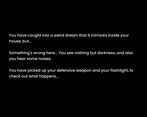
Yes, that square area is intended for setting the target fps to a lower amount when entered, I do that because of the weird dream I had before, which I was armed with a weapon and being outside of the large house become so laggy that anomaly didn't catch up, but when going inside of the house, that anomaly was so fast that I didn't get enough to react and it charged at me so that I woke up and almost screamed.
Appreciate your comment on this!
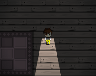
I'm a fan of the nice pixel art, and I liked the background music, it really helped set the creepy nightmare-like tone for the game. Nice job!
To be honest, the only pixel art drawn by me is the taser-alike weapon and the game implementation is done by me, others are basically taken and used from other sources.
Still, I appreciate your comment on this, thanks!
Its a perfect theme for this time of year. The presentation is great and the lighting and shadow effects really help set the mood.
Really appreciated your comment on this, thanks!