Play game
Project Neon - Ping Pong's itch.io pageResults
| Criteria | Rank | Score* | Raw Score |
| Theme | #31 | 3.813 | 3.813 |
| Visuals | #58 | 3.625 | 3.625 |
| Fun | #108 | 2.563 | 2.563 |
Ranked from 16 ratings. Score is adjusted from raw score by the median number of ratings per game in the jam.
Leave a comment
Log in with itch.io to leave a comment.


Comments
Visuals, atmosphere and controls are nice, but most things act and look quite unfinished. Guess you didn't had time left to finish most of your ideas? Keep up the good work! Rated!
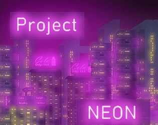
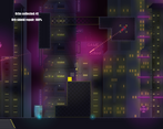
Interesting game! I like the visuals, how they manage to create a seemingly large city. The zooming in when opening up the inventory using the E key makes that even look nicer.
Also an interesting idea with the bullet deflect mechanic, although it's not always that easy and takes some skill.
Just something that caught my attention... The background music starts out nice but it seems to loop all the time. What there is sounds like a nice intro, but on repeat. It could burst open into something bigger, complete with a melody. I think the basis for that is there.
I finished the game. Overall really enjoyed it with all the creative platformer elements!
I like that there you decided to have the player deflect the bullets. It requires some dexterity and speed but is different from the usual click to shoot :) I was very tempted to get a snack/drink from the vending machines but they didn't seem to be interactive xD.
Interesting idea! It's nice to control the character. The music seemed to me not good.
What I noticed:
Good luck with development =)
That's a really good presentation of an interesting idea! The graphics are beautiful! While playing the game, immediately I thought about expanding the game for an infiltration/stealth kind of game, where you could be a secret agent, trying to figure out ways to stealthily get into facilities, in order to accomplish missions! That's the feeling I got from playing this game! The potential is there. Really nice soundtrack, and the mechanics are very good. Just some calibration for gravity and speed, then it will be pleasantly smooth. Almost there! Good job!
I’m pretty impressed by the way the systems in this game were implemented, but I felt like there was a little too much going on for me to really enjoy the game. Maybe just focusing on a couple of the mechanics, like the bullet reflecting and platforming, would be more enjoyable? The tutorial was also a bit confusing considering the amount of stuff that was in there.
Props for making a great looking game though! I thought the visuals, sound design, and menu systems all felt really smooth and well made. Best of luck if you decide to keep working on this!
I really wanted to say something nice about your game - and I mean, the background is nice - but it just wasn't very fun to play. The movement was fine (although a bit unbalanced imo - the player fell and jumped too quickly and moved too slowly), but the focus was all over the place. At first it felt like a standard platformer, then like a fighting game like Bleed where you have to deflect the bullets, then like a full-on RPG with inventory management. Frankly, in only 9 days, most experienced jammers would agree that simplicity is key - you need less tutorials, it's intuitive, the player can get into the game right away, and you have much more time to polish and perfect all aspects of the game. Jonas' video on overscoping
And I would absolutely say you needed more time for polishing. Personally, the level design wasn't very engaging, and I got through by just going to the right as fast as possible.There was little game juice - particles, screenshake, etc. - which made everything feel just... unfinished.
In conclusion, use design by subtraction, focus on what your game is really about instead of piling on new mechanics, and polish that as well as you can.
(Yes, I sound very negative when giving feedback. Constructive criticism is much more useful than praise imo)
I'm amazed by the amount of work you have done in 9 days! Parallax background and nice graphics. Simple but yet interesting. Wery good education even dumb me can understand. I don't usually play platformers but the movements were good and polished. I wish you the best of luck with your current and future projects.
I had fun playing your game! The background is really pretty, and all the lights and effects look great!! Nice work!
I was going to point out the double A thing, but looks like someone else mentioned it already. I totally did the same thing on my own game's page, I got the the controls wrong. We are all so tired brained after working so hard on the jam, so it's bound to happen xD
Oh definately, poor CD Project Red. I worked on my game for about 9 days too! I discovered it on the 13th and decided to start right away working everyday non-stop. At the end I told my friends "I feel like my brain just climbed Mount Everest mentally" xD
Amazing work on the visuals and they're easy on the eyes. And I like the parallax background. The game mechanics are pretty smooth. Yes, you need to continue making more levels. Keep up the great work.
Great visuals, it had an small dellay on the movement of the background but not in the player that make me a little dizzy, overall a very nice entry congrats!
I am not sure, but it feels like the background was having a different FPS in the movement than the player, I dont know if that makes sense to you, but the feeling was only at the start I got used pretty fast
I remember seeing this on the GMS2 discord so I decided to play it. The visuals look amazing. I love the atmosphere! It was relatively short but I see a lot of potential if you plan to make a post jam update. So now comes the feedback:
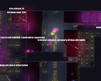
I think you had a typo on "Double A to Double jump" Did you mean W? Also double jump doesn't work with the space bar. The tutorial bombards the player with too much information. I think you should gradually introduce new mechanics as the player progresses. It's understandable why you crammed it in since there were only 2-3 maps but it felt very disappointing to learn how to play to game only to find it end too soon. I think the enemies have too much HP. 1-2 hits should be enough, especially for the beginning of the game. It's boring to sit there waiting for the enemy to shoot because I can't shoot my own projectiles. There should also be visuals or sound when I hit them. At first, I wasn't sure if I was hitting them or not.
Overall, I think you've built a great framework so I hope you continue to develop it and have your hard work pay off!