Play game
Neon Arena - Jam Edition's itch.io pageResults
| Criteria | Rank | Score* | Raw Score |
| Fun | #38 | 3.618 | 3.618 |
| Theme | #83 | 2.882 | 2.882 |
| Visuals | #83 | 3.294 | 3.294 |
Ranked from 34 ratings. Score is adjusted from raw score by the median number of ratings per game in the jam.
Leave a comment
Log in with itch.io to leave a comment.



Comments
In case you missed it, I did get around to playing this later on the stream!
Streaming Amaze Me Game Jam Entries (Part 2) - YouTube
After piecing together the rules, this game is really neat. Seriously, well done! Considering playing some more when my mind isn't dull. ^.^
Thank you for playing and for your feedback! =)
Unfortunately I was late, but I have already looked.
This is one of the more unique games I've played for the jam. Definitely a very interesting idea. As has been pointed out, the wall'o'text tutorial is bad, but you've already said that time constraints were in the way and you plan to replace it, so no problem there. I had a lot of fun rotating matrices and figuring out the best positioning in my head to give myself the biggest advantage each round. It was difficult, but not too difficult and each time I failed I kind of knew I was making a compromised choice when placing the data packet (or whatever it is, lol).
Awesome job!
Thanks for playing! Thank you for your feedback!
Glad you liked it =)
Very cool turn based tactics game. It took me a few tries to start making progress, but once I did, I really enjoyed it. The concept is very cool and unique. Great game, I had a lot of fun!
Thank you for playing and for your feedback! Glad you liked it!
Very interesting game, clever puzzle, I liked it.
I found it a bit bureaucratic to understand initially, maybe it is possible to reduce the number of buttons or steps?
Congratulations, keep up the good work
Thanks for playing or for your feedback!
Reducing the number of buttons - how?
Data controls are needed. Character controls too. Perhaps, in different game situations (with different sizes of the field, etc.), something is not needed. But, in this situation (as in RTS), it is necessary to show all the possibilities that the player has.
The number of phases is also difficult to change, this is the basis: posted data, player actions, enemy actions.
Thank you for your wishes =)
I believe that one possibility is to only show the buttons when there is action for them, instead of disabling them.
I agree, but testing is needed here. While the option fell on shutdown. The game turned out to be not easy to understand (because there is no normal training), so hiding / showing the controls would confuse the player even more.
Maybe you are right.
Same is a great game, good luck with it :)
Thank you very much for your wishes! In any case, I added your proposal to my notes and I will check it. Thanks for that =)
This was pretty cool! I'm a huge fan of turn-based tactics, I got real Hoplite vibes from this. I liked the mechanic of placing your own enemies, although I was able to cheese the game by blocking myself off in a corner for 6 or 7 turns, getting 20+ energy and no extra enemies, but I had a lot of fun figuring out the cheese and capitalizing on it.
I do wish there was a way to see what your enemies could do - knowing that it'll get as close to me as possible and shoot if there's LOS doesn't do too much good if I don't know how far it can move. Overall though, great job!
Thanks for playing! Thank you for your feedback!
And you are lucky and chose the right tactics at the right moment. The fact is that the Arena cards (starting) and Data packets are generated randomly, there are coefficients on how many opponents, walls, health, energy should be, but they also have a probability. Therefore, no matter which mode you choose, you will get a unique situation every time. This is the balance and its setting now.
Thank you for your interest in the project =)
Wow, this is a really unique game. You must have spent a lot of time designing it. I like the potential of the gameplay and I'd love to see you improve upon it with a full release.
I think you should remove the tutorial that's a lengthy read and put in scripted levels designed to teach the player how to play the game. I'm the type of person that likes playing around with things and figuring it out so the tutorial was a big turn off for me.
You should add in keyboard controls. Honestly, it was quite inconvenient to have to move pieces using the on-screen arrows rather than wasd or the arrow keys. You could even bind the action commands to the keyboard.
When you place the server data packet, you can override the walls but it seems to move enemies onto another location if it overlaps? It's a tough design choice. I think you should just prevent any overlapping before you send the data or allow the player to move around the pieces before sending it so it doesn't overlap.
Overall, good job on the game!
Thank you for playing and for your feedback!
On the page with the game there is a video of the gameplay, if you are interested, you can watch.
Thank you very much for your interest in the project and for your kind words! =)
Wow. You must have a brilliant mind to have come up with this - and just for this jam too! A lot of thought have gone into this as it's like creating a chess game with your very own sprites and rules in such a short time! Full of respect and admiration, man! After reading some of the previous comments and your replies, here's my thoughts, that I think may be able to help you :) :
There is definitely a learning curve for this game which is inevitable, and I would say it does take time to learn so I can see your challenge trying to convey this to the player - I myself am not v familiar the the rules of chess tbh so you can take it that I have 0 background knowledge and making reference to the rules of chess may not be 100% effective. As such, I'd think this game can be quite advanced and complex for the average casual gamer/public (assuming this is your target audience).
Whilst I think the detailed text explanation is helpful and important... may I suggest that instead of removing it or shortening it *too* much, instead, add some animations/gifs to show the sequence of the turn-based, what action should be done per turn, and how they (both the player and enemy) move/attack just beside where you are explaining the in the text can help with conveying this? Like one section/para can have the corresponding animation/gif beside it . This will really help with visualization and understanding.
Also, perhaps start with an easy level with maybe just one (or two different types if you feel is important for the player to know) and with prompts on what to do next (like a model answer). And break it down explicitly by steps within each turn. In this way, the player can quickly get the hang of it and be able to continue the next levels themselves independently without losing interest before that stage. You can also add this to the "How to Play" as part of the tutorial / something the player can go back to refer if needed.
Hope the above helps and all the best for your game! I like it, its looking good! :D
Thank you for playing, for your feedback and advice! =)
I added your suggestions to my notes. I perfectly understand what you are talking about and there are already thoughts on this score.
Alternatively, you can start with a small field and small "data packets" (for example, 1x2, etc.), first learn to place, then change sizes, then learn to turn, gradually introduce new enemies, abilities (in addition to teleportation, you can also come up with). The concept and mechanics are such that the difficulty curve is easy to make, as well as the mechanics itself.
The current version is a working prototype of mechanics at a higher difficulty level. This is a pure mechanic that I managed to do to demonstrate the idea.
For example, I planned that the enemies might have more than 1 life, but the initial architecture of the game (code) simply did not allow me to do this (because the instance data was not saved between downloading the packages), later this was corrected when the rules of the error, but the balance has already been more or less done.
Thank you for your interest in the project and your opinion! Glad you liked it! =)
My computer resolution is too high, so your text is super tiny and hard to read. I think the overall concept is really cool, once I figure out how it worked.
I don't think you need as much text if you make some simpler levels in the beginning, like do a level with just the heart and energy. Then have just one enemy. Or you could make a video BETWEEN levels.
Music is and aesthetic is nice and simple and fits the computer vibe well. Did you make this whole concept with music and art in just these few weeks?! O-o
The puzzle system is quite complex, and I kind of suck at it, because I cannot predict the enemy pathing (plus they move multiple squares when I only move a few).
I don't see any "bugs" so far as I can tell. It feels pretty solid, other than maybe some balancing with health, energy, blocks, and enemies. :)
Oh what, I just discovered by the end of this post that you can rotate the packet before you send it! Haha!
Oh what, the enemy can shoot away the blocks!
Thank you for playing and for your feedback!
Unfortunately, I can't figure out if you liked the game or not. But thanks for your interest in the project. =)
Hmm, I thought maybe the smileys would show it, but yeah, I really liked it, other than the immediately high difficulty curve! ;) But, the fact that you can do all actions by clicking something VISIBLE on the screen pretty much negates that. EVENTUALLY, if a person just experiments, they can figure it out. That's an awesome attention to detail. :)
Sorry if the part about the text and levels sounded like a negative thing. I should have mentioned that you might have thought of them already, because I completely agree that they should be the first thing to cut when on a time constraint. ;)
YOUR CORE MECHANIC WORKS GREAT! So your polish there is definitely seen and appreciated!
Near the end, I was just remarking at how I kept learning more and more as I fumbled around = I tried to play it more and more because I started to survive for longer even though I kind of suck. I feel like that really is saying a lot. It is DEFINITELY not an easy feat to get a person that sucks at something to want to keep playing it to get better. And it's like MULTIPLE TIMES more difficult than that to have them feel accomplished WHEN they get good at it. In some games it isn't a WHEN, but an IF. Making a turn-based strategy game definitely helps with that WHEN; and I think because the grid is small, it makes it both manageable and challenging for new players. I can see the grid getting bigger for high level players.
I'd probably keep playing this if I didn't have more games to rate!
Thank you very much for such kind words, I am very glad about it! =)
It looks like you have duplicated your comment =)
Yeah, sorry about that. I've been trying to be careful about that, but I think it happens when the browser warns about leaving the page without saving my rating, but I attempt to post the comment. Thanks for pointing it out so I could remove it. :)
My gosh, what have you done ! A simulation or tactic game, which are my favorite genre. Here no visuals are important, as with pen and paper games! Hope everyone will know this fact! The ambience, the planning, decisions, that's its spike! Will thoroughly test it later... Congrats.
Thank you for playing and for your feedback!
What a masterpiece! I liked a lot! In the beginning, I struggled, trying to understand well the mechanics. But once the understanding comes , then strategy begins and it becomes very fun to play and analyze! Nice choice for music as well. I'm feeling smarter now!
Thank you for playing and for your feedback! Glad I could interest you!
It's great to hear such good words! =)
Clean graphics mate! It was pretty hard for me to get in to the gameplay at first , i tried 4-5 times to get a good round but died kind of often. I do however love tactics games. And after awhile i actually got pretty good at this, which did make this game feel fun :) I think that the explanations just needs some polishing to get new players into it faster :)
Good job bro!
Thank you for playing and for your feedback! I'm glad I liked it =)
Okay, so obviously a wall of text will not necessarily attract players. Thankfully, your game was intuitive enough for me to figure it out on my own, and I'm glad I did, 'cause it was fun and innovative. The visuals need an upgrade: not only the sprites, but also any visual effects, transitions, animations, etc. and frankly I didn't see how neon fit into all this (apart from the title). But it was fun and it was a cool experience, well done.
Thanks for playing! Thank you for your feedback! Glad you liked it!
I will definitely work on the visual design of the game. I am a programmer, not an artist. But I will try to grow in all directions (or find a partner - an artist). Neon decoration (glow) of elements, the style of virtual reality presentation in films of the 90s (for example, the film Hackers in 1995) - this is my Jam theme.
Due to the complexity of the rules and my poor explanation, I think it will not be superfluous to record a video of the gameplay (passing in the task mode). Maybe this will help =)
I really like the design of this game. I'm finding the enemy attacks a bit punishing, and it's preventing me from getting too many levels in, but I really like how you can strategize how you want the next round of pieces positioned around you. Very innovative, and I'm definitely going to keep playing this one. Nice job!
Thanks for the game! And thanks for the nice words! I'm glad I was able to interest you =)
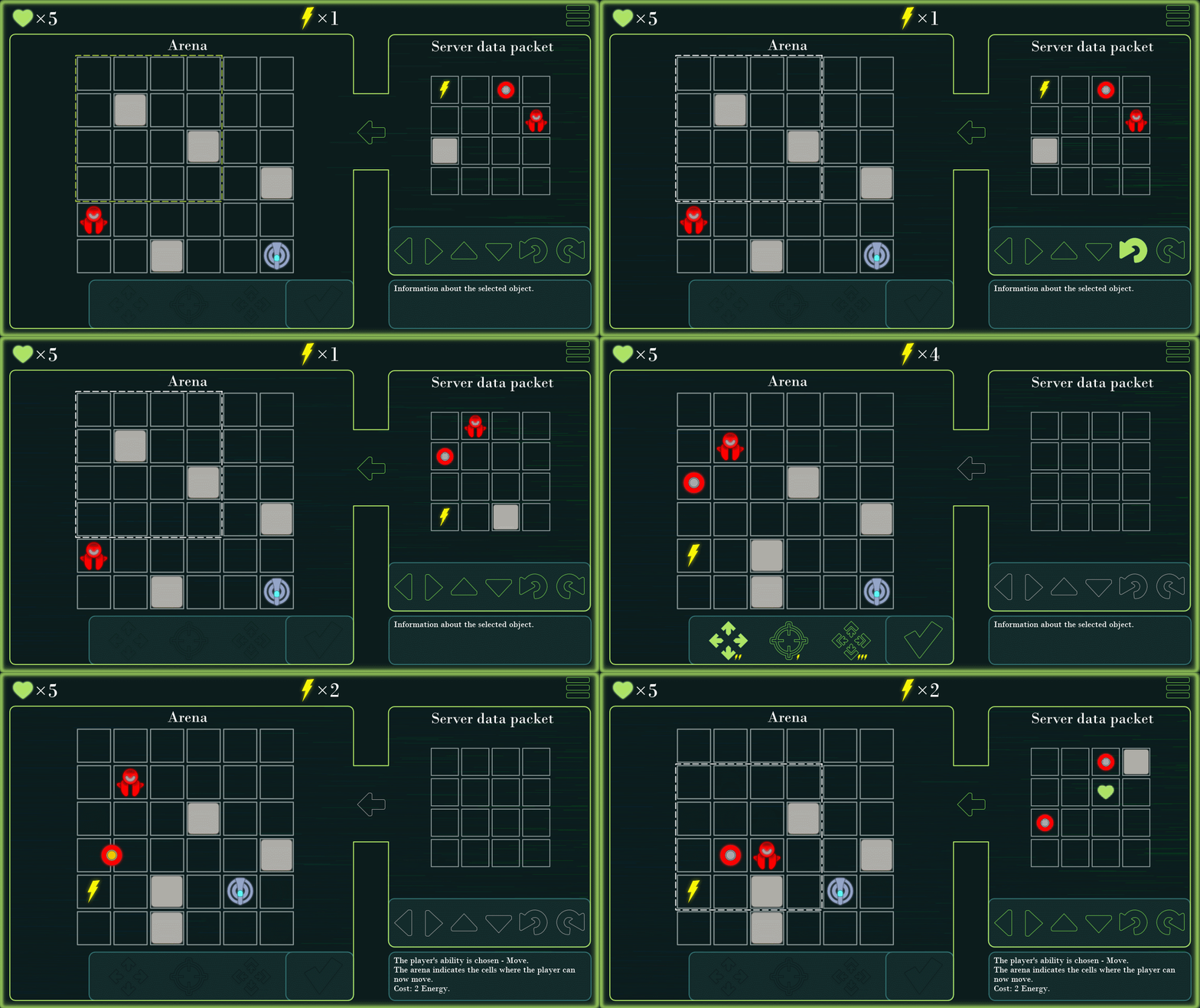
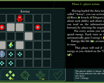
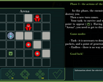
If you left-click on an enemy, then on the information panel (right-bottom) there will be a short description of its behavior algorithm. This should help to understand who you can hide from, for example.
Interesting idea, I died too many times trying to understand whats going on, I was too lazy to see the tutorial, rules are a little confusing but after sometime I understand it a bit, really nice idea and cool concept!
Thanks for the feedback and for the game! I am glad that you still liked it, despite the terrible explanation. I will work on it =)
Man, I really tried to understand this game but I think I'm too dumb to understand what is going on. haha. I tried reading the 'how to play' like 4 times and it just wasn't clicking. I think having a 'step-by-step' interaction tutorial would do this quite well! I'm a kinesthetic learner (like most) so reading a bunch of information does me no good. haha. That said, I did try and play it for a while. I just couldn't figure out the correlation between the data packet to send and the arena.
On another note, the graphics and overall polish are quite nice! It has a great neon feel to it! Everything was very well done, and from what I can tell it fits well within the tactical RTS genre amazingly!
Just as a note, I've never been able to wrap my head around tactical RTS-type games so don't take my experience with too much weight. haha. Good job though! Very smooth execution! :D
Thanks for your feedback and trying! =)
I will try to explain it anyway: imagine a chess field with pieces on it. And now you need to place more figures on this field according to the picture. If there is a figure in the place where you want to install, you remove it and put a new one. And you have the right to decide for yourself how to rotate this picture, how to place a 4x4 field on a 6x6 field (frame and rotation).
I just didn't have time to do the training, I'm sorry.
It's okay! I will try it again in a little while! :D Thanks for the explanation!
I am trying to explain in order to understand how difficult I am explaining. Of course, I will try to show this visually, but you also need to be able to explain with text =)
Really cool tactical game, I really like the overall concept! I'm not really good at these sorts of games, but I had fun trying to figure out the strategy. I died a lot, but had fun! Well done!
Thanks for the game! Thank you for your feedback!
I'm glad I liked it =)
Interesting premise! It would be cool to see a "tutorial" level to start with if you decide to work on a more polished version in the future.
Thanks for playing! Thank you for your feedback!
I will definitely do it. =)