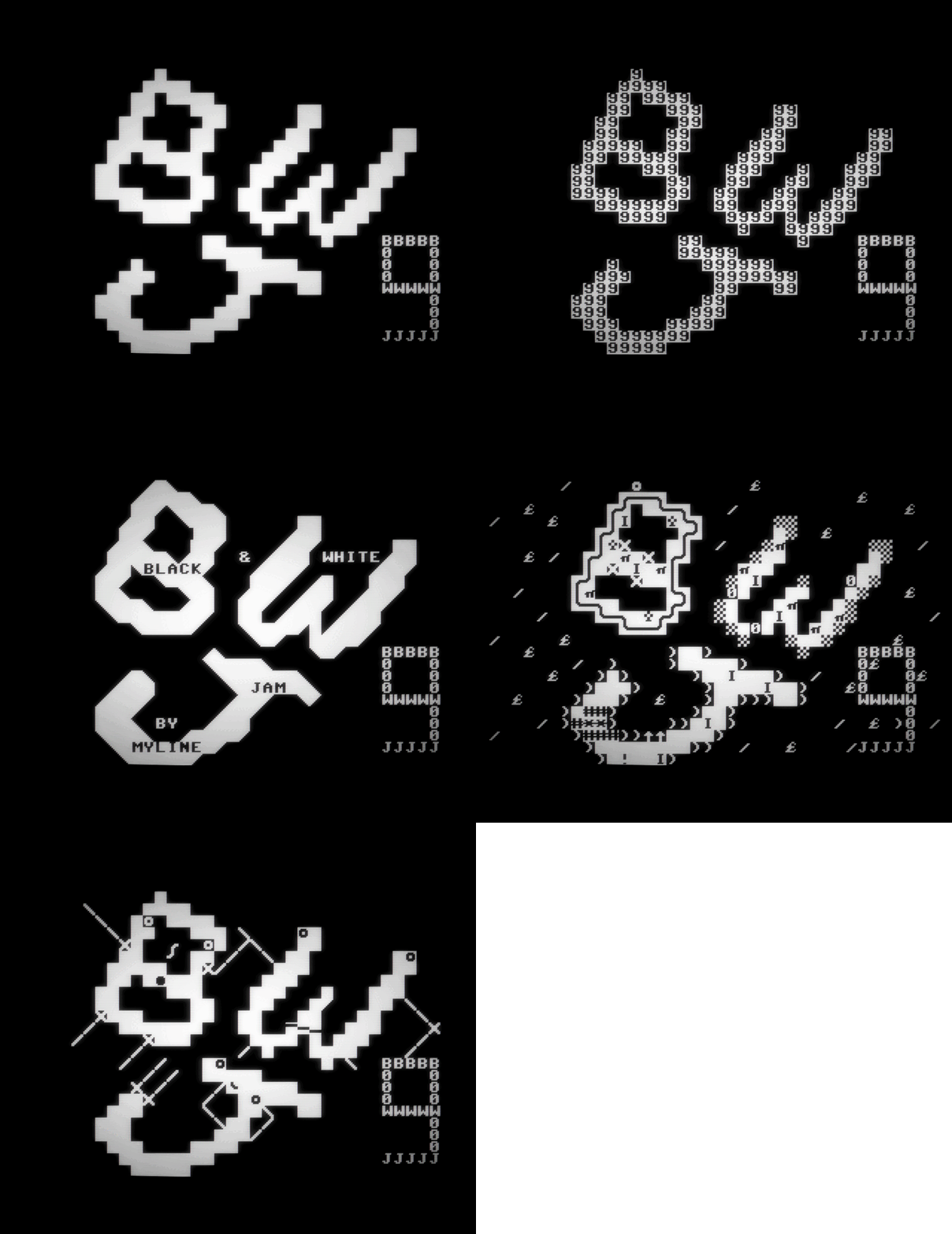
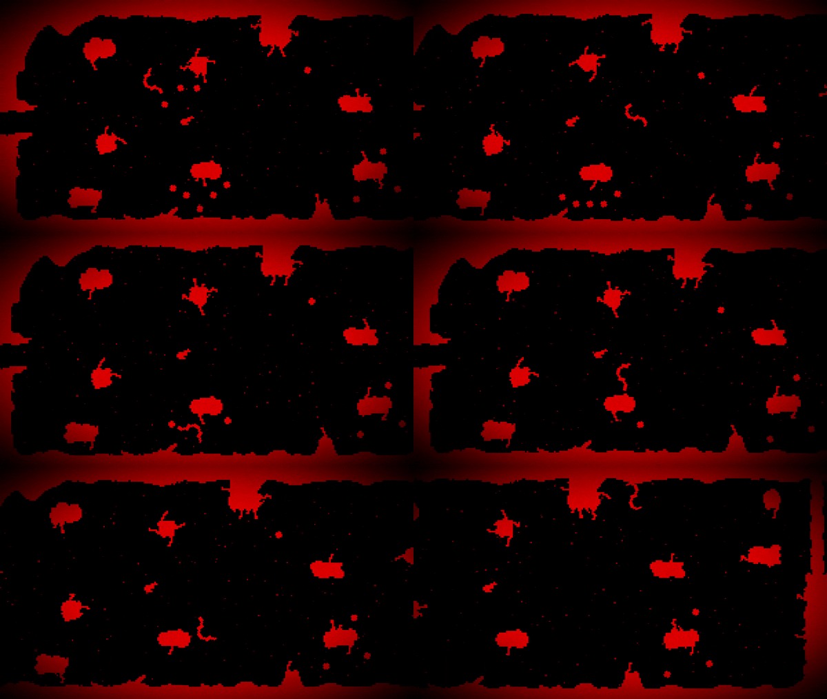
A cool game that makes the player go through tight corridors and obstacles. I definitely had fun playing it, but my initial difficulty came from not knowing my character hitbox. Had to watch the sprite wiggling a bit to fit out the parameters, but would be beneficial to make it more obvious for the player. Like the setting of it though, works with the game and the style.
Play game
Var - Z's itch.io pageResults
| Criteria | Rank | Score* | Raw Score |
| Originality | #32 | 3.500 | 3.500 |
| Art | #38 | 3.167 | 3.167 |
| Is the graphics 1 bit? | #45 | 4.333 | 4.333 |
| Music | #45 | 2.583 | 2.583 |
| Overall | #47 | 3.056 | 3.056 |
| Theme | #50 | 2.417 | 2.417 |
| Gameplay | #50 | 2.333 | 2.333 |
Ranked from 12 ratings. Score is adjusted from raw score by the median number of ratings per game in the jam.
Comments
Its a fun concept but the tunnel where you get knocked back to the beginning is just tedious and unfun. Overall a good concept.
I absolutely loved the difficulty of the game as well as the colours used.
The red and the black really made it stand out to me and i just overall loved it.
The level design is awesome and the sound effect used go perfect with the game.
Overall i had a fun experience and loved the challenge that the game had.
The initial screensaver appeared and I was already burning with impatience. The game turned out to be difficult, but pleasant in terms of the response to interactions. The stylistics and drawing are also very good, but the only thing I didn't like was that the worm sprite rotated, and did not move pixels. And yet I liked the game, thank you!
If it's not difficult for you, then leave a review on my game, I will be pleased)
Oh boy, this was hard.
What I liked:
- The tileset is great. "levels" feel organic and interesting.
- I love how everything pulsates but still stays pixel-perfect.
- The bloaty spikey obstacles were very well implemented.
Suggestions/advice/bugs:
- The game was too hard for several reasons: Controls were not precise enough for how the levels were designed. I'd often find myself in a situation where I had no way of avoiding obstacles.
- The knockback was too strong. It often knocks the player back to another tentacle, and another.. resulting in going back more than the current checkpoint's worth.
- If I got hit multiple times (by the rotating ones especially) my player would get stuck and unable to move. The only way out was to reset back to the checkpoint.
- The "sine wave" of the player moving is a bit too obvious. It gets distracting and takes away from the good visual experience.
You made a great rage game. Not sure if you wanted to though. :)
This one straight up didn't work for me?? like arrow keys and wasd did nothing, even in full screen. I watched your devlog though, and it looks like a pretty cool game.
The screenshots look so interesting and I would love to finish the game because it looks amazing and gives me a super cool vibe but unfortunately can't get past the long corridor? The long part with hair on the bottom and top.
I think it would fix this problem if when I pressed to move up or down it wouldn't rotate the character 360 degrees. Probably you have movement set so it rotates towards the velocity but instead of picking the shortest path to the desired rotation, it takes a long way around ( if the rotation degrees are 220 and the desired one is 0, it moves from 220 to 0 instead of going towards 360 ending up to 0). In my game engine, I would fix it by using lerp_angle() not lerp() but don't know the solution in yours.
Or maybe that's the desired movement and I am just dumb. In any case, I don't have the skill to complete the game (believe me, I have tried!!!)
Even if I couldn't give you too much feedback maybe you can give me some on my entry.


Leave a comment
Log in with itch.io to leave a comment.